Animated Gradient Border in React: 7 Tips
Published: November 21, 2026 · 8 min read
Seven tips for an animated gradient border in React and Tailwind CSS: light made of two conic-gradient arcs, a rotating layer instead of a moving angle, an oversized layer that hides corner gaps, a border cut by padding, a blurred glow, safe stacking, and reduced motion. Each tip comes from a real CTA button and ends with a complete copy-paste example.
An animated gradient border makes one CTA stand out
Your hero has a headline, a subline, and a button. The button is fine. It is also easy to scroll past.
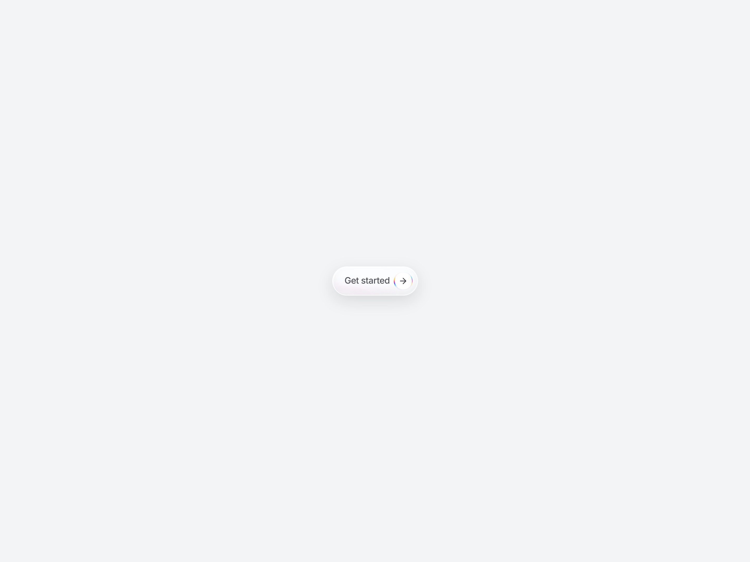
A thin ring of light that keeps moving around the button's arrow fixes that. It pulls the eye to the one action you want, without a loud color or a bigger button.
This guide is for React and Next.js developers who build landing pages, pricing sections, and sign-up flows. The effect fits any single primary action: "Get started" in a hero, "Start" on a pricing card, or "Continue" at the end of a form.
The video at the top is a close-up of the real thing: a CTA button on DesignLayer with a gradient border orbiting its arrow badge. Every number below comes from that component's code:
Two arcs of color in a conic-gradient, with the rest transparent
Rotating the layer, not the gradient angle
Making the rotating layer 190% so no corner shows
Setting the border width with padding and a white circle
Adding a blurred copy for a soft glow
Keeping the arrow above the light with isolate and z-10
Stopping the rotation for reduced motion
The snippets are short and trimmed from the component. A complete example you can paste is near the end.
Tip 1: Paint the gradient border with two arcs, not a full rainbow
Moving light needs dark space around it. So the conic-gradient holds only two short arcs of color, and everything else is transparent.
.mctb-spin {
  background: conic-gradient(
    from 0deg,
    transparent 0deg,
    transparent 14deg,
    #4ec4ff 28deg,   /* arc 1 fades in */
    #6b4dff 38deg,
    #ff4d9a 50deg,
    #ffd056 62deg,
    transparent 80deg,   /* arc 1 fades out */
    transparent 194deg,
    #62d4ff 210deg,  /* arc 2, on the opposite side */
    #8a63ff 222deg,
    #ff5aa8 236deg,
    #ffe08a 248deg,
    transparent 266deg,
    transparent 360deg
  );
}
Why it works
Each arc fades in from transparent, runs from blue through violet and pink to yellow, then fades out. The first arc spans 14deg to 80deg, the second 194deg to 266deg.
The two arcs sit on opposite sides of the circle. When the layer turns, the eye reads two streaks of light chasing each other, and the ring stays balanced at every angle.
The gradient starts and ends on transparent at 0deg and 360deg. That hides the seam where a conic-gradient wraps around.
Common mistake: a full rainbow ring
A gradient that is colored all the way around looks busy, and it barely looks like it is moving. When every angle already has color, a turn only shifts hues. The transparent gaps are what make the motion visible.
Tip 2: Rotate the gradient border layer, not the gradient angle
Keep the gradient fixed and turn the whole layer with transform: rotate. The component does one full turn every 3.8 seconds at a constant speed.
@keyframes mctb-orbit {
  /* keep the centering translate, or the layer jumps off-center */
  to { transform: translate(-50%, -50%) rotate(360deg); }
}

.mctb-spin {
  position: absolute;
  left: 50%;
  top: 50%;
  transform: translate(-50%, -50%);
  animation: mctb-orbit 3.8s linear infinite;
}
Why it works
Animating the angle inside conic-gradient(from …) needs a custom property registered with @property. Without it, the value does not interpolate and the light jumps. A transform animation works in every modern browser, and the browser does not have to redraw the gradient on every frame.
linear matters too. With an ease, the light would speed up and slow down once per turn, and the loop would show a visible beat.
Common mistake: dropping the translate in the keyframe
The layer is centered with translate(-50%, -50%). An animation replaces the whole transform, so a keyframe of only rotate(360deg) throws the centering away. The layer then spins around its top-left corner. Keep both in the keyframe, as above.
Tip 3: Make the rotating layer 190% so the gradient border never shows a gap
The rotating layer must cover the frame at every angle. The component makes it 190% of the badge, centered on it.
.mctb-spin {
  position: absolute;
  left: 50%;
  top: 50%;
  width: 190%;
  height: 190%;
  transform: translate(-50%, -50%);
}
Why it works
A layer the same size as its frame only covers it at 0deg. At 45deg, the corners of a square or pill frame poke out past the layer, and the light briefly breaks there. Covering the corners at every angle takes at least the diagonal, about 141% for a square.
190% leaves extra margin on top of that. The layer's edge sits far outside the clip, so no edge or anti-aliasing seam ever crosses the visible ring.
Common mistake: `inset: 0` on the rotating layer
On a perfect circle, a 100% layer gets away with it, just barely. Reuse the same CSS on a pill or a rounded rectangle, and four gaps appear and vanish once per turn. Size the layer from the start.
Tip 4: Set the gradient border width with padding and a white circle
There is no border property here. The badge is a 36px circle with p-[1.6px]. A white circle fills the content box, and the light shows only in the 1.6px of padding around it.
<span
  aria-hidden
  className="relative isolate flex size-[36px] shrink-0 overflow-hidden rounded-full p-[1.6px]"
>
  <span className="mctb-spin" />
  {/* The white circle fills the content box. 1.6px of light shows around it. */}
  <span className="relative z-10 flex size-full items-center justify-center rounded-full bg-white">
    <ArrowRight className="size-[18px] text-zinc-700" />
  </span>
</span>
Why it works
overflow-hidden and rounded-full cut the oversized layer down to a circle. The padding sets the border width, so changing one value makes the ring thicker or thinner.
The inner circle is solid white, so the arrow always sits on a clean background. Only the thin outer band carries color.
Common mistake: `border-image` with `border-radius`
border-image ignores border-radius. A gradient set that way draws a square frame around a round button. Forgetting overflow-hidden is the other version of this bug: the 190% layer spills out over the whole button.
Tip 5: Layer a blurred copy for a soft gradient border glow
The sharp ring alone can look a little flat. The component stacks a second layer under it with the same gradient and animation, blurred and half transparent.
.mctb-spin,
.mctb-spin-glow {
  /* same position, same conic-gradient, same mctb-orbit animation */
}

.mctb-spin-glow {
  width: 220%;
  height: 220%;
  filter: blur(8px) saturate(1.45);
  opacity: 0.5;
}
Why it works
blur(8px) spreads color into the transparent gaps around each arc, so the arcs get soft tails. Blur also washes colors out, and saturate(1.45) brings them back. opacity: 0.5 keeps the glow behind the sharp line instead of competing with it.
In the JSX, the glow comes first and the sharp ring second, so the ring paints on top. Both use the same 3.8s animation, so they stay in step.
The glow layer is 220%, a little larger than the ring. The soft edge of the blur stays well outside the visible area.
Common mistake: blurring the main ring itself
Putting the blur on the only layer turns the crisp line into a smudge. Keep one sharp layer for the edge and one blurred layer for the light.
Tip 6: Keep the arrow above the gradient border with isolate and z-10
The badge has isolate, and the white circle has relative z-10. In the CSS, both light layers have pointer-events: none, as in the complete example below.
{/* isolate keeps z-10 local to the badge */}
<span aria-hidden className="relative isolate flex ... overflow-hidden rounded-full p-[1.6px]">
  <span className="mctb-spin-glow" /> {/* pointer-events: none */}
  <span className="mctb-spin" /> {/* pointer-events: none */}
  <span className="relative z-10 flex size-full ... rounded-full bg-white">
    <ArrowRight />
  </span>
</span>
Why it works
isolate gives the badge its own stacking context. Inside it, z-10 only lifts the white circle above the light layers, and nothing on the rest of the page is affected.
The light layers are decoration. pointer-events: none keeps them from ever becoming the target of a click or hover, so events land on the button itself. The badge also has aria-hidden, so screen readers announce only the label.
Common mistake: z-10 without isolate
Without isolate, that z-10 competes with the whole page. The arrow circle can end up drawn over a sticky header or an open dropdown when the user scrolls.
Tip 7: Stop the gradient border rotation for reduced motion
Some users turn on "reduce motion" in their system settings. For them, the ring should stay still.
@media (prefers-reduced-motion: reduce) {
  .mctb-spin,
  .mctb-spin-glow {
    animation: none;
  }
}
Why it works
With animation: none, the base transform: translate(-50%, -50%) still applies. The ring stays centered and shows two still arcs of color, so the button keeps its look without moving.
The component stops its glass highlight animation in the same media query.
Common mistake: stopping only the sharp layer
The glow has its own class. If the media query lists only .mctb-spin, the blurred glow keeps spinning under a still ring. List both.
Complete React animated gradient border example (copy-paste)
This puts the seven tips together. It needs React, Tailwind CSS, and lucide-react for the arrow icon. The effect is pure CSS, so the component has no state and no "use client".
Add the CSS to your global stylesheet first.
/* app/globals.css */
@keyframes mctb-orbit {
  to { transform: translate(-50%, -50%) rotate(360deg); }
}

.mctb-spin,
.mctb-spin-glow {
  position: absolute;
  left: 50%;
  top: 50%;
  width: 190%;
  height: 190%;
  transform: translate(-50%, -50%);
  pointer-events: none;
  background: conic-gradient(
    from 0deg,
    transparent 0deg,
    transparent 14deg,
    #4ec4ff 28deg,
    #6b4dff 38deg,
    #ff4d9a 50deg,
    #ffd056 62deg,
    transparent 80deg,
    transparent 194deg,
    #62d4ff 210deg,
    #8a63ff 222deg,
    #ff5aa8 236deg,
    #ffe08a 248deg,
    transparent 266deg,
    transparent 360deg
  );
  animation: mctb-orbit 3.8s linear infinite;
}

.mctb-spin-glow {
  width: 220%;
  height: 220%;
  filter: blur(8px) saturate(1.45);
  opacity: 0.5;
}

@media (prefers-reduced-motion: reduce) {
  .mctb-spin,
  .mctb-spin-glow {
    animation: none;
  }
}
The button component
The DesignLayer component adds a frosted glass pill and a slow highlight behind the label. This version uses a plain white pill so the border stays the focus.
// components/gradient-ring-cta.tsx
import type { ReactNode } from "react";
import { ArrowRight } from "lucide-react";

type GradientRingCtaProps = {
  href: string;
  children: ReactNode;
};

export function GradientRingCta({ href, children }: GradientRingCtaProps) {
  return (
    <a
      href={href}
      className={[
        "inline-flex items-center rounded-full border border-zinc-200 bg-white p-[9px] shadow-lg",
        "focus-visible:outline-none focus-visible:ring-2 focus-visible:ring-zinc-300 focus-visible:ring-offset-2",
      ].join(" ")}
    >
      <span className="pl-[14px] pr-2 text-[17px] font-medium tracking-[-0.02em] text-zinc-600">
        {children}
      </span>
      <span
        aria-hidden
        className="relative isolate flex size-[36px] shrink-0 overflow-hidden rounded-full p-[1.6px]"
      >
        <span className="mctb-spin-glow" />
        <span className="mctb-spin" />
        <span className="relative z-10 flex size-full items-center justify-center rounded-full bg-white">
          <ArrowRight className="size-[18px] text-zinc-700" />
        </span>
      </span>
    </a>
  );
}
How to use it
Render it like a link, with your own label and destination.
import { GradientRingCta } from "@/components/gradient-ring-cta";

export default function Hero() {
  return (
    <section className="flex min-h-[60vh] items-center justify-center">
      <GradientRingCta href="/signup">Get started</GradientRingCta>
    </section>
  );
}
Animated gradient border mistakes and a pre-launch checklist
Most problems with this effect only show at certain angles or settings. Before you ship, check these:
Centering: the ring turns in place and never drifts. If it wobbles, the keyframe lost its
translate(-50%, -50%).Gaps: pause the animation in the DevTools Animations panel and scrub through a full turn. No corner or seam should appear.
Thickness: the ring is the same width all the way around, and the white circle covers the center.
Stacking: open your sticky header or a dropdown over the button. The arrow circle stays underneath.
Clicks: the whole button, ring included, opens the link.
Reduced motion: in DevTools Rendering, emulate
prefers-reduced-motion: reduce. Both layers stop.Focus: tab to the button. The focus ring is visible, and a screen reader reads only the label.
One per screen: keep the effect for the main action. Several orbiting rings on one page compete for the same attention.
Copy the finished animated gradient border button
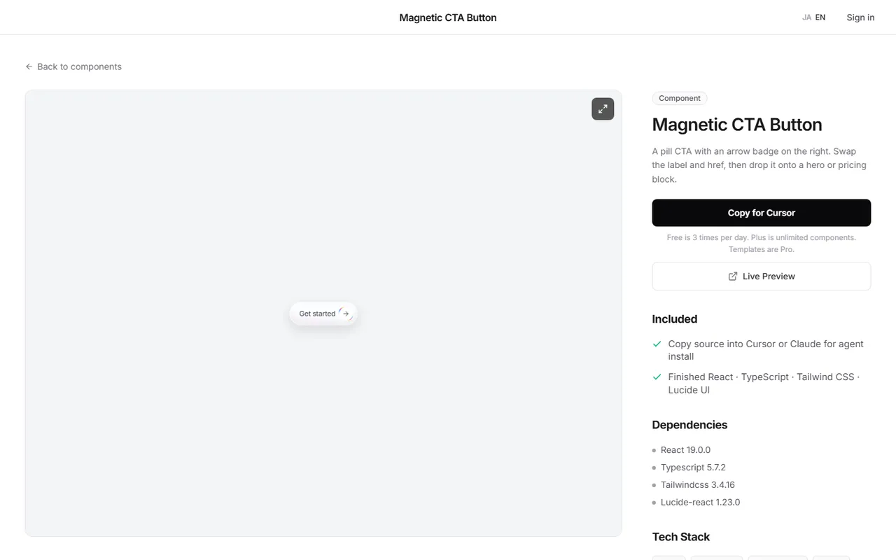
Use the ready-made version: the arrow CTA button on DesignLayer has everything in this guide, plus the frosted glass pill and the slow highlight behind the label. Open the live preview to see the ring orbit at full size.
Browsing and the live preview are free. This Component is free to copy, and the page shows the full TSX source with no account needed.
"Copy for Cursor" packages the install instructions, the live preview URL, the component TSX, and the npm list. Paste that into Cursor or Claude, then change the label and href.
Components are free to copy, plus one launch-video prompt per month. Blocks and Templates are the 30-Day Build Pass ($19, one-time), Lifetime Access ($79, one-time, founding price for the first 100 buyers), or Plus ($9/month, cancel anytime). Confirm the current offer on Pricing before you buy. The catalog is at https://design-layer.com/en/components.
React animated gradient border FAQ
Clip a circle or pill with
overflow-hiddenand a little padding. Inside it, place an oversized layer with aconic-gradientand rotate it with a CSStransformanimation. Cover the center with a solid element, so only the padding shows the moving gradient. No JavaScript or state is needed.
Summary: seven tips for an animated gradient border in React
Two arcs of color in a conic-gradient, transparent everywhere else
Rotate the layer with
mctb-orbit, 3.8s,linear, and keep the translate in the keyframeMake the rotating layer 190% so no corner shows at any angle
Set the border width with 1.6px of padding and a white inner circle, clipped by
overflow-hiddenandrounded-fullAdd a blurred copy with
blur(8px) saturate(1.45)at 0.5 opacityUse
isolateandz-10for the arrow, andpointer-events: nonefor the lightStop both layers for
prefers-reduced-motion
Start with the complete example and adjust the colors to your brand. If you would rather try the finished button first, open the arrow CTA button.