Back to components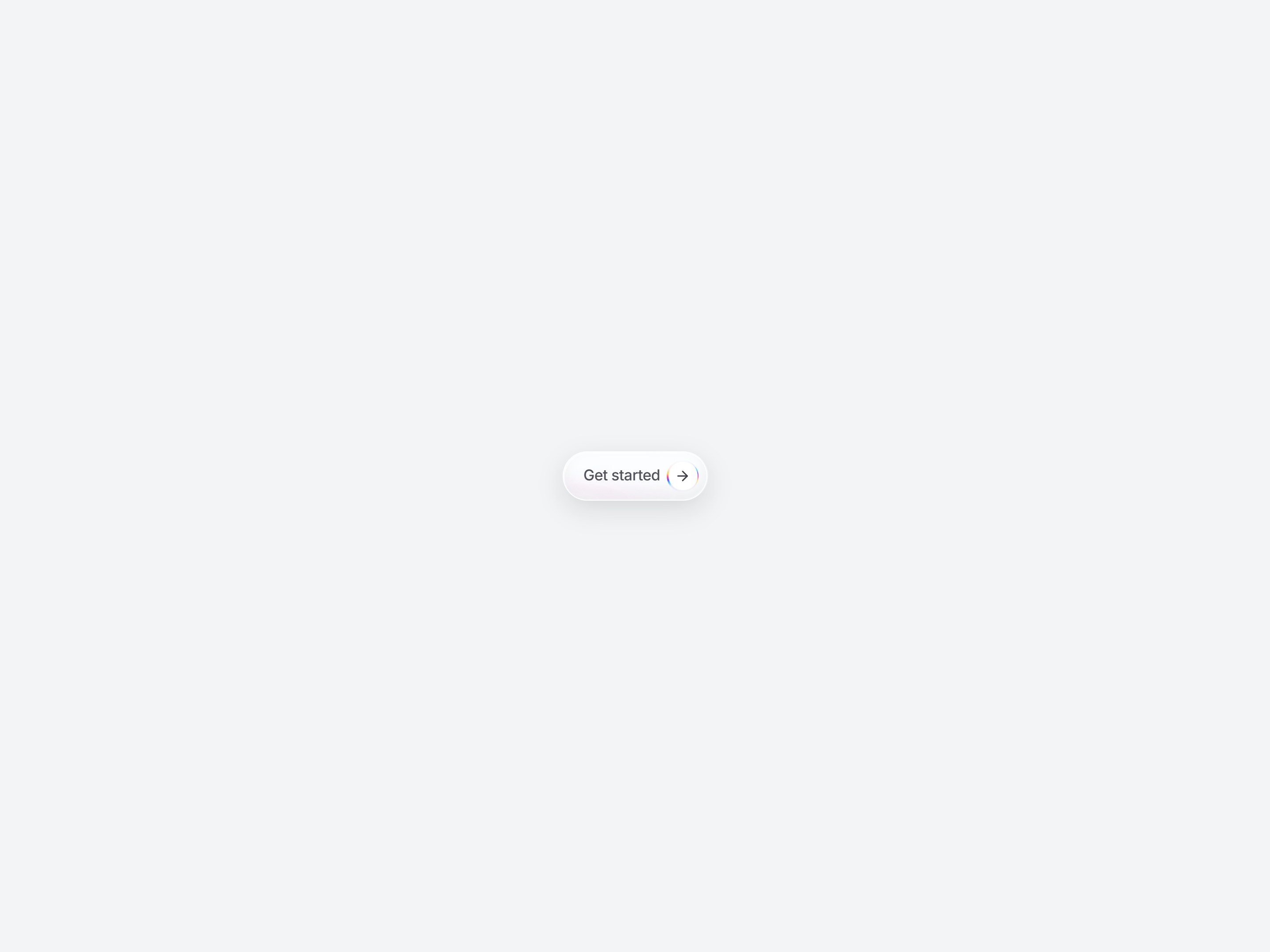
What is this?
A white glass pill CTA. An arrow sits in a round badge on the right, with a rainbow edge orbiting the badge. Swap the label and href, then drop it onto a hero or pricing block.
Full TSX source. No account needed.
magnetic-cta-button.tsx
"use client"; import * as React from "react";import { ArrowRight } from "lucide-react";import { coerceDisplayText } from "@/generation/lib/coerceActionNodes";import { cn } from "@/lib/utils"; export type MagneticCtaButtonProps = Omit< React.ComponentPropsWithoutRef<"button">, "type"> & { href?: string; type?: "button" | "submit" | "reset";}; const STYLE_ID = "magnetic-cta-button-css";const MCTB_CSS = `@keyframes mctb-orbit { to { transform: translate(-50%, -50%) rotate(360deg); }}@keyframes mctb-liquid-drift { 0% { transform: translate(-8%, -6%) rotate(0deg) scale(1.05); } 50% { transform: translate(6%, 8%) rotate(18deg) scale(1.12); } 100% { transform: translate(-8%, -6%) rotate(0deg) scale(1.05); }}.mctb-spin,.mctb-spin-glow { position: absolute; left: 50%; top: 50%; width: 190%; height: 190%; transform: translate(-50%, -50%); pointer-events: none; background: conic-gradient( from 0deg, transparent 0deg, transparent 14deg, #4ec4ff 28deg, #6b4dff 38deg, #ff4d9a 50deg, #ffd056 62deg, transparent 80deg, transparent 194deg, #62d4ff 210deg, #8a63ff 222deg, #ff5aa8 236deg, #ffe08a 248deg, transparent 266deg, transparent 360deg ); animation: mctb-orbit 3.8s linear infinite;}.mctb-spin-glow { width: 220%; height: 220%; filter: blur(8px) saturate(1.45); opacity: 0.5;}.mctb-glass { position: relative; display: flex; overflow: hidden; border-radius: 9999px; padding: 9px; font-weight: 400; background: rgba(255, 255, 255, 0.1); border: 1px solid rgba(255, 255, 255, 0.45); backdrop-filter: blur(18px) saturate(180%) contrast(1.08); -webkit-backdrop-filter: blur(18px) saturate(180%) contrast(1.08); box-shadow: 0 10px 28px rgba(15, 15, 20, 0.12), inset 1.5px 1.5px 0 rgba(255, 255, 255, 0.65), inset -1px -1px 0 rgba(255, 255, 255, 0.12), inset 0 -10px 16px rgba(15, 15, 20, 0.06);}.mctb-liquid { position: absolute; inset: -55%; pointer-events: none; background: radial-gradient(ellipse 42% 34% at 22% 12%, rgba(255,255,255,0.7) 0%, transparent 58%), radial-gradient(ellipse 38% 42% at 78% 86%, rgba(120, 190, 255, 0.22) 0%, transparent 55%), radial-gradient(ellipse 28% 30% at 68% 18%, rgba(255,255,255,0.35) 0%, transparent 50%), radial-gradient(ellipse 50% 40% at 40% 70%, rgba(255, 160, 220, 0.1) 0%, transparent 60%); animation: mctb-liquid-drift 10s ease-in-out infinite; mix-blend-mode: screen; opacity: 0.85;}@media (prefers-reduced-motion: reduce) { .mctb-spin, .mctb-spin-glow, .mctb-liquid { animation: none; }}`; function ensureStyles() { if (typeof document === "undefined") return; let style = document.getElementById(STYLE_ID) as HTMLStyleElement | null; if (!style) { style = document.createElement("style"); style.id = STYLE_ID; document.head.appendChild(style); } if (style.textContent !== MCTB_CSS) style.textContent = MCTB_CSS;} export const MagneticCtaButton = React.forwardRef< HTMLButtonElement, MagneticCtaButtonProps>( ( { href, className, children, style, type = "button", onPointerLeave, onPointerMove, ...props }, ref, ) => { const filterId = `mctb-liquid-${React.useId().replace(/:/g, "")}`; React.useEffect(() => { ensureStyles(); }, []); const label = coerceDisplayText(children) ?? "Get started"; const face = ( <> <span className="pl-[14px] pr-2 text-[17px] font-medium tracking-[-0.02em] text-zinc-600"> {label} </span> <span aria-hidden className="relative isolate flex size-[36px] shrink-0 overflow-hidden rounded-full p-[1.6px]" > <span className="mctb-spin-glow" /> <span className="mctb-spin" /> <span className="relative z-10 flex size-full items-center justify-center rounded-full bg-white"> <ArrowRight className="size-[18px] text-zinc-700" /> </span> </span> </> ); const innerClass = cn( "relative isolate inline-flex h-[36px] cursor-pointer items-center rounded-full bg-transparent pr-0 no-underline", "focus-visible:outline-none focus-visible:ring-2 focus-visible:ring-zinc-300 focus-visible:ring-offset-2", "disabled:pointer-events-none disabled:opacity-50", className, ); const control = href ? ( <a href={href} data-tsuna-id="magnetic-cta-button" className={innerClass} style={style} > {face} </a> ) : ( <button ref={ref} type={type} data-tsuna-id="magnetic-cta-button" className={innerClass} style={style} onPointerMove={onPointerMove} onPointerLeave={onPointerLeave} {...props} > {face} </button> ); return ( <span className="relative inline-flex"> <svg className="pointer-events-none absolute h-px w-px overflow-visible opacity-0" aria-hidden > <defs> <filter id={filterId} x="-40%" y="-40%" width="180%" height="180%" colorInterpolationFilters="sRGB" > <feTurbulence type="fractalNoise" baseFrequency="0.018 0.04" numOctaves="2" seed="4" result="noise" /> <feDisplacementMap in="SourceGraphic" in2="noise" scale="28" xChannelSelector="R" yChannelSelector="G" /> </filter> </defs> </svg> <div className="mctb-glass"> <div className="pointer-events-none absolute inset-0 z-0 overflow-hidden rounded-[inherit]"> <div className="mctb-liquid" style={{ filter: `url(#${filterId})` }} /> </div> <div className="relative z-10 flex items-center">{control}</div> </div> </span> ); },); MagneticCtaButton.displayName = "MagneticCtaButton";Read the guide
- Read the guide: Lifetime React Component Libraries in 2026: One-Time Prices Compared (and When a Pass or Subscription Is Cheaper)
- Read the guide: Liquid Glass Login Page in React: 3 Ways to Build One (and a Finished Screen to Copy)
- Read the guide: AI Product Launch Video Examples: 8 Films Made by AI Agents (and the Launch Page to Go With Each)
- Read the guide: Animated Pricing Section in React: 4 Ready-Made Designs to Copy (and How to Pick One)
Component
Magnetic CTA Button
A white glass pill CTA. An arrow sits in a round badge on the right, with a rainbow edge orbiting the badge. Swap the label and href, then drop it onto a hero or pricing block.
Verified Technical Spec
- Animation
- CSS / Tailwind
- Reduced motion
- Verified
- Keyboard focus
- Verified
- Compatibility
- Tailwind CSS v3.4 + v4 · React 19 / Next.js 15 App Router + Vite / Remix compatible
Included
- Copy source into Cursor or Claude for agent install
- Finished React · TypeScript · Tailwind CSS · Lucide UI
Dependencies
- React 19.0.0
- Typescript 5.7.2
- Tailwindcss 3.4.16
- Lucide-react 1.23.0
Tech Stack
- React
- TypeScript
- Tailwind CSS
- Lucide
Version 1.0.0