Next.js Custom Cursor: Build a Smooth Dot and Ring Follower
Published: October 8, 2026 · 9 min read
Build a custom cursor in Next.js: a dot and a trailing ring with requestAnimationFrame or Motion springs, growing on links, and switching off on touch devices and for reduced motion, with code.
Build a custom cursor that follows the mouse in Next.js
You are building a portfolio in Next.js and want that effect other creative sites have, where a ring trails the mouse around. But you are not sure where to start.
Here is the answer: lay a small element over the whole screen and move it to the mouse position.
Only the browser knows where the mouse is, so the cursor file gets "use client", the marker for browser-side code.
Move it by updating transform (the CSS property for moving and scaling elements), not position values. That keeps the motion smooth.
This guide covers:
Which sites a custom cursor suits, and which it does not
Two ways to build a dot and a trailing ring
Growing the ring over links and buttons
Switching the custom cursor off on touch devices and for reduced motion
CSS that keeps the native cursor in text fields
When a custom cursor helps, and when it gets in the way
A custom cursor works on sites where the visual impression matters most. For example:
Portfolios for designers and photographers
Brand and campaign pages
Galleries that show work at large sizes
There are two reasons. First, simply moving the mouse tells visitors the site was crafted with care.
Second, it highlights what is clickable. When the ring grows over a link, people know they can click it.
It is a poor fit for pages where people get work done, like admin panels or checkout. An unfamiliar cursor gets in the way when someone needs to click precisely.
Phones and tablets also have no mouse cursor at all. On touch devices, do not render the custom cursor.
Step 1: Build a custom cursor with a dot and a trailing ring
The small dot sticks right to the mouse, while the larger ring follows with a slight delay. That delay is what makes it feel smooth.
The ring moves a little closer on every repaint using requestAnimationFrame, the browser API that runs your code right before the next frame is drawn.
"use client";

import { useEffect, useRef } from "react";

export function CustomCursor() {
  const dotRef = useRef<HTMLDivElement>(null);
  const ringRef = useRef<HTMLDivElement>(null);

  useEffect(() => {
    const dot = dotRef.current;
    const ring = ringRef.current;
    if (!dot || !ring) return;

    let mouseX = -100;
    let mouseY = -100;
    let ringX = -100;
    let ringY = -100;
    let frame = 0;

    const onMove = (e: PointerEvent) => {
      mouseX = e.clientX;
      mouseY = e.clientY;
      dot.style.transform = "translate3d(" + mouseX + "px, " + mouseY + "px, 0)";
    };

    const tick = () => {
      ringX += (mouseX - ringX) * 0.2;
      ringY += (mouseY - ringY) * 0.2;
      ring.style.transform = "translate3d(" + ringX + "px, " + ringY + "px, 0)";
      frame = requestAnimationFrame(tick);
    };

    window.addEventListener("pointermove", onMove, { passive: true });
    frame = requestAnimationFrame(tick);

    return () => {
      window.removeEventListener("pointermove", onMove);
      cancelAnimationFrame(frame);
    };
  }, []);

  return (
    <div aria-hidden="true" className="pointer-events-none fixed inset-0 z-[100]">
      <div ref={ringRef} className="absolute left-0 top-0">
        <div className="h-9 w-9 -translate-x-1/2 -translate-y-1/2 rounded-full border border-zinc-900/50" />
      </div>
      <div ref={dotRef} className="absolute left-0 top-0">
        <div className="h-2 w-2 -translate-x-1/2 -translate-y-1/2 rounded-full bg-zinc-900" />
      </div>
    </div>
  );
}
Key points in the code
pointer-events-none on the outer div keeps the cursor from stealing clicks
Position is driven by transform, not left or top, so the browser does not recalculate the layout
Each frame the ring closes 20% of the remaining distance; a smaller value than 0.2 means more lag
The inner div uses -translate-x-1/2 to center the circle on the pointer tip
Until the mouse moves, everything sits off-screen at -100px
The cursor is pure decoration, so it carries aria-hidden to keep it out of screen readers.
Writing the custom cursor with Motion springs
If you already use Motion (formerly Framer Motion), useSpring gives you the ring's lag. A spring chases its target and settles, like a real spring.
Lower stiffness means more lag; lower damping makes it overshoot and wobble back. Motion values update transform without re-rendering React, so this version stays light too.
"use client";

import { useEffect } from "react";
import { motion, useMotionValue, useSpring } from "motion/react";

export function SpringCursor() {
  const x = useMotionValue(-100);
  const y = useMotionValue(-100);
  const ringX = useSpring(x, { stiffness: 300, damping: 30, mass: 0.5 });
  const ringY = useSpring(y, { stiffness: 300, damping: 30, mass: 0.5 });

  useEffect(() => {
    const onMove = (e: PointerEvent) => {
      x.set(e.clientX);
      y.set(e.clientY);
    };
    window.addEventListener("pointermove", onMove, { passive: true });
    return () => window.removeEventListener("pointermove", onMove);
  }, [x, y]);

  return (
    <div aria-hidden="true" className="pointer-events-none fixed inset-0 z-[100]">
      <motion.div
        style={{ x: ringX, y: ringY }}
        className="absolute -left-[18px] -top-[18px] h-9 w-9 rounded-full border border-zinc-900/50"
      />
      <motion.div
        style={{ x, y }}
        className="absolute -left-1 -top-1 h-2 w-2 rounded-full bg-zinc-900"
      />
    </div>
  );
}
Step 2: Grow the custom cursor over links
When the pointer is over a link or button, enlarge the ring and hide the dot so clickable spots stand out.
Attaching a listener to every link gets unmanageable as the page grows. Instead, attach one pointerover listener to document and inspect the element under the pointer. Handling events on a shared parent like this is called event delegation.
// Add inside CustomCursor
const rootRef = useRef<HTMLDivElement>(null);

useEffect(() => {
  const root = rootRef.current;
  if (!root) return;

  const growSelector = "a, button, [role='button'], [data-cursor='grow']";
  const textSelector = "input, textarea, select, [contenteditable='true']";

  const onOver = (e: PointerEvent) => {
    const el = e.target instanceof Element ? e.target : null;
    root.dataset.hover = el?.closest(growSelector) ? "true" : "false";
    root.dataset.text = el?.closest(textSelector) ? "true" : "false";
  };

  document.addEventListener("pointerover", onOver);
  return () => document.removeEventListener("pointerover", onOver);
}, []);

// The returned JSX (add ref and group to the outer div)
<div
  ref={rootRef}
  aria-hidden="true"
  className="group pointer-events-none fixed inset-0 z-[100] transition-opacity data-[text=true]:opacity-0"
>
  <div ref={ringRef} className="absolute left-0 top-0">
    <div className="h-9 w-9 -translate-x-1/2 -translate-y-1/2 rounded-full border border-zinc-900/50 transition-transform duration-200 group-data-[hover=true]:scale-[1.8]" />
  </div>
  <div ref={dotRef} className="absolute left-0 top-0">
    <div className="h-2 w-2 -translate-x-1/2 -translate-y-1/2 rounded-full bg-zinc-900 transition-opacity group-data-[hover=true]:opacity-0" />
  </div>
</div>
Opt more elements in with a data attribute
To grow the cursor over elements other than a and button, add data-cursor="grow" to them. It works well on project cards.
The check uses closest, so it still fires over icons or text nested inside a link.
Let CSS handle the size change
JavaScript only updates data-hover on the outer div. Scaling and fading are handled by Tailwind's group-data-[hover=true]: variant, and transition-transform makes the ring grow over 0.2 seconds.
Over text fields, data-text becomes true and the whole custom cursor fades out. Step 4 explains why.
Step 3: Turn the custom cursor off on touch devices and for reduced motion
Touch devices have no mouse cursor. Left as is, the ring can linger wherever someone tapped.
So read CSS media queries (conditions based on the screen or device) from JavaScript. There are three conditions:
hover: hover: the pointer can rest over elements, like a mouse
pointer: fine: the pointer is precise, like a mouse or trackpad
prefers-reduced-motion: no-preference: the user has not asked for less motion
"use client";

import { useEffect, useState } from "react";

const QUERY =
  "(hover: hover) and (pointer: fine) and (prefers-reduced-motion: no-preference)";

export function useCustomCursorEnabled() {
  const [enabled, setEnabled] = useState(false);

  useEffect(() => {
    const mq = window.matchMedia(QUERY);
    const update = () => setEnabled(mq.matches);
    update();
    mq.addEventListener("change", update);
    return () => mq.removeEventListener("change", update);
  }, []);

  return enabled;
}
Render the custom cursor only when the conditions match
CustomCursor runs its logic and renders only while this value is true. When it is false, nothing renders and the native cursor stays.
It also adds a has-custom-cursor class to the html element, which is what decides whether to hide the native cursor.
The initial value is false so the server-rendered HTML matches the first client render. The cursor appears only after the browser confirms the conditions.
// Only the changes to CustomCursor
import { useCustomCursorEnabled } from "@/hooks/useCustomCursorEnabled";

export function CustomCursor() {
  const enabled = useCustomCursorEnabled();
  // dotRef, ringRef, and rootRef stay the same

  useEffect(() => {
    document.documentElement.classList.toggle("has-custom-cursor", enabled);
    return () => document.documentElement.classList.remove("has-custom-cursor");
  }, [enabled]);

  useEffect(() => {
    if (!enabled) return;
    // The Step 1 follow logic (unchanged)
  }, [enabled]);

  useEffect(() => {
    if (!enabled) return;
    // The Step 2 hover detection (unchanged)
  }, [enabled]);

  if (!enabled) return null;

  // The return (JSX) below is the same as Step 2
}
Step 4: Mount the custom cursor in layout.tsx and keep the native cursor in text fields
Hiding the native arrow is optional. Adding just the ring while keeping the arrow is already a nice effect.
If you do hide it, set cursor: none only while has-custom-cursor is present, and bring back the native cursor in text fields, where it shows where typing will go.
/* Hide the native cursor only while the custom cursor is active */
html.has-custom-cursor,
html.has-custom-cursor * {
  cursor: none;
}

/* Bring the native cursor back wherever people type */
html.has-custom-cursor :is(input, textarea, select, [contenteditable="true"]) {
  cursor: auto;
}
Keep the native cursor in text fields
In text fields, people rely on the thin I-beam cursor to see where they are clicking. Replace that with a round ring and they lose track of the caret position.
That is why Step 2 hides the custom cursor over fields and this CSS restores the native one.
Mount it once in layout.tsx
Place a single custom cursor in the root layout.tsx. It is not recreated on navigation, so the ring never jumps.
layout.tsx itself does not need "use client"; only the CustomCursor file does.
import { CustomCursor } from "@/components/CustomCursor";
import "./globals.css";

export default function RootLayout({ children }: { children: React.ReactNode }) {
  return (
    <html lang="en">
      <body>
        {children}
        <CustomCursor />
      </body>
    </html>
  );
}
Common custom cursor mistakes and a pre-launch checklist
Forgetting pointer-events-none, so links stop working
Moving it with left and top, which makes the motion heavy
Rendering the ring on phones, where it lingers at the last tap
Showing the trailing motion to people who prefer reduced motion
Hiding the native cursor in text fields, so people cannot see where they are typing
Too much lag, so it is unclear what the cursor is pointing at
Adding it to work-focused screens. Keep the effect to showcase pages
Before launch, try it with a mouse, a trackpad, and a phone. Also test with your OS's reduce motion setting turned on.
Copy sections to pair with your custom cursor
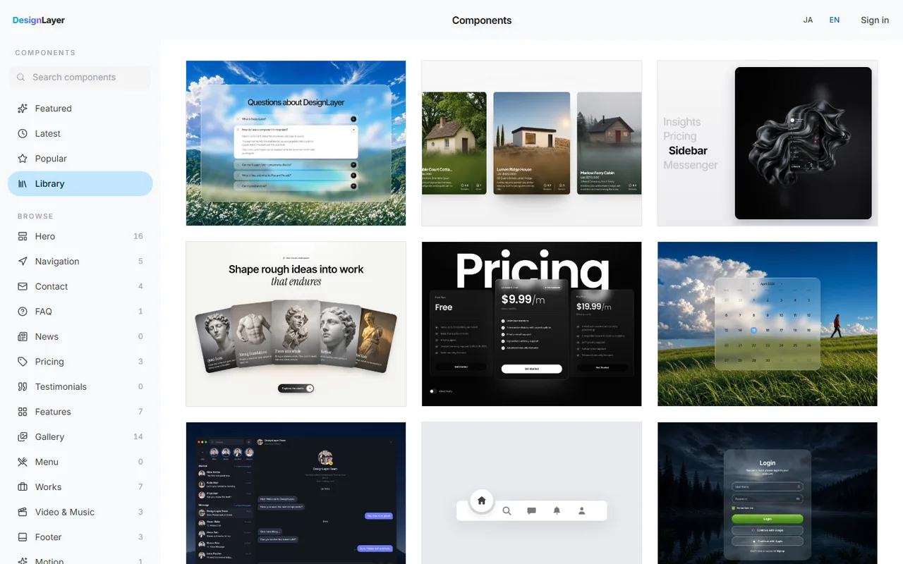
A custom cursor only shines when there is something for it to react to. Pair it with cards and buttons that move on hover for a consistent effect.
In the DesignLayer catalog, you can check animated sections in the live preview. Browsing and previews are free, with no account or card needed.
When you find one you like, press Copy for Cursor on its page. It bundles the integration instructions, the live preview URL, the component TSX, and npm dependencies, ready to paste into Cursor or Claude.
The free plan includes 3 source copies per day (JST). Open the catalog at https://design-layer.com/en/components.
Buttons that pull toward the cursor are covered in https://design-layer.com/en/articles/nextjs-magnetic-button-guide.
Cards that move on hover are covered in https://design-layer.com/en/articles/nextjs-hover-card-guide.
Custom cursor FAQ
Can't I make a custom cursor with just CSS cursor: url()?
If you only want to swap in an image, cursor: url() does it with no JavaScript.
But the image moves exactly with the mouse, like the native cursor. You cannot get a trailing ring or a smooth grow effect that way.
requestAnimationFrame or Motion springs: which should I use?
If you already use Motion, springs are shorter to write. If you would rather not add a dependency, requestAnimationFrame is plenty.
Both update transform, so there is no big difference in performance.
Does a custom cursor affect SEO or performance?
The cursor is decoration, so it does not change what search engines read.
Performance is rarely a concern as long as you move it with transform. It gets heavy if you move it with left and top, or update React state on every move.
Should I hide the native cursor?
Not necessarily. Keeping the native arrow and adding a ring works fine as an effect.
If you hide it, bring it back in text fields, and never hide it on touch devices or for people who prefer reduced motion.
Summary: how to build a custom cursor in Next.js
A custom cursor suits showcase sites like portfolios; keep it off work-focused screens
Move an element laid over the whole screen to the mouse position with transform
Add pointer-events-none so it never blocks clicks
Create the ring's lag with requestAnimationFrame or Motion springs
Detect links with a single pointerover listener on document to grow the ring
Switch it off on touch devices and for reduced motion, and keep the native cursor in text fields
Start by mounting the Step 1 code in layout.tsx and moving your mouse around. Buttons that react to the cursor are covered in https://design-layer.com/en/articles/nextjs-magnetic-button-guide.