How to Build a React OTP Input (Auto-Advance, Backspace, and Paste for a 6-Digit Code)
Published: November 12, 2026 · 10 min read
Learn how to build a React OTP input without a library: one string of state behind six boxes, auto-advance, Backspace that steps back, paste that fills every box, and a caret and complete state that feel finished.
A six-box code field looks easy until someone pastes into it
The email says 739 204. The user copies it, comes back to your sign-in screen, and pastes. One box fills with a 7. The other five stay empty.
That is the usual first version of an OTP (one-time passcode) field. Six inputs in a row look like a ten-minute job. Then the small behaviors show up: moving to the next box, stepping back with Backspace, pasting a whole code, the numeric keyboard on a phone.
Here is the short answer, the one you can reuse. A React OTP input is one string of digits shown across several boxes. Typing writes into that string and moves focus forward, Backspace removes a digit and moves focus back, and paste replaces the whole string at once. Keep the string free of gaps and most edge cases disappear.
This guide covers:
How to hold the code as one string instead of six states
How to auto-advance on typing and accept several digits at once
How to make Backspace handle both a filled box and an empty box
How to paste a code like
739 204into every boxHow to draw the caret, the digit pop, and the green complete state
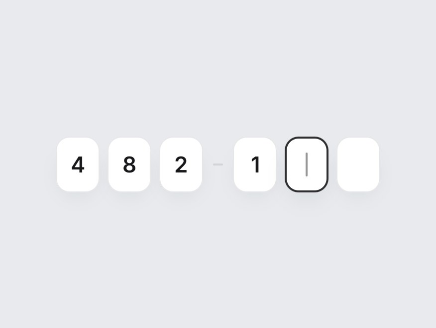
The behavior and timings below come from a real component, OTP Digit Input on DesignLayer. The video at the top is that component being typed into. The snippets are short and illustrative. They are not the full source.
Why a homemade React OTP input breaks
The boxes are rarely the problem. The state behind them is.
Six inputs with six pieces of state
If every box owns its own value, nothing stops the code from having holes: a digit in box 1, nothing in box 2, a digit in box 3. Then you need rules for what Backspace does in each layout, and what the submitted value is.
maxLength={1} blocks paste and autofill
maxLength={1} feels like the obvious guard. It also means a pasted or autofilled code is cut to its first character before your handler sees the rest. The component in this article does not set maxLength. It reads whatever arrives and decides where the digits go.
Backspace only clears the current box
The browser's default Backspace empties the box you are in and stops. People expect it to keep going backward, the way it does in a normal text field. If it does not, correcting a typo takes a click per box.
Build the React OTP input as one string behind six boxes
The approach is small on purpose.
Hold one string, for example code. Strip everything that is not a digit before it goes in. Box i shows code[i], and an empty box is simply a character that does not exist yet. The field is complete when the length of the string equals the number of boxes.
function digitsOnly(text: string) {
  return text.replace(/\D/g, "");
}

const [code, setCode] = React.useState("");

// Box i shows code[i]. An empty box is just a missing character.
const char = code[index] ?? "";
const complete = code.length === size;
Because the string is filled from the left, there is always exactly one "next" box: the one at code.length. Focus rules, the caret, and Backspace all hang off that single number.
The DesignLayer component also accepts value, defaultValue, and onValueChange, so it works controlled or uncontrolled. onComplete fires once the last box is filled, which is where you would submit the code.
How to build a React OTP input step by step
The look can stay simple. Each box in the DesignLayer component is 44px wide and 56px tall, with a 14px radius, a 22px semibold digit, and an 8px gap. With six boxes, a short dash sits between the third and fourth so the code reads as two groups of three.
Step 1 — Render the boxes with the right input attributes
Each box is a real <input>, wrapped in a group with role="group" and an aria-label such as "Verification code". Each input gets its own label in the form "Digit 2 of 6", so a screen reader user knows where they are.
<input
  type="text"
  inputMode="numeric"
  pattern="[0-9]*"
  autoComplete={index === 0 ? "one-time-code" : "off"}
  aria-label={`Digit ${index + 1} of ${size}`}
  value={char}
/>
type="text" with inputMode="numeric" opens the number pad on phones without the spinner arrows and quirks of type="number". autoComplete="one-time-code" goes on the first box only. It is the hint browsers use to offer a code from an SMS, and the first box is where an autofilled code should land.
Step 2 — Auto-advance by writing into the string
Typing does not "set box 3". It writes text into the string at a position, then moves focus to the box after the last digit written.
function writeAt(index: number, text: string) {
  const incoming = digitsOnly(text);
  if (!incoming) return;
  const start = Math.min(index, code.length); // never leave a gap
  const next = (
    code.slice(0, start) + incoming + code.slice(start + incoming.length)
  ).slice(0, size);
  commit(next);
  focusBox(Math.min(start + incoming.length, size - 1));
}
Two details do most of the work. Math.min(index, code.length) clamps the write position, so the string never gets a gap. And incoming can be longer than one character. If an autofill drops all six digits into the first box, the same function spreads them across the boxes.
Focusing a box also selects its content. If the box already has a digit, the next key press replaces it instead of adding a second character.
Step 3 — Make Backspace step back
Backspace has two cases, and the string makes them easy to tell apart. If the focused box has a digit, remove that digit and stay. If the focused box is empty, remove the digit before it and move focus back one box.
if (event.key === "Backspace") {
  event.preventDefault();
  if (index < code.length) {
    // This box has a digit: remove it and stay here.
    commit(code.slice(0, index) + code.slice(index + 1));
    focusBox(index);
  } else if (index > 0) {
    // This box is empty: remove the previous digit and step back.
    commit(code.slice(0, index - 1));
    focusBox(index - 1);
  }
}
Removing a digit from the middle shifts the later digits left, which keeps the string contiguous. Holding Backspace from the last box clears the whole code, one box at a time.
The component also handles the arrow keys, Home, and End. The right arrow stops at the first empty box, for the same reason as the clamp in Step 2.
Step 4 — Paste a whole code into every box
Paste is the behavior people notice most, and it is the shortest handler. Read the clipboard text, keep the digits, replace the string, and put focus on the last filled box.
const onPaste = (event: React.ClipboardEvent<HTMLInputElement>) => {
  const pasted = digitsOnly(event.clipboardData.getData("text"));
  if (!pasted) return;
  event.preventDefault();
  commit(pasted.slice(0, size));
  focusBox(Math.min(pasted.length, size - 1));
};
Because the text goes through digitsOnly, a code copied as 739 204 or 739-204 still fills all six boxes. The handler is attached to every box, so it does not matter which one has focus when the user pastes.
Step 5 — Keep focus on a box that makes sense
A user can click any box. If they click box 5 while only two digits are entered, typing there would leave a hole. So the focus handler sends them to the first empty box instead.
onFocus={(event) => {
  if (index > latest.current.length) {
    focusBox(latest.current.length); // send focus to the first empty box
    return;
  }
  setFocused(index);
  event.target.select();
}}
latest is a ref that always holds the newest code. Focus handlers can run before React has re-rendered with the new string, so reading the state directly would sometimes be one key press behind.
Step 6 — Draw the caret, the digit pop, and the complete state
The real inputs are there for typing and accessibility, but their own text and caret are transparent. A layer on top of each box draws what you see. That is what makes the motion possible: a native input cannot animate the character you just typed.
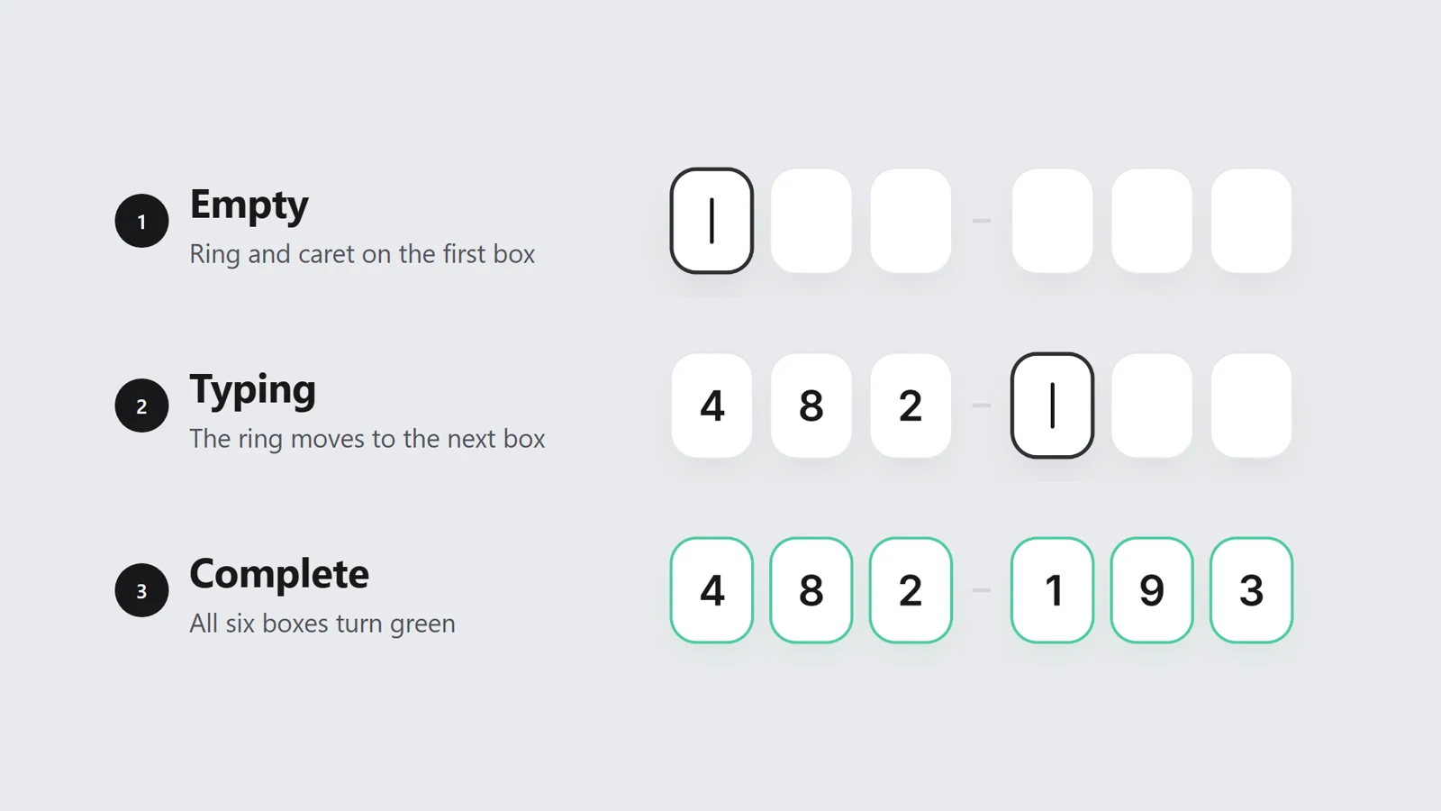
The active box gets a 2px dark ring. If it is empty, it shows a custom caret, 2px wide and 24px tall. The caret blinks on a 1.05s cycle only while the box has focus. When nothing is focused, the next empty box shows the same caret, still and at 45% opacity, as a hint of where the code continues.
@keyframes otp-digit-input-caret {
  0%, 45% { opacity: 1; }
  55%, 100% { opacity: 0; }
}
.otp-digit-input-caret {
  animation: otp-digit-input-caret 1.05s steps(1, end) infinite;
}

@keyframes otp-digit-input-pop {
  from { opacity: 0; transform: translateY(6px) scale(0.86); }
  to { opacity: 1; transform: none; }
}
.otp-digit-input-pop {
  animation: otp-digit-input-pop 320ms cubic-bezier(0.22, 1, 0.36, 1) both;
}

@media (prefers-reduced-motion: reduce) {
  .otp-digit-input-caret, .otp-digit-input-pop { animation: none; }
}
Each digit pops in over 320ms: it rises 6px and scales up from 0.86 with a strong ease-out. Paste fills six boxes at once, so all six pop together.
When the string is full, every box swaps its gray outline for a green one (rgba(16, 185, 129, 0.75)), with a 300ms transition. The box that still has focus keeps its dark ring until focus moves on. For users who prefer reduced motion, the blink, the pop, and the transition are turned off, and the states change in one step.
Use a finished React OTP input
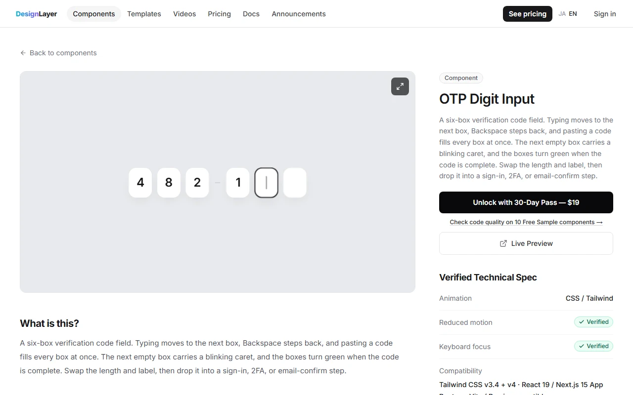
None of these handlers is long. Getting all of them to agree, on a desktop keyboard and on a phone, is where the afternoon goes. If you want to try the finished behavior first, open OTP Digit Input on DesignLayer. The live preview takes real input: type into it, hold Backspace, and paste a code.
Browsing and the live preview are free. You do not need an account or a card to try it. This component is not one of the Free Sample components. Copying its full source is included with the 30-Day Build Pass or Lifetime Access (Plus is also available if you prefer a monthly plan).
"Copy for Cursor" packages the install instructions, the live preview URL, the component TSX, and the npm list. Paste that into Cursor or Claude and drop the field into a sign-in, two-factor, or email-confirmation step. Swap the number of boxes and the label, and connect onComplete to your own verification call.
The component is the input only. Sending the code and checking it on the server are yours to build.
A free account still lets you copy 10 Free Sample components with no copy cap, plus one launch-video prompt per month. Unlimited copies of the full catalog (146 components; 136 of them are Pass-only) are the 30-Day Build Pass ($19, one-time), Lifetime Access ($79, one-time, founding price for the first 100 buyers), or Plus ($9/month, cancel anytime). Confirm the current offer on Pricing before you buy. The catalog is at https://design-layer.com/en/components.
React OTP input FAQ
Keep the code as one string of digits and render one input per character. Typing writes into the string and focuses the next box, Backspace removes a digit and focuses the previous box, and paste replaces the whole string. You do not need a package for six boxes.
Summary: a React OTP input in six moves
Hold the code as one string of digits, filled from the left
Use
type="text",inputMode="numeric", andone-time-codeon the first boxWrite into the string on typing, and focus the box after the last digit
Give Backspace two cases: a filled box and an empty box
On paste, keep the digits and replace the whole code
Draw the caret, the pop, and the green complete state on a layer above the inputs
Start with Steps 2 to 4 on plain inputs. When the keyboard behavior feels right, add the caret and the complete state. If you would rather try the finished field first, open OTP Digit Input. For the rest of the sign-in screen, see the login page design guide and the liquid glass login. For another small component built the same way, see the animated sparkline KPI card.