Next.js Loading Screens: loading.tsx to a Once-per-Session Opening
Published: October 8, 2026 · 8 min read
Next.js loading screens: when to show one, loading.tsx and Suspense, skeletons vs spinners, a once-per-session opening with fade-out, and protecting LCP, with code.
Show a loading screen only when there is a real wait
You are building a site in Next.js and want a loading screen when it opens, but you worry it will just make readers wait.
Here is the short answer: show a loading screen only when there is a real wait.
Waits during navigation are handled by App Router's loading.tsx. Even when it is a brand moment, show it once per session and keep it to about 1.5 seconds at most.
This guide covers:
When a loading screen helps, and when it is better left out
Showing a waiting state with loading.tsx and Suspense
Choosing between skeletons and spinners
A full-screen opening shown only once, with a Motion fade-out
How to avoid hurting LCP, the loading-speed metric
When to show a loading screen, and when not to
A loading screen exists to say "this is working" while people wait. Shown when there is no wait, it is just a roadblock.
There are three main cases for one:
Navigating to a page whose data takes time to fetch
Waiting for a result after an action, such as submitting a form
Showing a one-time opening on a brand site
On the other hand, avoid hiding a page that could render right away. Readers came for the content, so every second of waiting is a cost to them.
Keep decorative loading screens to portfolios and brand sites. On landing pages built for sign-ups or purchases, show the content first.
Three ways to build a loading screen in Next.js
Where you build it depends on the goal:
Step 1: Show a skeleton during navigation with loading.tsx
Step 2: Show a spinner or skeleton on a button or one region
Step 3: Show a full-screen opening only once, then fade it out
Most sites need only Steps 1 and 2. Add Step 3 only when the motion itself is part of the brand.
Step 1: A loading screen during navigation with loading.tsx
In the App Router, dropping a loading.tsx into a folder is all it takes. While page.tsx in the same folder waits for data, this screen shows instead.
Under the hood it runs on React Suspense, which shows a fallback while something is pending. Next.js wraps page.tsx in Suspense for you.
The example below is a skeleton shaped like the product grid's cards.
export default function Loading() {
  return (
    <div role="status" className="mx-auto max-w-5xl px-6 py-16">
      <span className="sr-only">Loading products</span>
      <div className="h-8 w-48 animate-pulse rounded-md bg-zinc-200 motion-reduce:animate-none" />
      <div className="mt-8 grid gap-6 sm:grid-cols-2 lg:grid-cols-3">
        {Array.from({ length: 6 }).map((_, i) => (
          <div key={i} className="space-y-3">
            <div className="aspect-[4/3] animate-pulse rounded-xl bg-zinc-200 motion-reduce:animate-none" />
            <div className="h-4 w-3/4 animate-pulse rounded bg-zinc-200 motion-reduce:animate-none" />
            <div className="h-4 w-1/2 animate-pulse rounded bg-zinc-200 motion-reduce:animate-none" />
          </div>
        ))}
      </div>
    </div>
  );
}
Key points in the code
role="status" plus visually hidden text tells screen readers that content is loading
The layout matches the real cards, so the swap causes less shifting
The pulse (animate-pulse) stops under reduced motion
loading.tsx renders on the server, so it needs no browser-side marker
Wrap only the slow part in Suspense
Sometimes only one part, like the reviews, is slow. Then wrap just that component in Suspense.
The heading and product description show first, and only the reviews area becomes a skeleton.
import { Suspense } from "react";
import { Reviews } from "./Reviews";
import { ReviewsSkeleton } from "./ReviewsSkeleton";

export default async function ProductPage({
  params,
}: {
  params: Promise<{ id: string }>;
}) {
  const { id } = await params;

  return (
    <main className="mx-auto max-w-5xl px-6 py-16">
      <h1 className="text-3xl font-semibold">Product details</h1>
      <p className="mt-4 text-zinc-600">The product description goes here.</p>
      <Suspense fallback={<ReviewsSkeleton />}>
        <Reviews productId={id} />
      </Suspense>
    </main>
  );
}
Step 2: Skeletons vs spinners on a loading screen
There are two basic ways to show a wait: skeletons and spinners.
Skeleton: gray boxes preview the shape of the content to come. Best for lists, cards, and anything with a known layout
Spinner: a rotating mark that only says "working". Best for short, shapeless waits such as a button submit
A page that is nothing but a centered spinner gives no hint of what is coming. If you know the shape, use a skeleton.
"use client";

import { useFormStatus } from "react-dom";

export function SubmitButton() {
  const { pending } = useFormStatus();

  return (
    <button
      type="submit"
      disabled={pending}
      className="inline-flex min-h-11 items-center gap-2 rounded-lg bg-zinc-900 px-5 text-sm font-medium text-white disabled:opacity-70"
    >
      {pending && (
        <span
          aria-hidden="true"
          className="size-4 animate-spin rounded-full border-2 border-white/40 border-t-white motion-reduce:animate-none"
        />
      )}
      {pending ? "Sending…" : "Send"}
    </button>
  );
}
Tips for a spinner on a submit button
useFormStatus is a React API that tells you whether the parent form is submitting. Use it together with the form's action.
Disable the button while sending to prevent double submits. Changing the label to "Sending…" also reaches people who cannot see the spinner.
Step 3: A loading screen opening shown only once
Brand sites sometimes show the logo first, then cut to the content. A full-screen loading screen like that gets in the way if it plays every time.
So leave a "seen" flag in sessionStorage, which remembers values until the tab closes. Within the same tab, it does not show again.
Cap it at 1.5 seconds and add a skip button. When it leaves, fade it out with Motion.
"use client";

import { useEffect, useState } from "react";
import { AnimatePresence, motion } from "motion/react";

const STORAGE_KEY = "splash-seen";
const MAX_MS = 1500;

function markSeen() {
  try {
    sessionStorage.setItem(STORAGE_KEY, "1");
  } catch {}
}

export function Splash() {
  const [visible, setVisible] = useState(true);

  useEffect(() => {
    let seen = false;
    try {
      seen = sessionStorage.getItem(STORAGE_KEY) === "1";
    } catch {}
    const reduce = window.matchMedia("(prefers-reduced-motion: reduce)").matches;
    if (seen || reduce) {
      setVisible(false);
      return;
    }
    const timer = window.setTimeout(() => {
      markSeen();
      setVisible(false);
    }, MAX_MS);
    return () => window.clearTimeout(timer);
  }, []);

  const skip = () => {
    markSeen();
    setVisible(false);
  };

  return (
    <AnimatePresence>
      {visible && (
        <motion.div
          key="splash"
          exit={{ opacity: 0 }}
          transition={{ duration: 0.5, ease: "easeOut" }}
          className="fixed inset-0 z-50 grid place-items-center bg-zinc-950 text-white [.splash-seen_&]:hidden"
        >
          <motion.p
            initial={{ opacity: 0, y: 12 }}
            animate={{ opacity: 1, y: 0 }}
            transition={{ duration: 0.6, ease: "easeOut" }}
            className="text-3xl font-semibold tracking-tight"
          >
            Acme Studio
          </motion.p>
          <button
            type="button"
            onClick={skip}
            className="absolute bottom-8 right-6 min-h-11 rounded-full px-5 text-sm text-white/70 hover:text-white focus-visible:outline focus-visible:outline-2 focus-visible:outline-white"
          >
            Skip
          </button>
        </motion.div>
      )}
    </AnimatePresence>
  );
}
Keep the loading screen from flashing on repeat visits
Splash runs in the browser, so it would flash on screen for a moment before it can check the flag. To prevent that, put a tiny script in layout.tsx that runs before the first paint.
If the flag is set, or the user prefers reduced motion, it adds a splash-seen class to html. The [.splash-seen_&]:hidden class on Splash reads it and hides the overlay from the start.
Because the script changes html's class, html gets suppressHydrationWarning.
import type { ReactNode } from "react";
import { Splash } from "@/components/Splash";
import "./globals.css";

const splashScript =
  'try{if(sessionStorage.getItem("splash-seen")==="1"||matchMedia("(prefers-reduced-motion: reduce)").matches){document.documentElement.classList.add("splash-seen")}}catch(e){}';

export default function RootLayout({ children }: { children: ReactNode }) {
  return (
    <html lang="en" suppressHydrationWarning>
      <head>
        <script dangerouslySetInnerHTML={{ __html: splashScript }} />
      </head>
      <body>
        <Splash />
        {children}
      </body>
    </html>
  );
}
Key points in the code
The "seen" flag is saved on timeout or skip. Even if the effect runs twice in development, the first visit is still handled correctly
Reduced motion users never see the opening
The real page renders normally underneath and is never made transparent
Wrapping it in AnimatePresence lets the exit animation run as it leaves
Motion basics are covered in https://design-layer.com/en/articles/nextjs-framer-motion-guide.
Keep your loading screen from hurting LCP
LCP is the time until the largest image or text block on the page appears. It is one of the loading-speed metrics Google weighs.
A full-screen loading screen can make it worse. Follow these three rules:
Do not hold page text or images at opacity: 0 while waiting. Transparent elements do not count for LCP, so the measurement gets pushed later
Do not add timers that make people wait on purpose, such as a minimum display time
Do not put large images or heavy video inside the opening
The opening should sit on top without blocking the page load. While it is showing, the page keeps getting ready underneath.
Loading screens under reduced motion
Stop or slow pulsing and spinning under reduced motion. In Tailwind, the motion-reduce: prefix applies a style only for that setting.
If you stop the spinner, always pair it with text such as "Loading" or "Sending…".
Common loading screen mistakes and a pre-launch checklist
A loading screen on a page with no wait, just for show
A full-screen opening on every navigation
No way to skip, so nothing can be done until it ends
A page that is only a centered spinner, with no hint of what is coming
Screen readers are never told that something is loading
The browser-side marker is on the whole page file
Before shipping, slow the network in your browser's developer tools. Choosing a preset such as Slow 4G in the Network tab shows waits close to those on a slow connection.
What the page looks like right after it opens is covered in https://design-layer.com/en/articles/nextjs-animated-hero-section-guide.
Copy a finished loading screen
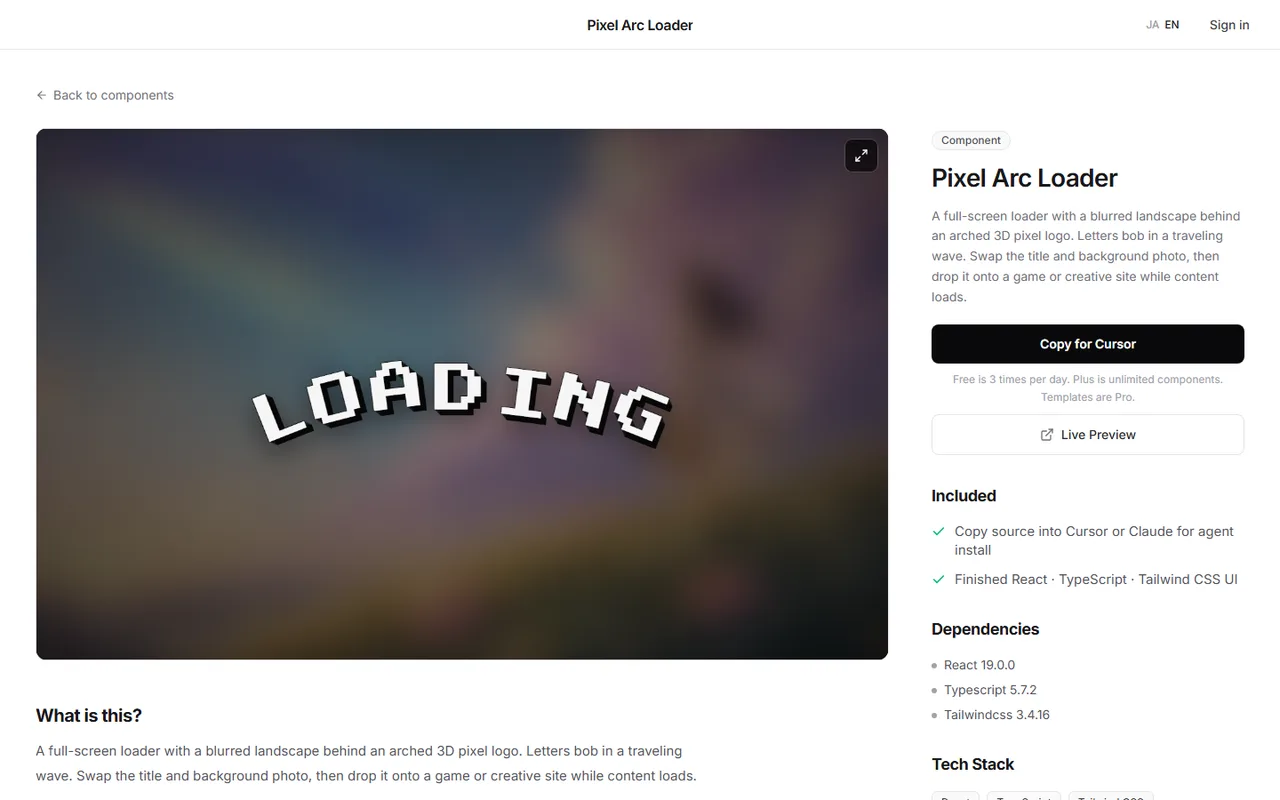
Sometimes you want a more elaborate loading screen, like a logo whose letters ripple one by one. Getting per-letter motion and background layering right takes more effort than it looks.
The Pixel Arc Loader in the DesignLayer catalog is a full-screen loading screen: a 3D pixel logo arranged in an arch ripples letter by letter over a blurred landscape photo.
Check the motion in the live preview on the detail page, then press Copy for Cursor. It copies the integration instructions, the live preview URL, the component TSX, and the npm dependencies in one go.
Paste them into Cursor or Claude to bring it into your Next.js app, then swap the logo text and background photo. Combine it with the sessionStorage approach from Step 3 to show it only on the first visit.
Browsing and live previews are free, with no account or card. Free source copies are 3 per day (JST). https://design-layer.com/en/components
Next.js loading screens: common questions
It shows while page.tsx in the same folder is waiting for data. If there is no wait, it swaps out almost before you can see it.
Summary: how to build loading screens in Next.js
Show a loading screen only when there is a real wait
For navigation waits, put a skeleton in loading.tsx
If only one part is slow, wrap just that component in Suspense
Use skeletons for known layouts and spinners for short submits
Show the opening once per session, within 1.5 seconds, with a skip button
Never make the page transparent; only layer the opening on top
Start by adding a single loading.tsx to the folder of a page that fetches data.
If your logo animates with Lottie, https://design-layer.com/en/articles/nextjs-lottie-animation-guide explains how to keep it light.