Next.js Bottom Tab Bar: Mobile Navigation with an Active State
Published: October 8, 2026 · 8 min read
Build a mobile bottom tab bar in Next.js: fix it to the bottom, keep it clear of the iPhone home indicator, mark the current tab with usePathname, add a sliding Motion indicator, and stop it from hiding your content.
Put mobile navigation in a bottom tab bar your thumb can reach
You are building an app-like site in Next.js and used a hamburger menu on mobile. But reaching up to the top-right corner every time gets tedious, and moving between pages feels clumsy.
That is where a bottom tab bar fits: navigation fixed to the bottom of the screen, also called bottom navigation.
Here is the answer. Fix a nav full of links to the bottom of the screen, and add bottom padding equal to the iPhone home indicator area.
Detect the current page with usePathname, which reads the URL. Only this file needs "use client", the marker for browser-side code.
This guide covers:
Which sites a bottom tab bar suits, and which it does not
The basic tab bar fixed to the bottom of the screen
Marking the current tab with color and aria-current
Padding that keeps it clear of the iPhone home indicator
A Motion indicator that slides between tabs
When a bottom tab bar fits, and when it does not
A bottom tab bar suits sites where people move between pages again and again on their phone. There are three reasons.
First, it is within thumb reach. When you hold a phone in one hand, the bottom of the screen is the easiest place to tap.
Second, the destinations are always visible. There is no menu to open, and you can see where you are at a glance.
Third, it works like an app. Most people already know this pattern from mobile apps, so it needs no explanation.
It fits best when you can narrow the destinations down to three to five. For example:
Services where people move between search, saved items, and their account
Dashboards and account areas after login
PWAs (websites people add to the home screen and use like an app)
It is a poor fit for a single-page landing page or a company site with six or more menu items. A header with an expandable menu works better there.
Building that kind of menu is covered in https://design-layer.com/en/articles/nextjs-mobile-nav-animation-guide.
Step 1: Build a bottom tab bar fixed to the screen
Start with a bottom tab bar of links laid out in a row and fixed to the bottom. It has no state yet, so it can stay a Server Component.
Keep each icon's SVG path in the array and stack it above its label.
import Link from "next/link";

export const tabs = [
  { href: "/", label: "Home", icon: "M3 10.5 12 3l9 7.5V21h-6v-6H9v6H3z" },
  { href: "/search", label: "Search", icon: "M11 4a7 7 0 1 0 0 14 7 7 0 0 0 0-14zm9 16-4.35-4.35" },
  { href: "/favorites", label: "Saved", icon: "M12 20s-7-4.35-7-10a4 4 0 0 1 7-2.65A4 4 0 0 1 19 10c0 5.65-7 10-7 10z" },
  { href: "/account", label: "Account", icon: "M12 12a4 4 0 1 0 0-8 4 4 0 0 0 0 8zm-7 9a7 7 0 0 1 14 0" },
];

export function TabIcon({ d }: { d: string }) {
  return (
    <svg
      aria-hidden="true"
      viewBox="0 0 24 24"
      className="h-6 w-6"
      fill="none"
      stroke="currentColor"
      strokeWidth={1.8}
      strokeLinecap="round"
      strokeLinejoin="round"
    >
      <path d={d} />
    </svg>
  );
}

export function BottomTabBar() {
  return (
    <nav
      aria-label="Main"
      className="fixed inset-x-0 bottom-0 z-40 border-t border-zinc-200 bg-white/95 pb-[env(safe-area-inset-bottom)] backdrop-blur md:hidden"
    >
      <ul className="mx-auto flex max-w-md">
        {tabs.map((tab) => (
          <li key={tab.href} className="flex-1">
            <Link
              href={tab.href}
              className="flex min-h-14 flex-col items-center justify-center gap-0.5 text-[11px] text-zinc-500"
            >
              <TabIcon d={tab.icon} />
              <span>{tab.label}</span>
            </Link>
          </li>
        ))}
      </ul>
    </nav>
  );
}
Key points in the code
fixed and bottom-0 keep it at the bottom while the page scrolls
md:hidden hides it at tablet width and above
flex-1 on each tab splits the width evenly
pb-[env(safe-area-inset-bottom)] handles the iPhone home indicator; Step 3 explains it
Show both an icon and a label
Icon-only tabs look clean, but first-time visitors may not know what they mean. With a label, nobody wonders whether a heart means "Saved" or "Like". Keep labels to one short word.
Mark the icons aria-hidden and let the label text do the talking for screen readers.
Make tap targets at least 44px
Anything people tap should be at least 44px tall and wide. The code above uses min-h-14 for a 56px height.
With five tabs, each one is still around 70px wide on a narrow phone. Six or more leads to mis-taps, so stop at five.
Step 2: Show the current tab in the bottom tab bar
A tab bar also tells people where they are. In Next.js, usePathname gives you the path of the current URL.
usePathname only works in Client Components, so add "use client" at the top of this file.
"use client";

import Link from "next/link";
import { usePathname } from "next/navigation";

// tabs and TabIcon are the same as in Step 1

function isActive(pathname: string, href: string) {
  if (href === "/") return pathname === "/";
  return pathname === href || pathname.startsWith(href + "/");
}

export function BottomTabBar() {
  const pathname = usePathname();

  return (
    <nav
      aria-label="Main"
      className="fixed inset-x-0 bottom-0 z-40 border-t border-zinc-200 bg-white/95 pb-[env(safe-area-inset-bottom)] backdrop-blur md:hidden"
    >
      <ul className="mx-auto flex max-w-md">
        {tabs.map((tab) => {
          const active = isActive(pathname, tab.href);
          return (
            <li key={tab.href} className="flex-1">
              <Link
                href={tab.href}
                aria-current={active ? "page" : undefined}
                className={
                  "flex min-h-14 flex-col items-center justify-center gap-0.5 text-[11px] transition-colors " +
                  (active ? "font-semibold text-zinc-900" : "text-zinc-500")
                }
              >
                <TabIcon d={tab.icon} />
                <span>{tab.label}</span>
              </Link>
            </li>
          );
        })}
      </ul>
    </nav>
  );
}
Keep the tab highlighted on nested pages
If you only highlight on an exact match, the Account tab goes dark as soon as someone opens /account/settings. That is why isActive also treats any path starting with /account as being in Account.
Home (/) is the exception. Every path starts with /, so it only lights up on an exact match.
Announce the current page with aria-current="page"
Changing the color alone tells nothing to people who cannot see the screen. Add aria-current="page" to the link for the current tab, and screen readers announce it as the current page.
Making it bold as well as colored also helps people who have trouble telling colors apart.
Step 3: Keep the bottom tab bar clear of the iPhone home indicator
iPhones without a home button have a horizontal home indicator at the very bottom of the screen. Without any adjustment, the tab bar sits too close to it and becomes awkward to tap.
There are two fixes: let the page extend to the screen edges in layout.tsx, and add padding under the tab bar equal to the indicator area.
import type { Viewport } from "next";
import { BottomTabBar } from "@/components/BottomTabBar";
import "./globals.css";

export const viewport: Viewport = {
  width: "device-width",
  initialScale: 1,
  viewportFit: "cover",
};

export default function RootLayout({ children }: { children: React.ReactNode }) {
  return (
    <html lang="en">
      <body>
        <main className="pb-[calc(4rem_+_env(safe-area-inset-bottom))] md:pb-0">
          {children}
        </main>
        <BottomTabBar />
      </body>
    </html>
  );
}
Set viewportFit: "cover" in the viewport export
In Next.js 15, viewport settings go in a viewport export from layout.tsx. viewportFit: "cover" tells the browser to use the screen all the way to its edges.
Without it, env(safe-area-inset-bottom) may stay at 0. env() is the CSS function that reads inset values reported by the device.
The Step 1 tab bar uses that value directly as its bottom padding. On devices without a home indicator it is 0, so no extra gap appears.
Stop the end of the page from hiding behind the bottom tab bar
A fixed element sits on top of your content. Left alone, the last button or paragraph on the page ends up behind the tab bar.
So give main bottom padding equal to the tab bar height plus the home indicator inset, and reset it to 0 from md up, where the bar is hidden.
Placing the tab bar in layout.tsx also means it is not recreated when the page changes. The Step 4 animation relies on this.
Step 4: Add a sliding indicator to the bottom tab bar
Draw a thin line above the current tab and let it slide sideways when another tab is tapped. With layoutId from Motion (formerly Framer Motion), it takes only a few lines.
layoutId animates an element from its old position when an element with the same id appears somewhere else.
"use client";

import Link from "next/link";
import { usePathname } from "next/navigation";
import { motion, useReducedMotion } from "motion/react";

// tabs, TabIcon, and isActive are the same as in Steps 1 and 2

export function BottomTabBar() {
  const pathname = usePathname();
  const reduceMotion = useReducedMotion();

  return (
    <nav
      aria-label="Main"
      className="fixed inset-x-0 bottom-0 z-40 border-t border-zinc-200 bg-white/95 pb-[env(safe-area-inset-bottom)] backdrop-blur md:hidden"
    >
      <ul className="mx-auto flex max-w-md">
        {tabs.map((tab) => {
          const active = isActive(pathname, tab.href);
          return (
            <li key={tab.href} className="flex-1">
              <Link
                href={tab.href}
                aria-current={active ? "page" : undefined}
                className={
                  "relative flex min-h-14 flex-col items-center justify-center gap-0.5 text-[11px] transition-colors " +
                  (active ? "font-semibold text-zinc-900" : "text-zinc-500")
                }
              >
                {active && (
                  <motion.span
                    layoutId="tab-indicator"
                    aria-hidden="true"
                    className="absolute inset-x-5 top-0 h-0.5 rounded-full bg-zinc-900"
                    transition={
                      reduceMotion
                        ? { duration: 0 }
                        : { type: "spring", stiffness: 500, damping: 40 }
                    }
                  />
                )}
                <TabIcon d={tab.icon} />
                <span>{tab.label}</span>
              </Link>
            </li>
          );
        })}
      </ul>
    </nav>
  );
}
Key points in the code
The line is rendered only inside the current tab; when the tab changes, Motion slides it from the previous position
relative on the Link pins the line to the top edge of the tab
For people who prefer reduced motion, useReducedMotion makes the move instant
The line is decoration, so it gets aria-hidden; aria-current already announces the current page
Motion basics are covered in https://design-layer.com/en/articles/nextjs-framer-motion-guide.
Common bottom tab bar mistakes and a pre-launch checklist
Six or more tabs. Mis-taps go up, so keep it to five
Icons with no labels. First-time visitors get lost
No bottom padding on the content, so the last button hides behind the bar
No viewportFit, so the bar crowds the home indicator on iPhone
Showing the bar on desktop. Use header navigation on wide screens
The current tab is marked by color only, with no aria-current
"use client" on the whole page.tsx. Put it only in the tab bar file
If you also have a fixed chat button or cookie banner at the bottom, check that it does not overlap the tab bar. Raise its bottom position by the height of the bar.
Building the desktop header is covered in https://design-layer.com/en/articles/nextjs-modern-header-guide.
Copy a finished bottom tab bar into your project
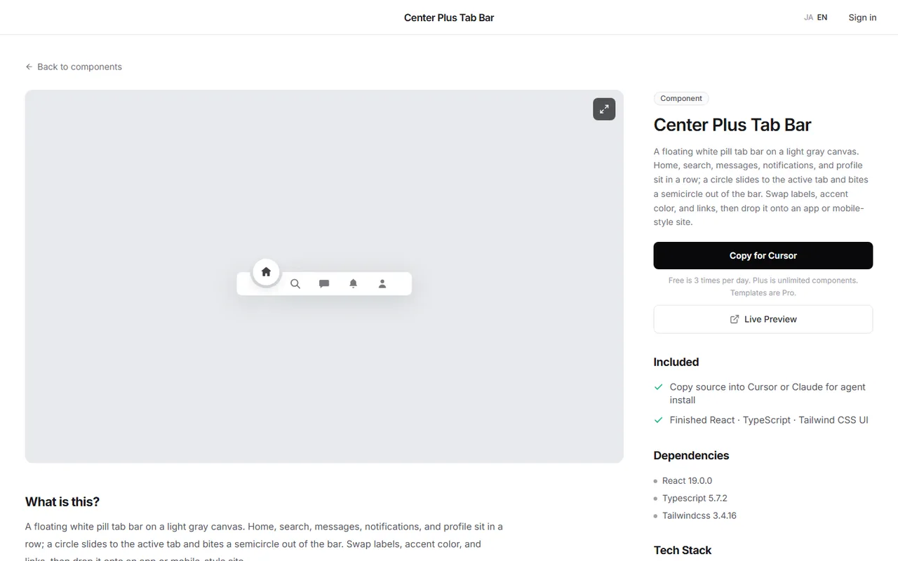
If you want something more distinctive than an underline indicator, you can also try a finished tab bar in the browser first.
The Center Plus Tab Bar on DesignLayer is a floating white pill tab bar with home, search, messages, notifications, and profile. A circle slides to the selected tab and bites a semicircle out of the bar.
In the catalog, watch it move in the live preview, then press Copy for Cursor. It copies the integration instructions, the live preview URL, the component TSX, and npm dependencies in one go, ready to paste into Cursor or Claude.
Browsing and live previews are free, with no account or card needed. The free plan includes 3 source copies per day (JST).
Open the catalog at https://design-layer.com/en/components. Once it is in your project, swap the links, labels, and accent color to match your site.
Bottom tab bar FAQ
Should I use a bottom tab bar or a hamburger menu?
If you have three to five destinations that people switch between often, a bottom tab bar is the better fit. It saves a tap and always shows where you are.
With six or more menu items, or a page read top to bottom like a landing page, a hamburger menu fits more comfortably.
How many tabs should a bottom tab bar have?
Three to five. Beyond five, each tab gets narrow and labels stop fitting. Move the rest into the account page or a "More" tab.
What should I do with the bottom tab bar on desktop?
Hide it with something like md:hidden and show the same links in the header. On wide screens, navigation at the top is easier to notice.
Reset the content's bottom padding at the same width, for example with md:pb-0.
How do I hide the bottom tab bar on certain pages?
Inside BottomTabBar, check the value from usePathname and return null for paths like checkout.
Those pages no longer need the extra bottom padding either, so remove it in that page's layout.
Summary: how to build a bottom tab bar in Next.js
A bottom tab bar suits sites with three to five destinations that people switch between often
Fix a nav to the bottom with icons and labels, and keep tap targets at 44px or more
Detect the current tab with usePathname and add aria-current="page"
Use viewportFit: "cover" and env(safe-area-inset-bottom) to keep clear of the iPhone home indicator
Pad the bottom of your content by the bar's height, and hide the bar on desktop
Build the sliding indicator with Motion's layoutId
Start by putting four of your own destinations into the Step 1 code. The full mobile menu is covered in https://design-layer.com/en/articles/nextjs-mobile-nav-animation-guide.