Next.js Login Page Design with Tailwind: Layout, Form, and Glass Card
Published: October 8, 2026 · 8 min read
Design a Next.js login page with Tailwind: card vs split layout, labels and autocomplete, show-password toggle, errors, social buttons, and a glass card over a photo.
Design a Next.js login page people can get through quickly
You built an app in Next.js and put two inputs and a button on the login page. It works, but it still looks homemade.
A login page earns trust through details, not decoration. Once labels, input hints, and error handling are right, the page already feels solid.
This guide polishes the look and usability with Tailwind CSS. Authentication itself is out of scope, so the form submits to a placeholder action.
This guide covers:
Choosing between a centered card and a split screen
Inputs with proper labels and autocomplete
A show/hide password button and error messages
How to order social login buttons
Contrast and mobile tweaks for a glass card over a photo
Three things that matter in login page design
People open the login page almost every day, yet nobody looks at it closely. All they want is to get in fast.
No guesswork: two inputs, one primary button, and a heading that says what the page is
Less typing: password managers and browser autofill work as expected
Easy recovery: errors explain what went wrong and how to fix it, right by the form
Add design flourishes only as long as these three hold. Photo backgrounds and glass effects come second to readable text.
Step 1: Choose a login page layout (centered card or split screen)
Login pages generally follow one of two layouts:
Centered card: a single form card in the middle of the screen. Fits any product and holds up on phones
Split screen: the form on one side, a photo or product pitch on the other. Good for brand presence on wide screens
If unsure, start with the centered card. The code below is just the page frame; the form comes in Step 2.
import type { Metadata } from "next";
import { LoginForm } from "./LoginForm";

export const metadata: Metadata = { title: "Log in" };

export default function LoginPage() {
  return (
    <main className="flex min-h-dvh items-center justify-center bg-zinc-50 px-4 py-12">
      <div className="w-full max-w-sm rounded-2xl border border-zinc-200 bg-white p-8 shadow-sm">
        <h1 className="text-2xl font-semibold text-zinc-900">Log in</h1>
        <p className="mt-2 text-sm text-zinc-600">Log in to your account to continue.</p>
        <LoginForm />
      </div>
    </main>
  );
}
A split-screen login page
Use two columns only on wide screens and hide the photo on phones so only the form remains. A two-column grid from lg: is all it takes.
The photo is decorative, so it gets aria-hidden. Set the background image through style.
<main className="grid min-h-dvh lg:grid-cols-2">
  <div className="flex items-center justify-center px-4 py-12">
    <div className="w-full max-w-sm">{/* heading and LoginForm */}</div>
  </div>
  <div
    aria-hidden="true"
    className="hidden bg-zinc-900 bg-cover bg-center lg:block"
    style={{ backgroundImage: "url(/login-side.jpg)" }}
  />
</main>
Step 2: Build the login form fields (labels and autocomplete)
Every input needs a label. A placeholder alone disappears as soon as someone starts typing, and then nobody knows what the field was.
The autocomplete attribute matters too. It tells the browser and password managers what belongs in each field.
Pending state and errors come back through React 19's useActionState. The password field component is built in Step 3.
"use client";

import { useActionState } from "react";
import { login, type LoginState } from "./actions";
import { PasswordField } from "./PasswordField";

const initialState: LoginState = {};

export function LoginForm() {
  const [state, formAction, pending] = useActionState(login, initialState);

  return (
    <form action={formAction} className="mt-8 space-y-5">
      {state.error ? (
        <p role="alert" className="rounded-lg bg-red-50 px-4 py-3 text-sm text-red-700">
          {state.error}
        </p>
      ) : null}

      <div>
        <label htmlFor="email" className="block text-sm font-medium text-zinc-800">
          Email
        </label>
        <input
          id="email"
          name="email"
          type="email"
          autoComplete="username"
          required
          defaultValue={state.email}
          className="mt-2 block min-h-11 w-full rounded-lg border border-zinc-300 px-3 text-base focus:border-zinc-900 focus:outline-none focus:ring-2 focus:ring-zinc-900/20"
        />
      </div>

      <PasswordField />

      <button
        type="submit"
        disabled={pending}
        className="flex min-h-11 w-full items-center justify-center rounded-lg bg-zinc-900 text-sm font-medium text-white hover:bg-zinc-700 disabled:opacity-60"
      >
        {pending ? "Logging in…" : "Log in"}
      </button>
    </form>
  );
}
Set up where the login form submits
The form submits to a function that runs on the server (a Server Action). With "use server" at the top of the file, the form can call it directly.
This is a placeholder that only checks the input. For real sign-in, call your auth library, such as Auth.js (NextAuth.js), inside this function by following its docs.
"use server";

export type LoginState = { error?: string; email?: string };

export async function login(_prev: LoginState, formData: FormData): Promise<LoginState> {
  const email = String(formData.get("email") ?? "").trim();
  const password = String(formData.get("password") ?? "");

  if (!email || !password) {
    return { error: "Enter your email and password.", email };
  }

  // Call your auth library's sign-in here (placeholder).
  // On success, move on with redirect("/dashboard") from next/navigation.
  return { error: "Incorrect email or password.", email };
}
Use username and current-password for autocomplete
Use autocomplete="username" for the login field, even when people sign in with an email address. The password field gets current-password.
Sign-up and change-password pages use new-password instead, so the browser knows whether to fill a saved password or suggest a new one. type="email" also brings up a keyboard with @ on phones.
Step 3: Add a show/hide password toggle to the login page
Typing a long masked password on a phone makes typos invisible. An eye-icon button lets people reveal what they typed.
The icons are Eye and EyeOff from lucide-react. Install it with npm i lucide-react, or swap in your own SVGs.
"use client";

import { useState } from "react";
import { Eye, EyeOff } from "lucide-react";

export function PasswordField() {
  const [visible, setVisible] = useState(false);

  return (
    <div>
      <label htmlFor="password" className="block text-sm font-medium text-zinc-800">
        Password
      </label>
      <div className="relative mt-2">
        <input
          id="password"
          name="password"
          type={visible ? "text" : "password"}
          autoComplete="current-password"
          required
          className="block min-h-11 w-full rounded-lg border border-zinc-300 pl-3 pr-12 text-base focus:border-zinc-900 focus:outline-none focus:ring-2 focus:ring-zinc-900/20"
        />
        <button
          type="button"
          onClick={() => setVisible((v) => !v)}
          aria-controls="password"
          aria-pressed={visible}
          className="absolute inset-y-0 right-0 flex w-11 items-center justify-center text-zinc-500 hover:text-zinc-900"
        >
          <span className="sr-only">Show password</span>
          {visible ? <EyeOff aria-hidden="true" className="size-5" /> : <Eye aria-hidden="true" className="size-5" />}
        </button>
      </div>
    </div>
  );
}
Key points of the show-password button
Make it type="button". Without it, pressing the toggle submits the form
Keep the accessible name fixed as "Show password" and expose the state with aria-pressed
Make the button 44px wide and pad the input on the right (pr-12) so text never runs under the icon
How to show errors on a login page
When sign-in fails, do not say whether the email or the password was wrong. That keeps strangers from learning which addresses are registered.
Say "Incorrect email or password" instead. The Step 2 code uses role="alert" so the message is announced when it appears.
Keep the email they typed. Say what went wrong in words, not just red color, so people who cannot tell colors apart still get it.
Step 4: Arrange social login buttons on the login page
If you offer Google or Apple sign-in, settle the arrangement first:
Put an "or" divider between email and social so it is clear there are two ways in
Put the most-used method on top, and keep the same order on every screen
Spell out the action on the button, like "Continue with Google"
If most people use social sign-in, place the buttons above the form. If email is the main path, put them below it as in this component.
Google and Apple each publish branding guidelines for their logos and buttons. Follow them when you use their logos.
export function SocialLogin() {
  return (
    <div className="mt-8">
      <div className="flex items-center gap-3 text-xs text-zinc-500">
        <span aria-hidden="true" className="h-px flex-1 bg-zinc-200" />
        or
        <span aria-hidden="true" className="h-px flex-1 bg-zinc-200" />
      </div>
      <div className="mt-6 grid gap-3">
        {/* Wire up the click handler the way your auth library expects */}
        <button
          type="button"
          className="flex min-h-11 items-center justify-center gap-3 rounded-lg border border-zinc-300 bg-white text-sm font-medium text-zinc-900 hover:bg-zinc-50"
        >
          {/* Google logo (SVG that follows their guidelines) */}
          Continue with Google
        </button>
        <button
          type="button"
          className="flex min-h-11 items-center justify-center gap-3 rounded-lg bg-black text-sm font-medium text-white hover:bg-zinc-800"
        >
          {/* Apple logo */}
          Continue with Apple
        </button>
      </div>
    </div>
  );
}
Step 5: Build a glass login page over a photo
A photo background with a frosted-glass card gives a login page real presence. The glass look comes from backdrop-blur, which blurs what is behind, plus a translucent white.
The thing to watch is legibility. Where the card sits over a bright part of the photo, white text becomes unreadable.
import { LoginForm } from "./LoginForm";

export default function LoginPage() {
  return (
    <main
      className="relative flex min-h-dvh items-center justify-center bg-zinc-900 bg-cover bg-center px-4 py-12"
      style={{ backgroundImage: "url(/login-bg.jpg)" }}
    >
      {/* Darken the photo to keep contrast for white text */}
      <div aria-hidden="true" className="absolute inset-0 bg-gradient-to-b from-black/50 via-black/30 to-black/60" />

      <div className="relative w-full max-w-sm rounded-3xl border border-white/20 bg-black/60 p-8 text-white shadow-2xl supports-[backdrop-filter]:bg-white/10 supports-[backdrop-filter]:backdrop-blur-xl">
        <h1 className="text-2xl font-semibold">Log in</h1>
        <p className="mt-2 text-sm text-white/80">Log in to your account to continue.</p>
        <LoginForm />
      </div>
    </main>
  );
}
Keep contrast on a glass login page
Aim for a contrast ratio of at least 4.5:1 between body text and its background. That is the value the WCAG accessibility guidelines set.
A translucent black layer over the photo keeps text readable even when you swap the image. Browsers without blur support get the darker bg-black/60 first.
Switch LoginForm's labels and borders to light colors too (text-white, border-white/30). Keep labels outside the inputs rather than relying on faint placeholders.
Glass UI in depth: https://design-layer.com/en/articles/nextjs-glassmorphism-ui-guide.
Tuning the login page for mobile
On phones, leave about 16px on each side of the card. That is what px-4 and w-full do in the code above.
Keep input text at 16px (text-base) or larger. iPhone Safari zooms the page when you tap a field with smaller text.
Use min-h-dvh for the height so the card is less likely to overflow as the mobile address bar shows and hides.
Common login page mistakes and pre-launch checks
Naming fields with placeholders only, no labels
Leaving out autocomplete or setting it to off, which gets in the way of password managers
Blocking paste in the password field, which breaks copying from a password manager
Forgetting type="button" on the toggle, so pressing it submits the form
Clearing every field on error. Keep the email
A photo so bright that the glass card's text is unreadable
Before launch, save a password in the browser and test autofill.
Also confirm you can reach every field and button in order using only the Tab key.
Copy a finished login page instead
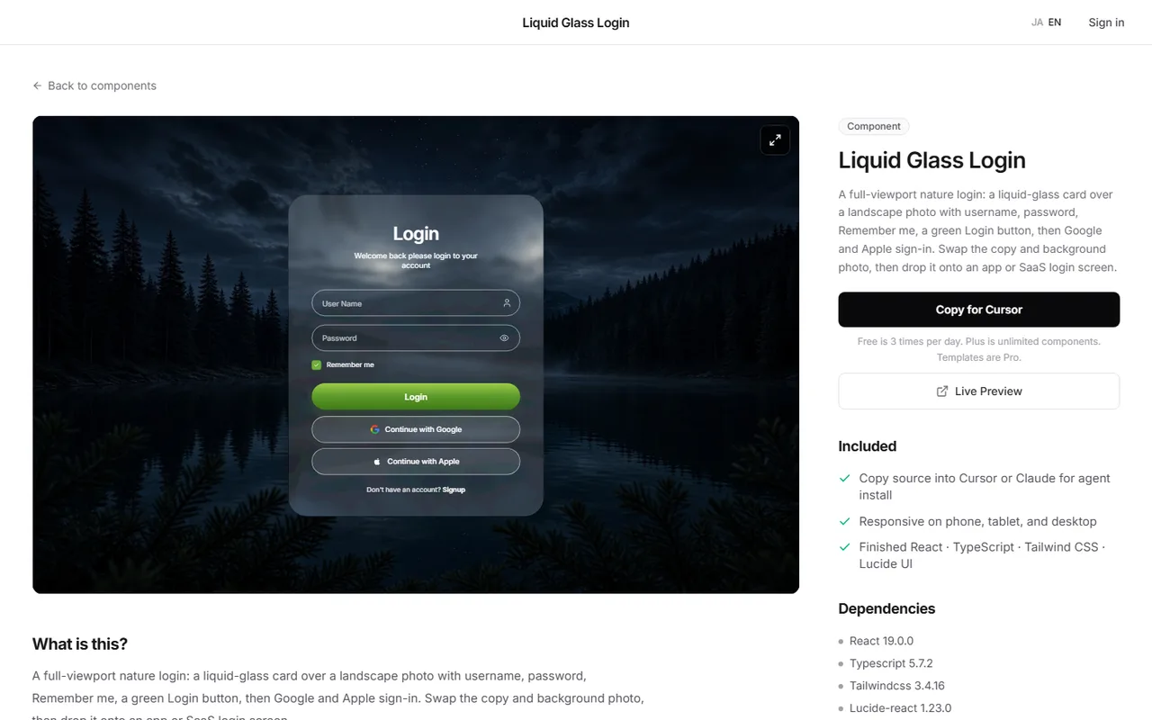
The Step 5 glass login takes time: picking a photo and tuning the transparency.
In that case you can check a finished login screen in the browser first, then bring its code into your Next.js app.
Liquid Glass Login on DesignLayer is a sign-in screen with a liquid-glass card over a full-bleed nature photo. It includes username and password, Remember me, a Login button, and Google and Apple sign-in.
Swap the heading, button labels, and background photo to use it for an app or SaaS login. Connect the authentication to your own service, just as in Step 2.
Press Copy for Cursor on the detail page to copy the integration instructions, the live preview URL, the component TSX, and npm dependencies in one go. Paste them into Cursor or Claude and ask it to wire things up.
Browsing and live previews are free with no account or card, and free source copies are 3 per day (JST).
Open the catalog at https://design-layer.com/en/components.
Next.js login page: common questions
When in doubt, the centered card. It holds up at any width and is simpler to build. Use a split screen on wide screens only when you want to show a product photo or pitch.
Summary: building a login page in Next.js
Start with a centered card, and use a split screen on wide screens only when you want to show a photo
Label every input and use username and current-password for autocomplete
Build the password toggle with type="button" and aria-pressed
Report errors without saying which field was wrong, and keep the email
For a glass card, layer translucent black over the photo to keep contrast
Start with the Step 1 and Step 2 code to get a centered-card login page running.
Navigation for the signed-in app is covered in https://design-layer.com/en/articles/nextjs-bottom-tab-bar-guide.