GSAP ScrollTrigger in Next.js: useGSAP, Scrub, Pin, and Cleanup
Published: October 8, 2026 · 8 min read
Use GSAP ScrollTrigger in the Next.js App Router: install gsap and @gsap/react, clean up automatically with useGSAP and scope, write scrub and pin animations, fix window is not defined and double runs in dev, and adapt to mobile and reduced motion.
When GSAP ScrollTrigger misbehaves in Next.js
You want scroll-driven motion on a Next.js landing page. You added GSAP's ScrollTrigger, and now you get errors, or every animation runs twice.
ScrollTrigger is the GSAP plugin that ties animations to scroll position. It works fine in the App Router once you get two things right: where the code lives, and how it cleans up.
Here is the short answer. Write your animations inside the official useGSAP hook, in a file marked with "use client" (the marker for browser-side code).
Pass useGSAP a scope (the element to search within), and everything it created is reverted when the component unmounts. That alone prevents double runs in development and stale positions after navigation.
This guide covers:
Installing gsap and @gsap/react and registering the plugin
A useGSAP + scope pattern that needs no manual cleanup
scrub, which ties progress to scroll distance, and pin, which holds a section in place
Fixing common errors such as window is not defined
Adapting to mobile screens and the reduced motion setting
Why use GSAP ScrollTrigger through useGSAP
Dropping GSAP straight into useEffect works at first. But cleanup is easy to forget, and then these problems show up:
In development the same animation is created twice, so markers and tweens double up
Old scroll triggers survive navigation and throw off start positions
Class-name selectors hit every copy when you render the component twice
useGSAP is GSAP's own React hook. It records every animation and ScrollTrigger created inside it and reverts them when the component unmounts.
Pass the component's outer element as scope, and selectors like ".card" only match inside that element. The hook body never runs on the server either, so touching window or document inside it is safe.
Step 1: Install GSAP and register ScrollTrigger
You need two packages. gsap is the core, and @gsap/react provides useGSAP. ScrollTrigger ships inside gsap, so there is nothing else to install.
npm install gsap @gsap/reactRegister the plugin in a browser-side file
Register plugins with gsap.registerPlugin before using them. The simplest spot is right under the imports in a "use client" file.
Registering more than once is harmless, so you can do it per component or in one shared file. GSAP's docs also recommend registering useGSAP itself, which avoids issues caused by mismatched React versions.
"use client";

import gsap from "gsap";
import { ScrollTrigger } from "gsap/ScrollTrigger";
import { useGSAP } from "@gsap/react";

gsap.registerPlugin(useGSAP, ScrollTrigger);
Step 2: Clean up ScrollTrigger with useGSAP and scope
Start with cards that rise into view once when they enter the screen. This plays over a fixed duration, not tied to scroll distance.
"use client";

import { useRef } from "react";
import gsap from "gsap";
import { ScrollTrigger } from "gsap/ScrollTrigger";
import { useGSAP } from "@gsap/react";

gsap.registerPlugin(useGSAP, ScrollTrigger);

const features = ["Set up in a day", "Weekly updates", "Human support"];

export function FeatureCards() {
  const container = useRef<HTMLElement>(null);

  useGSAP(
    () => {
      gsap.from(".feature-card", {
        y: 40,
        autoAlpha: 0,
        duration: 0.8,
        ease: "power2.out",
        stagger: 0.15,
        scrollTrigger: {
          trigger: container.current,
          start: "top 75%",
          once: true,
        },
      });
    },
    { scope: container }
  );

  return (
    <section ref={container} className="mx-auto grid max-w-5xl gap-6 px-6 py-24 md:grid-cols-3">
      {features.map((label) => (
        <div key={label} className="feature-card rounded-2xl border border-zinc-200 p-8 text-lg font-medium">
          {label}
        </div>
      ))}
    </section>
  );
}
Key points in the code
The second argument { scope: container } means ".feature-card" is only looked up inside this section
start: "top 75%" means "when the section's top reaches 75% down the viewport"
once: true stops watching the scroll after the first pass, so scrolling back up does not replay it
autoAlpha animates opacity and visibility together, so hidden cards cannot be clicked
Keep page.tsx on the server and import the component
Do not put "use client" in page.tsx. Just import this component there. Only this file runs in the browser, and the rest of the page is still rendered on the server.
Before JavaScript loads, the cards are simply visible. Place them below the first screen and nobody sees the brief flash on load.
Step 3: Link ScrollTrigger to scroll distance with scrub
With scrub, animation progress is tied to how far the user has scrolled. Scroll down and it moves forward, scroll up and it rewinds.
scrub: true sticks exactly to the scrollbar. A number like scrub: 1 takes about one second to catch up, which feels softer.
In this example the background slowly shrinks while the headline slides sideways. Both tweens live in one timeline (a container that sequences tweens), driven by a single ScrollTrigger.
"use client";

import { useRef } from "react";
import gsap from "gsap";
import { ScrollTrigger } from "gsap/ScrollTrigger";
import { useGSAP } from "@gsap/react";

gsap.registerPlugin(useGSAP, ScrollTrigger);

export function ScrubBanner() {
  const container = useRef<HTMLElement>(null);

  useGSAP(
    () => {
      const tl = gsap.timeline({
        scrollTrigger: {
          trigger: container.current,
          start: "top bottom",
          end: "bottom top",
          scrub: 1,
        },
      });

      tl.fromTo(".scrub-bg", { scale: 1.25 }, { scale: 1, ease: "none" })
        .fromTo(".scrub-title", { xPercent: -15 }, { xPercent: 15, ease: "none" }, 0);
    },
    { scope: container }
  );

  return (
    <section ref={container} className="relative flex h-[80vh] items-center overflow-hidden">
      <div className="scrub-bg absolute inset-0 bg-gradient-to-br from-sky-500 to-indigo-800" />
      <h2 className="scrub-title relative w-full text-center text-5xl font-semibold text-white md:text-7xl">
        A headline that follows your scroll
      </h2>
    </section>
  );
}
Reading start and end
start: "top bottom" means start when the element's top meets the viewport's bottom. The first word is the element, the second is the viewport.
end: "bottom top" ends when the element's bottom passes the viewport's top, so the animation runs exactly once from entering to leaving. Use ease: "none" with scrub so scroll and progress stay one to one.
Step 4: Pin a section in place with ScrollTrigger
pin holds an element on screen while the user keeps scrolling. That window is where you show sliding panels or swapping photos.
This example turns vertical scrolling into four panels sliding sideways.
"use client";

import { useRef } from "react";
import gsap from "gsap";
import { ScrollTrigger } from "gsap/ScrollTrigger";
import { useGSAP } from "@gsap/react";

gsap.registerPlugin(useGSAP, ScrollTrigger);

const panels = ["Plan", "Design", "Build", "Launch"];

export function PinnedSteps() {
  const wrapper = useRef<HTMLDivElement>(null);
  const section = useRef<HTMLElement>(null);
  const track = useRef<HTMLDivElement>(null);

  useGSAP(
    () => {
      const el = track.current;
      if (!el) return;
      // Distance to slide = total panel width - viewport width
      const distance = () => el.scrollWidth - window.innerWidth;

      gsap.to(el, {
        x: () => -distance(),
        ease: "none",
        scrollTrigger: {
          trigger: section.current,
          start: "top top",
          end: () => "+=" + distance(),
          pin: section.current,
          scrub: 1,
          invalidateOnRefresh: true,
        },
      });
    },
    { scope: wrapper }
  );

  return (
    <div ref={wrapper}>
      <section ref={section} className="h-svh overflow-hidden bg-zinc-950 text-white">
        <div ref={track} className="flex h-full w-max">
          {panels.map((label, i) => (
            <div key={label} className="flex w-screen shrink-0 items-center justify-center">
              <p className="text-4xl font-semibold md:text-6xl">
                {String(i + 1).padStart(2, "0")} {label}
              </p>
            </div>
          ))}
        </div>
      </section>
    </div>
  );
}
Things to watch when pinning
Do not pin the component's outermost element. Wrap it in a div and pin the section inside, because GSAP wraps the pinned element in a spacer
Make end a function and set invalidateOnRefresh: true so distances are re-measured when the viewport resizes
Avoid transform on the pinned element's ancestors. It throws off the pinned position
On phones, long horizontal runs can feel tedious. A later section shows how to split the motion by screen width.
Common ScrollTrigger errors and how to fix them
window is not defined
Next.js renders client components to HTML on the server first. There is no window there, so touching it at module level or during render throws this error.
Move anything that reads window.innerWidth into useGSAP, or into a function value like the ones in Step 4. Calling useGSAP in a file without "use client" also fails, with an error about hooks.
Animations run twice only in development
In development, React mounts, unmounts, and remounts components to surface bugs (Strict Mode). A useEffect without cleanup leaves two ScrollTriggers behind.
Switch to useGSAP and the first set is reverted automatically. Production does not double-run, but the same missing cleanup is what leaves stale triggers after navigation, so fix it anyway.
Shipping with markers still on
markers: true draws lines at the start and end positions for debugging. Handy while tuning, but easy to forget. Write markers: process.env.NODE_ENV === "development" and they never appear in production builds.
Start positions drift after images load
ScrollTrigger measures element positions up front to set start and end. If an image loads afterward and changes the height, those measurements go stale.
First, give next/image a width and height so space is reserved before loading. If the height still changes later, call ScrollTrigger.refresh() when loading finishes.
"use client";

import Image from "next/image";
import { ScrollTrigger } from "gsap/ScrollTrigger";

export function HeroImage() {
  return (
    <Image
      src="/hero.jpg"
      alt="Exterior of the new office"
      width={1600}
      height={900}
      className="h-auto w-full"
      // Re-measure start and end positions once the image has loaded
      onLoad={() => ScrollTrigger.refresh()}
    />
  );
}
Adapt ScrollTrigger to mobile and reduced motion
Pins and big movements can be hard to follow on a small phone screen. People who turned on reduced motion in their OS settings should not get large motion at all.
gsap.matchMedia lets you register different animations per screen width or motion preference. When a condition changes, the previous animations are reverted automatically.
With reduced motion, register nothing and leave the cards visible from the start. No fade-from-transparent means content can never get stuck hidden.
"use client";

import { useRef } from "react";
import gsap from "gsap";
import { ScrollTrigger } from "gsap/ScrollTrigger";
import { useGSAP } from "@gsap/react";

gsap.registerPlugin(useGSAP, ScrollTrigger);

const features = ["Set up in a day", "Weekly updates", "Human support"];

export function ResponsiveFeatureCards() {
  const container = useRef<HTMLElement>(null);

  useGSAP(
    () => {
      const mm = gsap.matchMedia(container);

      mm.add(
        {
          isDesktop: "(min-width: 768px)",
          isMobile: "(max-width: 767px)",
          reduceMotion: "(prefers-reduced-motion: reduce)",
        },
        (context) => {
          const { isDesktop, reduceMotion } = context.conditions as {
            isDesktop: boolean;
            reduceMotion: boolean;
          };
          // Reduced motion: register nothing, so the cards stay visible
          if (reduceMotion) return;

          gsap.from(".feature-card", {
            y: isDesktop ? 60 : 20,
            autoAlpha: 0,
            duration: isDesktop ? 0.8 : 0.5,
            stagger: isDesktop ? 0.15 : 0.08,
            scrollTrigger: { trigger: container.current, start: "top 80%", once: true },
          });
        }
      );

      return () => mm.revert();
    },
    { scope: container }
  );

  return (
    <section ref={container} className="mx-auto grid max-w-5xl gap-6 px-6 py-24 md:grid-cols-3">
      {features.map((label) => (
        <div key={label} className="feature-card rounded-2xl border border-zinc-200 p-8 text-lg font-medium">
          {label}
        </div>
      ))}
    </section>
  );
}
Copy a finished GSAP ScrollTrigger section instead
Combining pinning with scroll-linked motion takes a lot of tuning: photo placement, how long the section stays put. If you want to move faster, you can try a finished section in the browser first.
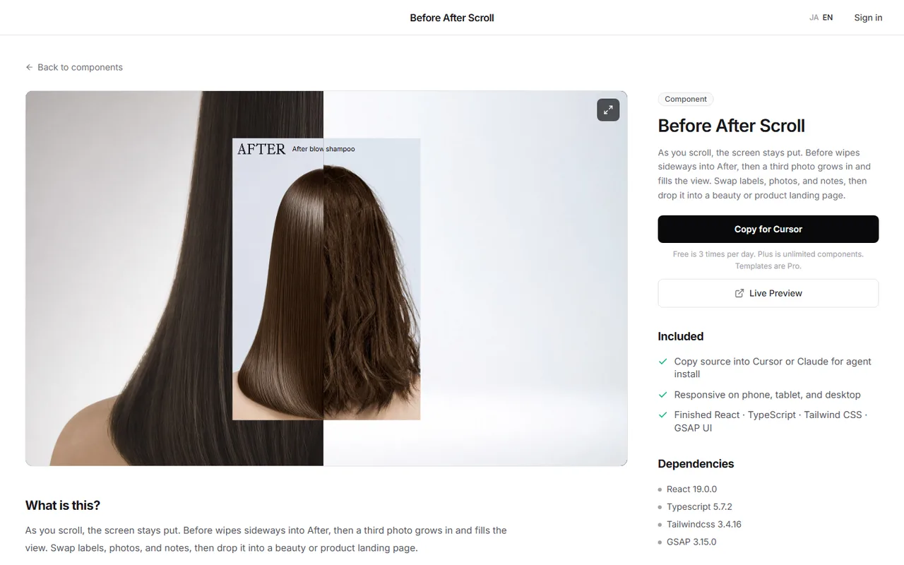
DesignLayer's Before After Scroll is a section built with GSAP ScrollTrigger. As you scroll, it stays on screen while the photo wipes from Before to After, then the next photo expands. It also includes a view for people who prefer reduced motion.
Watch it in the catalog's live preview, then press Copy for Cursor on the component page. It copies the integration instructions, the live preview URL, the TSX, and npm dependencies in one go, ready to paste into Cursor or Claude.
Browsing and live previews are free, with no account or card. Free source copies are limited to 3 per day (JST), and Plus (¥990/month) and Pro (¥2,980/month) make component copies unlimited. https://design-layer.com/en/components
GSAP ScrollTrigger FAQ
Is GSAP ScrollTrigger free to use?
Yes. ScrollTrigger has always been free, and since GSAP 3.13 in 2025 every plugin, including formerly paid ones like SplitText, is free, even on commercial sites. Check the official GSAP site for the exact license terms.
When should I use Motion vs GSAP?
For button feedback or fading in on enter, Motion (formerly Framer Motion) is plenty, and it feels like plain React. For pinned sections that step through several animations in order, GSAP timelines are easier to build. Motion basics are in https://design-layer.com/en/articles/nextjs-framer-motion-guide.
Can I use ScrollTrigger in a Server Component?
No. Watching scroll only works in the browser. Split the animated part into a "use client" file and import it from page.tsx. The rest of the page can stay on the server.
Why do ScrollTrigger positions break after navigating?
Either the previous page's triggers are still alive, or positions were measured before images loaded. Write animations with useGSAP for automatic cleanup, and call ScrollTrigger.refresh() for elements whose height changes later.
Summary: using GSAP ScrollTrigger in Next.js
Install gsap and @gsap/react, and register the plugin and useGSAP in a "use client" file
Write animations inside useGSAP and pass the outer element as scope. Cleanup becomes automatic
Use scrub to follow scroll distance, and pin to hold a section in place
Show markers only in development, and re-measure with refresh when heights change later
Use gsap.matchMedia to give phones and reduced-motion users a lighter version
Start with the Step 2 cards. To fade things in on enter without GSAP, see https://design-layer.com/en/articles/nextjs-scroll-reveal-guide.
For a slider that compares two photos side by side, see https://design-layer.com/en/articles/nextjs-before-after-slider-guide.