React Toast Notification: 7 Tips for Smooth, Stacked Toasts (Spring Animation, Swipe, and Accessibility)
Published: November 21, 2026 · 9 min read
Seven practical tips for a React toast notification: stacking and spacing, spring enter and exit animation, swipe to dismiss, auto-dismiss that pauses on hover, success, error, and loading variants, accessibility, and mobile positioning, with a complete copy-paste example.
A React toast notification looks finished until three arrive at once
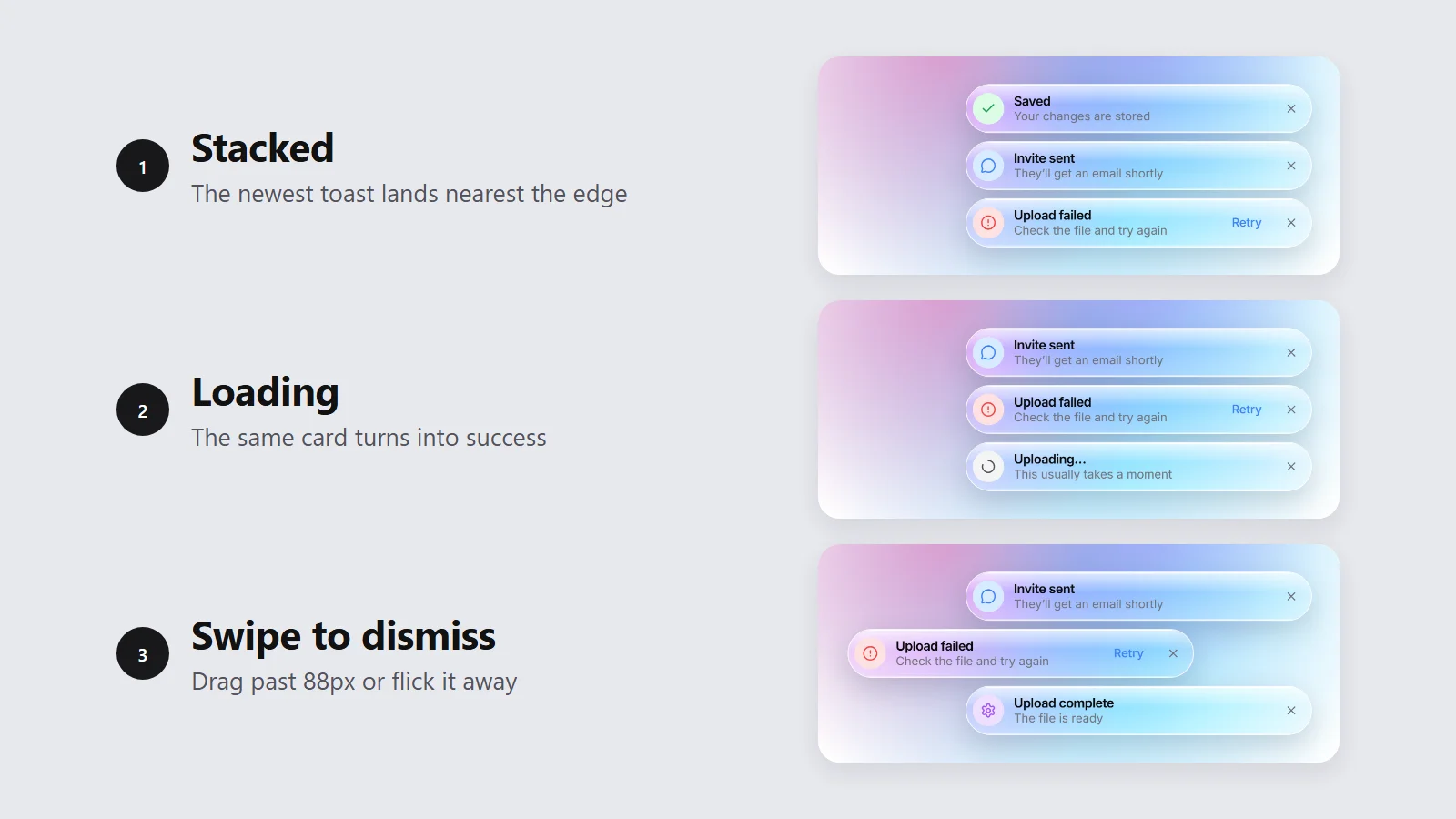
You click Save. A toast slides in. You click Save again before it leaves, and a second toast lands right on top of the first. Then an upload fails, and the error disappears before you finish reading it.
Here is the short answer. A good React toast notification keeps a list of toasts in state and shows only the newest few. Each one springs in, can be swiped or clicked away, and dismisses itself on a timer that pauses while the pointer is over it. One always-mounted live region announces each toast to screen readers.
This guide gives you seven tips for getting there:
Stacking and spacing several toasts
Enter and exit animation with spring physics
Swipe or click to dismiss
Auto-dismiss timing that pauses on hover
Success, error, and loading variants
Accessibility: aria-live, role="status", and reduced motion
Positioning on mobile
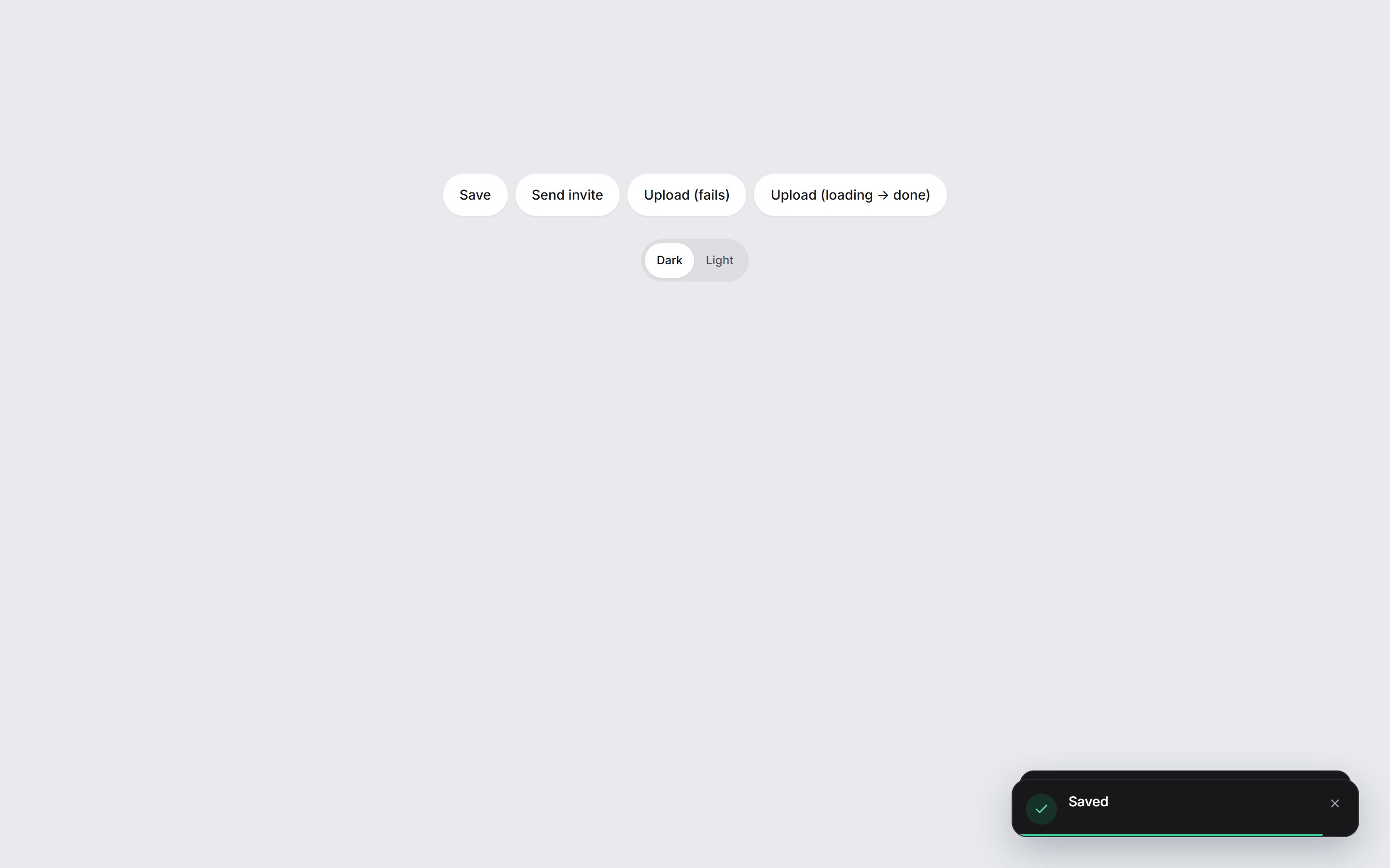
The numbers below come from a real component, Spring Toast Stack on DesignLayer. The video at the top is that component: three toasts stack, a loading toast turns into success, and two are swiped away. The snippets are short and illustrative. A complete example you can paste is near the end.
Tip 1: Stack toasts in a list and cap how many show
Most overlap bugs come from rendering each toast on its own. Keep one array instead, put the newest toast first, and render only the first few.
const MAX_VISIBLE = 3;

// Newest first. Older toasts wait in state until a slot frees up.
setToasts((prev) => [next, ...prev.filter((t) => t.id !== next.id)]);

<ol className="flex flex-col-reverse gap-2">
  {toasts.slice(0, MAX_VISIBLE).map((t) => (
    <ToastItem key={t.id} toast={t} />
  ))}
</ol>
Spring Toast Stack shows three toasts by default (maxVisible). Older ones stay in state and move up when a visible one leaves. Nothing is dropped just because the screen is busy.
Use gap-2 (8px) between cards rather than margins on each card. For a stack in the bottom corner, flex-col-reverse puts the newest toast nearest the edge. For a top corner, use flex-col instead.
Pass an id when the same event can fire twice. The filter above replaces the old toast with that id, so three quick saves give you one toast, not three.
Tip 2: Animate toast enter and exit with spring physics
A fixed-duration ease looks fine for one toast. With a stack, every card shifts when a new one arrives, and springs handle those interrupted moves more gracefully. A spring starts from wherever the card is and keeps its speed.
const SPRING = { type: "spring", stiffness: 460, damping: 34, mass: 0.78 } as const;

<AnimatePresence initial={false}>
  {visible.map((t) => (
    <motion.li
      key={t.id}
      layout
      initial={{ opacity: 0, y: 28, scale: 0.98 }}
      animate={{ opacity: 1, y: 0, scale: 1 }}
      exit={{ opacity: 0, transition: { duration: 0.14 } }}
      transition={SPRING}
    />
  ))}
</AnimatePresence>
This is the react toast animation Spring Toast Stack uses, built on Motion (motion/react). A new card starts 28px lower, at 98% scale and transparent, and springs into place. The layout prop moves the other cards with the same spring.
Exit is a short 140ms fade, not a spring. A leaving toast should get out of the way, and the cards behind it already move with layout. For a stack at the top of the screen, start the card from y: -24 so it drops in from above.
Tip 3: Let users swipe or click to dismiss a toast
Give every toast a close button. Add a horizontal swipe on top of it, because on a phone that is the gesture people try first.
const x = useMotionValue(0);

function handleDragEnd(_event: PointerEvent, info: PanInfo) {
  const passed = Math.abs(info.offset.x) > 88 || Math.abs(info.velocity.x) > 700;
  if (!passed) {
    animate(x, 0, SPRING); // not far or fast enough: spring back
    return;
  }
  const direction = info.offset.x < 0 ? -1 : 1;
  animate(x, direction * 320, SPRING).then(() => onDismiss(toast.id));
}

<motion.div
  drag="x"
  dragMomentum={false}
  dragElastic={0.18}
  style={{ x }}
  onDragEnd={handleDragEnd}
/>
A swipe counts when the card travels more than 88px, or moves faster than 700px per second. The speed check matters: a short, quick flick should dismiss the toast too.
dragElastic={0.18} adds some resistance, so the card feels attached until you commit. dragMomentum={false} stops it from sliding on by itself. If the swipe does not pass, the card springs back to zero.
The close button needs an aria-label such as "Dismiss notification". An icon alone tells a screen reader nothing.
Tip 4: Time auto-dismiss and pause it on hover
A toast that never leaves turns into clutter. One that leaves while someone is reading it is worse. So run a timer, but stop it while the user is interacting with the stack.
const remaining = useRef(4800);

useEffect(() => {
  if (toast.tone === "loading" || paused) return;
  const start = Date.now();
  const timer = window.setTimeout(() => onDismiss(toast.id), remaining.current);
  return () => {
    window.clearTimeout(timer);
    remaining.current -= Date.now() - start; // keep the time that is left
  };
}, [toast.id, toast.tone, paused, onDismiss]);
Spring Toast Stack waits 4800ms by default, and each toast can set its own duration. The timer pauses while the pointer is over the stack, while focus is inside it, and while a card is being dragged.
The remaining ref is the detail people miss. Restarting the full duration after every hover means a toast can stay forever. Keeping what is left means it resumes where it stopped.
Loading toasts skip the timer entirely. They leave when the work finishes, not when a clock runs out.
Tip 5: Build success, error, and loading toast variants
Three tones cover most app feedback: success, error, and loading. Give each a distinct icon or color dot, so the meaning does not depend on reading the title.
const id = toast({ title: "Uploading…", tone: "loading" });

try {
  await uploadFile(file);
  update(id, { title: "Upload complete", tone: "success" });
} catch {
  update(id, {
    title: "Upload failed",
    description: "Check the file and try again",
    tone: "error",
  });
}
Turn the loading toast into the result instead of stacking a second toast on top of it. update keeps the same id and the same card, so the user watches one notification change from "Uploading…" to "Upload complete".
Spring Toast Stack works this way. A loading card shows a spinning icon and sets aria-busy. When it updates to success, the icon and text swap in place.
Errors can carry an action, such as Retry. Keep it to one short button, so the toast stays a toast and does not become a dialog.
Tip 6: Make toast notifications accessible
A toast appears without moving focus, so a screen reader user only hears it if it lands in a live region. That region has to exist before the toast does.
{/* Always mounted, even when there are no toasts */}
<div role="status" aria-live="polite" aria-label="Notifications">
  <ol>
    <li aria-busy={toast.tone === "loading" || undefined}>
      <p>{toast.title}</p>
      <button type="button" aria-label="Dismiss notification">×</button>
    </li>
  </ol>
</div>

const reduce = useReducedMotion();
initial={reduce ? { opacity: 0 } : { opacity: 0, y: 28, scale: 0.98 }}
drag={reduce ? false : "x"}
Keep the role="status" container mounted even when the list is empty. Screen readers can skip a live region that appears in the DOM together with its content. aria-live="polite" waits until the reader finishes its current sentence.
Reserve role="alert" for an error the user must act on right away. It interrupts, so a stack of alerts quickly gets noisy.
Respect reduced motion. When useReducedMotion() is true, swap the spring for a plain fade and turn off the drag. Spring Toast Stack does both, with a 160ms fade. The close button still works, so nothing is lost.
Do not put the only copy of important information in a toast. It disappears, and some users will miss it. Make sure the result is also visible on the page itself.
Tip 7: Position toasts so they work on mobile
A 22rem card in the bottom-right corner works on a laptop. On a phone it can run off the screen or sit under the home indicator.
<section
  className="pointer-events-none fixed inset-x-4 z-50 flex justify-center
             bottom-[max(1rem,env(safe-area-inset-bottom))]
             sm:inset-x-auto sm:right-6 sm:bottom-6 sm:w-[22rem]"
>
  <div className="pointer-events-auto w-full max-w-sm">{/* the list */}</div>
</section>
On small screens, span the width with a 16px gutter on each side (inset-x-4). From the sm breakpoint, pin the stack to the corner at a fixed width. Spring Toast Stack caps its width at min(22rem, 100vw - 2.5rem) for the same reason.
env(safe-area-inset-bottom) keeps the stack above the home indicator on phones with no home button. The outer layer has pointer-events-none, so the empty area around the toasts never blocks taps on your page.
Bottom is the easier spot to reach with a thumb. If your app has a bottom tab bar, raise the stack above it or move it to the top.
Complete React toast notification example (copy-paste)
This puts all seven tips together in one file. It needs React, Motion (npm install motion), and Tailwind CSS. The DesignLayer component has more polish, such as the glass card and icons, but this example covers the same behavior.
"use client";

import {
  createContext,
  useCallback,
  useContext,
  useEffect,
  useMemo,
  useRef,
  useState,
  type ReactNode,
} from "react";
import {
  AnimatePresence,
  animate,
  motion,
  useMotionValue,
  useReducedMotion,
  type PanInfo,
} from "motion/react";

type Tone = "success" | "error" | "loading";
type Toast = { id: string; title: string; description?: string; tone: Tone };
type ToastInput = { id?: string; title: string; description?: string; tone?: Tone };
type ToastApi = {
  toast: (input: ToastInput) => string;
  update: (id: string, patch: Partial<Omit<Toast, "id">>) => void;
  dismiss: (id: string) => void;
};

const SPRING = { type: "spring", stiffness: 460, damping: 34, mass: 0.78 } as const;
const DURATION = 4800;
const MAX_VISIBLE = 3;
const DOT: Record<Tone, string> = {
  success: "bg-emerald-500",
  error: "bg-red-500",
  loading: "bg-zinc-400 motion-safe:animate-pulse",
};

const ToastContext = createContext<ToastApi | null>(null);
let seq = 0;

export function useToast() {
  const api = useContext(ToastContext);
  if (!api) throw new Error("useToast must be used inside <ToastProvider>");
  return api;
}

export function ToastProvider({ children }: { children: ReactNode }) {
  const [toasts, setToasts] = useState<Toast[]>([]);
  const [paused, setPaused] = useState(false);

  const dismiss = useCallback((id: string) => {
    setToasts((prev) => prev.filter((t) => t.id !== id));
  }, []);

  const toast = useCallback((input: ToastInput) => {
    seq += 1;
    const id = input.id ?? `toast-${seq}`;
    const next: Toast = { ...input, id, tone: input.tone ?? "success" };
    setToasts((prev) => [next, ...prev.filter((t) => t.id !== id)]);
    return id;
  }, []);

  const update = useCallback((id: string, patch: Partial<Omit<Toast, "id">>) => {
    setToasts((prev) => prev.map((t) => (t.id === id ? { ...t, ...patch } : t)));
  }, []);

  const api = useMemo(() => ({ toast, update, dismiss }), [toast, update, dismiss]);

  return (
    <ToastContext.Provider value={api}>
      {children}
      <section
        className={[
          "pointer-events-none fixed inset-x-4 z-50 flex justify-center",
          "bottom-[max(1rem,env(safe-area-inset-bottom))]",
          "sm:inset-x-auto sm:right-6 sm:bottom-6 sm:w-[22rem]",
        ].join(" ")}
      >
        <div
          role="status"
          aria-live="polite"
          aria-label="Notifications"
          className="pointer-events-auto w-full max-w-sm"
          onPointerEnter={() => setPaused(true)}
          onPointerLeave={() => setPaused(false)}
          onFocus={() => setPaused(true)}
          onBlur={(event) => {
            const next = event.relatedTarget as Node | null;
            if (!event.currentTarget.contains(next)) setPaused(false);
          }}
        >
          <ol className="flex flex-col-reverse gap-2">
            <AnimatePresence initial={false}>
              {toasts.slice(0, MAX_VISIBLE).map((t) => (
                <ToastItem key={t.id} toast={t} paused={paused} onDismiss={dismiss} />
              ))}
            </AnimatePresence>
          </ol>
        </div>
      </section>
    </ToastContext.Provider>
  );
}

function ToastItem({
  toast,
  paused,
  onDismiss,
}: {
  toast: Toast;
  paused: boolean;
  onDismiss: (id: string) => void;
}) {
  const reduce = useReducedMotion() ?? false;
  const x = useMotionValue(0);
  const remaining = useRef(DURATION);

  useEffect(() => {
    if (toast.tone === "loading" || paused) return;
    const start = Date.now();
    const timer = window.setTimeout(() => onDismiss(toast.id), remaining.current);
    return () => {
      window.clearTimeout(timer);
      remaining.current -= Date.now() - start;
    };
  }, [toast.id, toast.tone, paused, onDismiss]);

  function handleDragEnd(_event: PointerEvent | MouseEvent | TouchEvent, info: PanInfo) {
    const passed = Math.abs(info.offset.x) > 88 || Math.abs(info.velocity.x) > 700;
    if (!passed) {
      void animate(x, 0, SPRING);
      return;
    }
    const direction = info.offset.x < 0 ? -1 : 1;
    void animate(x, direction * 320, SPRING).then(() => onDismiss(toast.id));
  }

  return (
    <motion.li
      layout={!reduce}
      aria-busy={toast.tone === "loading" || undefined}
      initial={reduce ? { opacity: 0 } : { opacity: 0, y: 28, scale: 0.98 }}
      animate={{ opacity: 1, y: 0, scale: 1 }}
      exit={{ opacity: 0, transition: { duration: reduce ? 0.16 : 0.14 } }}
      transition={reduce ? { duration: 0.16 } : SPRING}
    >
      <motion.div
        drag={reduce ? false : "x"}
        dragMomentum={false}
        dragElastic={0.18}
        style={{ x }}
        onDragEnd={handleDragEnd}
        className="flex items-center gap-3 rounded-2xl border border-zinc-200 bg-white p-3 shadow-lg"
      >
        <span aria-hidden className={`size-2.5 shrink-0 rounded-full ${DOT[toast.tone]}`} />
        <div className="min-w-0 flex-1">
          <p className="truncate text-sm font-semibold text-zinc-950">{toast.title}</p>
          {toast.description ? (
            <p className="truncate text-xs text-zinc-500">{toast.description}</p>
          ) : null}
        </div>
        <button
          type="button"
          onClick={() => onDismiss(toast.id)}
          aria-label="Dismiss notification"
          className={[
            "inline-flex size-8 shrink-0 items-center justify-center rounded-full",
            "text-zinc-500 hover:bg-zinc-100 hover:text-zinc-950",
            "focus-visible:outline-none focus-visible:ring-2 focus-visible:ring-sky-400",
          ].join(" ")}
        >
          ×
        </button>
      </motion.div>
    </motion.li>
  );
}
How to use it
Wrap your app once, then call useToast() from any client component below it.
// app/layout.tsx
<ToastProvider>{children}</ToastProvider>

// Anywhere below it
function SaveButton() {
  const { toast, update } = useToast();

  async function handleSave() {
    const id = toast({ title: "Saving…", tone: "loading" });
    try {
      await saveChanges(); // your own async call
      update(id, { title: "Saved", tone: "success" });
    } catch {
      update(id, { title: "Save failed", tone: "error" });
    }
  }

  return <button type="button" onClick={handleSave}>Save</button>;
}
In the Next.js App Router, the file needs "use client" at the top, as shown. You can still render <ToastProvider> inside a server layout.tsx.
Use the ready-made React toast stack
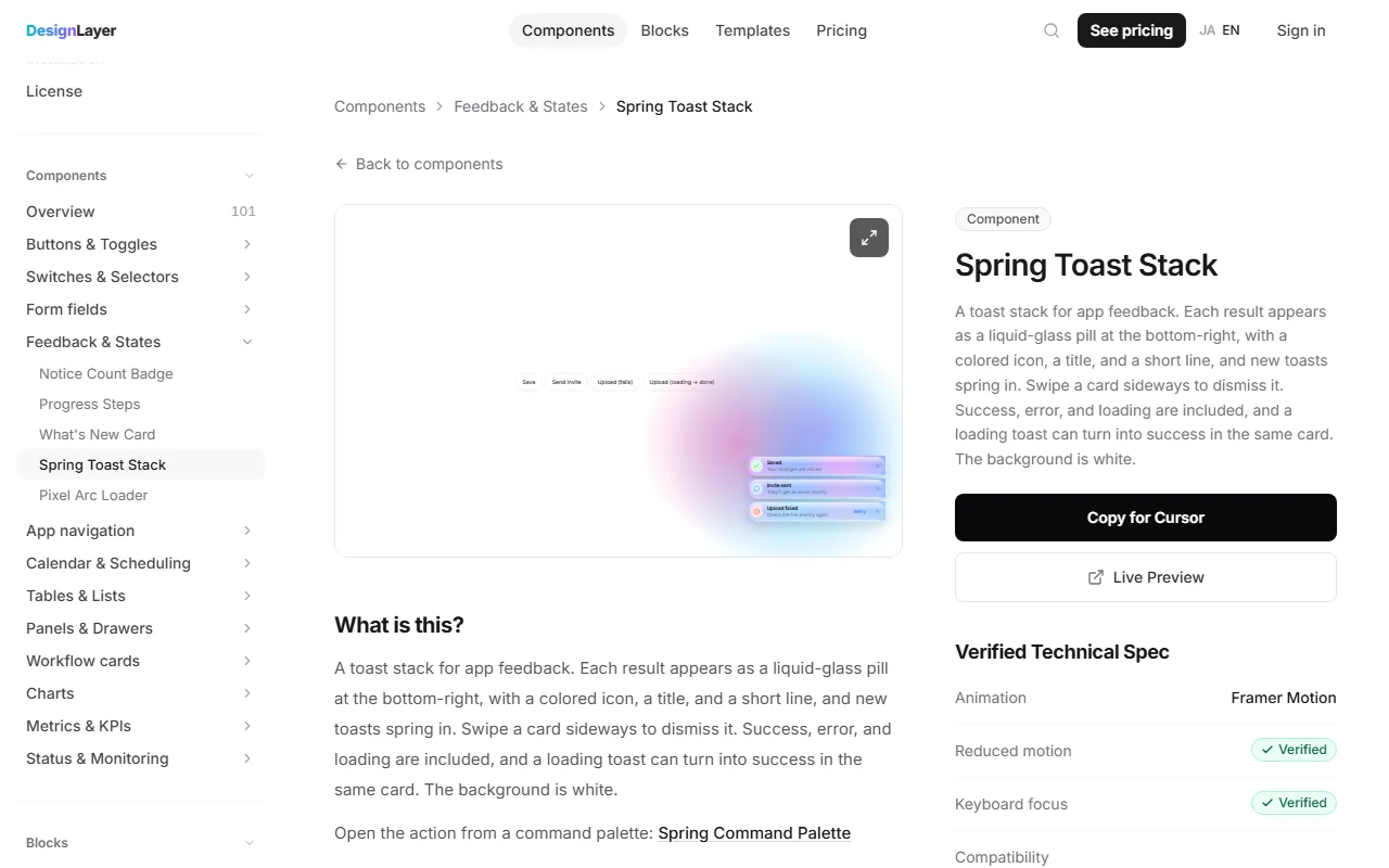
Use the ready-made version: Spring Toast Stack on DesignLayer has everything in this guide: springs, swipe to dismiss, pause on hover, loading to success in the same card, and reduced motion. Open the live preview and press the buttons to stack a few toasts.
Browsing and the live preview are free. You do not need an account or a card to try it. This Component is free to copy. Blocks and Templates need the 30-Day Build Pass or Lifetime Access (Plus is also available if you prefer a monthly plan).
"Copy for Cursor" packages the install instructions, the live preview URL, the component TSX, and the npm list. Paste that into Cursor or Claude, mount <SpringToastStack> once, and call toast() from your own handlers.
Components are free to copy, plus one launch-video prompt per month. Blocks and Templates are the 30-Day Build Pass ($19, one-time), Lifetime Access ($79, one-time, founding price for the first 100 buyers), or Plus ($9/month, cancel anytime). Confirm the current offer on Pricing before you buy. The catalog is at https://design-layer.com/en/components.
React toast notification FAQ
Keep all toasts in one array with the newest first, and render only the first few, for example three. Lay them out in a flex column with an 8px gap, and give each card Motion's
layoutprop so the others move smoothly when one arrives or leaves.
Summary: seven tips for a React toast notification
Keep one array, newest first, and show only the first three
Spring the entrance, fade the exit, and let
layoutmove the restDismiss on an 88px swipe, a fast flick, or the close button
Auto-dismiss after about 4.8 seconds, and pause on hover, focus, and drag
Turn a loading toast into success or error in the same card
Announce through an always-mounted
role="status"region, and respect reduced motionGo full width with safe-area padding on phones, and pin to a corner from
smup
Start with the complete example and adjust the timing to your app. If you would rather try the finished stack first, open Spring Toast Stack. For more Motion patterns, see the Next.js Framer Motion guide and the Next.js Tailwind animation guide. For another small component built step by step, see the React OTP input guide.