Next.js Before/After Slider: clip-path, Drag, and Scroll Wipe
Published: October 8, 2026 · 7 min read
Build a before/after comparison slider in Next.js: a keyboard-accessible base with CSS clip-path and a range input, pointer-event dragging, matching images with next/image, and a sticky scroll-driven wipe, with code.
When you need a before/after slider in Next.js
You run a site for a renovation company or a hair salon, with before and after photos side by side. Placed next to each other, it is hard to see what actually changed.
That is what a before/after slider is for. Stack the two photos and move a divider left and right to compare them.
Here is the short answer. Stack two images and clip the top one with CSS clip-path (a way to show only part of an element).
Store the divider position in a native range input. That alone gives you keyboard control and screen reader support.
This guide covers:
The simplest before/after slider, with clip-path and a range input
Dragging the divider with a mouse or a finger
Matching the size and framing of both photos with next/image
An advanced version where the photo wipes as you scroll
Why build a before/after slider on a range input
A slider that only responds to dragging is unusable for anyone who cannot use a mouse or touch. Moving the divider with a keyboard is the bare minimum for a comparison.
A range input moves in small steps with the arrow keys, jumps to either end with Home and End, and reports its value to screen readers.
You only build the visuals and the drag behavior. The browser handles the core interaction, so the code stays short.
Step 1: Build a before/after slider with clip-path and range
Put the After photo on the bottom layer and Before on top. Clip the right side of the top layer with clip-path so only its left part shows.
Make the range input transparent and stretch it over the whole image. Clicking or dragging with a mouse moves the divider to that point.
"use client";

import Image from "next/image";
import { useId, useState } from "react";

type Img = { src: string; alt: string };

export function BeforeAfterSlider({ before, after }: { before: Img; after: Img }) {
  const [pos, setPos] = useState(50); // How much of Before to show (%)
  const inputId = useId();

  return (
    <div className="relative aspect-[3/2] w-full select-none overflow-hidden rounded-2xl bg-zinc-100">
      {/* Bottom layer: After */}
      <Image src={after.src} alt={after.alt} fill sizes="(min-width: 768px) 720px, 100vw" className="object-cover" />

      {/* Top layer: Before, clipped so only the left part shows */}
      <div className="absolute inset-0" style={{ clipPath: "inset(0 " + (100 - pos) + "% 0 0)" }}>
        <Image src={before.src} alt={before.alt} fill sizes="(min-width: 768px) 720px, 100vw" className="object-cover" />
      </div>

      {/* Divider line */}
      <div
        aria-hidden="true"
        className="pointer-events-none absolute inset-y-0 w-0.5 -translate-x-1/2 bg-white"
        style={{ left: pos + "%" }}
      />

      <label htmlFor={inputId} className="sr-only">
        Position of the before/after divider
      </label>
      <input
        id={inputId}
        type="range"
        min={0}
        max={100}
        value={pos}
        onChange={(e) => setPos(Number(e.target.value))}
        aria-valuetext={"Showing " + pos + "% of before"}
        className="absolute inset-0 h-full w-full cursor-ew-resize opacity-0"
      />
    </div>
  );
}
Key points in the code
inset(0 30% 0 0) means "clip 30% from the right", putting the divider at 70%
Both images fill the same box, so clipping never shifts the photo
The label is visually hidden (sr-only) and exists only for screen readers
aria-valuetext announces what the number means, such as "Showing 70% of before"
Where Step 1 falls short
The transparent range input behaves well with a mouse and keyboard. On phones, though, users end up hunting for an invisible thumb, and the divider may not land where they expect.
If much of your traffic is mobile, Step 2 handles finger dragging yourself.
Step 2: Make the before/after slider draggable
Handle mouse and touch with Pointer Events (one event model for mouse, finger, and pen). Compute the divider from where the pointer went down, then follow it until release.
Keep the range input for keyboard and screen readers, but stop it from receiving pointer input. Replace the Step 1 file with this:
"use client";

import Image from "next/image";
import { useId, useRef, useState } from "react";

type Img = { src: string; alt: string };

type Props = {
  before: Img;
  after: Img;
  aspect?: string; // e.g. "3 / 2"
  initial?: number;
};

const SIZES = "(min-width: 768px) 720px, 100vw";

export function BeforeAfterSlider({ before, after, aspect = "3 / 2", initial = 50 }: Props) {
  const [pos, setPos] = useState(initial);
  const boxRef = useRef<HTMLDivElement>(null);
  const dragging = useRef(false);
  const inputId = useId();

  function moveTo(clientX: number) {
    const box = boxRef.current;
    if (!box) return;
    const rect = box.getBoundingClientRect();
    const next = ((clientX - rect.left) / rect.width) * 100;
    setPos(Math.round(Math.min(100, Math.max(0, next))));
  }

  function stop() {
    dragging.current = false;
  }

  return (
    <div
      ref={boxRef}
      onPointerDown={(e) => {
        dragging.current = true;
        e.currentTarget.setPointerCapture(e.pointerId);
        moveTo(e.clientX);
      }}
      onPointerMove={(e) => {
        if (dragging.current) moveTo(e.clientX);
      }}
      onPointerUp={stop}
      onPointerCancel={stop}
      className="group relative w-full cursor-ew-resize touch-pan-y select-none overflow-hidden rounded-2xl bg-zinc-100"
      style={{ aspectRatio: aspect }}
    >
      <Image src={after.src} alt={after.alt} fill sizes={SIZES} draggable={false} className="object-cover" />
      <div className="absolute inset-0" style={{ clipPath: "inset(0 " + (100 - pos) + "% 0 0)" }}>
        <Image src={before.src} alt={before.alt} fill sizes={SIZES} draggable={false} className="object-cover" />
      </div>

      <span className="pointer-events-none absolute left-3 top-3 rounded-full bg-black/60 px-3 py-1 text-xs text-white">Before</span>
      <span className="pointer-events-none absolute right-3 top-3 rounded-full bg-black/60 px-3 py-1 text-xs text-white">After</span>

      {/* For keyboard and screen readers. Mouse and touch go to the outer div */}
      <label htmlFor={inputId} className="sr-only">
        Position of the before/after divider
      </label>
      <input
        id={inputId}
        type="range"
        min={0}
        max={100}
        value={pos}
        onChange={(e) => setPos(Number(e.target.value))}
        aria-valuetext={"Showing " + pos + "% of before"}
        className="pointer-events-none absolute inset-0 h-full w-full opacity-0"
      />

      {/* Divider line and handle (visual only) */}
      <div
        aria-hidden="true"
        className="pointer-events-none absolute inset-y-0 w-0.5 -translate-x-1/2 bg-white"
        style={{ left: pos + "%" }}
      >
        <span className="absolute left-1/2 top-1/2 flex size-11 -translate-x-1/2 -translate-y-1/2 items-center justify-center rounded-full bg-white text-zinc-900 shadow-lg ring-sky-500 ring-offset-2 group-has-[:focus-visible]:ring-2">
          ↔
        </span>
      </div>
    </div>
  );
}
Do not block vertical scrolling on phones
touch-pan-y on the outer div tells the browser to use vertical finger movement for page scrolling. Only horizontal drags reach the slider, so swiping up and down still scrolls the page.
setPointerCapture keeps tracking the pointer even after it leaves the image, so the divider never gets stuck mid-drag.
Handle size and focus styles
The handle is size-11 (44px), a comfortable touch target. Pressing anywhere on the image moves the divider, so the handle is mostly a visual cue.
When the slider gets keyboard focus, group-has-[:focus-visible] draws a blue ring on the handle. The input itself is invisible, so this is how users see what is focused.
Step 3: Match before/after slider images with next/image
What matters most in a comparison is that both photos share the same framing. If their aspect ratios differ, object-cover crops them differently and the photo jumps at the divider.
Export both images at the same ratio and angle, then put them in public. The component uses fill, and the outer box's aspect-ratio sets the height.
import { BeforeAfterSlider } from "@/components/BeforeAfterSlider";

export default function Page() {
  return (
    <section className="mx-auto max-w-3xl px-6 py-24">
      <h2 className="text-3xl font-semibold">Decluttering service: before and after</h2>
      <p className="mt-3 text-zinc-600">Drag the divider to compare the room before and after.</p>
      <div className="mt-10">
        <BeforeAfterSlider
          before={{ src: "/ba/room-before.jpg", alt: "Living room before: boxes stacked on the floor" }}
          after={{ src: "/ba/room-after.jpg", alt: "Living room after: clear floor, everything on shelves" }}
          aspect="3 / 2"
        />
      </div>
    </section>
  );
}
Write sizes and alt text
Always set sizes with fill. The browser then picks an image that matches the displayed width, and phones skip oversized downloads.
In alt, say what is in the photo and whether it is before or after. If both just say "project photo", screen reader users cannot tell them apart. page.tsx can stay a Server Component. Only the slider file runs in the browser.
Advanced: a scroll-driven before/after slider
On a landing page highlight, a common effect is switching from Before to After just by scrolling. The photo stays on screen while the divider follows scroll distance.
The trick is a tall outer track with a sticky photo inside (sticky keeps it on screen while you scroll). Motion's useScroll reads how far you are through the track, and that becomes the clip width.
People who prefer reduced motion get the manual slider from Step 2 instead.
"use client";

import Image from "next/image";
import { useRef } from "react";
import { motion, useReducedMotion, useScroll, useTransform } from "motion/react";
import { BeforeAfterSlider } from "./BeforeAfterSlider";

type Img = { src: string; alt: string };
type Props = { before: Img; after: Img };

const SIZES = "(min-width: 1024px) 896px, 100vw";

export function BeforeAfterScroll(props: Props) {
  const reduce = useReducedMotion();
  // With reduced motion, fall back to the manual slider
  if (reduce) return <BeforeAfterSlider {...props} />;
  return <ScrollWipe {...props} />;
}

function ScrollWipe({ before, after }: Props) {
  const trackRef = useRef<HTMLDivElement>(null);
  const { scrollYProgress } = useScroll({ target: trackRef, offset: ["start start", "end end"] });
  // Between 15% and 85% progress, clip Before's right side from 0% to 100%
  const hidden = useTransform(scrollYProgress, [0.15, 0.85], [0, 100]);
  const clipPath = useTransform(hidden, (v) => "inset(0 " + v + "% 0 0)");
  const lineLeft = useTransform(hidden, (v) => 100 - v + "%");

  return (
    <div ref={trackRef} className="relative h-[250vh]">
      <div className="sticky top-0 flex h-svh items-center justify-center px-6">
        <div className="relative aspect-[3/2] w-full max-w-4xl overflow-hidden rounded-2xl bg-zinc-100">
          <Image src={after.src} alt={after.alt} fill sizes={SIZES} className="object-cover" />
          <motion.div className="absolute inset-0" style={{ clipPath }}>
            <Image src={before.src} alt={before.alt} fill sizes={SIZES} className="object-cover" />
          </motion.div>
          <motion.div
            aria-hidden="true"
            className="absolute inset-y-0 w-0.5 -translate-x-1/2 bg-white"
            style={{ left: lineLeft }}
          />
        </div>
      </div>
    </div>
  );
}
Building it with GSAP instead
If text or another photo should animate after the wipe, sequencing it with GSAP ScrollTrigger is easier. Using it in Next.js is covered in https://design-layer.com/en/articles/nextjs-gsap-scrolltrigger-guide.
Common before/after slider mistakes and pre-launch checks
Mismatched ratios or angles. Buildings or faces shift as the divider moves
The browser's native image drag kicks in when you press the photo. Stop it with draggable={false} and select-none
An ancestor has overflow: hidden. sticky stops working and the scroll version slides away
The divider starts at an edge. Start near 50% so it is obvious there are two photos
No Before and After labels. Mark which side is which on top of the image
Reduced motion not tested. Flip the OS setting and confirm the manual slider appears
If you want to flip through many photos, a carousel fits better than a slider. See https://design-layer.com/en/articles/nextjs-image-carousel-guide.
Copy a finished before/after section instead
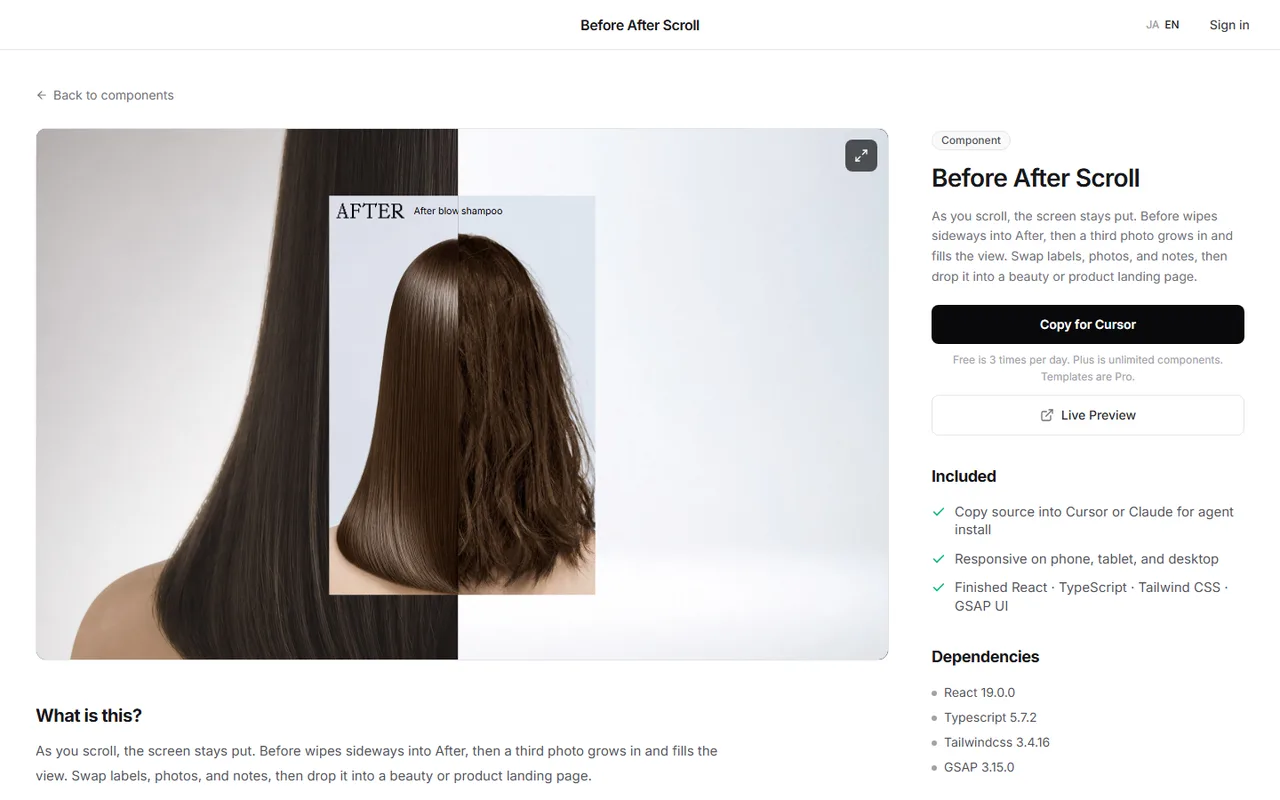
A scroll-driven wipe takes time to tune: how the photos stack, how long the section stays put. You can also try a finished section in the browser first, then bring it into your site.
DesignLayer's Before After Scroll is a section where the photo wipes from Before to After as you scroll. The next photo then expands, showing the result in three stages.
Watch it in the catalog's live preview, then press Copy for Cursor on the component page. It copies the integration instructions, the live preview URL, the TSX, and npm dependencies in one go, ready to paste into Cursor or Claude.
Browsing and live previews are free, with no account or card. Free source copies are limited to 3 per day (JST), and Plus (¥990/month) and Pro (¥2,980/month) make component copies unlimited. https://design-layer.com/en/components
Before/after slider FAQ
Do I need a library for a before/after slider?
No. CSS clip-path and a range input are enough. Only the scroll-driven version gets easier with Motion or GSAP.
Can I make a vertical before/after slider?
Yes. Clip from the bottom with something like inset(0 0 30% 0), and compute the position from clientY and the height. Then use touch-pan-x so only horizontal scrolling goes to the page.
Vertical scrolling stopped working on phones.
touch-none on the outer element hands every finger movement to the slider. Use touch-pan-y to keep vertical scrolling.
What if my photos have different aspect ratios?
The reliable fix is cropping both to the same ratio and framing in an image editor. If that is not possible, align their centers with object-position, but large ratio differences will still show.
Summary: building a before/after slider in Next.js
Stack two photos and clip the Before layer with clip-path
Store the divider in a range input for keyboard and screen reader support
Handle mouse and touch with Pointer Events, and keep vertical scrolling with touch-pan-y
Prepare both photos at the same ratio and framing, and render them with next/image fill and sizes
Build the scroll wipe with sticky and useScroll, and fall back to the manual slider for reduced motion
Start by dropping two of your own photos into the Step 1 code. The basics of revealing elements on scroll are in https://design-layer.com/en/articles/nextjs-scroll-reveal-guide.