Back to components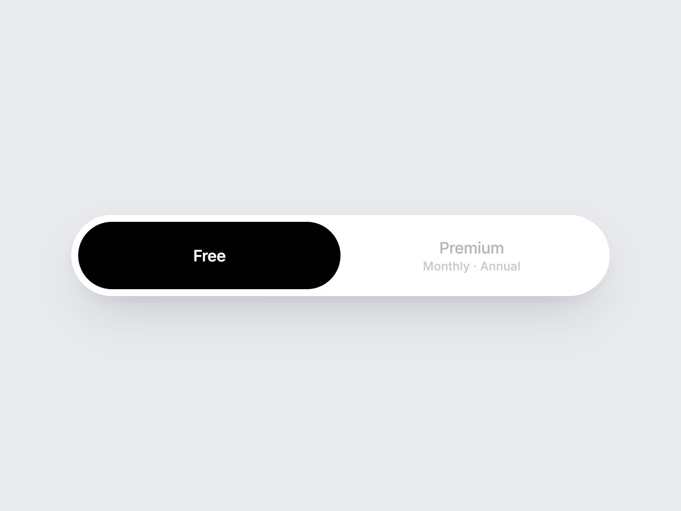
What is this?
A white pill switch. The selected plan slides into a black capsule: Free on the left, Premium with Monthly · Annual on the right. Swap the labels, then drop it at the top of a pricing block.
Full TSX source. No account needed.
plan-pill-switch.tsx
"use client"; import * as React from "react";import { cn } from "@/lib/utils"; export type PlanPillOption = { value: string; label: string; hint?: string;}; export const PLAN_PILL_DEFAULT_OPTIONS: readonly PlanPillOption[] = [ { value: "free", label: "Free" }, { value: "premium", label: "Premium", hint: "Monthly · Annual" },]; export type PlanPillSwitchProps = Omit< React.ComponentPropsWithoutRef<"div">, "onChange"> & { options?: readonly PlanPillOption[]; value?: string; defaultValue?: string; onValueChange?: (value: string) => void;}; export const PlanPillSwitch = React.forwardRef<HTMLDivElement, PlanPillSwitchProps>( ( { options = PLAN_PILL_DEFAULT_OPTIONS, value, defaultValue, onValueChange, className, ...props }, ref, ) => { const items = options.length > 0 ? options : PLAN_PILL_DEFAULT_OPTIONS; const first = items[0]?.value ?? "free"; const [uncontrolled, setUncontrolled] = React.useState(defaultValue ?? first); const selected = value ?? uncontrolled; const index = Math.max( 0, items.findIndex((item) => item.value === selected), ); const choose = (next: string) => { if (value === undefined) setUncontrolled(next); onValueChange?.(next); }; const onKeyDown = (event: React.KeyboardEvent<HTMLDivElement>) => { if (event.key !== "ArrowRight" && event.key !== "ArrowLeft") return; event.preventDefault(); const step = event.key === "ArrowRight" ? 1 : -1; const next = items[(index + step + items.length) % items.length]; if (next) choose(next.value); }; return ( <div ref={ref} role="radiogroup" data-tsuna-id="plan-pill-switch" aria-label="Plan" onKeyDown={onKeyDown} className={cn( "relative inline-grid min-w-[34rem] grid-cols-2 rounded-full bg-white p-[7px]", "shadow-[0_22px_48px_-18px_rgba(15,23,42,0.22),0_6px_16px_-10px_rgba(15,23,42,0.12)]", className, )} {...props} > <span aria-hidden className="pointer-events-none absolute top-[7px] left-[7px] h-[calc(100%-14px)] w-[calc(50%-7px)] rounded-full bg-black motion-reduce:transition-none" style={{ transform: `translateX(${index * 100}%)`, transition: "transform 520ms cubic-bezier(0.22, 1, 0.36, 1)", }} /> {items.map((item) => { const active = item.value === items[index]?.value; return ( <button key={item.value} type="button" role="radio" aria-checked={active} onClick={() => choose(item.value)} className={cn( "relative z-10 flex min-h-[4.25rem] cursor-pointer flex-col items-center justify-center rounded-full border-0 bg-transparent px-8", "transition-colors duration-300 motion-reduce:transition-none", "focus-visible:outline-none focus-visible:ring-2 focus-visible:ring-black/30 focus-visible:ring-offset-2", active ? "text-white" : "text-[#b5b5b5] hover:text-[#7a7a7a]", )} > <span className={cn( "text-[16px] leading-none tracking-[-0.02em]", active ? "font-semibold" : "font-medium", )} > {item.label} </span> {item.hint ? ( <span className={cn( "mt-[5px] text-[12px] leading-none font-medium tracking-[0.01em]", active ? "text-white/72" : "text-[#c8c8c8]", )} > {item.hint} </span> ) : null} </button> ); })} </div> ); },); PlanPillSwitch.displayName = "PlanPillSwitch";Read the guide
- Read the guide: Lifetime React Component Libraries in 2026: One-Time Prices Compared (and When a Pass or Subscription Is Cheaper)
- Read the guide: Aceternity UI Alternatives in 2026: Animated React Libraries Compared (Free vs Paid)
- Read the guide: AI Product Launch Video Examples: 8 Films Made by AI Agents (and the Launch Page to Go With Each)
- Read the guide: Animated Pricing Section in React: 4 Ready-Made Designs to Copy (and How to Pick One)
Component
Plan Pill Switch
A white pill switch. The selected plan slides into a black capsule: Free on the left, Premium with Monthly · Annual on the right. Swap the labels, then drop it at the top of a pricing block.
Verified Technical Spec
- Animation
- CSS / Tailwind
- Reduced motion
- Verified
- Keyboard focus
- Verified
- Compatibility
- Tailwind CSS v3.4 + v4 · React 19 / Next.js 15 App Router + Vite / Remix compatible
Included
- Copy source into Cursor or Claude for agent install
- Finished React · TypeScript · Tailwind CSS UI
Dependencies
- React 19.0.0
- Typescript 5.7.2
- Tailwindcss 3.4.16
Tech Stack
- React
- TypeScript
- Tailwind CSS
Version 1.0.0