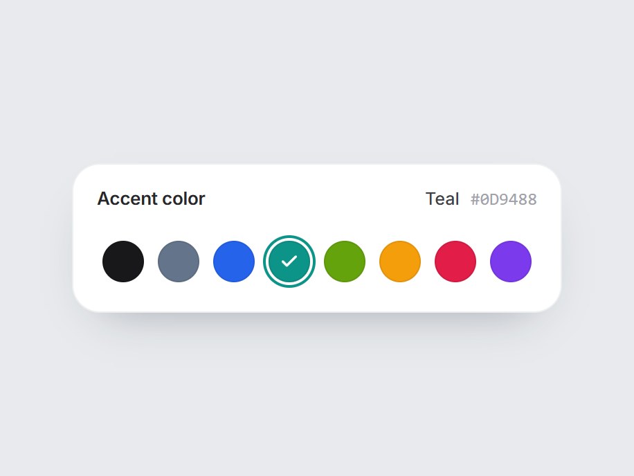
What is this?
A white tile with a row of round color swatches for picking an accent or label color. The selection ring glides to the next swatch and takes its color, a check pops in, and the name and hex update in the header. Arrow keys, Home, and End move the choice. Swap the colors and heading, then drop it into theme settings or a project label editor.
Full TSX source. No account needed.
color-swatch-row.tsx
"use client"; import * as React from "react";import { Check } from "lucide-react";import { cn } from "@/lib/utils"; export type ColorSwatch = { id: string; /** Any CSS color. Hex reads best in the caption. */ value: string; label?: string;}; export type ColorSwatchRowProps = Omit< React.ComponentPropsWithoutRef<"div">, "onChange" | "defaultValue"> & { colors?: readonly ColorSwatch[]; /** Selected swatch id. */ value?: string; defaultValue?: string; onValueChange?: (id: string, swatch: ColorSwatch) => void; /** Heading above the row. Pass "" to hide the header. */ label?: string;}; const EASE = "cubic-bezier(0.22, 1, 0.36, 1)";const SWATCH = 30;const GAP = 10;const SLOT = SWATCH + GAP; const COLOR_SWATCH_DEFAULTS: readonly ColorSwatch[] = [ { id: "ink", value: "#18181b", label: "Ink" }, { id: "slate", value: "#64748b", label: "Slate" }, { id: "ocean", value: "#2563eb", label: "Ocean" }, { id: "teal", value: "#0d9488", label: "Teal" }, { id: "lime", value: "#65a30d", label: "Lime" }, { id: "amber", value: "#f59e0b", label: "Amber" }, { id: "rose", value: "#e11d48", label: "Rose" }, { id: "violet", value: "#7c3aed", label: "Violet" },]; /** True when dark text reads better on the color (hex only; others count as dark). */function isLight(color: string) { const hex = color.trim().match(/^#([0-9a-f]{3}|[0-9a-f]{6})$/i)?.[1]; if (!hex) return false; const full = hex.length === 3 ? hex.replace(/./g, (c) => c + c) : hex; const [r, g, b] = [0, 2, 4].map((i) => parseInt(full.slice(i, i + 2), 16)); return (0.299 * (r ?? 0) + 0.587 * (g ?? 0) + 0.114 * (b ?? 0)) / 255 > 0.68;} export const ColorSwatchRow = React.forwardRef< HTMLDivElement, ColorSwatchRowProps>( ( { colors = COLOR_SWATCH_DEFAULTS, value, defaultValue, onValueChange, label = "Accent color", className, ...props }, ref, ) => { const items = colors.length > 0 ? colors : COLOR_SWATCH_DEFAULTS; const [uncontrolled, setUncontrolled] = React.useState( defaultValue ?? items[2]?.id ?? items[0]?.id ?? "", ); const selectedId = value ?? uncontrolled; const index = Math.max( 0, items.findIndex((item) => item.id === selectedId), ); const selected = items[index]; const buttons = React.useRef<Array<HTMLButtonElement | null>>([]); const choose = (next: number, focus = false) => { const swatch = items[(next + items.length) % items.length]; if (!swatch) return; if (value === undefined) setUncontrolled(swatch.id); onValueChange?.(swatch.id, swatch); if (focus) buttons.current[(next + items.length) % items.length]?.focus(); }; const onKeyDown = (event: React.KeyboardEvent<HTMLDivElement>) => { const keys: Record<string, number> = { ArrowRight: index + 1, ArrowDown: index + 1, ArrowLeft: index - 1, ArrowUp: index - 1, Home: 0, End: items.length - 1, }; const next = keys[event.key]; if (next === undefined) return; event.preventDefault(); choose(next, true); }; return ( <div ref={ref} data-tsuna-id="color-swatch-row" className={cn( "inline-flex max-w-full flex-col gap-3.5 rounded-[20px] bg-white p-4", "shadow-[0_16px_36px_-22px_rgba(15,23,42,0.42),inset_0_0_0_1px_rgba(15,23,42,0.07)]", className, )} {...props} > {label ? ( <div className="flex items-baseline justify-between gap-6 px-0.5"> <span className="text-[13px] font-semibold tracking-[-0.01em] text-zinc-800"> {label} </span> <span aria-hidden className="flex items-center gap-2 text-[12.5px]"> <span key={selected?.id} className="font-medium text-zinc-700 motion-safe:animate-[color-swatch-row-in_360ms_cubic-bezier(0.22,1,0.36,1)]" > {selected?.label ?? selected?.id} </span> <span className="font-mono text-zinc-400 uppercase"> {selected?.value} </span> </span> </div> ) : null} <style>{`@keyframes color-swatch-row-in { from { opacity: 0; transform: translateY(4px); } to { opacity: 1; transform: none; } }`}</style> <div role="radiogroup" aria-label={label || "Color"} onKeyDown={onKeyDown} className="relative flex overflow-x-auto p-1.5 [scrollbar-width:none]" style={{ gap: GAP }} > <span aria-hidden className="pointer-events-none absolute top-1.5 left-1.5 rounded-full motion-reduce:!transition-none" style={{ width: SWATCH, height: SWATCH, boxShadow: `0 0 0 2px #fff, 0 0 0 4px ${selected?.value ?? "#18181b"}`, transform: `translateX(${index * SLOT}px)`, transition: `transform 480ms ${EASE}, box-shadow 480ms ${EASE}`, }} /> {items.map((swatch, i) => { const active = i === index; return ( <button key={swatch.id} ref={(node) => { buttons.current[i] = node; }} type="button" role="radio" aria-checked={active} aria-label={swatch.label ?? swatch.id} title={swatch.label ?? swatch.value} tabIndex={active ? 0 : -1} onClick={() => choose(i)} className={cn( "relative grid shrink-0 cursor-pointer place-items-center rounded-full border-0 p-0", "shadow-[inset_0_0_0_1px_rgba(0,0,0,0.08)] transition-transform duration-300 hover:scale-110 motion-reduce:transition-none motion-reduce:hover:scale-100", "focus-visible:outline-none focus-visible:ring-2 focus-visible:ring-black/40 focus-visible:ring-offset-[3px]", )} style={{ width: SWATCH, height: SWATCH, background: swatch.value, }} > <Check aria-hidden className={cn( "size-3.5 motion-reduce:!transition-none", isLight(swatch.value) ? "text-zinc-900" : "text-white", )} strokeWidth={3} style={{ opacity: active ? 1 : 0, transform: active ? "scale(1)" : "scale(0.3)", transition: `opacity 220ms ${EASE}, transform 420ms ${EASE}`, }} /> </button> ); })} </div> </div> ); },); ColorSwatchRow.displayName = "ColorSwatchRow";
Color Swatch Row
A white tile with a row of round color swatches for picking an accent or label color. The selection ring glides to the next swatch and takes its color, a check pops in, and the name and hex update in the header. Arrow keys, Home, and End move the choice. Swap the colors and heading, then drop it into theme settings or a project label editor.
Verified Technical Spec
- Animation
- CSS / Tailwind
- Reduced motion
- Verified
- Keyboard focus
- Verified
- Compatibility
- Tailwind CSS v3.4 + v4 · React 19 / Next.js 15 App Router + Vite / Remix compatible
Included
- Copy source into Cursor or Claude for agent install
- Finished React · TypeScript · Tailwind CSS · Lucide UI
Dependencies
- React 19.0.0
- Typescript 5.7.2
- Tailwindcss 3.4.16
- Lucide-react 1.23.0
Tech Stack
- React
- TypeScript
- Tailwind CSS
- Lucide
Version 1.0.0