Back to components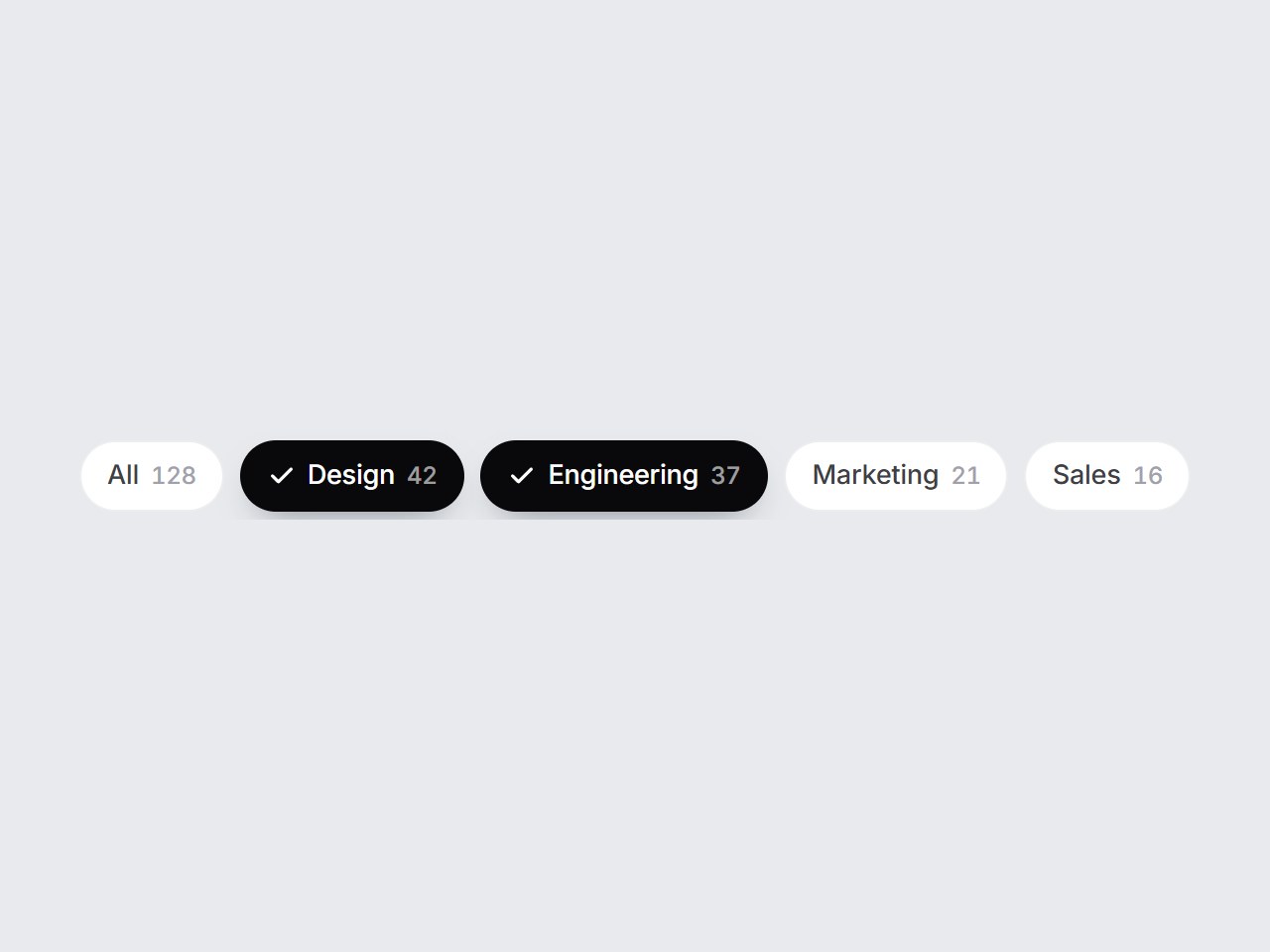
What is this?
A horizontal row of filter chips with counts. The selected chip fills black and a check slides in beside its label. Pass multiple to let several chips stay on at once. Swap the options, then drop it above a list, a gallery, or search results.
Full TSX source. No account needed.
filter-chip-row.tsx
"use client"; import * as React from "react";import { Check } from "lucide-react";import { cn } from "@/lib/utils"; export type FilterChipOption = { value: string; label: string; /** Optional result count shown after the label. */ count?: number;}; export const FILTER_CHIP_DEFAULT_OPTIONS: readonly FilterChipOption[] = [ { value: "all", label: "All", count: 128 }, { value: "design", label: "Design", count: 42 }, { value: "engineering", label: "Engineering", count: 37 }, { value: "marketing", label: "Marketing", count: 21 }, { value: "sales", label: "Sales", count: 16 },]; export type FilterChipRowProps = Omit< React.ComponentPropsWithoutRef<"div">, "onChange" | "defaultValue"> & { options?: readonly FilterChipOption[]; /** Selected values. With `multiple={false}` it holds at most one value. */ value?: readonly string[]; defaultValue?: readonly string[]; /** Allow several chips at once. Single mode always keeps one chip selected. */ multiple?: boolean; onValueChange?: (value: string[]) => void; ariaLabel?: string;}; const EASE = "cubic-bezier(0.22, 1, 0.36, 1)"; export const FilterChipRow = React.forwardRef<HTMLDivElement, FilterChipRowProps>( ( { options = FILTER_CHIP_DEFAULT_OPTIONS, value, defaultValue, multiple = false, onValueChange, ariaLabel = "Filters", className, ...props }, ref, ) => { const items = options.length > 0 ? options : FILTER_CHIP_DEFAULT_OPTIONS; const [uncontrolled, setUncontrolled] = React.useState<string[]>(() => [ ...(defaultValue ?? (items[0] ? [items[0].value] : [])), ]); const selected = value ?? uncontrolled; const chips = React.useRef<(HTMLButtonElement | null)[]>([]); const commit = (next: string[]) => { if (value === undefined) setUncontrolled(next); onValueChange?.(next); }; const toggle = (itemValue: string) => { const isOn = selected.includes(itemValue); if (!multiple) { if (!isOn) commit([itemValue]); return; } commit(isOn ? selected.filter((v) => v !== itemValue) : [...selected, itemValue]); }; const onKeyDown = (event: React.KeyboardEvent<HTMLDivElement>) => { if (event.key !== "ArrowRight" && event.key !== "ArrowLeft") return; const current = chips.current.findIndex((node) => node === document.activeElement); if (current < 0) return; event.preventDefault(); const step = event.key === "ArrowRight" ? 1 : -1; const next = (current + step + items.length) % items.length; chips.current[next]?.focus(); }; return ( <div ref={ref} role="group" aria-label={ariaLabel} data-tsuna-id="filter-chip-row" data-multiple={multiple ? "" : undefined} onKeyDown={onKeyDown} className={cn( "flex max-w-full gap-2 overflow-x-auto px-1 py-1 [scrollbar-width:none] [&::-webkit-scrollbar]:hidden", className, )} {...props} > {items.map((item, i) => { const on = selected.includes(item.value); return ( <button key={item.value} ref={(node) => { chips.current[i] = node; }} type="button" aria-pressed={on} onClick={() => toggle(item.value)} className={cn( "inline-flex h-9 shrink-0 cursor-pointer items-center rounded-full border-0 px-3.5", "text-[13.5px] leading-none font-medium tracking-[-0.01em] whitespace-nowrap", "transition-[background-color,color,box-shadow,transform] duration-300 active:scale-[0.96]", "motion-reduce:transition-none motion-reduce:active:scale-100", "focus-visible:outline-none focus-visible:ring-2 focus-visible:ring-zinc-900/40 focus-visible:ring-offset-2 focus-visible:ring-offset-[#e8eaed]", on ? "bg-zinc-950 text-white shadow-[0_8px_18px_-10px_rgba(15,23,42,0.6)]" : "bg-white text-zinc-700 shadow-[inset_0_0_0_1px_rgba(15,23,42,0.08)] hover:bg-zinc-50 hover:text-zinc-950", )} > <span aria-hidden className="grid overflow-hidden motion-reduce:!transition-none" style={{ gridTemplateColumns: on ? "1fr" : "0fr", marginRight: on ? 6 : 0, opacity: on ? 1 : 0, transition: `grid-template-columns 380ms ${EASE}, margin 380ms ${EASE}, opacity 260ms ${EASE}`, }} > <span className="min-w-0"> <Check className="size-3.5" strokeWidth={2.8} /> </span> </span> {item.label} {item.count !== undefined ? ( <span className={cn( "ml-1.5 text-[12px] tabular-nums transition-colors duration-300 motion-reduce:transition-none", on ? "text-white/60" : "text-zinc-400", )} > {item.count} </span> ) : null} </button> ); })} </div> ); },); FilterChipRow.displayName = "FilterChipRow";
Component
Filter Chip Row
A horizontal row of filter chips with counts. The selected chip fills black and a check slides in beside its label. Pass multiple to let several chips stay on at once. Swap the options, then drop it above a list, a gallery, or search results.
Verified Technical Spec
- Animation
- CSS / Tailwind
- Reduced motion
- Verified
- Keyboard focus
- Verified
- Compatibility
- Tailwind CSS v3.4 + v4 · React 19 / Next.js 15 App Router + Vite / Remix compatible
Included
- Copy source into Cursor or Claude for agent install
- Finished React · TypeScript · Tailwind CSS · Lucide UI
Dependencies
- React 19.0.0
- Typescript 5.7.2
- Tailwindcss 3.4.16
- Lucide-react 1.23.0
Tech Stack
- React
- TypeScript
- Tailwind CSS
- Lucide
Version 1.0.0