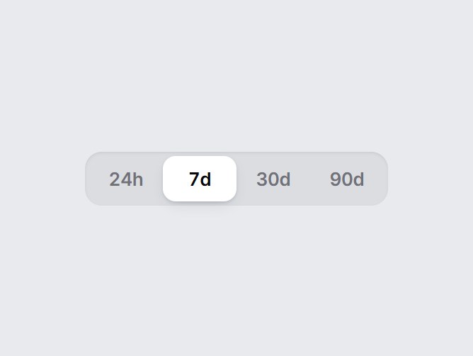
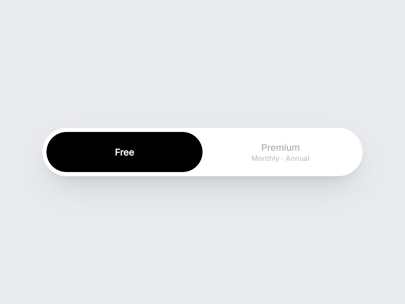
Switches & Selectors
11 components · Switches, tabs, steppers and sliders.
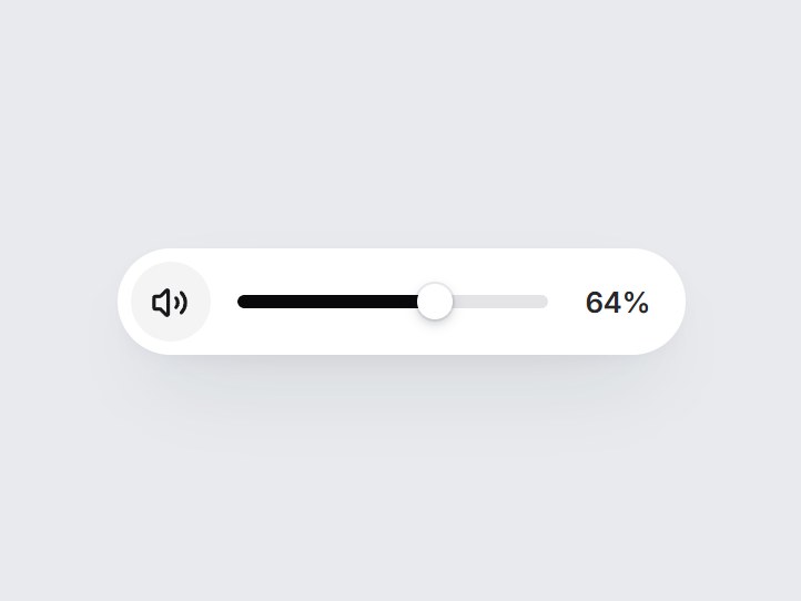
"use client"; import * as React from "react";import { Volume1, Volume2, VolumeX } from "lucide-react";import { cn } from "@/lib/utils"; export type VolumePillSliderProps = Omit< React.ComponentPropsWithoutRef<"div">, "onChange" | "defaultValue"> & { /** 0–100. */ value?: number; defaultValue?: number; onValueChange?: (value: number) => void; muted?: boolean; defaultMuted?: boolean; onMutedChange?: (muted: boolean) => void; /** Keyboard step. */ step?: number; /** Show the percentage after the track. */ showValue?: boolean; /** Accessible name for the slider. */ ariaLabel?: string; muteLabel?: string; unmuteLabel?: string;}; const EASE = "cubic-bezier(0.22, 1, 0.36, 1)"; const clamp = (n: number) => Math.min(100, Math.max(0, Math.round(n))); export const VolumePillSlider = React.forwardRef<HTMLDivElement, VolumePillSliderProps>( ( { value, defaultValue = 64, onValueChange, muted, defaultMuted = false, onMutedChange, step = 5, showValue = true, ariaLabel = "Volume", muteLabel = "Mute", unmuteLabel = "Unmute", className, ...props }, ref, ) => { const [ownValue, setOwnValue] = React.useState(() => clamp(defaultValue)); const [ownMuted, setOwnMuted] = React.useState(defaultMuted); const level = clamp(value ?? ownValue); const isMuted = muted ?? ownMuted; const silent = isMuted || level === 0; const [dragging, setDragging] = React.useState(false); const track = React.useRef<HTMLDivElement | null>(null); const pointer = React.useRef<{ id: number; moved: boolean } | null>(null); const setMuted = (next: boolean) => { if (next === isMuted) return; if (muted === undefined) setOwnMuted(next); onMutedChange?.(next); }; const commit = (next: number) => { const bounded = clamp(next); if (isMuted && bounded > 0) setMuted(false); if (bounded === level) return; if (value === undefined) setOwnValue(bounded); onValueChange?.(bounded); }; const valueAt = (clientX: number) => { const rect = track.current?.getBoundingClientRect(); if (!rect || rect.width === 0) return level; return ((clientX - rect.left) / rect.width) * 100; }; const onPointerDown = (event: React.PointerEvent<HTMLDivElement>) => { if (event.button !== 0) return; event.currentTarget.setPointerCapture(event.pointerId); pointer.current = { id: event.pointerId, moved: false }; // A plain click eases the thumb to the spot; dragging switches to direct follow. commit(valueAt(event.clientX)); }; const onPointerMove = (event: React.PointerEvent<HTMLDivElement>) => { const p = pointer.current; if (!p || p.id !== event.pointerId) return; if (!p.moved) { p.moved = true; setDragging(true); } commit(valueAt(event.clientX)); }; const endPointer = (event: React.PointerEvent<HTMLDivElement>) => { if (pointer.current?.id !== event.pointerId) return; pointer.current = null; setDragging(false); }; const onKeyDown = (event: React.KeyboardEvent<HTMLDivElement>) => { const map: Record<string, number | undefined> = { ArrowRight: level + step, ArrowUp: level + step, ArrowLeft: level - step, ArrowDown: level - step, PageUp: level + step * 4, PageDown: level - step * 4, Home: 0, End: 100, }; const next = map[event.key]; if (next === undefined) return; event.preventDefault(); commit(next); }; const motion = dragging ? "none" : `left 420ms ${EASE}, width 420ms ${EASE}, background-color 300ms ${EASE}`; const icons = [ { Icon: VolumeX, show: silent }, { Icon: Volume1, show: !silent && level < 50 }, { Icon: Volume2, show: !silent && level >= 50 }, ]; return ( <div ref={ref} data-tsuna-id="volume-pill-slider" data-muted={isMuted ? "" : undefined} data-dragging={dragging ? "" : undefined} className={cn( "inline-flex h-12 items-center gap-3 rounded-full bg-white py-[6px] pl-[6px]", showValue ? "pr-4" : "pr-5", "shadow-[0_18px_40px_-18px_rgba(15,23,42,0.28),0_4px_12px_-8px_rgba(15,23,42,0.14)]", className, )} {...props} > <button type="button" aria-pressed={isMuted} aria-label={isMuted ? unmuteLabel : muteLabel} onClick={() => setMuted(!isMuted)} className={cn( "grid size-9 shrink-0 cursor-pointer place-items-center rounded-full border-0", "transition-[background-color,color,transform] duration-300 active:scale-90", "motion-reduce:transition-none motion-reduce:active:scale-100", "focus-visible:outline-none focus-visible:ring-2 focus-visible:ring-zinc-900/35 focus-visible:ring-offset-2", isMuted ? "bg-zinc-950 text-white hover:bg-zinc-800" : "bg-zinc-100 text-zinc-900 hover:bg-zinc-200", )} > <span aria-hidden className="grid"> {icons.map(({ Icon, show }, i) => ( <Icon key={i} className="col-start-1 row-start-1 size-[17px] motion-reduce:!transition-none" strokeWidth={2.2} style={{ opacity: show ? 1 : 0, transform: show ? "scale(1)" : "scale(0.7)", filter: show ? "blur(0)" : "blur(2px)", transition: `opacity 260ms ${EASE}, transform 420ms ${EASE}, filter 260ms ${EASE}`, }} /> ))} </span> </button> <div ref={track} role="slider" tabIndex={0} aria-label={ariaLabel} aria-valuemin={0} aria-valuemax={100} aria-valuenow={level} aria-valuetext={isMuted ? `${level}%, muted` : `${level}%`} onKeyDown={onKeyDown} onPointerDown={onPointerDown} onPointerMove={onPointerMove} onPointerUp={endPointer} onPointerCancel={endPointer} className={cn( "group relative h-9 w-[140px] shrink-0 cursor-pointer touch-none rounded-full select-none", "focus-visible:outline-none focus-visible:ring-2 focus-visible:ring-zinc-900/35 focus-visible:ring-offset-2", )} > <span aria-hidden className="absolute inset-x-0 top-1/2 h-1.5 -translate-y-1/2 overflow-hidden rounded-full bg-zinc-200" > <span className={cn( "absolute inset-y-0 left-0 rounded-full motion-reduce:!transition-none", isMuted ? "bg-zinc-400" : "bg-zinc-950", )} style={{ width: `${level}%`, transition: motion }} /> </span> <span aria-hidden className="absolute top-1/2 size-4 motion-reduce:!transition-none" style={{ left: `${level}%`, transition: motion }} > <span className={cn( "block size-full -translate-x-1/2 -translate-y-1/2 rounded-full bg-white", "shadow-[0_2px_6px_-1px_rgba(15,23,42,0.35),0_0_0_1px_rgba(15,23,42,0.08)]", "transition-transform duration-300 group-hover:scale-110 group-active:scale-125", "motion-reduce:transition-none motion-reduce:group-hover:scale-100 motion-reduce:group-active:scale-100", dragging && "scale-125", )} /> </span> </div> {showValue ? ( <span aria-hidden className={cn( "w-[4ch] text-right text-[13px] leading-none font-semibold tabular-nums tracking-[-0.01em]", "transition-colors duration-300 motion-reduce:transition-none", isMuted ? "text-zinc-400" : "text-zinc-800", )} > {level}% </span> ) : null} </div> ); },); VolumePillSlider.displayName = "VolumePillSlider";