Back to components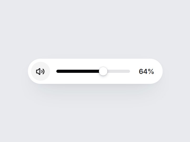
What is this?
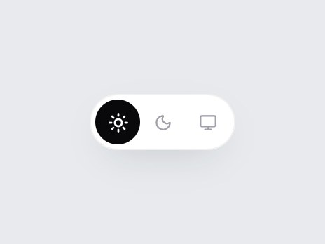
A white pill volume control: a speaker button and a short track. The speaker mutes and unmutes, a click on the track eases the thumb to that spot, and dragging follows the pointer. Arrow keys, Home, and End work too. Swap the starting level and step, then drop it into a video player or a call screen.
Full TSX source. No account needed.
volume-pill-slider.tsx
"use client"; import * as React from "react";import { Volume1, Volume2, VolumeX } from "lucide-react";import { cn } from "@/lib/utils"; export type VolumePillSliderProps = Omit< React.ComponentPropsWithoutRef<"div">, "onChange" | "defaultValue"> & { /** 0–100. */ value?: number; defaultValue?: number; onValueChange?: (value: number) => void; muted?: boolean; defaultMuted?: boolean; onMutedChange?: (muted: boolean) => void; /** Keyboard step. */ step?: number; /** Show the percentage after the track. */ showValue?: boolean; /** Accessible name for the slider. */ ariaLabel?: string; muteLabel?: string; unmuteLabel?: string;}; const EASE = "cubic-bezier(0.22, 1, 0.36, 1)"; const clamp = (n: number) => Math.min(100, Math.max(0, Math.round(n))); export const VolumePillSlider = React.forwardRef<HTMLDivElement, VolumePillSliderProps>( ( { value, defaultValue = 64, onValueChange, muted, defaultMuted = false, onMutedChange, step = 5, showValue = true, ariaLabel = "Volume", muteLabel = "Mute", unmuteLabel = "Unmute", className, ...props }, ref, ) => { const [ownValue, setOwnValue] = React.useState(() => clamp(defaultValue)); const [ownMuted, setOwnMuted] = React.useState(defaultMuted); const level = clamp(value ?? ownValue); const isMuted = muted ?? ownMuted; const silent = isMuted || level === 0; const [dragging, setDragging] = React.useState(false); const track = React.useRef<HTMLDivElement | null>(null); const pointer = React.useRef<{ id: number; moved: boolean } | null>(null); const setMuted = (next: boolean) => { if (next === isMuted) return; if (muted === undefined) setOwnMuted(next); onMutedChange?.(next); }; const commit = (next: number) => { const bounded = clamp(next); if (isMuted && bounded > 0) setMuted(false); if (bounded === level) return; if (value === undefined) setOwnValue(bounded); onValueChange?.(bounded); }; const valueAt = (clientX: number) => { const rect = track.current?.getBoundingClientRect(); if (!rect || rect.width === 0) return level; return ((clientX - rect.left) / rect.width) * 100; }; const onPointerDown = (event: React.PointerEvent<HTMLDivElement>) => { if (event.button !== 0) return; event.currentTarget.setPointerCapture(event.pointerId); pointer.current = { id: event.pointerId, moved: false }; // A plain click eases the thumb to the spot; dragging switches to direct follow. commit(valueAt(event.clientX)); }; const onPointerMove = (event: React.PointerEvent<HTMLDivElement>) => { const p = pointer.current; if (!p || p.id !== event.pointerId) return; if (!p.moved) { p.moved = true; setDragging(true); } commit(valueAt(event.clientX)); }; const endPointer = (event: React.PointerEvent<HTMLDivElement>) => { if (pointer.current?.id !== event.pointerId) return; pointer.current = null; setDragging(false); }; const onKeyDown = (event: React.KeyboardEvent<HTMLDivElement>) => { const map: Record<string, number | undefined> = { ArrowRight: level + step, ArrowUp: level + step, ArrowLeft: level - step, ArrowDown: level - step, PageUp: level + step * 4, PageDown: level - step * 4, Home: 0, End: 100, }; const next = map[event.key]; if (next === undefined) return; event.preventDefault(); commit(next); }; const motion = dragging ? "none" : `left 420ms ${EASE}, width 420ms ${EASE}, background-color 300ms ${EASE}`; const icons = [ { Icon: VolumeX, show: silent }, { Icon: Volume1, show: !silent && level < 50 }, { Icon: Volume2, show: !silent && level >= 50 }, ]; return ( <div ref={ref} data-tsuna-id="volume-pill-slider" data-muted={isMuted ? "" : undefined} data-dragging={dragging ? "" : undefined} className={cn( "inline-flex h-12 items-center gap-3 rounded-full bg-white py-[6px] pl-[6px]", showValue ? "pr-4" : "pr-5", "shadow-[0_18px_40px_-18px_rgba(15,23,42,0.28),0_4px_12px_-8px_rgba(15,23,42,0.14)]", className, )} {...props} > <button type="button" aria-pressed={isMuted} aria-label={isMuted ? unmuteLabel : muteLabel} onClick={() => setMuted(!isMuted)} className={cn( "grid size-9 shrink-0 cursor-pointer place-items-center rounded-full border-0", "transition-[background-color,color,transform] duration-300 active:scale-90", "motion-reduce:transition-none motion-reduce:active:scale-100", "focus-visible:outline-none focus-visible:ring-2 focus-visible:ring-zinc-900/35 focus-visible:ring-offset-2", isMuted ? "bg-zinc-950 text-white hover:bg-zinc-800" : "bg-zinc-100 text-zinc-900 hover:bg-zinc-200", )} > <span aria-hidden className="grid"> {icons.map(({ Icon, show }, i) => ( <Icon key={i} className="col-start-1 row-start-1 size-[17px] motion-reduce:!transition-none" strokeWidth={2.2} style={{ opacity: show ? 1 : 0, transform: show ? "scale(1)" : "scale(0.7)", filter: show ? "blur(0)" : "blur(2px)", transition: `opacity 260ms ${EASE}, transform 420ms ${EASE}, filter 260ms ${EASE}`, }} /> ))} </span> </button> <div ref={track} role="slider" tabIndex={0} aria-label={ariaLabel} aria-valuemin={0} aria-valuemax={100} aria-valuenow={level} aria-valuetext={isMuted ? `${level}%, muted` : `${level}%`} onKeyDown={onKeyDown} onPointerDown={onPointerDown} onPointerMove={onPointerMove} onPointerUp={endPointer} onPointerCancel={endPointer} className={cn( "group relative h-9 w-[140px] shrink-0 cursor-pointer touch-none rounded-full select-none", "focus-visible:outline-none focus-visible:ring-2 focus-visible:ring-zinc-900/35 focus-visible:ring-offset-2", )} > <span aria-hidden className="absolute inset-x-0 top-1/2 h-1.5 -translate-y-1/2 overflow-hidden rounded-full bg-zinc-200" > <span className={cn( "absolute inset-y-0 left-0 rounded-full motion-reduce:!transition-none", isMuted ? "bg-zinc-400" : "bg-zinc-950", )} style={{ width: `${level}%`, transition: motion }} /> </span> <span aria-hidden className="absolute top-1/2 size-4 motion-reduce:!transition-none" style={{ left: `${level}%`, transition: motion }} > <span className={cn( "block size-full -translate-x-1/2 -translate-y-1/2 rounded-full bg-white", "shadow-[0_2px_6px_-1px_rgba(15,23,42,0.35),0_0_0_1px_rgba(15,23,42,0.08)]", "transition-transform duration-300 group-hover:scale-110 group-active:scale-125", "motion-reduce:transition-none motion-reduce:group-hover:scale-100 motion-reduce:group-active:scale-100", dragging && "scale-125", )} /> </span> </div> {showValue ? ( <span aria-hidden className={cn( "w-[4ch] text-right text-[13px] leading-none font-semibold tabular-nums tracking-[-0.01em]", "transition-colors duration-300 motion-reduce:transition-none", isMuted ? "text-zinc-400" : "text-zinc-800", )} > {level}% </span> ) : null} </div> ); },); VolumePillSlider.displayName = "VolumePillSlider";
Component
Volume Pill Slider
A white pill volume control: a speaker button and a short track. The speaker mutes and unmutes, a click on the track eases the thumb to that spot, and dragging follows the pointer. Arrow keys, Home, and End work too. Swap the starting level and step, then drop it into a video player or a call screen.
Verified Technical Spec
- Animation
- CSS / Tailwind
- Reduced motion
- Verified
- Keyboard focus
- Verified
- Compatibility
- Tailwind CSS v3.4 + v4 · React 19 / Next.js 15 App Router + Vite / Remix compatible
Included
- Copy source into Cursor or Claude for agent install
- Finished React · TypeScript · Tailwind CSS · Lucide UI
Dependencies
- React 19.0.0
- Typescript 5.7.2
- Tailwindcss 3.4.16
- Lucide-react 1.23.0
Tech Stack
- React
- TypeScript
- Tailwind CSS
- Lucide
Version 1.0.0