Back to components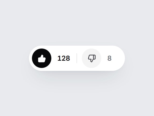
What is this?
A white pill with thumbs up and thumbs down. The chosen side fills black with a quick pop and the count beside it rolls by one; press it again to clear your vote. Swap the counts and labels, then drop it under a help article or an AI answer.
Full TSX source. No account needed.
thumb-vote-pair.tsx
"use client"; import * as React from "react";import { ThumbsDown, ThumbsUp } from "lucide-react";import { cn } from "@/lib/utils"; export type ThumbVote = "up" | "down" | null; export type ThumbVotePairProps = Omit< React.ComponentPropsWithoutRef<"div">, "onChange" | "defaultValue"> & { value?: ThumbVote; defaultValue?: ThumbVote; onValueChange?: (value: ThumbVote) => void; /** Votes from everyone else. The current vote is added on top. */ upCount?: number; /** Optional. When set, a count also shows after the down button. */ downCount?: number; upLabel?: string; downLabel?: string; /** Accessible name for the pair. */ ariaLabel?: string;}; const EASE = "cubic-bezier(0.22, 1, 0.36, 1)"; const CSS = `@keyframes thumb-vote-pair-pop-up { 0% { transform: scale(1); } 40% { transform: translateY(-2px) scale(1.3) rotate(-14deg); } 100% { transform: scale(1) rotate(0deg); } }@keyframes thumb-vote-pair-pop-down { 0% { transform: scale(1); } 40% { transform: translateY(2px) scale(1.3) rotate(14deg); } 100% { transform: scale(1) rotate(0deg); } }@keyframes thumb-vote-pair-in-up { from { transform: translateY(70%); opacity: 0; filter: blur(3px); } to { transform: translateY(0); opacity: 1; filter: blur(0); } }@keyframes thumb-vote-pair-in-down { from { transform: translateY(-70%); opacity: 0; filter: blur(3px); } to { transform: translateY(0); opacity: 1; filter: blur(0); } }@keyframes thumb-vote-pair-out-up { from { transform: translateY(0); opacity: 1; } to { transform: translateY(-70%); opacity: 0; filter: blur(3px); } }@keyframes thumb-vote-pair-out-down { from { transform: translateY(0); opacity: 1; } to { transform: translateY(70%); opacity: 0; filter: blur(3px); } }.thumb-vote-pair-icon { animation-duration: 460ms; animation-timing-function: ${EASE}; animation-fill-mode: both; }.thumb-vote-pair-digit { grid-area: 1 / 1; animation-duration: 420ms; animation-timing-function: ${EASE}; animation-fill-mode: both; }@media (prefers-reduced-motion: reduce) { .thumb-vote-pair-icon, .thumb-vote-pair-digit { animation: none !important; } .thumb-vote-pair-digit[data-leaving] { display: none; }}`; const formatCount = (n: number) => n.toLocaleString("en-US"); type Reel = { value: number; prev: number | null; direction: "up" | "down"; key: number }; /** One rolling number. Keeps the outgoing value for a single swap. */function RollingCount({ value, className }: { value: number; className?: string }) { const [reel, setReel] = React.useState<Reel>({ value, prev: null, direction: "up", key: 0 }); if (reel.value !== value) { setReel({ value, prev: reel.value, direction: value > reel.value ? "up" : "down", key: reel.key + 1, }); } return ( <span className={cn( "grid overflow-hidden py-1 text-[14px] leading-none font-semibold tabular-nums tracking-[-0.02em]", className, )} > {reel.prev !== null ? ( <span key={`out-${reel.key}`} aria-hidden data-leaving="" className="thumb-vote-pair-digit" style={{ animationName: `thumb-vote-pair-out-${reel.direction}` }} onAnimationEnd={() => { const done = reel.key; setReel((cur) => (cur.key === done ? { ...cur, prev: null } : cur)); }} > {formatCount(reel.prev)} </span> ) : null} <span key={`in-${reel.key}`} className="thumb-vote-pair-digit" style={reel.key > 0 ? { animationName: `thumb-vote-pair-in-${reel.direction}` } : undefined} > {formatCount(value)} </span> </span> );} export const ThumbVotePair = React.forwardRef<HTMLDivElement, ThumbVotePairProps>( ( { value, defaultValue = null, onValueChange, upCount = 128, downCount, upLabel = "Helpful", downLabel = "Not helpful", ariaLabel = "Vote", className, ...props }, ref, ) => { const [own, setOwn] = React.useState<ThumbVote>(defaultValue); const vote = value === undefined ? own : value; const [pop, setPop] = React.useState<{ side: "up" | "down"; key: number } | null>(null); const buttons = React.useRef<(HTMLButtonElement | null)[]>([]); const choose = (side: "up" | "down") => { const next: ThumbVote = vote === side ? null : side; if (value === undefined) setOwn(next); if (next) setPop((p) => ({ side: next, key: (p?.key ?? 0) + 1 })); onValueChange?.(next); }; const onKeyDown = (event: React.KeyboardEvent<HTMLDivElement>) => { if (event.key !== "ArrowLeft" && event.key !== "ArrowRight") return; event.preventDefault(); buttons.current[event.key === "ArrowLeft" ? 0 : 1]?.focus(); }; const sides = [ { side: "up" as const, Icon: ThumbsUp, label: upLabel }, { side: "down" as const, Icon: ThumbsDown, label: downLabel }, ]; return ( <div ref={ref} role="group" aria-label={ariaLabel} data-tsuna-id="thumb-vote-pair" data-vote={vote ?? "none"} onKeyDown={onKeyDown} className={cn( "inline-flex items-center gap-1 rounded-full bg-white p-[6px]", "shadow-[0_18px_40px_-18px_rgba(15,23,42,0.28),0_4px_12px_-8px_rgba(15,23,42,0.14)]", className, )} {...props} > <style>{CSS}</style> {sides.map(({ side, Icon, label }, i) => { const on = vote === side; const base = side === "up" ? upCount : downCount; const shown = base === undefined ? undefined : Math.max(0, base + (on ? 1 : 0)); const popping = pop?.side === side && on; return ( <React.Fragment key={side}> {i === 1 ? ( <span aria-hidden className="mx-1.5 h-5 w-px shrink-0 bg-zinc-200" /> ) : null} <button ref={(node) => { buttons.current[i] = node; }} type="button" aria-pressed={on} aria-label={shown === undefined ? label : `${label} (${shown})`} onClick={() => choose(side)} className={cn( "grid size-10 shrink-0 cursor-pointer place-items-center rounded-full border-0", "transition-[background-color,color,transform] duration-300 active:scale-90", "motion-reduce:transition-none motion-reduce:active:scale-100", "focus-visible:outline-none focus-visible:ring-2 focus-visible:ring-zinc-900/35 focus-visible:ring-offset-2", on ? "bg-zinc-950 text-white hover:bg-zinc-800" : "bg-zinc-100 text-zinc-700 hover:bg-zinc-200 hover:text-zinc-950", )} > <Icon key={popping ? `pop-${pop.key}` : "still"} aria-hidden className={cn( "thumb-vote-pair-icon size-[17px] transition-[fill] duration-300 motion-reduce:transition-none", on ? "fill-current" : "fill-transparent", )} style={popping ? { animationName: `thumb-vote-pair-pop-${side}` } : undefined} strokeWidth={2.1} /> </button> {shown !== undefined ? ( <span aria-hidden className={cn(side === "up" ? "pr-1 pl-2" : "pr-3 pl-2")}> <RollingCount value={shown} className={cn( "min-w-[2ch] transition-colors duration-300 motion-reduce:transition-none", on ? "text-zinc-950" : "text-zinc-500", )} /> </span> ) : null} </React.Fragment> ); })} </div> ); },); ThumbVotePair.displayName = "ThumbVotePair";
Component
Thumb Vote Pair
A white pill with thumbs up and thumbs down. The chosen side fills black with a quick pop and the count beside it rolls by one; press it again to clear your vote. Swap the counts and labels, then drop it under a help article or an AI answer.
Verified Technical Spec
- Animation
- CSS / Tailwind
- Reduced motion
- Verified
- Keyboard focus
- Verified
- Compatibility
- Tailwind CSS v3.4 + v4 · React 19 / Next.js 15 App Router + Vite / Remix compatible
Included
- Copy source into Cursor or Claude for agent install
- Finished React · TypeScript · Tailwind CSS · Lucide UI
Dependencies
- React 19.0.0
- Typescript 5.7.2
- Tailwindcss 3.4.16
- Lucide-react 1.23.0
Tech Stack
- React
- TypeScript
- Tailwind CSS
- Lucide
Version 1.0.0