Back to components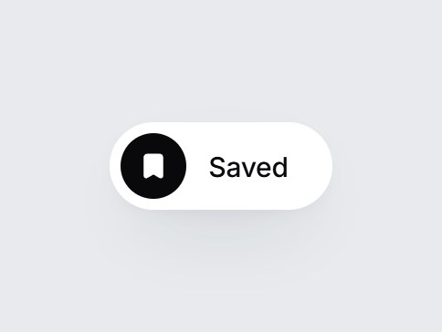
What is this?
A white pill save button: a bookmark icon and a label. Press it and the bookmark fills while “Save” rolls up into “Saved”, and it stays saved until pressed again. Swap the labels, then drop it into the corner of an article, recipe, or product card.
Full TSX source. No account needed.
bookmark-save-toggle.tsx
"use client"; import * as React from "react";import { Bookmark } from "lucide-react";import { cn } from "@/lib/utils"; export type BookmarkSaveToggleProps = Omit< React.ComponentPropsWithoutRef<"button">, "children" | "type" | "value" | "defaultValue"> & { pressed?: boolean; defaultPressed?: boolean; onPressedChange?: (pressed: boolean) => void; /** Resting label. */ label?: string; /** Label while saved. */ savedLabel?: string; /** When set, the saved state reverts on its own after this many ms. Off by default. */ resetMs?: number;}; const EASE = "cubic-bezier(0.22, 1, 0.36, 1)"; const CSS = `@keyframes bookmark-save-toggle-tuck { 0% { transform: translateY(0) scale(1); } 35% { transform: translateY(-3px) scale(0.86, 1.16); } 70% { transform: translateY(1px) scale(1.08, 0.94); } 100% { transform: translateY(0) scale(1); } }.bookmark-save-toggle-tuck { animation: bookmark-save-toggle-tuck 460ms ${EASE} both; }@media (prefers-reduced-motion: reduce) { .bookmark-save-toggle-tuck { animation: none; } }`; export const BookmarkSaveToggle = React.forwardRef<HTMLButtonElement, BookmarkSaveToggleProps>( ( { pressed, defaultPressed = false, onPressedChange, label = "Save", savedLabel = "Saved", resetMs, onClick, className, ...props }, ref, ) => { const [own, setOwn] = React.useState(defaultPressed); const saved = pressed ?? own; const [tuckKey, setTuckKey] = React.useState(0); const timer = React.useRef<ReturnType<typeof setTimeout> | null>(null); React.useEffect( () => () => { if (timer.current) clearTimeout(timer.current); }, [], ); const commit = (next: boolean) => { if (pressed === undefined) setOwn(next); onPressedChange?.(next); }; const handleClick = (event: React.MouseEvent<HTMLButtonElement>) => { onClick?.(event); if (event.defaultPrevented) return; const next = !saved; if (next) setTuckKey((k) => k + 1); commit(next); if (timer.current) clearTimeout(timer.current); if (next && resetMs !== undefined && resetMs > 0) { timer.current = setTimeout(() => commit(false), resetMs); } }; const swap = (visible: boolean, from: "up" | "down"): React.CSSProperties => ({ opacity: visible ? 1 : 0, transform: visible ? "translateY(0)" : `translateY(${from === "up" ? "-70%" : "70%"})`, filter: visible ? "blur(0)" : "blur(3px)", transition: `opacity 360ms ${EASE}, transform 420ms ${EASE}, filter 360ms ${EASE}`, }); return ( <button ref={ref} type="button" data-tsuna-id="bookmark-save-toggle" data-saved={saved ? "" : undefined} aria-pressed={saved} aria-label={label} onClick={handleClick} className={cn( "group inline-flex h-12 cursor-pointer items-center gap-3 rounded-full border-0 bg-white py-[6px] pr-6 pl-[6px]", "text-[15px] font-medium tracking-[-0.01em] text-zinc-900", "shadow-[0_18px_40px_-18px_rgba(15,23,42,0.28),0_4px_12px_-8px_rgba(15,23,42,0.14)]", "transition-transform duration-300 active:scale-[0.98]", "motion-reduce:transition-none motion-reduce:active:scale-100", "focus-visible:outline-none focus-visible:ring-2 focus-visible:ring-zinc-900/35 focus-visible:ring-offset-2 focus-visible:ring-offset-[#e8eaed]", className, )} {...props} > <style>{CSS}</style> <span aria-hidden className={cn( "grid size-9 shrink-0 place-items-center rounded-full", "transition-colors duration-300 motion-reduce:transition-none", saved ? "bg-zinc-950 text-white" : "bg-zinc-100 text-zinc-900 group-hover:bg-zinc-200", )} > <Bookmark key={tuckKey} className={cn( "size-[16px] transition-[fill] duration-300 motion-reduce:transition-none", saved ? "fill-current" : "fill-transparent", tuckKey > 0 && saved && "bookmark-save-toggle-tuck", )} strokeWidth={2.2} /> </span> <span aria-hidden className="relative grid overflow-hidden text-left leading-none"> <span className="col-start-1 row-start-1 py-1 motion-reduce:!transition-none" style={swap(!saved, "up")} > {label} </span> <span className="col-start-1 row-start-1 py-1 text-zinc-950 motion-reduce:!transition-none" style={swap(saved, "down")} > {savedLabel} </span> </span> </button> ); },); BookmarkSaveToggle.displayName = "BookmarkSaveToggle";
Component
Bookmark Save Toggle
A white pill save button: a bookmark icon and a label. Press it and the bookmark fills while “Save” rolls up into “Saved”, and it stays saved until pressed again. Swap the labels, then drop it into the corner of an article, recipe, or product card.
Verified Technical Spec
- Animation
- CSS / Tailwind
- Reduced motion
- Verified
- Keyboard focus
- Verified
- Compatibility
- Tailwind CSS v3.4 + v4 · React 19 / Next.js 15 App Router + Vite / Remix compatible
Included
- Copy source into Cursor or Claude for agent install
- Finished React · TypeScript · Tailwind CSS · Lucide UI
Dependencies
- React 19.0.0
- Typescript 5.7.2
- Tailwindcss 3.4.16
- Lucide-react 1.23.0
Tech Stack
- React
- TypeScript
- Tailwind CSS
- Lucide
Version 1.0.0