Back to components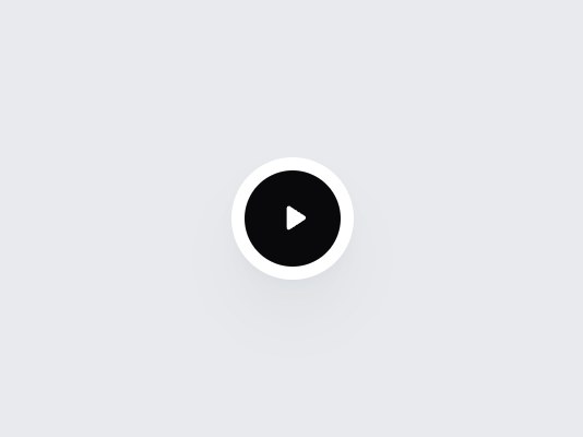
What is this?
Just the play/pause button: a black circle inside a white ring. The triangle and the two bars turn into each other on every press. It only reports the state, so wire it to your own audio or video. Swap the labels, then drop it onto a video thumbnail or a podcast row.
Full TSX source. No account needed.
play-pause-button.tsx
"use client"; import * as React from "react";import { cn } from "@/lib/utils"; export type PlayPauseButtonProps = Omit< React.ComponentPropsWithoutRef<"button">, "children" | "type" | "value" | "defaultValue"> & { playing?: boolean; defaultPlaying?: boolean; onPlayingChange?: (playing: boolean) => void; /** Accessible name while paused (the action the button will take). */ playLabel?: string; /** Accessible name while playing. */ pauseLabel?: string;}; const EASE = "cubic-bezier(0.22, 1, 0.36, 1)"; /** * Only the button. It reports the state; wire `onPlayingChange` to your own * audio or video element. */export const PlayPauseButton = React.forwardRef<HTMLButtonElement, PlayPauseButtonProps>( ( { playing, defaultPlaying = false, onPlayingChange, playLabel = "Play", pauseLabel = "Pause", onClick, className, ...props }, ref, ) => { const [own, setOwn] = React.useState(defaultPlaying); const isPlaying = playing ?? own; const handleClick = (event: React.MouseEvent<HTMLButtonElement>) => { onClick?.(event); if (event.defaultPrevented) return; const next = !isPlaying; if (playing === undefined) setOwn(next); onPlayingChange?.(next); }; // The two bars squeeze toward the middle while the triangle turns in, and back. const bar = (side: "left" | "right"): React.CSSProperties => ({ transformBox: "fill-box", transformOrigin: "center", opacity: isPlaying ? 1 : 0, transform: isPlaying ? "scale(1) translateX(0)" : `scale(0.4, 0.7) translateX(${side === "left" ? "60%" : "-60%"})`, transition: `opacity 260ms ${EASE}, transform 420ms ${EASE}`, }); return ( <button ref={ref} type="button" data-tsuna-id="play-pause-button" data-playing={isPlaying ? "" : undefined} aria-label={isPlaying ? pauseLabel : playLabel} onClick={handleClick} className={cn( "group grid size-14 shrink-0 cursor-pointer place-items-center rounded-full border-0 bg-white p-[6px]", "shadow-[0_18px_40px_-18px_rgba(15,23,42,0.28),0_4px_12px_-8px_rgba(15,23,42,0.14)]", "focus-visible:outline-none focus-visible:ring-2 focus-visible:ring-zinc-900/35 focus-visible:ring-offset-2 focus-visible:ring-offset-[#e8eaed]", className, )} {...props} > <span aria-hidden className={cn( "grid size-full place-items-center rounded-full bg-zinc-950 text-white", "transition-[background-color,transform] duration-300 group-hover:bg-zinc-800 group-active:scale-90", "motion-reduce:transition-none motion-reduce:group-active:scale-100", )} > <svg viewBox="0 0 24 24" className="size-[18px] overflow-visible" fill="currentColor"> <rect x="6" y="5" width="4" height="14" rx="1.4" className="motion-reduce:!transition-none" style={bar("left")} /> <rect x="14" y="5" width="4" height="14" rx="1.4" className="motion-reduce:!transition-none" style={bar("right")} /> <path d="M8.4 5.6c0-1 1.1-1.6 1.95-1.08l9.1 5.98c.78.51.78 1.66 0 2.17l-9.1 5.98c-.85.55-1.95-.06-1.95-1.07V5.6Z" className="motion-reduce:!transition-none" style={{ transformBox: "fill-box", transformOrigin: "center", opacity: isPlaying ? 0 : 1, transform: isPlaying ? "scale(0.5) rotate(-90deg)" : "scale(1) rotate(0deg)", transition: `opacity 260ms ${EASE}, transform 460ms ${EASE}`, }} /> </svg> </span> </button> ); },); PlayPauseButton.displayName = "PlayPauseButton";
Component
Play Pause Button
Just the play/pause button: a black circle inside a white ring. The triangle and the two bars turn into each other on every press. It only reports the state, so wire it to your own audio or video. Swap the labels, then drop it onto a video thumbnail or a podcast row.
Verified Technical Spec
- Animation
- CSS / Tailwind
- Reduced motion
- Verified
- Keyboard focus
- Verified
- Compatibility
- Tailwind CSS v3.4 + v4 · React 19 / Next.js 15 App Router + Vite / Remix compatible
Included
- Copy source into Cursor or Claude for agent install
- Finished React · TypeScript · Tailwind CSS UI
Dependencies
- React 19.0.0
- Typescript 5.7.2
- Tailwindcss 3.4.16
Tech Stack
- React
- TypeScript
- Tailwind CSS
Version 1.0.0