Back to components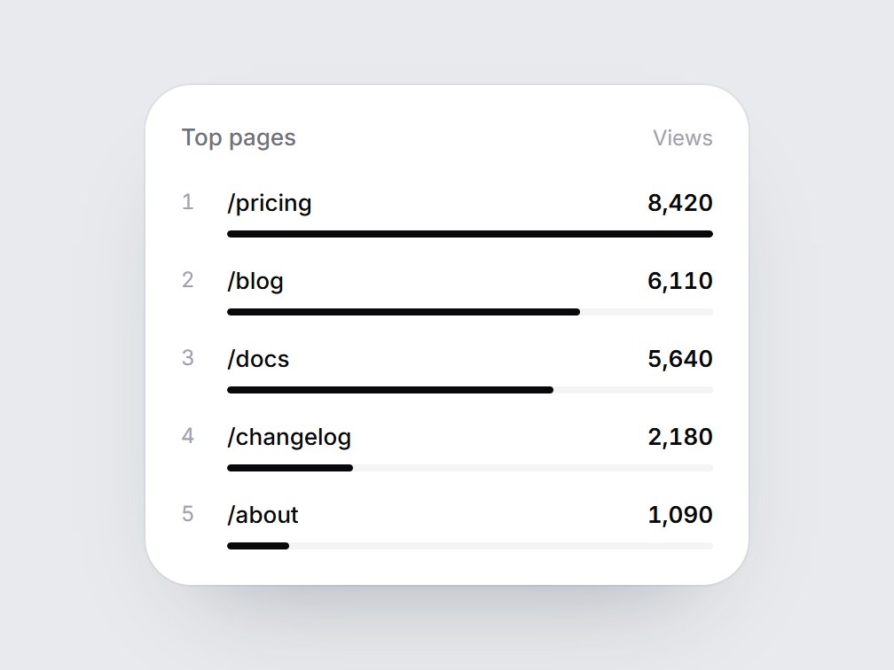
What is this?
A white ranked list of five rows: a rank number, a name, a count, and a thin bar under each. When the card comes into view, the bars grow to their relative widths from the top row down, and the counts fade in with them. Swap the title, column name, and items, then drop it into a top-pages report, a leaderboard, or an analytics feature grid.
Full TSX source. No account needed.
rank-bar-list.tsx
"use client"; import * as React from "react";import { cn } from "@/lib/utils"; export type RankBarItem = { label: string; value: number;}; export const RANK_BAR_LIST_DEFAULT_ITEMS: readonly RankBarItem[] = [ { label: "/pricing", value: 8420 }, { label: "/blog", value: 6110 }, { label: "/docs", value: 5640 }, { label: "/changelog", value: 2180 }, { label: "/about", value: 1090 },]; export type RankBarListProps = React.ComponentPropsWithoutRef<"div"> & { title?: string; /** Column name on the right of the header, e.g. "Views". */ valueLabel?: string; /** Highest first. The rank number comes from the position. */ items?: readonly RankBarItem[];}; const EASE = "cubic-bezier(0.22, 1, 0.36, 1)";const BAR_MS = 800;const STAGGER_MS = 80; export const RankBarList = React.forwardRef<HTMLDivElement, RankBarListProps>( ( { title = "Top pages", valueLabel = "Views", items = RANK_BAR_LIST_DEFAULT_ITEMS, className, ...props }, ref, ) => { const localRef = React.useRef<HTMLDivElement>(null); React.useImperativeHandle(ref, () => localRef.current as HTMLDivElement); const [drawn, setDrawn] = React.useState(false); const top = Math.max(1, ...items.map((item) => item.value)); React.useEffect(() => { const node = localRef.current; if (!node || typeof IntersectionObserver === "undefined") { setDrawn(true); return; } const observer = new IntersectionObserver( ([entry]) => { if (entry?.isIntersecting) { setDrawn(true); observer.disconnect(); } }, { threshold: 0.35 }, ); observer.observe(node); return () => observer.disconnect(); }, []); return ( <div ref={localRef} data-tsuna-id="rank-bar-list" className={cn( "w-[340px] max-w-full rounded-[26px] bg-white p-5 text-zinc-950", "shadow-[0_30px_60px_-34px_rgba(15,23,42,0.35),0_0_0_1px_rgba(15,23,42,0.05)]", className, )} {...props} > <div className="flex items-baseline justify-between gap-3"> <span className="text-[13px] font-medium text-zinc-500">{title}</span> {valueLabel ? <span className="text-[12px] text-zinc-400">{valueLabel}</span> : null} </div> <ol className="m-0 mt-4 flex list-none flex-col gap-3.5 p-0"> {items.map((item, index) => { const delay = index * STAGGER_MS; return ( <li key={item.label} className="grid grid-cols-[18px_minmax(0,1fr)] gap-x-2"> <span className="text-[12px] leading-5 text-zinc-400 tabular-nums">{index + 1}</span> <div className="min-w-0"> <div className="flex items-baseline justify-between gap-3"> <span className="truncate text-[13px] leading-5 font-medium">{item.label}</span> <span className="text-[13px] leading-5 font-semibold tabular-nums motion-reduce:!transition-none" style={{ opacity: drawn ? 1 : 0, transition: `opacity 400ms ${EASE} ${delay + 150}ms`, }} > {item.value.toLocaleString("en-US")} </span> </div> <div className="mt-1.5 h-1 overflow-hidden rounded-full bg-zinc-100"> <div className="h-full origin-left rounded-full bg-zinc-950 motion-reduce:!transition-none" style={{ width: `${Math.max(2, (item.value / top) * 100)}%`, transform: `scaleX(${drawn ? 1 : 0})`, transition: `transform ${BAR_MS}ms ${EASE} ${delay}ms`, }} /> </div> </div> </li> ); })} </ol> </div> ); },); RankBarList.displayName = "RankBarList";
Component
Rank Bar List
A white ranked list of five rows: a rank number, a name, a count, and a thin bar under each. When the card comes into view, the bars grow to their relative widths from the top row down, and the counts fade in with them. Swap the title, column name, and items, then drop it into a top-pages report, a leaderboard, or an analytics feature grid.
Verified Technical Spec
- Animation
- CSS / Tailwind
- Reduced motion
- Verified
- Keyboard focus
- Not detected in source
- Compatibility
- Tailwind CSS v3.4 + v4 · React 19 / Next.js 15 App Router + Vite / Remix compatible
Included
- Copy source into Cursor or Claude for agent install
- Finished React · TypeScript · Tailwind CSS UI
Dependencies
- React 19.0.0
- Typescript 5.7.2
- Tailwindcss 3.4.16
Tech Stack
- React
- TypeScript
- Tailwind CSS
Version 1.0.0