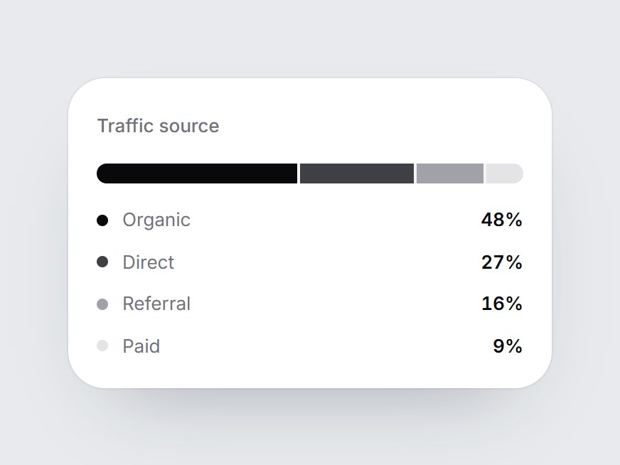
What is this?
A white card with a title, one horizontal 100% stacked bar, and a four-row legend with percents. When the card comes into view, the bar fills from left to right, one segment after another, and each legend row fades in with its segment. Swap the title and segments, then drop it into a traffic report, a channel breakdown, or an analytics feature grid.
Full TSX source. No account needed.
stacked-share-bar.tsx
"use client"; import * as React from "react";import { cn } from "@/lib/utils"; export type StackedShareSegment = { label: string; value: number; /** Any CSS color. Falls back to a zinc step by position. */ color?: string;}; export const STACKED_SHARE_DEFAULT_SEGMENTS: readonly StackedShareSegment[] = [ { label: "Organic", value: 48, color: "#09090b" }, { label: "Direct", value: 27, color: "#3f3f46" }, { label: "Referral", value: 16, color: "#a1a1aa" }, { label: "Paid", value: 9, color: "#e4e4e7" },]; export type StackedShareBarProps = React.ComponentPropsWithoutRef<"div"> & { title?: string; /** Largest first reads best. Shares are computed from the values. */ segments?: readonly StackedShareSegment[];}; const EASE = "cubic-bezier(0.22, 1, 0.36, 1)";const FIRST_MS = 700;const NEXT_MS = 560;const FALLBACK_COLORS = ["#09090b", "#3f3f46", "#a1a1aa", "#e4e4e7"]; /** The first segment leads; each later one starts as the one before it settles. */function segmentDelay(index: number) { return index === 0 ? 0 : FIRST_MS + 80 + (index - 1) * 400;} export const StackedShareBar = React.forwardRef<HTMLDivElement, StackedShareBarProps>( ({ title = "Traffic source", segments = STACKED_SHARE_DEFAULT_SEGMENTS, className, ...props }, ref) => { const localRef = React.useRef<HTMLDivElement>(null); React.useImperativeHandle(ref, () => localRef.current as HTMLDivElement); const [filled, setFilled] = React.useState(false); const parts = React.useMemo(() => { const visible = segments.filter((segment) => segment.value > 0); const total = visible.reduce((sum, segment) => sum + segment.value, 0) || 1; return visible.map((segment, index) => ({ label: segment.label, share: (segment.value / total) * 100, color: segment.color ?? FALLBACK_COLORS[index % FALLBACK_COLORS.length] ?? "#09090b", })); }, [segments]); React.useEffect(() => { const node = localRef.current; if (!node || typeof IntersectionObserver === "undefined") { setFilled(true); return; } const observer = new IntersectionObserver( ([entry]) => { if (entry?.isIntersecting) { setFilled(true); observer.disconnect(); } }, { threshold: 0.35 }, ); observer.observe(node); return () => observer.disconnect(); }, []); const summary = parts.map((part) => `${part.label} ${Math.round(part.share)}%`).join(", "); return ( <div ref={localRef} data-tsuna-id="stacked-share-bar" className={cn( "w-[340px] max-w-full rounded-[26px] bg-white p-5 text-zinc-950", "shadow-[0_30px_60px_-34px_rgba(15,23,42,0.35),0_0_0_1px_rgba(15,23,42,0.05)]", className, )} {...props} > <span className="text-[13px] font-medium text-zinc-500">{title}</span> <div role="img" aria-label={`${title}: ${summary}`} className="mt-4 flex h-3.5 gap-[2px] overflow-hidden rounded-full bg-zinc-100" > {parts.map((part, index) => ( <span key={part.label} className="h-full min-w-0" style={{ width: `${part.share}%` }}> <span className="block h-full w-full origin-left motion-reduce:!transition-none" style={{ backgroundColor: part.color, transform: `scaleX(${filled ? 1 : 0})`, transition: `transform ${index === 0 ? FIRST_MS : NEXT_MS}ms ${EASE} ${segmentDelay(index)}ms`, }} /> </span> ))} </div> <ul className="m-0 mt-4 flex list-none flex-col gap-2.5 p-0"> {parts.map((part, index) => ( <li key={part.label} className="flex items-center gap-2.5 motion-reduce:!transition-none" style={{ opacity: filled ? 1 : 0, transition: `opacity 400ms ${EASE} ${segmentDelay(index) + 120}ms`, }} > <span aria-hidden className="size-2 shrink-0 rounded-full" style={{ backgroundColor: part.color }} /> <span className="min-w-0 flex-1 truncate text-[13px] text-zinc-500">{part.label}</span> <span className="text-[13px] font-semibold tabular-nums">{Math.round(part.share)}%</span> </li> ))} </ul> </div> ); },); StackedShareBar.displayName = "StackedShareBar";
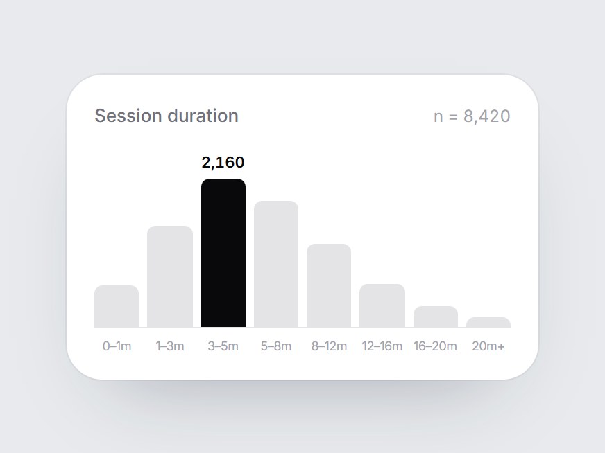
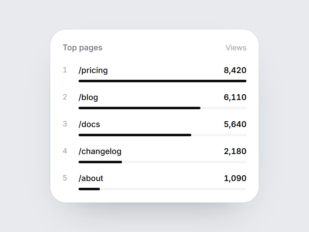
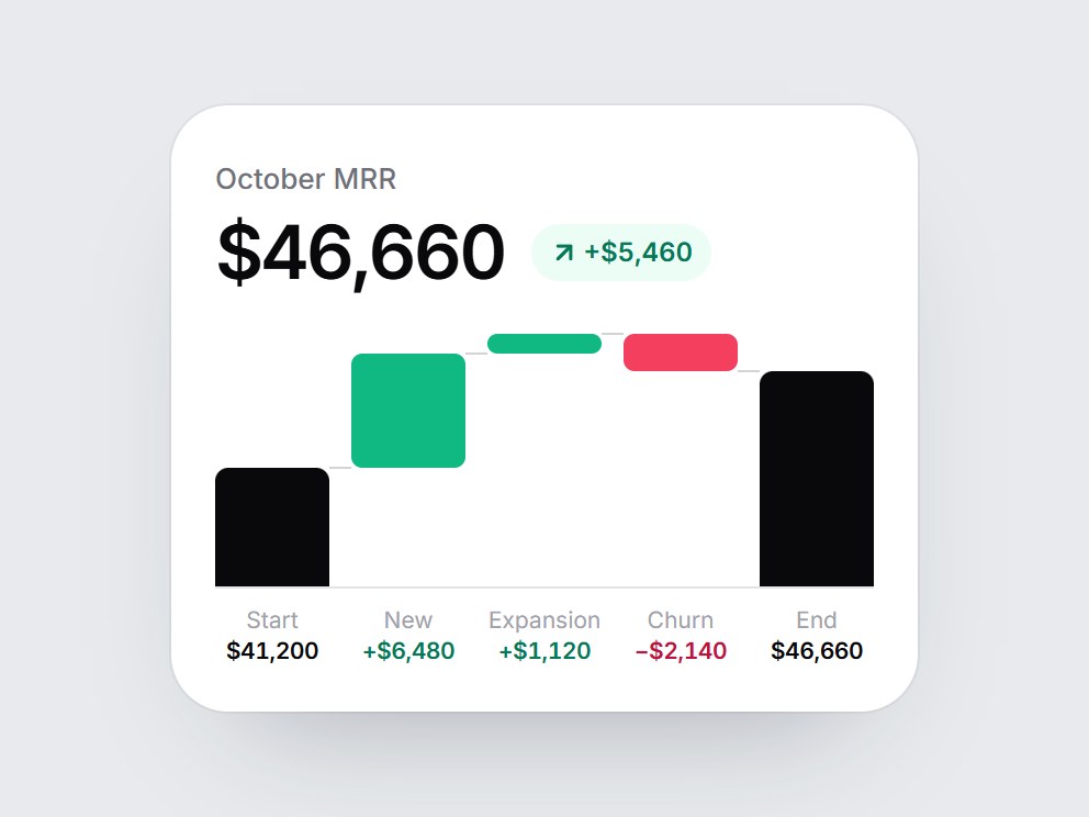
Stacked Share Bar
A white card with a title, one horizontal 100% stacked bar, and a four-row legend with percents. When the card comes into view, the bar fills from left to right, one segment after another, and each legend row fades in with its segment. Swap the title and segments, then drop it into a traffic report, a channel breakdown, or an analytics feature grid.
Verified Technical Spec
- Animation
- CSS / Tailwind
- Reduced motion
- Verified
- Keyboard focus
- Not detected in source
- Compatibility
- Tailwind CSS v3.4 + v4 · React 19 / Next.js 15 App Router + Vite / Remix compatible
Included
- Copy source into Cursor or Claude for agent install
- Finished React · TypeScript · Tailwind CSS UI
Dependencies
- React 19.0.0
- Typescript 5.7.2
- Tailwindcss 3.4.16
Tech Stack
- React
- TypeScript
- Tailwind CSS
Version 1.0.0