Back to components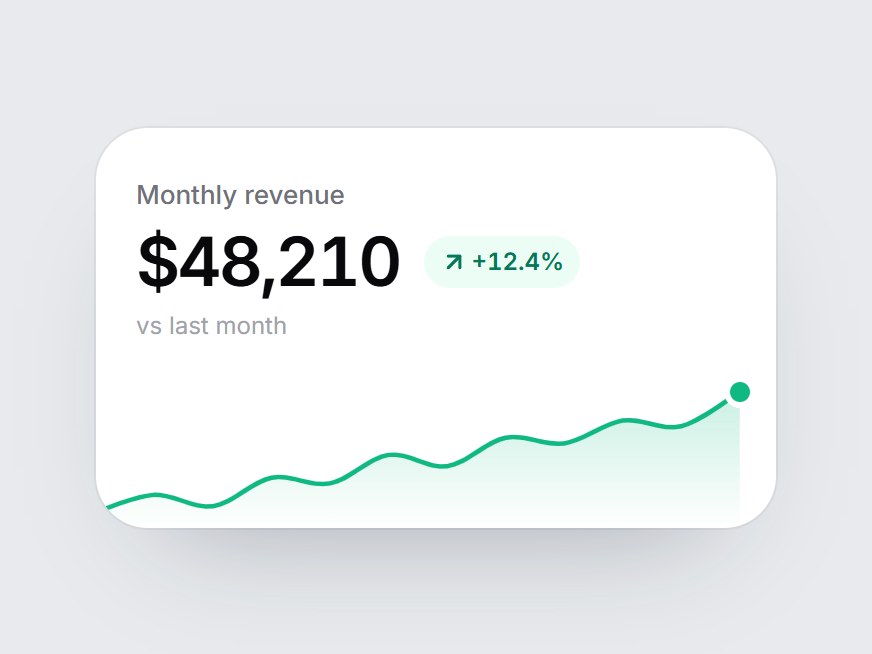
What is this?
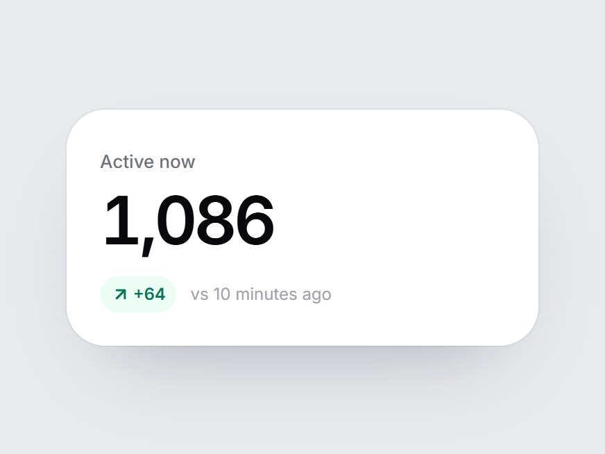
A white KPI tile: a label, a big figure, a delta pill, and a small sparkline. When the card comes into view, the line draws itself from left to right, the area underneath fades in, and the end point pings. Swap the label, value, delta, and points, then drop it into a dashboard row or an analytics feature grid.
Full TSX source. No account needed.
sparkline-kpi-card.tsx
"use client"; import * as React from "react";import { ArrowDownRight, ArrowUpRight } from "lucide-react";import { cn } from "@/lib/utils"; export const SPARKLINE_KPI_DEFAULT_POINTS: readonly number[] = [ 31, 34, 32, 37, 36, 41, 39, 44, 43, 47, 46, 52,]; export type SparklineKpiCardProps = React.ComponentPropsWithoutRef<"div"> & { label: string; /** Pre-formatted figure, e.g. "$48,210". */ value: React.ReactNode; /** Change text, e.g. "+12.4%". */ delta?: string; /** Green up arrow when true, red down arrow when false. */ positive?: boolean; /** Oldest first. 2+ values. */ points?: readonly number[]; /** Caption after the delta, e.g. "vs last month". */ comparison?: string;}; const EASE = "cubic-bezier(0.22, 1, 0.36, 1)";const W = 300;const H = 76;const PAD_Y = 8;/** Room on the right so the end dot is not clipped. */const PAD_R = 16; function round(n: number) { return Math.round(n * 100) / 100;} /** Smooth path through the points (Catmull-Rom → cubic Bézier). */function buildPath(values: readonly number[]) { const min = Math.min(...values); const max = Math.max(...values); const span = max - min || 1; const pts = values.map((v, i) => ({ x: round((i / (values.length - 1)) * (W - PAD_R)), y: round(H - PAD_Y - ((v - min) / span) * (H - PAD_Y * 2)), })); let d = `M ${pts[0]?.x ?? 0} ${pts[0]?.y ?? H}`; for (let i = 0; i < pts.length - 1; i += 1) { const p0 = pts[i - 1] ?? pts[i]!; const p1 = pts[i]!; const p2 = pts[i + 1]!; const p3 = pts[i + 2] ?? p2; const c1 = { x: round(p1.x + (p2.x - p0.x) / 6), y: round(p1.y + (p2.y - p0.y) / 6) }; const c2 = { x: round(p2.x - (p3.x - p1.x) / 6), y: round(p2.y - (p3.y - p1.y) / 6) }; d += ` C ${c1.x} ${c1.y}, ${c2.x} ${c2.y}, ${p2.x} ${p2.y}`; } const last = pts[pts.length - 1] ?? { x: W, y: H }; return { line: d, area: `${d} L ${last.x} ${H} L 0 ${H} Z`, end: last };} const CSS = `@keyframes sparkline-kpi-card-ping { 0% { transform: scale(1); opacity: 0.5; } 100% { transform: scale(3); opacity: 0; } }.sparkline-kpi-card-ping { animation: sparkline-kpi-card-ping 1.8s cubic-bezier(0.22, 1, 0.36, 1) 1.6s infinite; }@media (prefers-reduced-motion: reduce) { .sparkline-kpi-card-ping { animation: none; opacity: 0; } }`; export const SparklineKpiCard = React.forwardRef<HTMLDivElement, SparklineKpiCardProps>( ( { label, value, delta, positive = true, points = SPARKLINE_KPI_DEFAULT_POINTS, comparison = "vs last month", className, ...props }, ref, ) => { const values = points.length >= 2 ? points : SPARKLINE_KPI_DEFAULT_POINTS; const { line, area, end } = React.useMemo(() => buildPath(values), [values]); const localRef = React.useRef<HTMLDivElement>(null); React.useImperativeHandle(ref, () => localRef.current as HTMLDivElement); const [drawn, setDrawn] = React.useState(false); const gradientId = React.useId().replace(/:/g, ""); const color = positive ? "#10b981" : "#f43f5e"; const Arrow = positive ? ArrowUpRight : ArrowDownRight; React.useEffect(() => { const node = localRef.current; if (!node || typeof IntersectionObserver === "undefined") { setDrawn(true); return; } const observer = new IntersectionObserver( ([entry]) => { if (entry?.isIntersecting) { setDrawn(true); observer.disconnect(); } }, { threshold: 0.35 }, ); observer.observe(node); return () => observer.disconnect(); }, []); return ( <div ref={localRef} data-tsuna-id="sparkline-kpi-card" className={cn( "w-[340px] max-w-full overflow-hidden rounded-[26px] bg-white pt-5 text-zinc-950", "shadow-[0_30px_60px_-34px_rgba(15,23,42,0.35),0_0_0_1px_rgba(15,23,42,0.05)]", className, )} {...props} > <style>{CSS}</style> <div className="px-5"> <span className="text-[13px] font-medium text-zinc-500">{label}</span> <div className="mt-1.5 flex flex-wrap items-center gap-x-3 gap-y-1"> <span className="text-[34px] leading-none font-semibold tabular-nums tracking-[-0.04em]"> {value} </span> {delta ? ( <span className={cn( "inline-flex items-center gap-0.5 rounded-full px-2 py-1 text-[12px] font-semibold tabular-nums", positive ? "bg-emerald-50 text-emerald-700" : "bg-rose-50 text-rose-700", )} > <Arrow aria-hidden className="size-3.5" strokeWidth={2.6} /> {delta} </span> ) : null} </div> {delta && comparison ? ( <span className="mt-1.5 block text-[12px] text-zinc-400">{comparison}</span> ) : null} </div> <svg role="img" aria-label={`${label} trend, ${values.length} points`} viewBox={`0 0 ${W} ${H}`} preserveAspectRatio="none" className="mt-4 block h-[76px] w-full overflow-visible" > <defs> <linearGradient id={gradientId} x1="0" y1="0" x2="0" y2="1"> <stop offset="0%" stopColor={color} stopOpacity="0.22" /> <stop offset="100%" stopColor={color} stopOpacity="0" /> </linearGradient> </defs> <path d={area} fill={`url(#${gradientId})`} className="motion-reduce:!transition-none" style={{ opacity: drawn ? 1 : 0, transition: `opacity 900ms ${EASE} 500ms` }} /> <path d={line} pathLength={100} fill="none" stroke={color} strokeWidth={2.25} strokeLinecap="round" strokeLinejoin="round" className="motion-reduce:!transition-none" style={{ strokeDasharray: "100 100", strokeDashoffset: drawn ? 0 : 100, transition: `stroke-dashoffset 1400ms ${EASE}`, }} /> </svg> <div className="relative h-0"> <span aria-hidden className="absolute size-2.5 -translate-x-1/2 -translate-y-1/2 rounded-full ring-[3px] ring-white motion-reduce:!transition-none" style={{ left: `${(end.x / W) * 100}%`, top: -(H - end.y), backgroundColor: color, opacity: drawn ? 1 : 0, transform: `translate(-50%, -50%) scale(${drawn ? 1 : 0.4})`, transition: `opacity 300ms ${EASE} 1250ms, transform 420ms ${EASE} 1250ms`, }} > <span className="sparkline-kpi-card-ping absolute inset-0 rounded-full" style={{ backgroundColor: color }} /> </span> </div> </div> ); },); SparklineKpiCard.displayName = "SparklineKpiCard";Read the guide
Component
Sparkline KPI Card
A white KPI tile: a label, a big figure, a delta pill, and a small sparkline. When the card comes into view, the line draws itself from left to right, the area underneath fades in, and the end point pings. Swap the label, value, delta, and points, then drop it into a dashboard row or an analytics feature grid.
Verified Technical Spec
- Animation
- CSS / Tailwind
- Reduced motion
- Verified
- Keyboard focus
- Not detected in source
- Compatibility
- Tailwind CSS v3.4 + v4 · React 19 / Next.js 15 App Router + Vite / Remix compatible
Included
- Copy source into Cursor or Claude for agent install
- Finished React · TypeScript · Tailwind CSS · Lucide UI
Dependencies
- React 19.0.0
- Typescript 5.7.2
- Tailwindcss 3.4.16
- Lucide-react 1.23.0
Tech Stack
- React
- TypeScript
- Tailwind CSS
- Lucide
Version 1.0.0