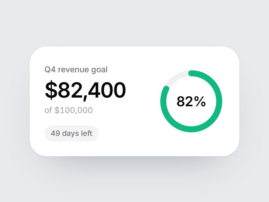
What is this?
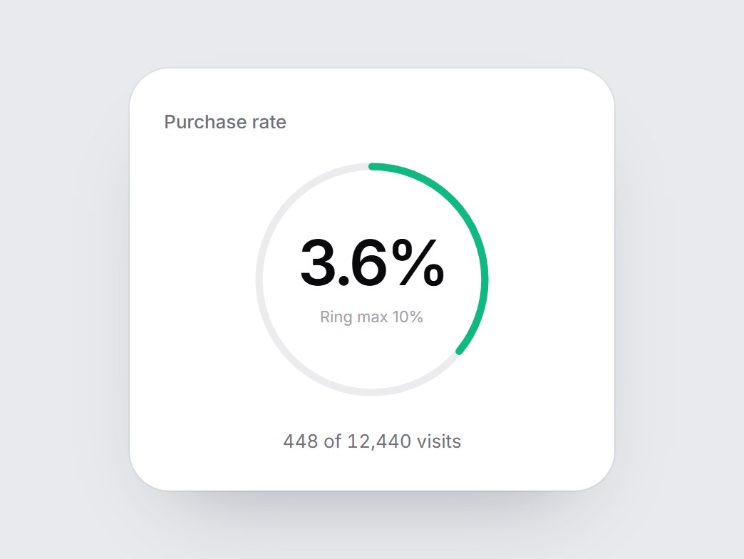
A white goal card: a label, the amount reached, the target, and a closed ring with the percent in its center. When the card comes into view, the green ring draws around to the percent and the amount counts up with it. Swap the label, value, goal, prefix, and caption, then drop it into a revenue dashboard, a fundraising page, or a goals feature block.
Full TSX source. No account needed.
goal-progress-ring.tsx
"use client"; import * as React from "react";import { cn } from "@/lib/utils"; export const GOAL_PROGRESS_RING_DEFAULT_VALUE = 82400;export const GOAL_PROGRESS_RING_DEFAULT_MAX = 100000; export type GoalProgressRingProps = React.ComponentPropsWithoutRef<"div"> & { label?: string; /** Amount reached so far. Counts up from 0. */ value?: number; /** The goal. */ max?: number; /** Short line under the amount, e.g. "49 days left". */ caption?: string; /** Text before each amount, e.g. "$". */ prefix?: string; /** Text after each amount, e.g. " km". */ suffix?: string; /** Word between the amount and the goal. */ ofLabel?: string;}; const EASE = "cubic-bezier(0.22, 1, 0.36, 1)";const DRAW_MS = 1200; function usePrefersReducedMotion() { const [reduced, setReduced] = React.useState(false); React.useEffect(() => { const query = window.matchMedia("(prefers-reduced-motion: reduce)"); const update = () => setReduced(query.matches); update(); query.addEventListener("change", update); return () => query.removeEventListener("change", update); }, []); return reduced;} export const GoalProgressRing = React.forwardRef<HTMLDivElement, GoalProgressRingProps>( ( { label = "Q4 revenue goal", value = GOAL_PROGRESS_RING_DEFAULT_VALUE, max = GOAL_PROGRESS_RING_DEFAULT_MAX, caption = "49 days left", prefix = "$", suffix = "", ofLabel = "of", className, ...props }, ref, ) => { const safeMax = Math.max(1, max); const target = Math.max(0, value); const ratio = Math.min(1, target / safeMax); const localRef = React.useRef<HTMLDivElement>(null); React.useImperativeHandle(ref, () => localRef.current as HTMLDivElement); const reduced = usePrefersReducedMotion(); const [started, setStarted] = React.useState(false); const [count, setCount] = React.useState(0); React.useEffect(() => { const node = localRef.current; if (!node || typeof IntersectionObserver === "undefined") { setStarted(true); return; } const observer = new IntersectionObserver( ([entry]) => { if (entry?.isIntersecting) { setStarted(true); observer.disconnect(); } }, { threshold: 0.35 }, ); observer.observe(node); return () => observer.disconnect(); }, []); React.useEffect(() => { if (!started) return; if (reduced) { setCount(target); return; } let frame = 0; const from = performance.now(); const tick = (now: number) => { const t = Math.min(1, (now - from) / DRAW_MS); setCount(Math.round(target * (1 - Math.pow(1 - t, 3)))); if (t < 1) frame = requestAnimationFrame(tick); }; frame = requestAnimationFrame(tick); return () => cancelAnimationFrame(frame); }, [started, reduced, target]); const shown = started ? ratio : 0; const format = (n: number) => `${prefix}${n.toLocaleString("en-US")}${suffix}`; return ( <div ref={localRef} data-tsuna-id="goal-progress-ring" className={cn( "w-[340px] max-w-full rounded-[28px] bg-white p-6 text-zinc-950", "shadow-[0_30px_60px_-34px_rgba(15,23,42,0.35),0_0_0_1px_rgba(15,23,42,0.05)]", className, )} {...props} > <div className="flex items-center justify-between gap-4"> <div className="min-w-0"> <span className="text-[13px] font-medium text-zinc-500">{label}</span> <div className="mt-1.5 text-[34px] leading-none font-semibold tabular-nums tracking-[-0.04em]"> {format(count)} </div> <span className="mt-1.5 block text-[13px] text-zinc-400 tabular-nums"> {ofLabel} {format(safeMax)} </span> {caption ? ( <span className="mt-3.5 inline-flex rounded-full bg-zinc-100 px-2.5 py-1 text-[12px] font-medium text-zinc-500 motion-reduce:!transition-none" style={{ opacity: started ? 1 : 0, transition: `opacity 400ms ${EASE} 500ms` }} > {caption} </span> ) : null} </div> <div role="meter" aria-label={label} aria-valuemin={0} aria-valuemax={safeMax} aria-valuenow={Math.min(target, safeMax)} aria-valuetext={`${target} of ${safeMax}`} className="relative aspect-square w-[108px] shrink-0" > <svg aria-hidden viewBox="0 0 100 100" className="absolute inset-0 h-full w-full -rotate-90"> <circle cx={50} cy={50} r={42} fill="none" stroke="#f1f1f3" strokeWidth={9} /> <circle cx={50} cy={50} r={42} pathLength={100} fill="none" stroke="#10b981" strokeWidth={9} strokeLinecap="round" className="motion-reduce:!transition-none" style={{ strokeDasharray: "100 100", strokeDashoffset: 100 - shown * 100, opacity: shown > 0 ? 1 : 0, transition: `stroke-dashoffset ${DRAW_MS}ms ${EASE}, opacity 200ms linear`, }} /> </svg> <span className="absolute inset-0 flex items-center justify-center text-[22px] font-semibold tabular-nums tracking-[-0.03em]"> {Math.round((Math.min(count, safeMax) / safeMax) * 100)}% </span> </div> </div> </div> ); },); GoalProgressRing.displayName = "GoalProgressRing";
Goal Progress Ring
A white goal card: a label, the amount reached, the target, and a closed ring with the percent in its center. When the card comes into view, the green ring draws around to the percent and the amount counts up with it. Swap the label, value, goal, prefix, and caption, then drop it into a revenue dashboard, a fundraising page, or a goals feature block.
Verified Technical Spec
- Animation
- CSS / Tailwind
- Reduced motion
- Verified
- Keyboard focus
- Not detected in source
- Compatibility
- Tailwind CSS v3.4 + v4 · React 19 / Next.js 15 App Router + Vite / Remix compatible
Included
- Copy source into Cursor or Claude for agent install
- Finished React · TypeScript · Tailwind CSS UI
Dependencies
- React 19.0.0
- Typescript 5.7.2
- Tailwindcss 3.4.16
Tech Stack
- React
- TypeScript
- Tailwind CSS
Version 1.0.0