Back to blocks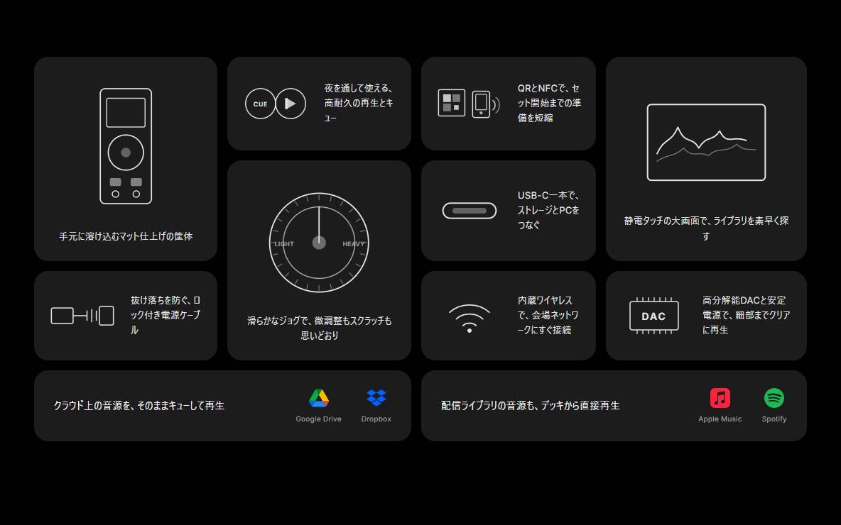
What is this?
A dark product-spec bento: portrait, landscape, and wide tiles in an asymmetric grid. Line-art icons and official service logos present features, ready to drop into the middle of a product landing page. Swap the headlines and integration names, then ship.
Full TSX source. No account needed.
product-feature-bento.tsx
"use client"; import type { ReactNode } from "react";import { cn } from "@/lib/utils"; export type ProductFeatureBentoVisual = | "device" | "power"Read the guide
- Read the guide: Lifetime React Component Libraries in 2026: One-Time Prices Compared (and When a Pass or Subscription Is Cheaper)
- Read the guide: Tailwind Plus Alternatives in 2026: What to Use Now That You Can't Buy Tailwind UI
- Read the guide: Aceternity UI Alternatives in 2026: Animated React Libraries Compared (Free vs Paid)
- Read the guide: AI Product Launch Video Examples: 8 Films Made by AI Agents (and the Launch Page to Go With Each)
BlockPass
Product Feature Bento
A dark product-spec bento: portrait, landscape, and wide tiles in an asymmetric grid. Line-art icons and official service logos present features, ready to drop into the middle of a product landing page. Swap the headlines and integration names, then ship.
Checking access…
Live PreviewVerified Technical Spec
- Animation
- CSS / Tailwind
- Reduced motion
- Standard motion
- Keyboard focus
- Not detected in source
- Compatibility
- Tailwind CSS v3.4 + v4 · React 19 / Next.js 15 App Router + Vite / Remix compatible
Included
- Copy source into Cursor or Claude for agent install
- Responsive on phone, tablet, and desktop
- Finished React · TypeScript · Tailwind CSS UI
Dependencies
- React 19.0.0
- Typescript 5.7.2
- Tailwindcss 3.4.16
Tech Stack
- React
- TypeScript
- Tailwind CSS
Version 1.0.0