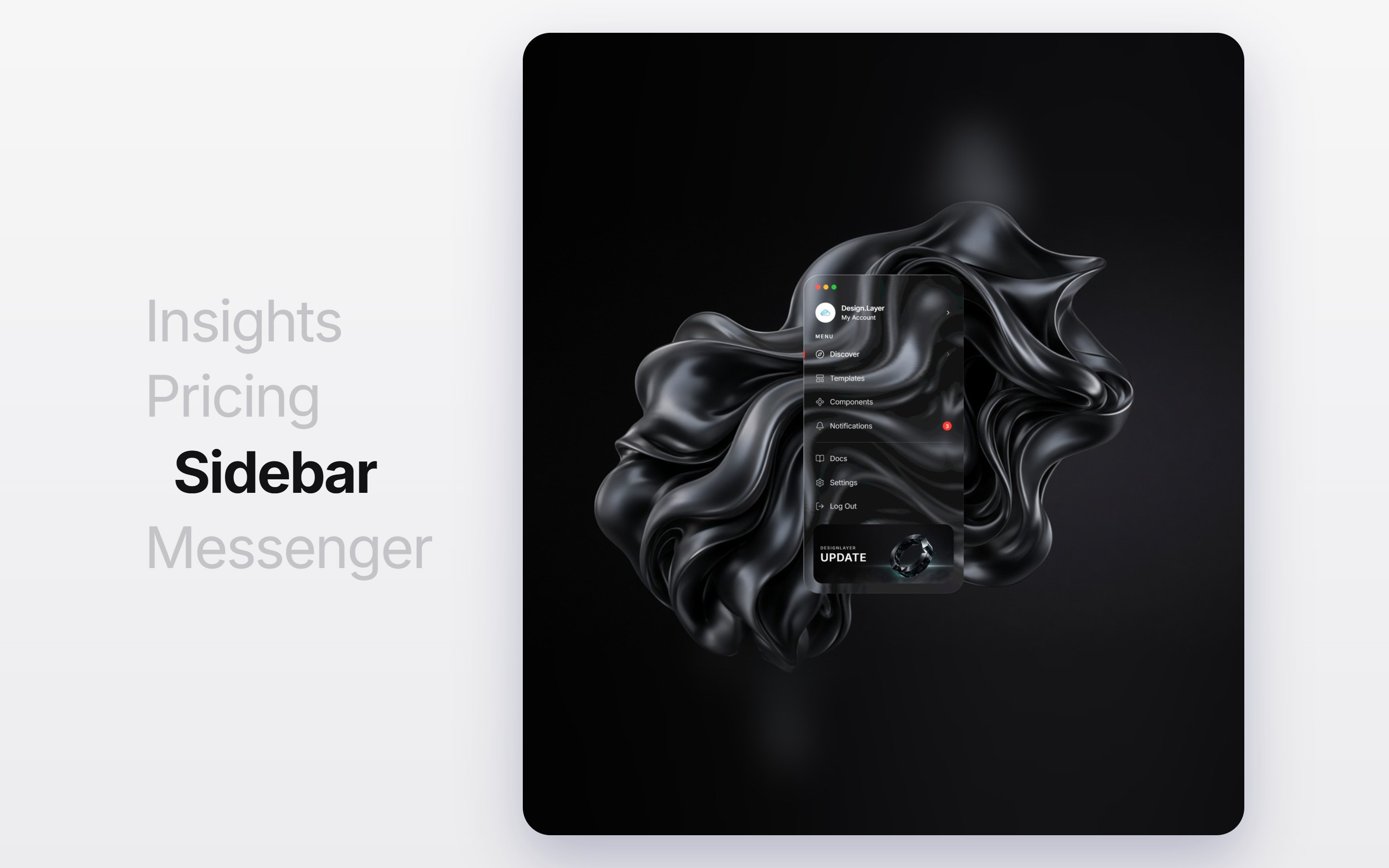
What is this?
A light showcase with large stacked headings such as “Insights” and “Pricing” on the left and a component screen on the right. The active heading turns bold black and nudges right. Scrolling steps to the next heading and clicking a heading scrolls to it; each switch reveals the next panel from its bottom edge upward. Swap the headings and background images, then drop it into a feature section.
Full TSX source. No account needed.
scroll-accordion-showcase.tsx
"use client"; import { useCallback, useEffect, useRef, useState, type CSSProperties,Read the guide



Scroll Feature Showcase
A light showcase with large stacked headings such as “Insights” and “Pricing” on the left and a component screen on the right. The active heading turns bold black and nudges right. Scrolling steps to the next heading and clicking a heading scrolls to it; each switch reveals the next panel from its bottom edge upward. Swap the headings and background images, then drop it into a feature section.
Verified Technical Spec
- Animation
- CSS / Tailwind
- Reduced motion
- Verified
- Keyboard focus
- Not detected in source
- Compatibility
- Tailwind CSS v3.4 + v4 · React 19 / Next.js 15 App Router + Vite / Remix compatible
Included
- Copy source into Cursor or Claude for agent install
- Finished React · TypeScript · Tailwind CSS UI
Dependencies
- React 19.0.0
- Typescript 5.7.2
- Tailwindcss 3.4.16
Tech Stack
- React
- TypeScript
- Tailwind CSS
Version 1.0.0