コンポーネント一覧へ戻る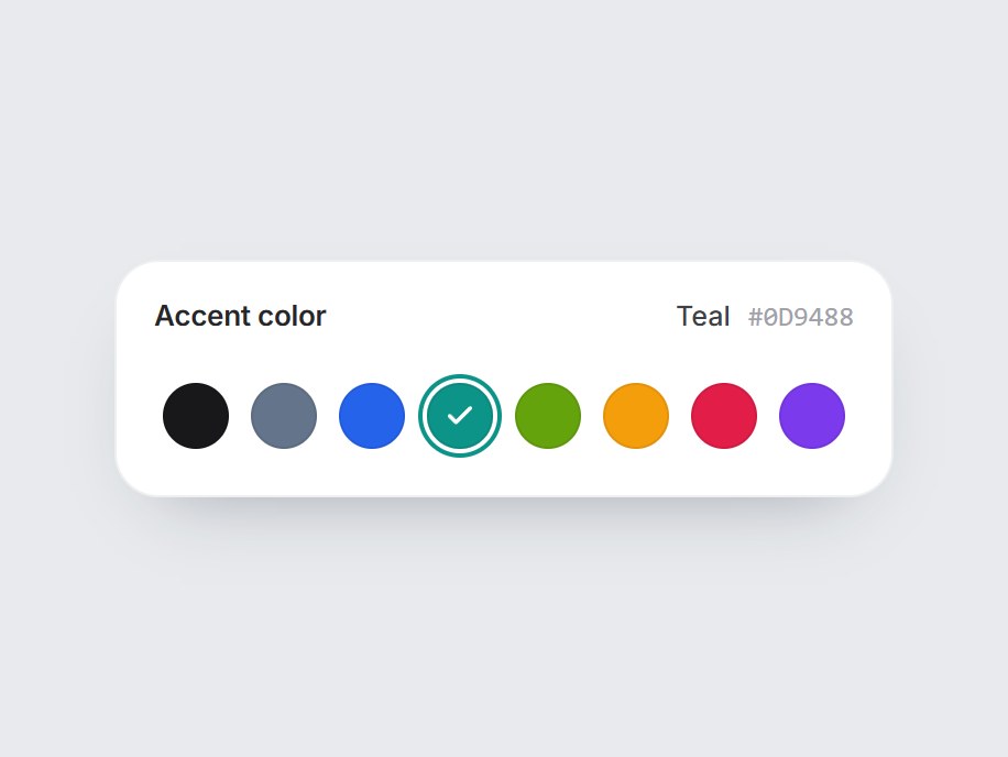
これは何か
アクセントやラベルの色を選ぶ、丸いスウォッチを並べた白いタイルです。選ぶと輪が次の色へ滑りながらその色に変わり、中にチェックが現れます。見出しの横には色の名前と hex が出ます。矢印キーと Home・End でも選べます。色と見出しを差し替えて、テーマ設定やプロジェクトのラベル編集にそのまま置けます。
TSX の全文です。アカウントは不要です。
color-swatch-row.tsx
"use client"; import * as React from "react";import { Check } from "lucide-react";import { cn } from "@/lib/utils"; export type ColorSwatch = { id: string; /** Any CSS color. Hex reads best in the caption. */ value: string; label?: string;}; export type ColorSwatchRowProps = Omit< React.ComponentPropsWithoutRef<"div">, "onChange" | "defaultValue"> & { colors?: readonly ColorSwatch[]; /** Selected swatch id. */ value?: string; defaultValue?: string; onValueChange?: (id: string, swatch: ColorSwatch) => void; /** Heading above the row. Pass "" to hide the header. */ label?: string;}; const EASE = "cubic-bezier(0.22, 1, 0.36, 1)";const SWATCH = 30;const GAP = 10;const SLOT = SWATCH + GAP; const COLOR_SWATCH_DEFAULTS: readonly ColorSwatch[] = [ { id: "ink", value: "#18181b", label: "Ink" }, { id: "slate", value: "#64748b", label: "Slate" }, { id: "ocean", value: "#2563eb", label: "Ocean" }, { id: "teal", value: "#0d9488", label: "Teal" }, { id: "lime", value: "#65a30d", label: "Lime" }, { id: "amber", value: "#f59e0b", label: "Amber" }, { id: "rose", value: "#e11d48", label: "Rose" }, { id: "violet", value: "#7c3aed", label: "Violet" },]; /** True when dark text reads better on the color (hex only; others count as dark). */function isLight(color: string) { const hex = color.trim().match(/^#([0-9a-f]{3}|[0-9a-f]{6})$/i)?.[1]; if (!hex) return false; const full = hex.length === 3 ? hex.replace(/./g, (c) => c + c) : hex; const [r, g, b] = [0, 2, 4].map((i) => parseInt(full.slice(i, i + 2), 16)); return (0.299 * (r ?? 0) + 0.587 * (g ?? 0) + 0.114 * (b ?? 0)) / 255 > 0.68;} export const ColorSwatchRow = React.forwardRef< HTMLDivElement, ColorSwatchRowProps>( ( { colors = COLOR_SWATCH_DEFAULTS, value, defaultValue, onValueChange, label = "Accent color", className, ...props }, ref, ) => { const items = colors.length > 0 ? colors : COLOR_SWATCH_DEFAULTS; const [uncontrolled, setUncontrolled] = React.useState( defaultValue ?? items[2]?.id ?? items[0]?.id ?? "", ); const selectedId = value ?? uncontrolled; const index = Math.max( 0, items.findIndex((item) => item.id === selectedId), ); const selected = items[index]; const buttons = React.useRef<Array<HTMLButtonElement | null>>([]); const choose = (next: number, focus = false) => { const swatch = items[(next + items.length) % items.length]; if (!swatch) return; if (value === undefined) setUncontrolled(swatch.id); onValueChange?.(swatch.id, swatch); if (focus) buttons.current[(next + items.length) % items.length]?.focus(); }; const onKeyDown = (event: React.KeyboardEvent<HTMLDivElement>) => { const keys: Record<string, number> = { ArrowRight: index + 1, ArrowDown: index + 1, ArrowLeft: index - 1, ArrowUp: index - 1, Home: 0, End: items.length - 1, }; const next = keys[event.key]; if (next === undefined) return; event.preventDefault(); choose(next, true); }; return ( <div ref={ref} data-tsuna-id="color-swatch-row" className={cn( "inline-flex max-w-full flex-col gap-3.5 rounded-[20px] bg-white p-4", "shadow-[0_16px_36px_-22px_rgba(15,23,42,0.42),inset_0_0_0_1px_rgba(15,23,42,0.07)]", className, )} {...props} > {label ? ( <div className="flex items-baseline justify-between gap-6 px-0.5"> <span className="text-[13px] font-semibold tracking-[-0.01em] text-zinc-800"> {label} </span> <span aria-hidden className="flex items-center gap-2 text-[12.5px]"> <span key={selected?.id} className="font-medium text-zinc-700 motion-safe:animate-[color-swatch-row-in_360ms_cubic-bezier(0.22,1,0.36,1)]" > {selected?.label ?? selected?.id} </span> <span className="font-mono text-zinc-400 uppercase"> {selected?.value} </span> </span> </div> ) : null} <style>{`@keyframes color-swatch-row-in { from { opacity: 0; transform: translateY(4px); } to { opacity: 1; transform: none; } }`}</style> <div role="radiogroup" aria-label={label || "Color"} onKeyDown={onKeyDown} className="relative flex overflow-x-auto p-1.5 [scrollbar-width:none]" style={{ gap: GAP }} > <span aria-hidden className="pointer-events-none absolute top-1.5 left-1.5 rounded-full motion-reduce:!transition-none" style={{ width: SWATCH, height: SWATCH, boxShadow: `0 0 0 2px #fff, 0 0 0 4px ${selected?.value ?? "#18181b"}`, transform: `translateX(${index * SLOT}px)`, transition: `transform 480ms ${EASE}, box-shadow 480ms ${EASE}`, }} /> {items.map((swatch, i) => { const active = i === index; return ( <button key={swatch.id} ref={(node) => { buttons.current[i] = node; }} type="button" role="radio" aria-checked={active} aria-label={swatch.label ?? swatch.id} title={swatch.label ?? swatch.value} tabIndex={active ? 0 : -1} onClick={() => choose(i)} className={cn( "relative grid shrink-0 cursor-pointer place-items-center rounded-full border-0 p-0", "shadow-[inset_0_0_0_1px_rgba(0,0,0,0.08)] transition-transform duration-300 hover:scale-110 motion-reduce:transition-none motion-reduce:hover:scale-100", "focus-visible:outline-none focus-visible:ring-2 focus-visible:ring-black/40 focus-visible:ring-offset-[3px]", )} style={{ width: SWATCH, height: SWATCH, background: swatch.value, }} > <Check aria-hidden className={cn( "size-3.5 motion-reduce:!transition-none", isLight(swatch.value) ? "text-zinc-900" : "text-white", )} strokeWidth={3} style={{ opacity: active ? 1 : 0, transform: active ? "scale(1)" : "scale(0.3)", transition: `opacity 220ms ${EASE}, transform 420ms ${EASE}`, }} /> </button> ); })} </div> </div> ); },); ColorSwatchRow.displayName = "ColorSwatchRow";
コンポーネント
カラースウォッチロウ
アクセントやラベルの色を選ぶ、丸いスウォッチを並べた白いタイルです。選ぶと輪が次の色へ滑りながらその色に変わり、中にチェックが現れます。見出しの横には色の名前と hex が出ます。矢印キーと Home・End でも選べます。色と見出しを差し替えて、テーマ設定やプロジェクトのラベル編集にそのまま置けます。
Verified Technical Spec
- アニメーション
- CSS / Tailwind
- Reduced motion
- 確認済み
- キーボードフォーカス
- 確認済み
- 対応環境
- Tailwind CSS v3.4 + v4 · React 19 / Next.js 15 App Router + Vite / Remix 対応
含まれるもの
- ソースを Cursor / Claude に渡してエージェントに組み込める
- React · TypeScript · Tailwind CSS · Lucide の完成 UI
依存パッケージ
- React 19.0.0
- Typescript 5.7.2
- Tailwindcss 3.4.16
- Lucide-react 1.23.0
技術スタック
- React
- TypeScript
- Tailwind CSS
- Lucide
バージョン 1.0.0