Back to components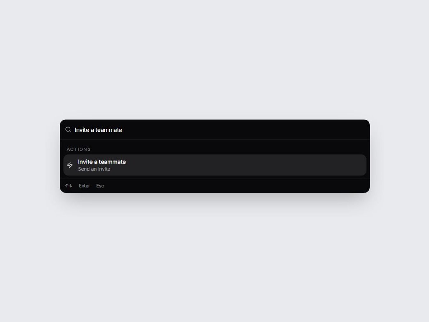
What is this?
A command palette React UI: a ⌘K search modal React teams can paste in like a react cmdk component. Pages, Actions, and Recent come from a props array and filter as you type. Drop it onto SaaS dashboards, dev tools, and admin panels. Dark and light, with spring motion and full keyboard support.
Confirm the chosen command with a toast: Spring Toast Stack
Use cases
- SaaS dashboards, where a command palette React shortcut jumps to a page or runs an action.
- Dev tools that need a react cmdk component: type to filter, then choose a row.
- Admin panels that keep recent records and actions in one ⌘K search modal React users already expect.
Props
| Prop | Type | Default | Description |
|---|---|---|---|
| items | SpringCommandPaletteItem[] | demo items | Rows passed as an array. Each item has id, label, group (pages, actions, or recent), and optional hint and keywords. The demo rows are fictional. |
| variant | "dark" | "light" | "dark" | Dark or light panel, trigger, and stage. |
| openLabel | string | Open palette (⌘K) | Label of the button that opens the palette. Touch devices use this button. |
| placeholder | string | Search commands… | Placeholder on the combobox. |
| title | string | Command palette | Accessible name of the dialog. |
| pagesLabel | string | Pages | Heading for the pages group. |
| actionsLabel | string | Actions | Heading for the actions group. |
| recentLabel | string | Recent | Heading for the recent group. |
| emptyLabel | string | No matching commands | Shown when the filter matches nothing. |
| onSelect | (item) => void | — | Fires when Enter or a click chooses a row. The dialog then closes. Selection is a demo and does not navigate. |
| open | boolean | — | Controlled open state. |
| defaultOpen | boolean | false | Initial open state when open is not controlled. |
| onOpenChange | (open: boolean) => void | — | Called when the palette opens or closes. |
| className | string | — | Extra classes on the trigger wrapper. |
Full TSX source. No account needed.
spring-command-palette.tsx
"use client"; import { useCallback, useEffect, useId, useLayoutEffect, useRef, useState, type KeyboardEvent as ReactKeyboardEvent, type ReactNode,} from "react";import { AnimatePresence, motion, useReducedMotion } from "motion/react";import { Clock, FileText, Search, Zap } from "lucide-react";import { coerceDisplayText } from "@/generation/lib/coerceActionNodes";import { cn } from "@/lib/utils"; export type SpringCommandPaletteGroup = "pages" | "actions" | "recent"; export type SpringCommandPaletteItem = { id: string; label: string; group: SpringCommandPaletteGroup; hint?: string; keywords?: string;}; export type SpringCommandPaletteProps = { items?: SpringCommandPaletteItem[]; variant?: "dark" | "light"; open?: boolean; defaultOpen?: boolean; /** When false, the demo trigger is omitted and the dialog is the only surface. */ showTrigger?: boolean; /** When false, choosing a row keeps the palette open. */ closeOnSelect?: boolean; /** Text already in the search field when the palette opens. */ defaultQuery?: string; /** When false, the result list and key hints stay closed until the query changes. */ defaultExpanded?: boolean; onOpenChange?: (open: boolean) => void; onSelect?: (item: SpringCommandPaletteItem) => void; openLabel?: string; placeholder?: string; title?: string; pagesLabel?: string; actionsLabel?: string; recentLabel?: string; emptyLabel?: string; className?: string;}; const GROUPS: readonly SpringCommandPaletteGroup[] = ["pages", "actions", "recent"]; const GROUP_ICON = { pages: FileText, actions: Zap, recent: Clock,} as const; export const SPRING_COMMAND_PALETTE_DEMO_ITEMS: SpringCommandPaletteItem[] = [ { id: "overview", label: "Overview", group: "pages", hint: "Dashboard", keywords: "home" }, { id: "billing", label: "Billing", group: "pages", hint: "Plans and invoices" }, { id: "team", label: "Team", group: "pages", hint: "Members and roles" }, { id: "audit", label: "Audit log", group: "pages", hint: "Security events" }, { id: "invite", label: "Invite a teammate", group: "actions", hint: "Send an invite" }, { id: "project", label: "Create a project", group: "actions", hint: "New workspace" }, { id: "maintenance", label: "Toggle maintenance mode", group: "actions", hint: "Status page" }, { id: "northwind", label: "Northwind redesign", group: "recent", hint: "Opened yesterday" }, { id: "harbor", label: "Harbor launch checklist", group: "recent", hint: "Edited today" },]; function asPlainString(value: ReactNode, fallback: string): string { const text = coerceDisplayText(value); if (typeof text === "string" && text.trim()) return text; if (typeof text === "number" || typeof text === "bigint") return String(text); return fallback;} function usePrefersReducedMotion() { const fromMotion = useReducedMotion() === true; const [fromMedia, setFromMedia] = useState(false); useEffect(() => { const media = window.matchMedia("(prefers-reduced-motion: reduce)"); const apply = () => setFromMedia(media.matches); apply(); media.addEventListener("change", apply); return () => media.removeEventListener("change", apply); }, []); return fromMotion || fromMedia;} function optionDomId(listId: string, itemId: string) { return `${listId}-${itemId.replace(/[^A-Za-z0-9_-]/g, "-")}`;} function matchesQuery(item: SpringCommandPaletteItem, query: string) { if (!query) return true; const haystack = `${item.label} ${item.hint ?? ""} ${item.keywords ?? ""} ${item.group}`.toLowerCase(); return haystack.includes(query);} export function SpringCommandPalette({ items = SPRING_COMMAND_PALETTE_DEMO_ITEMS, variant = "dark", open: openProp, defaultOpen = false, showTrigger = true, closeOnSelect = true, defaultQuery = "", defaultExpanded = true, onOpenChange, onSelect, openLabel = "Open palette (⌘K)", placeholder = "Search commands…", title = "Command palette", pagesLabel = "Pages", actionsLabel = "Actions", recentLabel = "Recent", emptyLabel = "No matching commands", className,}: SpringCommandPaletteProps) { const reduce = usePrefersReducedMotion(); const dark = variant !== "light"; const reactId = useId(); const [idBase, setIdBase] = useState("spring-command-palette"); useEffect(() => { setIdBase(reactId.replace(/:/g, "")); }, [reactId]); const listId = `${idBase}-list`; const titleId = `${idBase}-title`; const triggerRef = useRef<HTMLButtonElement>(null); const dialogRef = useRef<HTMLDivElement>(null); const inputRef = useRef<HTMLInputElement>(null); const listBodyRef = useRef<HTMLDivElement>(null); const wasOpen = useRef(false); const onOpenChangeRef = useRef(onOpenChange); const onSelectRef = useRef(onSelect); onOpenChangeRef.current = onOpenChange; onSelectRef.current = onSelect; const [uncontrolledOpen, setUncontrolledOpen] = useState(defaultOpen); const open = openProp ?? uncontrolledOpen; const openRef = useRef(open); openRef.current = open; const [query, setQuery] = useState(defaultQuery); const [expanded, setExpanded] = useState(defaultExpanded); const [active, setActive] = useState(0); const [listHeight, setListHeight] = useState<number | null>(null); const triggerLabel = asPlainString(openLabel, "Open palette (⌘K)"); const placeholderText = asPlainString(placeholder, "Search commands…"); const titleText = asPlainString(title, "Command palette"); const emptyText = asPlainString(emptyLabel, "No matching commands"); const groupLabel: Record<SpringCommandPaletteGroup, string> = { pages: asPlainString(pagesLabel, "Pages"), actions: asPlainString(actionsLabel, "Actions"), recent: asPlainString(recentLabel, "Recent"), }; const normalized = query.trim().toLowerCase(); const filtered = items.filter((item) => matchesQuery(item, normalized)); const activeIndex = filtered.length === 0 ? -1 : Math.min(active, filtered.length - 1); const activeItem = activeIndex >= 0 ? filtered[activeIndex] : undefined; const setOpenState = useCallback((next: boolean) => { if (next) setActive(0); if (!next) setQuery(""); onOpenChangeRef.current?.(next); if (openProp === undefined) setUncontrolledOpen(next); }, [openProp]); const itemsKey = items.map((item) => item.id).join("|"); useEffect(() => { setActive((current) => { const nextItems = items.filter((item) => matchesQuery(item, normalized)); const stillThere = nextItems[current]; if (stillThere && matchesQuery(stillThere, normalized)) return current; return 0; }); }, [items, itemsKey, normalized]); useEffect(() => { const onKey = (event: KeyboardEvent) => { if (event.repeat || event.altKey || event.isComposing) return; if (event.key.toLowerCase() !== "k") return; if (!event.metaKey && !event.ctrlKey) return; event.preventDefault(); setOpenState(!openRef.current); }; window.addEventListener("keydown", onKey); return () => window.removeEventListener("keydown", onKey); }, [setOpenState]); const skipMountFocus = useRef(defaultOpen); useEffect(() => { if (!open) return; if (skipMountFocus.current) { skipMountFocus.current = false; return; } const frame = requestAnimationFrame(() => { const input = inputRef.current; if (!input) return; input.focus({ preventScroll: true }); const end = input.value.length; input.setSelectionRange(end, end); }); return () => cancelAnimationFrame(frame); }, [open]); useEffect(() => { if (open) { wasOpen.current = true; return; } if (!wasOpen.current) return; wasOpen.current = false; triggerRef.current?.focus(); }, [open]); useEffect(() => { if (!open) return; const previous = document.body.style.overflow; document.body.style.overflow = "hidden"; const root = dialogRef.current; const onFocusIn = (event: FocusEvent) => { if (!root) return; if (event.target instanceof Node && root.contains(event.target)) return; inputRef.current?.focus({ preventScroll: true }); const input = inputRef.current; if (input) { const end = input.value.length; input.setSelectionRange(end, end); } }; document.addEventListener("focusin", onFocusIn); return () => { document.body.style.overflow = previous; document.removeEventListener("focusin", onFocusIn); }; }, [open]); useLayoutEffect(() => { const node = listBodyRef.current; if (!open || !node) return; const measure = () => setListHeight(node.offsetHeight); measure(); const observer = new ResizeObserver(measure); observer.observe(node); return () => observer.disconnect(); }, [open, normalized, filtered.length, reduce]); useEffect(() => { if (!open || !activeItem) return; document.getElementById(optionDomId(listId, activeItem.id))?.scrollIntoView({ block: "nearest", }); }, [open, activeItem, listId]); function selectItem(item: SpringCommandPaletteItem | undefined) { if (!item) return; onSelectRef.current?.(item); const next = filtered.findIndex((entry) => entry.id === item.id); if (next >= 0) setActive(next); if (!closeOnSelect) { setQuery(item.label); setExpanded(true); return; } setOpenState(false); } function onDialogKeyDown(event: ReactKeyboardEvent<HTMLDivElement>) { if (event.key === "Escape") { event.preventDefault(); event.stopPropagation(); setOpenState(false); return; } if (event.key === "ArrowDown") { event.preventDefault(); if (!expanded) { setExpanded(true); return; } if (filtered.length === 0) return; setActive((index) => Math.min(filtered.length - 1, index + 1)); return; } if (event.key === "ArrowUp") { event.preventDefault(); setActive((index) => Math.max(0, index - 1)); return; } if (event.key === "Enter") { event.preventDefault(); if (!expanded) return; selectItem(activeItem); return; } if (event.key !== "Tab") return; const root = dialogRef.current; if (!root) return; const nodes = [...root.querySelectorAll<HTMLElement>("input, button, [href], [tabindex]:not([tabindex='-1'])")].filter( (node) => !node.hasAttribute("disabled"), ); if (nodes.length === 0) return; const first = nodes[0]; const last = nodes[nodes.length - 1]; if (event.shiftKey && document.activeElement === first) { event.preventDefault(); last.focus(); } else if (!event.shiftKey && document.activeElement === last) { event.preventDefault(); first.focus(); } } const grouped = GROUPS.map((group) => ({ group, label: groupLabel[group], items: filtered.filter((item) => item.group === group), })).filter((group) => group.items.length > 0); return ( <div className={cn("flex flex-col items-center", className)}> {showTrigger ? ( <button ref={triggerRef} type="button" onClick={() => setOpenState(true)} aria-haspopup="dialog" aria-expanded={open} aria-controls={open ? listId : undefined} className={cn( "inline-flex min-h-11 cursor-pointer items-center rounded-full px-4 py-2.5 text-sm font-medium shadow-sm", "focus-visible:outline-none focus-visible:ring-2 focus-visible:ring-sky-400 focus-visible:ring-offset-2", dark ? "border border-white/15 bg-white text-zinc-900 focus-visible:ring-offset-[#e8eaed]" : "border border-zinc-300 bg-zinc-900 text-white focus-visible:ring-offset-[#f4f4f5]", )} > {triggerLabel} </button> ) : null} <AnimatePresence> {open ? ( <motion.div key="spring-command-palette-layer" className="fixed inset-0 z-50" initial={{ opacity: 0 }} animate={{ opacity: 1 }} exit={{ opacity: 0 }} transition={{ duration: reduce ? 0.15 : 0.18 }} > <div className={cn("absolute inset-0", dark ? "bg-[#e8eaed]" : "bg-zinc-900/40 backdrop-blur-md")} /> <div className="pointer-events-none absolute inset-0 flex items-start justify-center px-4 pt-[12vh] sm:px-6 sm:pt-[16vh]"> <motion.div ref={dialogRef} role="dialog" aria-modal="true" aria-labelledby={titleId} onKeyDown={onDialogKeyDown} initial={reduce ? { opacity: 1 } : { opacity: 0, scale: 0.96 }} animate={{ opacity: 1, scale: 1 }} exit={reduce ? { opacity: 1 } : { opacity: 0, scale: 0.96 }} transition={ reduce ? { duration: 0 } : { type: "spring", stiffness: 460, damping: 32, mass: 0.8 } } style={{ transformOrigin: "top center" }} className={cn( "pointer-events-auto w-full max-w-3xl overflow-hidden rounded-2xl border shadow-2xl", dark ? "border-white/10 bg-zinc-950 text-white" : "border-zinc-200 bg-white text-zinc-900", )} > <h2 id={titleId} className="sr-only"> {titleText} </h2> <div className={cn( "flex items-center gap-2 px-3", expanded && "border-b", dark ? "border-white/10" : "border-zinc-200", )} > <Search className={cn("size-4 shrink-0", dark ? "text-zinc-400" : "text-zinc-500")} aria-hidden /> <input ref={inputRef} role="combobox" aria-expanded={expanded} aria-controls={expanded ? listId : undefined} aria-activedescendant={expanded && activeItem ? optionDomId(listId, activeItem.id) : undefined} aria-autocomplete="list" aria-label={titleText} value={query} placeholder={placeholderText} onChange={(event) => { setQuery(event.target.value); setExpanded(true); }} autoComplete="off" autoCorrect="off" spellCheck={false} className={cn( "h-12 w-full bg-transparent text-sm outline-none", "focus-visible:ring-2 focus-visible:ring-inset focus-visible:ring-sky-400", dark ? "text-white placeholder:text-zinc-500" : "text-zinc-900 placeholder:text-zinc-400", )} /> </div> {expanded ? ( <motion.div className="overflow-hidden" initial={false} animate={{ height: listHeight == null || reduce ? "auto" : listHeight }} transition={ reduce || listHeight == null ? { duration: 0 } : { type: "spring", stiffness: 420, damping: 34 } } > <div ref={listBodyRef} id={listId} role="listbox" aria-label={titleText} className="max-h-[min(40rem,70vh)] overflow-y-auto p-2" > {grouped.length === 0 ? ( <p className={cn("px-3 py-8 text-center text-sm", dark ? "text-zinc-400" : "text-zinc-500")}> {emptyText} </p> ) : ( grouped.map((group) => ( <div key={group.group} role="presentation"> <p className={cn( "px-2 pb-1 pt-2 text-[11px] font-medium uppercase tracking-[0.14em]", dark ? "text-zinc-500" : "text-zinc-400", )} > {group.label} </p> {group.items.map((item) => { const index = filtered.indexOf(item); const selected = item.id === activeItem?.id; const Icon = GROUP_ICON[item.group]; return ( <motion.div key={item.id} id={optionDomId(listId, item.id)} role="option" aria-selected={selected} initial={reduce ? { opacity: 0 } : { opacity: 0, y: -8 }} animate={{ opacity: 1, y: 0 }} transition={{ duration: reduce ? 0.12 : 0.28, delay: reduce ? 0 : Math.min(index, 8) * 0.035, }} onMouseEnter={() => { const next = filtered.findIndex((entry) => entry.id === item.id); if (next >= 0) setActive(next); }} onMouseDown={(event) => { event.preventDefault(); const next = filtered.findIndex((entry) => entry.id === item.id); if (next >= 0) setActive(next); }} onClick={() => selectItem(item)} className="relative cursor-pointer rounded-xl px-2 py-2" > {selected && !reduce ? ( <motion.span layoutId="spring-command-palette-active" className={cn( "pointer-events-none absolute inset-0 rounded-xl", dark ? "bg-white/10" : "bg-zinc-900/10", )} transition={{ type: "spring", stiffness: 520, damping: 38 }} /> ) : null} {selected && reduce ? ( <span className={cn( "pointer-events-none absolute inset-0 rounded-xl", dark ? "bg-white/10" : "bg-zinc-900/10", )} /> ) : null} <span className="relative z-[1] flex items-center gap-3"> <Icon className={cn("size-4 shrink-0", dark ? "text-zinc-300" : "text-zinc-500")} aria-hidden /> <span className="min-w-0 flex-1"> <span className="block truncate text-sm font-medium">{item.label}</span> {item.hint ? ( <span className={cn("block truncate text-xs", dark ? "text-zinc-400" : "text-zinc-500")}> {item.hint} </span> ) : null} </span> </span> </motion.div> ); })} </div> )) )} </div> </motion.div> ) : null} {expanded ? ( <div className={cn( "flex items-center gap-4 border-t px-3 py-2 text-[11px]", dark ? "border-white/10 text-zinc-400" : "border-zinc-200 text-zinc-500", )} > <span>↑↓</span> <span>Enter</span> <span>Esc</span> </div> ) : null} </motion.div> </div> </motion.div> ) : null} </AnimatePresence> </div> );} export function SpringCommandPaletteStage({ children, variant = "dark", className,}: { children?: ReactNode; variant?: "dark" | "light"; className?: string;}) { const dark = variant !== "light"; return ( <div data-tsuna-id="spring-command-palette" className={cn( "relative flex min-h-screen w-full items-start justify-center px-6 pt-[18vh] sm:pt-[22vh]", dark ? "bg-[#e8eaed] text-zinc-800" : "bg-[#f4f4f5] text-zinc-900", className, )} > {children} </div> );}Read the guide
Component
Spring Command Palette
A command palette React UI: a ⌘K search modal React teams can paste in like a react cmdk component. Pages, Actions, and Recent come from a props array and filter as you type. Drop it onto SaaS dashboards, dev tools, and admin panels. Dark and light, with spring motion and full keyboard support.
Verified Technical Spec
- Animation
- Framer Motion
- Reduced motion
- Verified
- Keyboard focus
- Verified
- Compatibility
- Tailwind CSS v3.4 + v4 · React 19 / Next.js 15 App Router + Vite / Remix compatible
Included
- Copy source into Cursor or Claude for agent install
- Responsive on phone, tablet, and desktop
- Finished React · TypeScript · Tailwind CSS · Motion · Lucide UI
Dependencies
- React 19.0.0
- Typescript 5.7.2
- Tailwindcss 3.4.16
- Lucide-react 1.23.0
- Motion 12.42.2
Tech Stack
- React
- TypeScript
- Tailwind CSS
- Motion
- Lucide
Version 1.0.0