Back to components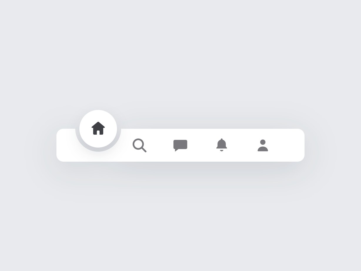
What is this?
A floating white pill tab bar on a light gray canvas. Home, search, messages, notifications, and profile sit in a row; a circle slides to the active tab and bites a semicircle out of the bar. Swap labels, accent color, and links, then drop it onto an app or mobile-style site.
Full TSX source. No account needed.
center-plus-tab-bar.tsx
"use client"; import { useState, type CSSProperties, type MouseEvent, type ReactNode,} from "react";import { coerceDisplayText } from "@/generation/lib/coerceActionNodes";import { cn } from "@/lib/utils"; export type CenterPlusTabKey = | "home" | "search" | "message" | "notification" | "profile"; export type CenterPlusTabBarProps = { homeHref?: string; homeLabel?: string; searchHref?: string; searchLabel?: string; messageHref?: string; messageLabel?: string; notificationHref?: string; notificationLabel?: string; profileHref?: string; profileLabel?: string; /** 初期アクティブ */ active?: CenterPlusTabKey; /** プロフィール右上のドット。true は表示、数値は件数 */ profileBadge?: boolean | number; /** 中央 + の色 */ accentColor?: string; /** アイコン色 */ inkColor?: string; className?: string; contentClassName?: string;}; const DEFAULT_ACCENT = "#22c55e";const DEFAULT_INK = "#3f3f46"; const SLOT_W = 70;const END_PAD = 36;const BAR_H = 56;const BAR_W = END_PAD * 2 + SLOT_W * 5;const CIRCLE = 64;const HOLE = 78;const BAR_RADIUS = 12;const NAV_H = BAR_H + CIRCLE / 2; /** バー左端からの円中心。両端を広く取り、端タブの U ノッチが角に呑まれないようにする */const FAB_X: Record<CenterPlusTabKey, number> = { home: END_PAD + SLOT_W * 0.5, search: END_PAD + SLOT_W * 1.5, message: END_PAD + SLOT_W * 2.5, notification: END_PAD + SLOT_W * 3.5, profile: END_PAD + SLOT_W * 4.5,}; function asPlainString(value: ReactNode, fallback: string): string { const text = coerceDisplayText(value); if (typeof text === "string" && text.trim()) return text; if (typeof text === "number" || typeof text === "bigint") return String(text); return fallback;} function HomeMark() { return ( <svg aria-hidden viewBox="0 0 24 24" className="block h-8 w-8" fill="currentColor" > <path d="M11.2 3.35a1.3 1.3 0 0 1 1.6 0l7.35 6.18c.55.46.2 1.37-.5 1.37H18.4v7.35c0 .72-.58 1.3-1.3 1.3h-3.35v-4.4c0-.5-.4-.9-.9-.9h-1.7c-.5 0-.9.4-.9.9v4.4H6.9c-.72 0-1.3-.58-1.3-1.3V10.9H4.35c-.7 0-1.05-.91-.5-1.37l7.35-6.18Z" /> </svg> );} function ProfileMark() { return ( <svg aria-hidden viewBox="0 0 24 24" className="block h-8 w-8" fill="currentColor" > <circle cx="12" cy="8.1" r="3.35" /> <path d="M5.4 18.85c.55-3.2 3.2-5.15 6.6-5.15s6.05 1.95 6.6 5.15c.08.48-.3.9-.79.9H6.19c-.49 0-.87-.42-.79-.9Z" /> </svg> );} function SearchMark() { return ( <svg aria-hidden viewBox="0 0 24 24" className="block h-8 w-8" fill="none" stroke="currentColor" strokeWidth="2.1" strokeLinecap="round" > <circle cx="10.6" cy="10.6" r="6.1" /> <path d="M15.2 15.2 20 20" /> </svg> );} function MessageMark() { return ( <svg aria-hidden viewBox="0 0 24 24" className="block h-8 w-8" fill="currentColor" > <path d="M5.2 5.2h13.6c.99 0 1.8.81 1.8 1.8v8.1c0 .99-.81 1.8-1.8 1.8H9.4L5 20.2v-3.3h-.2c-.99 0-1.8-.81-1.8-1.8V7c0-.99.81-1.8 1.8-1.8h.4Z" /> </svg> );} function NotificationMark() { return ( <svg aria-hidden viewBox="0 0 24 24" className="block h-8 w-8" fill="currentColor" > <path d="M12 3.4c.66 0 1.2.54 1.2 1.2v.36c2.38.62 4.1 2.76 4.1 5.34v3.28l1.42 1.7c.3.36.04.92-.42.92H5.7c-.46 0-.72-.56-.42-.92l1.42-1.7V10.3c0-2.58 1.72-4.72 4.1-5.34V4.6c0-.66.54-1.2 1.2-1.2Zm0 16.4c1.16 0 2.1-.78 2.1-1.75h-4.2c0 .97.94 1.75 2.1 1.75Z" /> </svg> );} function badgeLabel(badge: boolean | number | undefined): string | null { if (badge === true) return ""; if (typeof badge === "number" && badge > 0) { return badge > 9 ? "9+" : String(badge); } return null;} function TabIcon({ name }: { name: CenterPlusTabKey }) { switch (name) { case "search": return <SearchMark />; case "message": return <MessageMark />; case "notification": return <NotificationMark />; case "profile": return <ProfileMark />; default: return <HomeMark />; }} function TabLink({ href, label, active, onSelect, children,}: { href: string; label: string; active: boolean; onSelect: () => void; children: ReactNode;}) { return ( <a href={href} aria-label={label} aria-current={active ? "page" : undefined} onClick={(event: MouseEvent<HTMLAnchorElement>) => { if (!href || href === "#") event.preventDefault(); onSelect(); }} className={cn( "flex shrink-0 items-center justify-center transition-opacity", active ? "opacity-0" : "opacity-70 hover:opacity-90", )} style={{ color: "var(--cptb-ink)", height: BAR_H, width: SLOT_W }} > {active ? null : children} </a> );} /** * 選択タブの位置でバーをえぐるフローティング・タブバー。 * ホーム/検索/メッセージ/通知/プロフィール。 */export function CenterPlusTabBar({ homeHref = "#", homeLabel = "Home", searchHref = "#", searchLabel = "Search", messageHref = "#", messageLabel = "Messages", notificationHref = "#", notificationLabel = "Notifications", profileHref = "#", profileLabel = "Profile", active = "home", profileBadge = false, accentColor = DEFAULT_ACCENT, inkColor = DEFAULT_INK, className, contentClassName,}: CenterPlusTabBarProps) { const accent = asPlainString(accentColor, DEFAULT_ACCENT); const ink = asPlainString(inkColor, DEFAULT_INK); const homeText = asPlainString(homeLabel, "Home"); const searchText = asPlainString(searchLabel, "Search"); const messageText = asPlainString(messageLabel, "Messages"); const notificationText = asPlainString(notificationLabel, "Notifications"); const profileText = asPlainString(profileLabel, "Profile"); const [current, setCurrent] = useState<CenterPlusTabKey>(active); const badge = badgeLabel(profileBadge); const fabX = FAB_X[current] ?? FAB_X.home; return ( <nav data-tsuna-id="center-plus-tab-bar" aria-label="Primary" className={cn("relative isolate", className)} style={ { width: BAR_W, height: NAV_H, "--cptb-accent": accent, "--cptb-ink": ink, } as CSSProperties } > <div className="pointer-events-none absolute inset-x-0 bottom-0 z-0 drop-shadow-[0_12px_28px_rgba(24,32,48,0.14)]" style={{ height: BAR_H }} > <div className="absolute inset-0 overflow-hidden" style={{ borderRadius: BAR_RADIUS }} > <div className="absolute rounded-full transition-[left] duration-300 ease-out" style={{ left: fabX - HOLE / 2, top: -HOLE / 2, width: HOLE, height: HOLE, boxShadow: "0 0 0 640px #fff", }} /> </div> </div> <div aria-hidden className="pointer-events-none absolute z-30 overflow-hidden rounded-full bg-white shadow-[0_10px_24px_rgba(24,32,48,0.12)] transition-[left,bottom] duration-300 ease-out" style={{ left: fabX - CIRCLE / 2, width: CIRCLE, height: CIRCLE, bottom: BAR_H - CIRCLE / 2, color: "var(--cptb-ink)", }} > <span className="absolute inset-0 flex items-center justify-center leading-none"> <TabIcon name={current} /> </span> </div> <div className={cn( "absolute inset-x-0 bottom-0 z-20 flex items-center bg-transparent", contentClassName, )} style={{ height: BAR_H, paddingLeft: END_PAD, paddingRight: END_PAD }} > <div className="relative z-20 flex items-center"> <TabLink href={homeHref} label={homeText} active={current === "home"} onSelect={() => setCurrent("home")} > <HomeMark /> </TabLink> <TabLink href={searchHref} label={searchText} active={current === "search"} onSelect={() => setCurrent("search")} > <SearchMark /> </TabLink> <TabLink href={messageHref} label={messageText} active={current === "message"} onSelect={() => setCurrent("message")} > <MessageMark /> </TabLink> <TabLink href={notificationHref} label={notificationText} active={current === "notification"} onSelect={() => setCurrent("notification")} > <NotificationMark /> </TabLink> <TabLink href={profileHref} label={profileText} active={current === "profile"} onSelect={() => setCurrent("profile")} > <span className="relative inline-flex"> <ProfileMark /> {badge != null ? ( <span className={cn( "absolute -right-px top-0 flex items-center justify-center rounded-full bg-zinc-900 text-[8px] font-semibold leading-none text-white", badge ? "min-h-[13px] min-w-[13px] px-0.5" : "h-2.5 w-2.5", )} > {badge || <span className="sr-only">New</span>} </span> ) : null} </span> </TabLink> </div> </div> </nav> );} export function CenterPlusTabBarStage({ children, className,}: { children?: ReactNode; className?: string;}) { return ( <div className={cn( "relative flex min-h-screen w-full items-center justify-center bg-[#e8eaed]", className, )} > {children ?? <CenterPlusTabBar />} </div> );}Read the guide
Component
Center Plus Tab Bar
A floating white pill tab bar on a light gray canvas. Home, search, messages, notifications, and profile sit in a row; a circle slides to the active tab and bites a semicircle out of the bar. Swap labels, accent color, and links, then drop it onto an app or mobile-style site.
Verified Technical Spec
- Animation
- CSS / Tailwind
- Reduced motion
- Standard motion
- Keyboard focus
- Not detected in source
- Compatibility
- Tailwind CSS v3.4 + v4 · React 19 / Next.js 15 App Router + Vite / Remix compatible
Included
- Copy source into Cursor or Claude for agent install
- Finished React · TypeScript · Tailwind CSS UI
Dependencies
- React 19.0.0
- Typescript 5.7.2
- Tailwindcss 3.4.16
Tech Stack
- React
- TypeScript
- Tailwind CSS
Version 1.0.0