Back to components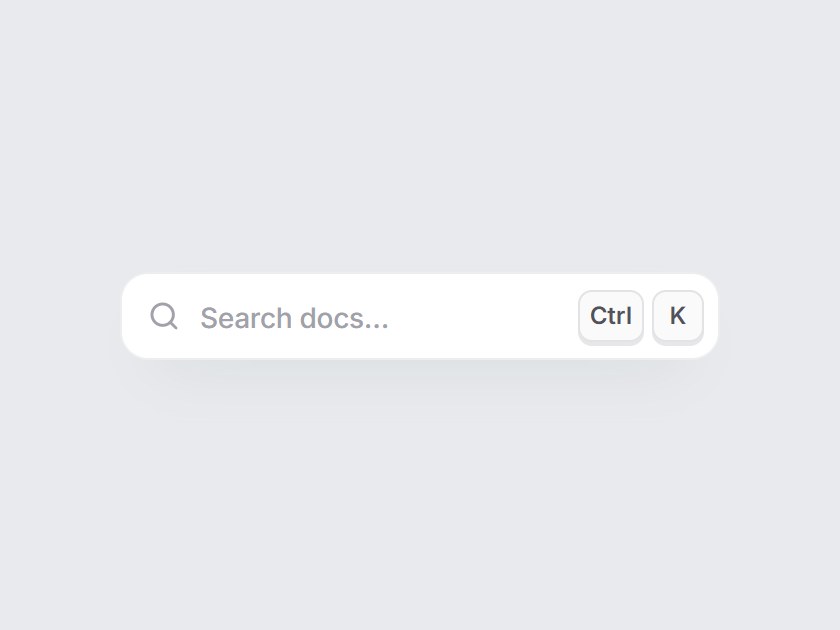
What is this?
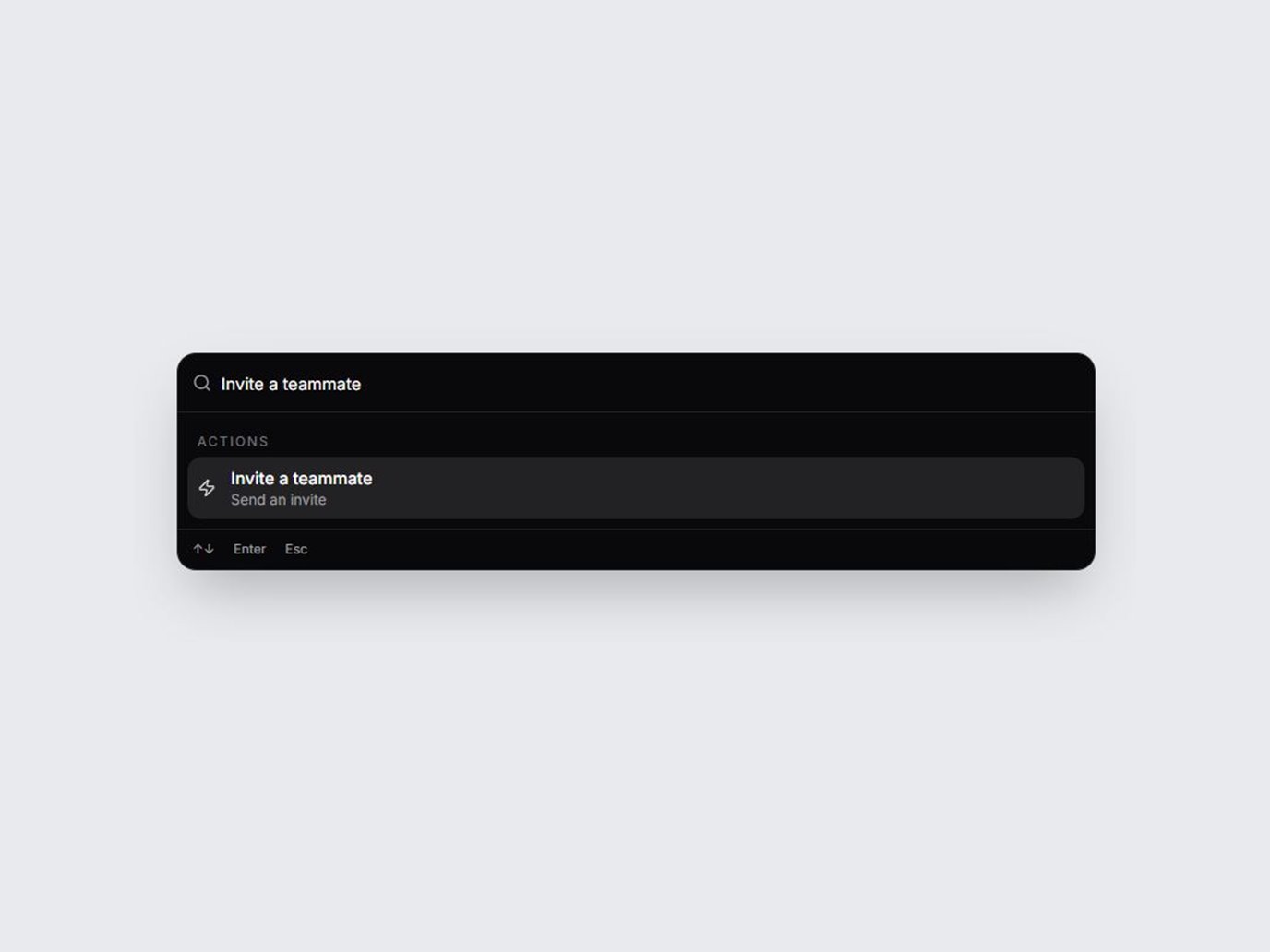
A compact search trigger for a header: a search icon, a quiet label, and keycaps that read ⌘K on Apple devices and Ctrl K elsewhere. The keys lift on hover and sink when you click or press the shortcut. Swap the label and keys, wire onClick to your own palette, then drop it into a docs or app header.
Full TSX source. No account needed.
command-k-hint.tsx
"use client"; import * as React from "react";import { Search } from "lucide-react";import { cn } from "@/lib/utils"; export type CommandKHintProps = Omit< React.ComponentPropsWithoutRef<"button">, "type" | "children" | "onClick"> & { /** Placeholder-like label inside the trigger. */ label?: string; /** * Keys shown on the right, e.g. "⌘K", "Ctrl+K", "/" or "Shift + P". * Leave unset to show ⌘K on Apple devices and Ctrl K elsewhere. */ shortcut?: string; /** Click handler. When set, the default ⌘K / Ctrl+K hotkey also calls it. */ onClick?: () => void; /** Listen for ⌘K / Ctrl+K on the window (only while onClick is set). */ hotkey?: boolean;}; const EASE = "cubic-bezier(0.22, 1, 0.36, 1)"; function splitShortcut(shortcut: string): string[] { const parts = shortcut .split(/\s*\+\s*|\s+/) .map((part) => part.trim()) .filter(Boolean); if (parts.length === 1) { const only = parts[0] ?? ""; // "⌘K" → ["⌘", "K"]; a lone symbol such as "/" stays one key. const symbol = only.match(/^([⌘⌥⇧⌃])(.+)$/); if (symbol) return [symbol[1] ?? "", symbol[2] ?? ""]; } return parts;} export const CommandKHint = React.forwardRef< HTMLButtonElement, CommandKHintProps>( ( { label = "Search docs…", shortcut, onClick, hotkey = true, className, ...props }, ref, ) => { const [platformShortcut, setPlatformShortcut] = React.useState("⌘K"); const [pressed, setPressed] = React.useState(false); const timer = React.useRef<ReturnType<typeof setTimeout> | null>(null); React.useEffect(() => { if (shortcut) return; const platform = (navigator as Navigator & { userAgentData?: { platform?: string } }) .userAgentData?.platform ?? navigator.platform; setPlatformShortcut(/mac|iphone|ipad/i.test(platform) ? "⌘K" : "Ctrl K"); }, [shortcut]); const flash = React.useCallback(() => { setPressed(true); if (timer.current) clearTimeout(timer.current); timer.current = setTimeout(() => setPressed(false), 180); }, []); React.useEffect( () => () => { if (timer.current) clearTimeout(timer.current); }, [], ); React.useEffect(() => { if (!hotkey || !onClick) return; const onKey = (event: KeyboardEvent) => { if ( event.key.toLowerCase() !== "k" || !(event.metaKey || event.ctrlKey) ) return; event.preventDefault(); flash(); onClick(); }; window.addEventListener("keydown", onKey); return () => window.removeEventListener("keydown", onKey); }, [hotkey, onClick, flash]); const keys = splitShortcut(shortcut ?? platformShortcut); return ( <button ref={ref} type="button" data-tsuna-id="command-k-hint" data-pressed={pressed ? "" : undefined} aria-keyshortcuts={keys .join("+") .replace("⌘", "Meta") .replace(/^Ctrl/, "Control")} onClick={() => { flash(); onClick?.(); }} className={cn( "group inline-flex h-11 w-[300px] max-w-full cursor-pointer items-center gap-2.5 rounded-[14px] border-0 bg-white pr-2 pl-3.5 text-left", "shadow-[0_14px_32px_-20px_rgba(15,23,42,0.4),inset_0_0_0_1px_rgba(15,23,42,0.08)]", "transition-shadow duration-300 hover:shadow-[0_18px_36px_-20px_rgba(15,23,42,0.45),inset_0_0_0_1px_rgba(15,23,42,0.16)] motion-reduce:transition-none", "focus-visible:outline-none focus-visible:ring-2 focus-visible:ring-black/30 focus-visible:ring-offset-2 focus-visible:ring-offset-[#e8eaed]", className, )} {...props} > <Search aria-hidden className="size-[16px] shrink-0 text-zinc-400 transition-colors duration-300 group-hover:text-zinc-700 motion-reduce:transition-none" strokeWidth={2.2} /> <span className="min-w-0 flex-1 truncate text-[14px] font-medium tracking-[-0.01em] text-zinc-400 transition-colors duration-300 group-hover:text-zinc-600 motion-reduce:transition-none"> {label} </span> <span aria-hidden className="flex shrink-0 items-center gap-1"> {keys.map((key, index) => ( <kbd key={`${key}-${index}`} className={cn( "inline-grid h-[26px] min-w-[26px] place-items-center rounded-[7px] bg-zinc-50 px-1.5 font-sans text-[12px] leading-none font-semibold text-zinc-600", "shadow-[inset_0_0_0_1px_rgba(15,23,42,0.1),0_2px_0_0_rgba(15,23,42,0.1)]", "group-hover:-translate-y-px group-hover:shadow-[inset_0_0_0_1px_rgba(15,23,42,0.14),0_3px_0_0_rgba(15,23,42,0.12)]", "group-active:translate-y-px group-active:shadow-[inset_0_0_0_1px_rgba(15,23,42,0.14),0_0_0_0_rgba(15,23,42,0.1)]", "motion-reduce:!translate-y-0 motion-reduce:!transition-none", pressed && "!translate-y-px !shadow-[inset_0_0_0_1px_rgba(15,23,42,0.16),0_0_0_0_rgba(15,23,42,0.1)]", )} style={{ transition: `transform 280ms ${EASE}, box-shadow 280ms ${EASE}`, transitionDelay: pressed ? `${index * 40}ms` : "0ms", }} > {key} </kbd> ))} </span> </button> ); },); CommandKHint.displayName = "CommandKHint";
Component
Command K Hint
A compact search trigger for a header: a search icon, a quiet label, and keycaps that read ⌘K on Apple devices and Ctrl K elsewhere. The keys lift on hover and sink when you click or press the shortcut. Swap the label and keys, wire onClick to your own palette, then drop it into a docs or app header.
Verified Technical Spec
- Animation
- CSS / Tailwind
- Reduced motion
- Verified
- Keyboard focus
- Verified
- Compatibility
- Tailwind CSS v3.4 + v4 · React 19 / Next.js 15 App Router + Vite / Remix compatible
Included
- Copy source into Cursor or Claude for agent install
- Finished React · TypeScript · Tailwind CSS · Lucide UI
Dependencies
- React 19.0.0
- Typescript 5.7.2
- Tailwindcss 3.4.16
- Lucide-react 1.23.0
Tech Stack
- React
- TypeScript
- Tailwind CSS
- Lucide
Version 1.0.0