コンポーネント一覧へ戻る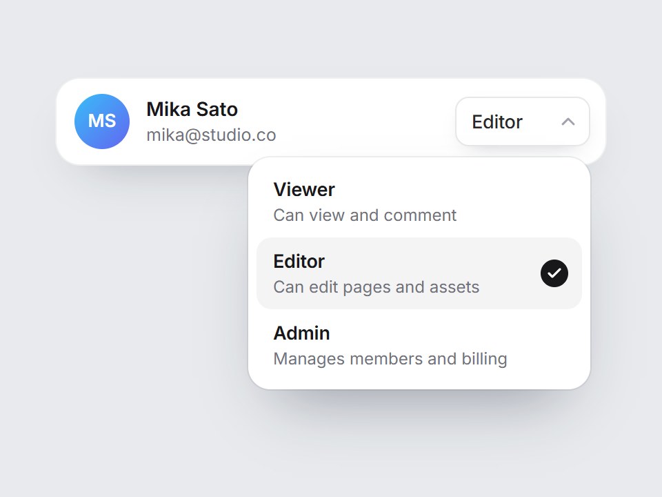
これは何か
メンバー一覧の行に置く、小さな権限の切り替えです。トリガーに今の権限が出て、開くと Viewer・Editor・Admin の短いリストが説明付きで現れます。ポインターや矢印キーに合わせて淡いハイライトが動き、選んだ行へチェックが滑ります。Enter で決定、Escape で閉じます。権限と説明を差し替えて、チーム設定の一覧の各行の右端にそのまま置けます。
TSX の全文です。アカウントは不要です。
member-role-select.tsx
"use client"; import * as React from "react";import { Check, ChevronDown } from "lucide-react";import { cn } from "@/lib/utils"; export type MemberRoleOption = { value: string; label: string; /** One short line under the label in the list. */ description?: string;}; export type MemberRoleSelectProps = Omit< React.ComponentPropsWithoutRef<"div">, "onChange" | "defaultValue"> & { options?: readonly MemberRoleOption[]; value?: string; defaultValue?: string; onValueChange?: (value: string) => void; /** Start with the list open (handy for previews). */ defaultOpen?: boolean; /** Accessible name, e.g. "Role for Mika Sato". */ ariaLabel?: string; /** Which edge of the trigger the list lines up with. */ align?: "start" | "end";}; const EASE = "cubic-bezier(0.22, 1, 0.36, 1)";const ROW = 52; const MEMBER_ROLE_DEFAULTS: readonly MemberRoleOption[] = [ { value: "viewer", label: "Viewer", description: "Can view and comment" }, { value: "editor", label: "Editor", description: "Can edit pages and assets", }, { value: "admin", label: "Admin", description: "Manages members and billing", },]; export const MemberRoleSelect = React.forwardRef< HTMLDivElement, MemberRoleSelectProps>( ( { options = MEMBER_ROLE_DEFAULTS, value, defaultValue, onValueChange, defaultOpen = false, ariaLabel = "Member role", align = "end", className, ...props }, ref, ) => { const items = options.length > 0 ? options : MEMBER_ROLE_DEFAULTS; const id = React.useId(); const [uncontrolled, setUncontrolled] = React.useState( defaultValue ?? items[1]?.value ?? items[0]?.value ?? "", ); const selectedValue = value ?? uncontrolled; const selectedIndex = Math.max( 0, items.findIndex((item) => item.value === selectedValue), ); const selected = items[selectedIndex]; const [open, setOpen] = React.useState(defaultOpen); const [active, setActive] = React.useState(selectedIndex); const rootRef = React.useRef<HTMLDivElement>(null); const triggerRef = React.useRef<HTMLButtonElement>(null); const listRef = React.useRef<HTMLUListElement>(null); React.useImperativeHandle(ref, () => rootRef.current as HTMLDivElement); React.useEffect(() => { if (!open) return; const onPointer = (event: PointerEvent) => { if (!rootRef.current?.contains(event.target as Node)) setOpen(false); }; document.addEventListener("pointerdown", onPointer); return () => document.removeEventListener("pointerdown", onPointer); }, [open]); const openList = (index = selectedIndex) => { setActive(index); setOpen(true); requestAnimationFrame(() => listRef.current?.focus({ preventScroll: true }), ); }; const choose = (index: number) => { const option = items[index]; if (!option) return; if (value === undefined) setUncontrolled(option.value); onValueChange?.(option.value); setActive(index); setOpen(false); triggerRef.current?.focus({ preventScroll: true }); }; const onTriggerKeyDown = ( event: React.KeyboardEvent<HTMLButtonElement>, ) => { if (event.key === "ArrowDown" || event.key === "ArrowUp") { event.preventDefault(); openList(); } }; const onListKeyDown = (event: React.KeyboardEvent<HTMLUListElement>) => { if (event.key === "ArrowDown" || event.key === "ArrowUp") { event.preventDefault(); const step = event.key === "ArrowDown" ? 1 : -1; setActive((current) => (current + step + items.length) % items.length); } else if (event.key === "Home" || event.key === "End") { event.preventDefault(); setActive(event.key === "Home" ? 0 : items.length - 1); } else if (event.key === "Enter" || event.key === " ") { event.preventDefault(); choose(active); } else if (event.key === "Escape") { event.preventDefault(); setOpen(false); triggerRef.current?.focus({ preventScroll: true }); } else if (event.key === "Tab") { setOpen(false); } }; return ( <div ref={rootRef} data-tsuna-id="member-role-select" data-open={open ? "" : undefined} className={cn("relative inline-block", className)} {...props} > <button ref={triggerRef} type="button" aria-haspopup="listbox" aria-expanded={open} aria-controls={`${id}-list`} aria-label={`${ariaLabel}: ${selected?.label ?? ""}`} onClick={() => (open ? setOpen(false) : openList())} onKeyDown={onTriggerKeyDown} className={cn( "inline-flex h-9 cursor-pointer items-center gap-1.5 rounded-[10px] border-0 bg-white py-0 pr-2 pl-3 text-[13.5px] font-medium tracking-[-0.01em] text-zinc-800", "shadow-[0_6px_16px_-10px_rgba(15,23,42,0.35),inset_0_0_0_1px_rgba(15,23,42,0.1)]", "transition-shadow duration-200 hover:shadow-[0_6px_16px_-10px_rgba(15,23,42,0.4),inset_0_0_0_1px_rgba(15,23,42,0.2)] motion-reduce:transition-none", "focus-visible:outline-none focus-visible:ring-2 focus-visible:ring-black/30 focus-visible:ring-offset-2", )} > <span className="min-w-[3.5rem] text-left">{selected?.label}</span> <ChevronDown aria-hidden className="size-4 text-zinc-400 transition-transform duration-300 motion-reduce:transition-none" strokeWidth={2.2} style={{ transform: open ? "rotate(180deg)" : "none", transitionTimingFunction: EASE, }} /> </button> <ul ref={listRef} id={`${id}-list`} role="listbox" tabIndex={-1} aria-label={ariaLabel} aria-activedescendant={open ? `${id}-opt-${active}` : undefined} onKeyDown={onListKeyDown} className={cn( "absolute top-[calc(100%+8px)] z-20 m-0 w-[248px] list-none rounded-[16px] bg-white p-1.5 outline-none", "shadow-[0_24px_48px_-20px_rgba(15,23,42,0.4),0_0_0_1px_rgba(15,23,42,0.07)]", "motion-reduce:!transition-none", align === "end" ? "right-0 origin-top-right" : "left-0 origin-top-left", open ? "pointer-events-auto" : "pointer-events-none", )} style={{ opacity: open ? 1 : 0, transform: open ? "none" : "translateY(-6px) scale(0.97)", visibility: open ? "visible" : "hidden", transition: `opacity 220ms ${EASE}, transform 320ms ${EASE}, visibility 0s linear ${open ? "0s" : "320ms"}`, }} > {/* hover / keyboard highlight that glides between rows */} <span aria-hidden className="pointer-events-none absolute right-1.5 left-1.5 rounded-[11px] bg-zinc-100 motion-reduce:!transition-none" style={{ top: 6, height: ROW, transform: `translateY(${active * ROW}px)`, transition: `transform 300ms ${EASE}`, }} /> {/* the check slides to the chosen row */} <span aria-hidden className="pointer-events-none absolute right-4 grid size-5 place-items-center rounded-full bg-zinc-900 text-white motion-reduce:!transition-none" style={{ top: 6 + (ROW - 20) / 2, transform: `translateY(${selectedIndex * ROW}px)`, transition: `transform 440ms ${EASE}`, }} > <Check className="size-3" strokeWidth={3.2} /> </span> {items.map((option, index) => ( <li key={option.value} id={`${id}-opt-${index}`} role="option" aria-selected={index === selectedIndex} onPointerEnter={() => setActive(index)} onClick={() => choose(index)} className="relative flex cursor-pointer flex-col justify-center pr-11 pl-3" style={{ height: ROW }} > <span className="text-[13.5px] font-semibold tracking-[-0.01em] text-zinc-900"> {option.label} </span> {option.description ? ( <span className="truncate text-[12px] text-zinc-500"> {option.description} </span> ) : null} </li> ))} </ul> </div> ); },); MemberRoleSelect.displayName = "MemberRoleSelect";

コンポーネント
メンバー権限セレクト
メンバー一覧の行に置く、小さな権限の切り替えです。トリガーに今の権限が出て、開くと Viewer・Editor・Admin の短いリストが説明付きで現れます。ポインターや矢印キーに合わせて淡いハイライトが動き、選んだ行へチェックが滑ります。Enter で決定、Escape で閉じます。権限と説明を差し替えて、チーム設定の一覧の各行の右端にそのまま置けます。
Verified Technical Spec
- アニメーション
- CSS / Tailwind
- Reduced motion
- 確認済み
- キーボードフォーカス
- 確認済み
- 対応環境
- Tailwind CSS v3.4 + v4 · React 19 / Next.js 15 App Router + Vite / Remix 対応
含まれるもの
- ソースを Cursor / Claude に渡してエージェントに組み込める
- React · TypeScript · Tailwind CSS · Lucide の完成 UI
依存パッケージ
- React 19.0.0
- Typescript 5.7.2
- Tailwindcss 3.4.16
- Lucide-react 1.23.0
技術スタック
- React
- TypeScript
- Tailwind CSS
- Lucide
バージョン 1.0.0