コンポーネント一覧へ戻る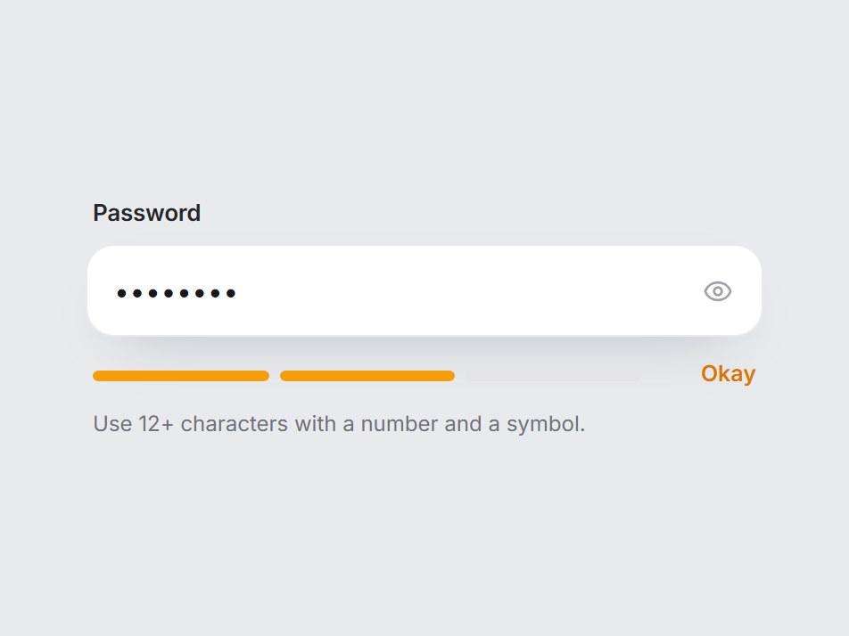
これは何か
表示切り替え付きのパスワード入力の下に、3つに分かれたメーターを置いた部品です。入力に合わせてメーターが左から埋まり、色が赤・黄・緑と変わって、Weak・Okay・Strong の文字が出ます。内蔵の判定は見た目の目安で、本番の判定は strength に渡せます。文言と注意書きを差し替えて、会員登録やパスワード変更のフォームにそのまま置けます。
TSX の全文です。アカウントは不要です。
password-strength-field.tsx
"use client"; import * as React from "react";import { Eye, EyeOff } from "lucide-react";import { cn } from "@/lib/utils"; /** 0 = empty, 1 = weak, 2 = okay, 3 = strong. */export type PasswordStrength = 0 | 1 | 2 | 3; export type PasswordStrengthLabels = { weak: string; okay: string; strong: string;}; export type PasswordStrengthFieldProps = Omit< React.ComponentPropsWithoutRef<"div">, "onChange" | "defaultValue"> & { value?: string; defaultValue?: string; onValueChange?: (value: string) => void; /** Override the built-in estimate with your own score. */ strength?: PasswordStrength; labels?: Partial<PasswordStrengthLabels>; label?: string; placeholder?: string; /** Line shown under the meter. Pass "" to hide it. */ hint?: string; showLabel?: string; hideLabel?: string;}; const EASE = "cubic-bezier(0.22, 1, 0.36, 1)"; const DEFAULT_LABELS: PasswordStrengthLabels = { weak: "Weak", okay: "Okay", strong: "Strong",}; const TONES = { 1: { bar: "#f43f5e", text: "text-rose-600" }, 2: { bar: "#f59e0b", text: "text-amber-600" }, 3: { bar: "#10b981", text: "text-emerald-600" },} as const; /** A light heuristic: length, mixed case, digits, symbols. Not a security check. */function estimate(password: string): PasswordStrength { if (!password) return 0; const points = Number(password.length >= 8) + Number(password.length >= 12) + Number(/[a-z]/.test(password) && /[A-Z]/.test(password)) + Number(/\d/.test(password)) + Number(/[^A-Za-z0-9]/.test(password)); if (points >= 4) return 3; if (points >= 2) return 2; return 1;} export const PasswordStrengthField = React.forwardRef< HTMLDivElement, PasswordStrengthFieldProps>( ( { value, defaultValue = "", onValueChange, strength, labels, label = "Password", placeholder = "Create a password", hint = "Use 12+ characters with a number and a symbol.", showLabel = "Show password", hideLabel = "Hide password", className, ...props }, ref, ) => { const id = React.useId(); const [uncontrolled, setUncontrolled] = React.useState(defaultValue); const password = value ?? uncontrolled; const [visible, setVisible] = React.useState(false); const score = strength ?? estimate(password); const copy = { ...DEFAULT_LABELS, ...labels }; const word = score === 1 ? copy.weak : score === 2 ? copy.okay : score === 3 ? copy.strong : ""; const tone = score > 0 ? TONES[score as 1 | 2 | 3] : null; return ( <div ref={ref} data-tsuna-id="password-strength-field" data-strength={score} className={cn("flex w-[380px] max-w-full flex-col gap-2", className)} {...props} > <label htmlFor={`${id}-input`} className="px-1 text-[13px] font-semibold tracking-[-0.01em] text-zinc-800" > {label} </label> <div className={cn( "flex h-[52px] items-center rounded-[16px] bg-white pr-1.5 pl-4", "shadow-[0_14px_32px_-20px_rgba(15,23,42,0.4),inset_0_0_0_1px_rgba(15,23,42,0.09)]", "transition-shadow duration-300 motion-reduce:transition-none", "focus-within:shadow-[0_16px_34px_-20px_rgba(15,23,42,0.45),inset_0_0_0_1.5px_rgba(24,24,27,0.7)]", )} > <input id={`${id}-input`} type={visible ? "text" : "password"} value={password} placeholder={placeholder} autoComplete="new-password" aria-describedby={`${id}-meter`} onChange={(event) => { if (value === undefined) setUncontrolled(event.target.value); onValueChange?.(event.target.value); }} className="h-full min-w-0 flex-1 border-0 bg-transparent text-[15px] tracking-[0.02em] text-zinc-900 outline-none placeholder:tracking-normal placeholder:text-zinc-400" /> <button type="button" aria-pressed={visible} aria-label={visible ? hideLabel : showLabel} onClick={() => setVisible((current) => !current)} className={cn( "grid size-10 shrink-0 cursor-pointer place-items-center rounded-[12px] border-0 bg-transparent text-zinc-400", "transition-colors duration-200 hover:bg-zinc-100 hover:text-zinc-800 motion-reduce:transition-none", "focus-visible:outline-none focus-visible:ring-2 focus-visible:ring-black/30", )} > {visible ? ( <EyeOff aria-hidden className="size-[17px]" strokeWidth={2} /> ) : ( <Eye aria-hidden className="size-[17px]" strokeWidth={2} /> )} </button> </div> <div id={`${id}-meter`} className="flex items-center gap-3 px-1 pt-1"> <div aria-hidden className="grid flex-1 grid-cols-3 gap-1.5"> {[1, 2, 3].map((step) => ( <span key={step} className="h-1.5 overflow-hidden rounded-full bg-zinc-900/10" > <span className="block h-full origin-left rounded-full motion-reduce:!transition-none" style={{ background: tone?.bar ?? "transparent", transform: `scaleX(${score >= step ? 1 : 0})`, transition: `transform 460ms ${EASE} ${score >= step ? (step - 1) * 70 : 0}ms, background-color 360ms ${EASE}`, }} /> </span> ))} </div> <span aria-live="polite" className={cn( "min-w-[3.25rem] text-right text-[12.5px] font-semibold transition-colors duration-300 motion-reduce:transition-none", tone?.text ?? "text-zinc-400", )} > {word ? <span className="sr-only">{`${label}: `}</span> : null} {word} </span> </div> {hint ? ( <span className="px-1 text-[12px] leading-5 text-zinc-500"> {hint} </span> ) : null} </div> ); },); PasswordStrengthField.displayName = "PasswordStrengthField";

コンポーネント
パスワード強度フィールド
表示切り替え付きのパスワード入力の下に、3つに分かれたメーターを置いた部品です。入力に合わせてメーターが左から埋まり、色が赤・黄・緑と変わって、Weak・Okay・Strong の文字が出ます。内蔵の判定は見た目の目安で、本番の判定は strength に渡せます。文言と注意書きを差し替えて、会員登録やパスワード変更のフォームにそのまま置けます。
Verified Technical Spec
- アニメーション
- CSS / Tailwind
- Reduced motion
- 確認済み
- キーボードフォーカス
- 確認済み
- 対応環境
- Tailwind CSS v3.4 + v4 · React 19 / Next.js 15 App Router + Vite / Remix 対応
含まれるもの
- ソースを Cursor / Claude に渡してエージェントに組み込める
- React · TypeScript · Tailwind CSS · Lucide の完成 UI
依存パッケージ
- React 19.0.0
- Typescript 5.7.2
- Tailwindcss 3.4.16
- Lucide-react 1.23.0
技術スタック
- React
- TypeScript
- Tailwind CSS
- Lucide
バージョン 1.0.0