What is this?
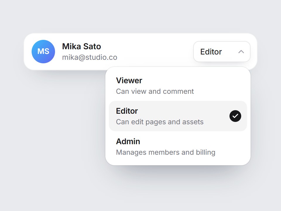
A compact role picker for a members row. The trigger shows the current role, and opening it drops a short list of Viewer, Editor, and Admin with one-line descriptions. A soft highlight follows the pointer or arrow keys, and the check slides to the row you pick. Enter chooses and Escape closes. Swap the roles and descriptions, then drop it at the end of each row in a team settings table.
Full TSX source. No account needed.
member-role-select.tsx
"use client"; import * as React from "react";import { Check, ChevronDown } from "lucide-react";import { cn } from "@/lib/utils"; export type MemberRoleOption = { value: string; label: string; /** One short line under the label in the list. */ description?: string;}; export type MemberRoleSelectProps = Omit< React.ComponentPropsWithoutRef<"div">, "onChange" | "defaultValue"> & { options?: readonly MemberRoleOption[]; value?: string; defaultValue?: string; onValueChange?: (value: string) => void; /** Start with the list open (handy for previews). */ defaultOpen?: boolean; /** Accessible name, e.g. "Role for Mika Sato". */ ariaLabel?: string; /** Which edge of the trigger the list lines up with. */ align?: "start" | "end";}; const EASE = "cubic-bezier(0.22, 1, 0.36, 1)";const ROW = 52; const MEMBER_ROLE_DEFAULTS: readonly MemberRoleOption[] = [ { value: "viewer", label: "Viewer", description: "Can view and comment" }, { value: "editor", label: "Editor", description: "Can edit pages and assets", }, { value: "admin", label: "Admin", description: "Manages members and billing", },]; export const MemberRoleSelect = React.forwardRef< HTMLDivElement, MemberRoleSelectProps>( ( { options = MEMBER_ROLE_DEFAULTS, value, defaultValue, onValueChange, defaultOpen = false, ariaLabel = "Member role", align = "end", className, ...props }, ref, ) => { const items = options.length > 0 ? options : MEMBER_ROLE_DEFAULTS; const id = React.useId(); const [uncontrolled, setUncontrolled] = React.useState( defaultValue ?? items[1]?.value ?? items[0]?.value ?? "", ); const selectedValue = value ?? uncontrolled; const selectedIndex = Math.max( 0, items.findIndex((item) => item.value === selectedValue), ); const selected = items[selectedIndex]; const [open, setOpen] = React.useState(defaultOpen); const [active, setActive] = React.useState(selectedIndex); const rootRef = React.useRef<HTMLDivElement>(null); const triggerRef = React.useRef<HTMLButtonElement>(null); const listRef = React.useRef<HTMLUListElement>(null); React.useImperativeHandle(ref, () => rootRef.current as HTMLDivElement); React.useEffect(() => { if (!open) return; const onPointer = (event: PointerEvent) => { if (!rootRef.current?.contains(event.target as Node)) setOpen(false); }; document.addEventListener("pointerdown", onPointer); return () => document.removeEventListener("pointerdown", onPointer); }, [open]); const openList = (index = selectedIndex) => { setActive(index); setOpen(true); requestAnimationFrame(() => listRef.current?.focus({ preventScroll: true }), ); }; const choose = (index: number) => { const option = items[index]; if (!option) return; if (value === undefined) setUncontrolled(option.value); onValueChange?.(option.value); setActive(index); setOpen(false); triggerRef.current?.focus({ preventScroll: true }); }; const onTriggerKeyDown = ( event: React.KeyboardEvent<HTMLButtonElement>, ) => { if (event.key === "ArrowDown" || event.key === "ArrowUp") { event.preventDefault(); openList(); } }; const onListKeyDown = (event: React.KeyboardEvent<HTMLUListElement>) => { if (event.key === "ArrowDown" || event.key === "ArrowUp") { event.preventDefault(); const step = event.key === "ArrowDown" ? 1 : -1; setActive((current) => (current + step + items.length) % items.length); } else if (event.key === "Home" || event.key === "End") { event.preventDefault(); setActive(event.key === "Home" ? 0 : items.length - 1); } else if (event.key === "Enter" || event.key === " ") { event.preventDefault(); choose(active); } else if (event.key === "Escape") { event.preventDefault(); setOpen(false); triggerRef.current?.focus({ preventScroll: true }); } else if (event.key === "Tab") { setOpen(false); } }; return ( <div ref={rootRef} data-tsuna-id="member-role-select" data-open={open ? "" : undefined} className={cn("relative inline-block", className)} {...props} > <button ref={triggerRef} type="button" aria-haspopup="listbox" aria-expanded={open} aria-controls={`${id}-list`} aria-label={`${ariaLabel}: ${selected?.label ?? ""}`} onClick={() => (open ? setOpen(false) : openList())} onKeyDown={onTriggerKeyDown} className={cn( "inline-flex h-9 cursor-pointer items-center gap-1.5 rounded-[10px] border-0 bg-white py-0 pr-2 pl-3 text-[13.5px] font-medium tracking-[-0.01em] text-zinc-800", "shadow-[0_6px_16px_-10px_rgba(15,23,42,0.35),inset_0_0_0_1px_rgba(15,23,42,0.1)]", "transition-shadow duration-200 hover:shadow-[0_6px_16px_-10px_rgba(15,23,42,0.4),inset_0_0_0_1px_rgba(15,23,42,0.2)] motion-reduce:transition-none", "focus-visible:outline-none focus-visible:ring-2 focus-visible:ring-black/30 focus-visible:ring-offset-2", )} > <span className="min-w-[3.5rem] text-left">{selected?.label}</span> <ChevronDown aria-hidden className="size-4 text-zinc-400 transition-transform duration-300 motion-reduce:transition-none" strokeWidth={2.2} style={{ transform: open ? "rotate(180deg)" : "none", transitionTimingFunction: EASE, }} /> </button> <ul ref={listRef} id={`${id}-list`} role="listbox" tabIndex={-1} aria-label={ariaLabel} aria-activedescendant={open ? `${id}-opt-${active}` : undefined} onKeyDown={onListKeyDown} className={cn( "absolute top-[calc(100%+8px)] z-20 m-0 w-[248px] list-none rounded-[16px] bg-white p-1.5 outline-none", "shadow-[0_24px_48px_-20px_rgba(15,23,42,0.4),0_0_0_1px_rgba(15,23,42,0.07)]", "motion-reduce:!transition-none", align === "end" ? "right-0 origin-top-right" : "left-0 origin-top-left", open ? "pointer-events-auto" : "pointer-events-none", )} style={{ opacity: open ? 1 : 0, transform: open ? "none" : "translateY(-6px) scale(0.97)", visibility: open ? "visible" : "hidden", transition: `opacity 220ms ${EASE}, transform 320ms ${EASE}, visibility 0s linear ${open ? "0s" : "320ms"}`, }} > {/* hover / keyboard highlight that glides between rows */} <span aria-hidden className="pointer-events-none absolute right-1.5 left-1.5 rounded-[11px] bg-zinc-100 motion-reduce:!transition-none" style={{ top: 6, height: ROW, transform: `translateY(${active * ROW}px)`, transition: `transform 300ms ${EASE}`, }} /> {/* the check slides to the chosen row */} <span aria-hidden className="pointer-events-none absolute right-4 grid size-5 place-items-center rounded-full bg-zinc-900 text-white motion-reduce:!transition-none" style={{ top: 6 + (ROW - 20) / 2, transform: `translateY(${selectedIndex * ROW}px)`, transition: `transform 440ms ${EASE}`, }} > <Check className="size-3" strokeWidth={3.2} /> </span> {items.map((option, index) => ( <li key={option.value} id={`${id}-opt-${index}`} role="option" aria-selected={index === selectedIndex} onPointerEnter={() => setActive(index)} onClick={() => choose(index)} className="relative flex cursor-pointer flex-col justify-center pr-11 pl-3" style={{ height: ROW }} > <span className="text-[13.5px] font-semibold tracking-[-0.01em] text-zinc-900"> {option.label} </span> {option.description ? ( <span className="truncate text-[12px] text-zinc-500"> {option.description} </span> ) : null} </li> ))} </ul> </div> ); },); MemberRoleSelect.displayName = "MemberRoleSelect";

Member Role Select
A compact role picker for a members row. The trigger shows the current role, and opening it drops a short list of Viewer, Editor, and Admin with one-line descriptions. A soft highlight follows the pointer or arrow keys, and the check slides to the row you pick. Enter chooses and Escape closes. Swap the roles and descriptions, then drop it at the end of each row in a team settings table.
Verified Technical Spec
- Animation
- CSS / Tailwind
- Reduced motion
- Verified
- Keyboard focus
- Verified
- Compatibility
- Tailwind CSS v3.4 + v4 · React 19 / Next.js 15 App Router + Vite / Remix compatible
Included
- Copy source into Cursor or Claude for agent install
- Finished React · TypeScript · Tailwind CSS · Lucide UI
Dependencies
- React 19.0.0
- Typescript 5.7.2
- Tailwindcss 3.4.16
- Lucide-react 1.23.0
Tech Stack
- React
- TypeScript
- Tailwind CSS
- Lucide
Version 1.0.0