Orders Table Panel
What is this?
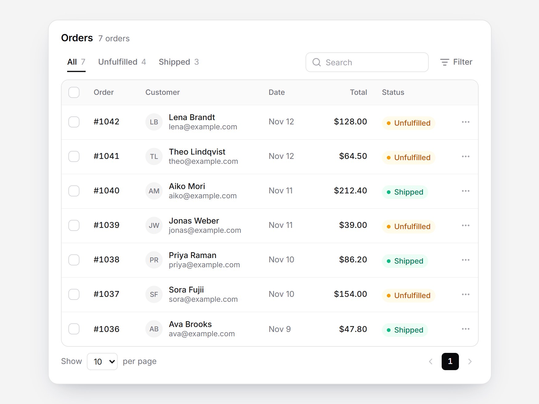
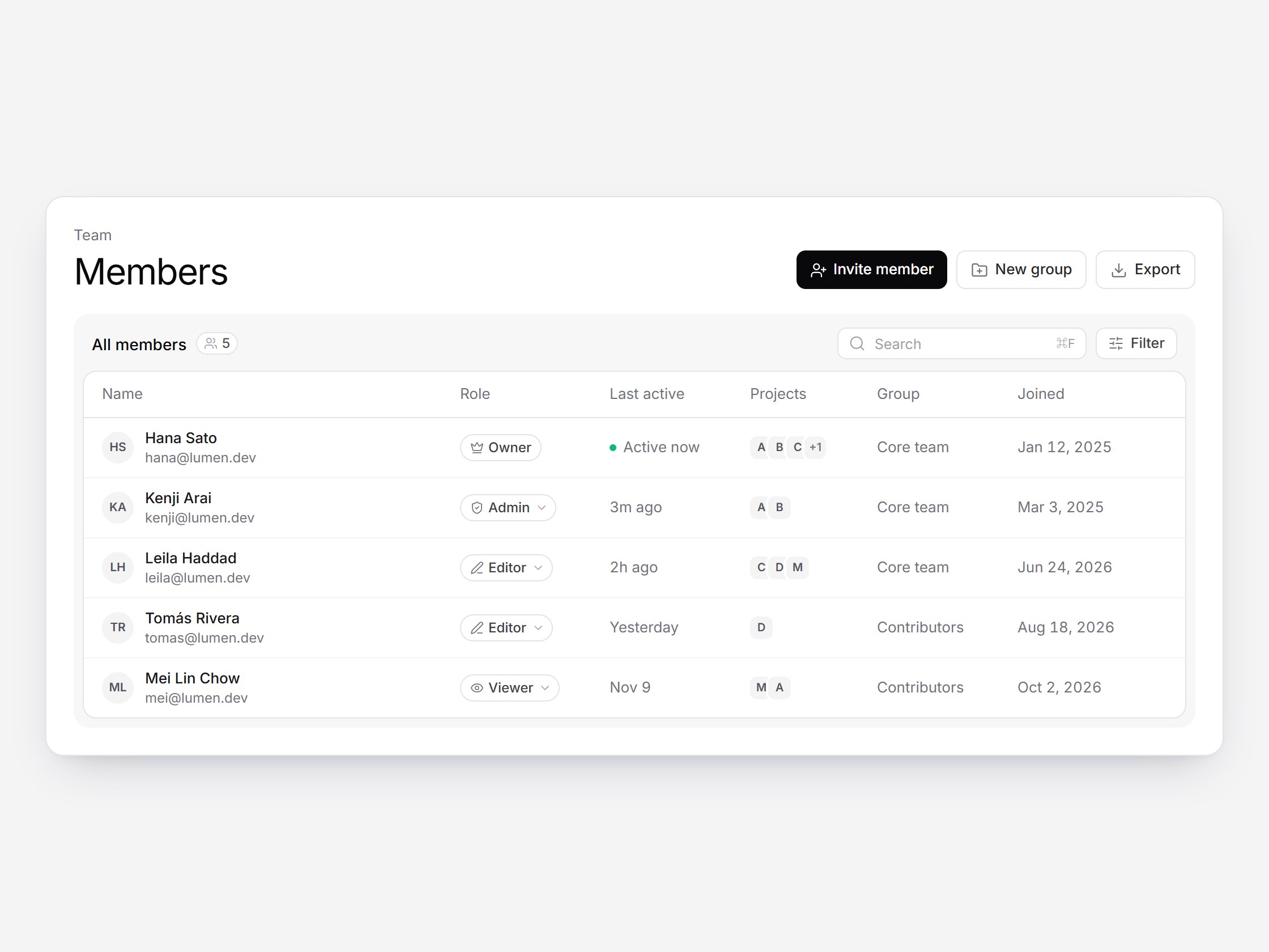
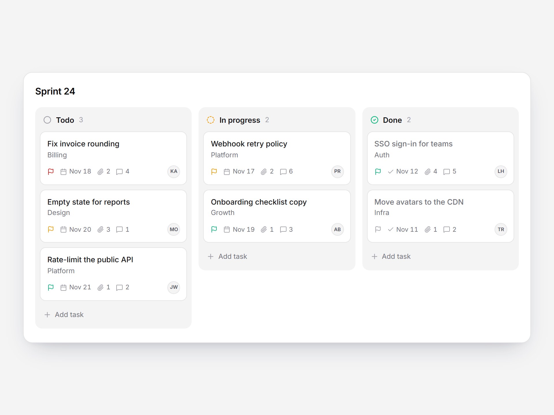
A white orders panel. “Orders” sits beside a count, with All, Unfulfilled, and Shipped as underline tabs, plus search and Filter. The table has its own border; each customer shows initials and an email. Selecting rows crossfades the footer from “Show 10 per page” to “2 selected” and Mark as shipped. Switching tabs fades the rows and the table height follows. The header checkbox selects the visible rows and shows the indeterminate state. Swap the orders and labels, then drop it into a store admin or a fulfillment screen.

Orders Table Panel
A white orders panel. “Orders” sits beside a count, with All, Unfulfilled, and Shipped as underline tabs, plus search and Filter. The table has its own border; each customer shows initials and an email. Selecting rows crossfades the footer from “Show 10 per page” to “2 selected” and Mark as shipped. Switching tabs fades the rows and the table height follows. The header checkbox selects the visible rows and shows the indeterminate state. Swap the orders and labels, then drop it into a store admin or a fulfillment screen.
Verified Technical Spec
- Animation
- Framer Motion
- Reduced motion
- Verified
- Keyboard focus
- Verified
- Compatibility
- Tailwind CSS v3.4 + v4 · React 19 / Next.js 15 App Router + Vite / Remix compatible
Included
- Copy source into Cursor or Claude for agent install
- Finished React · TypeScript · Tailwind CSS · Motion · Lucide UI
Dependencies
- React 19.0.0
- Typescript 5.7.2
- Tailwindcss 3.4.16
- Lucide-react 1.23.0
- Motion 12.42.2
Tech Stack
- React
- TypeScript
- Tailwind CSS
- Motion
- Lucide
Version 1.0.0