Notification Inbox Panel
What is this?
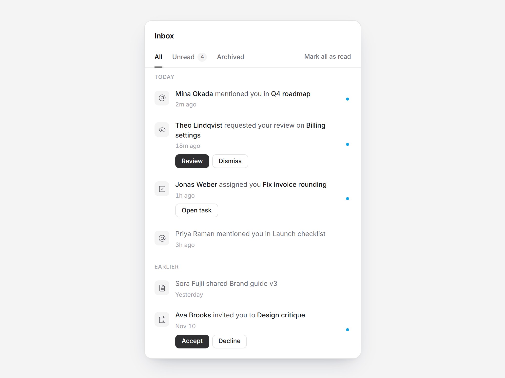
A white inbox with clear unread states. Underline tabs for All, Unread, and Archived sit beside “Mark all as read”, and rows are grouped under Today and Earlier. Review requests and invites carry inline buttons such as Review and Accept that turn into a short result line like “Review started”. Hover a row to archive it, and switching tabs slides the underline while the panel resizes. Swap the items and labels, then drop it into an app header popover or a dashboard.
Notification Inbox Panel
A white inbox with clear unread states. Underline tabs for All, Unread, and Archived sit beside “Mark all as read”, and rows are grouped under Today and Earlier. Review requests and invites carry inline buttons such as Review and Accept that turn into a short result line like “Review started”. Hover a row to archive it, and switching tabs slides the underline while the panel resizes. Swap the items and labels, then drop it into an app header popover or a dashboard.
Verified Technical Spec
- Animation
- CSS / Tailwind
- Reduced motion
- Verified
- Keyboard focus
- Verified
- Compatibility
- Tailwind CSS v3.4 + v4 · React 19 / Next.js 15 App Router + Vite / Remix compatible
Included
- Copy source into Cursor or Claude for agent install
- Finished React · TypeScript · Tailwind CSS · Lucide UI
Dependencies
- React 19.0.0
- Typescript 5.7.2
- Tailwindcss 3.4.16
- Lucide-react 1.23.0
Tech Stack
- React
- TypeScript
- Tailwind CSS
- Lucide
Version 1.0.0