Issue Detail Drawer
What is this?
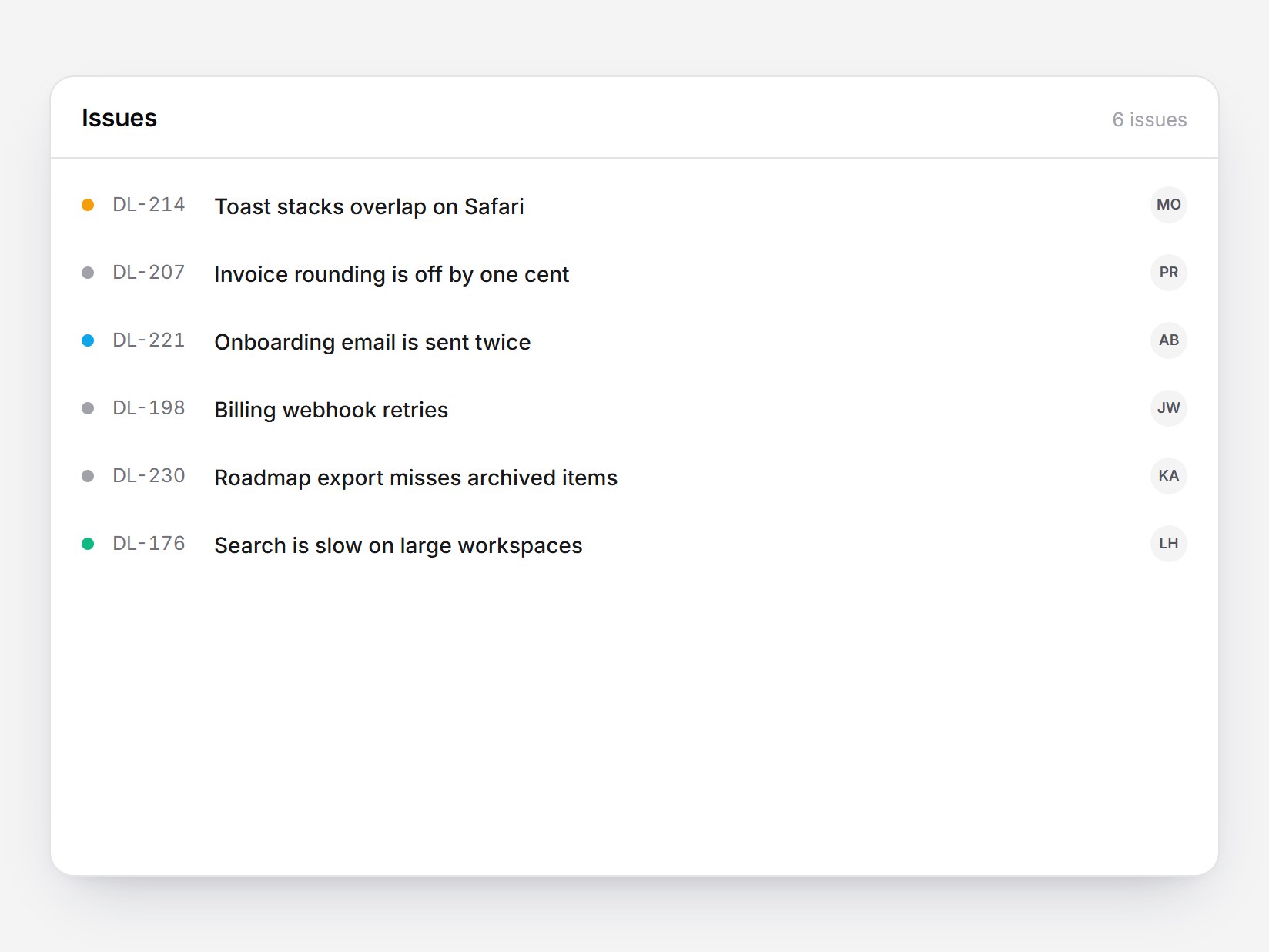
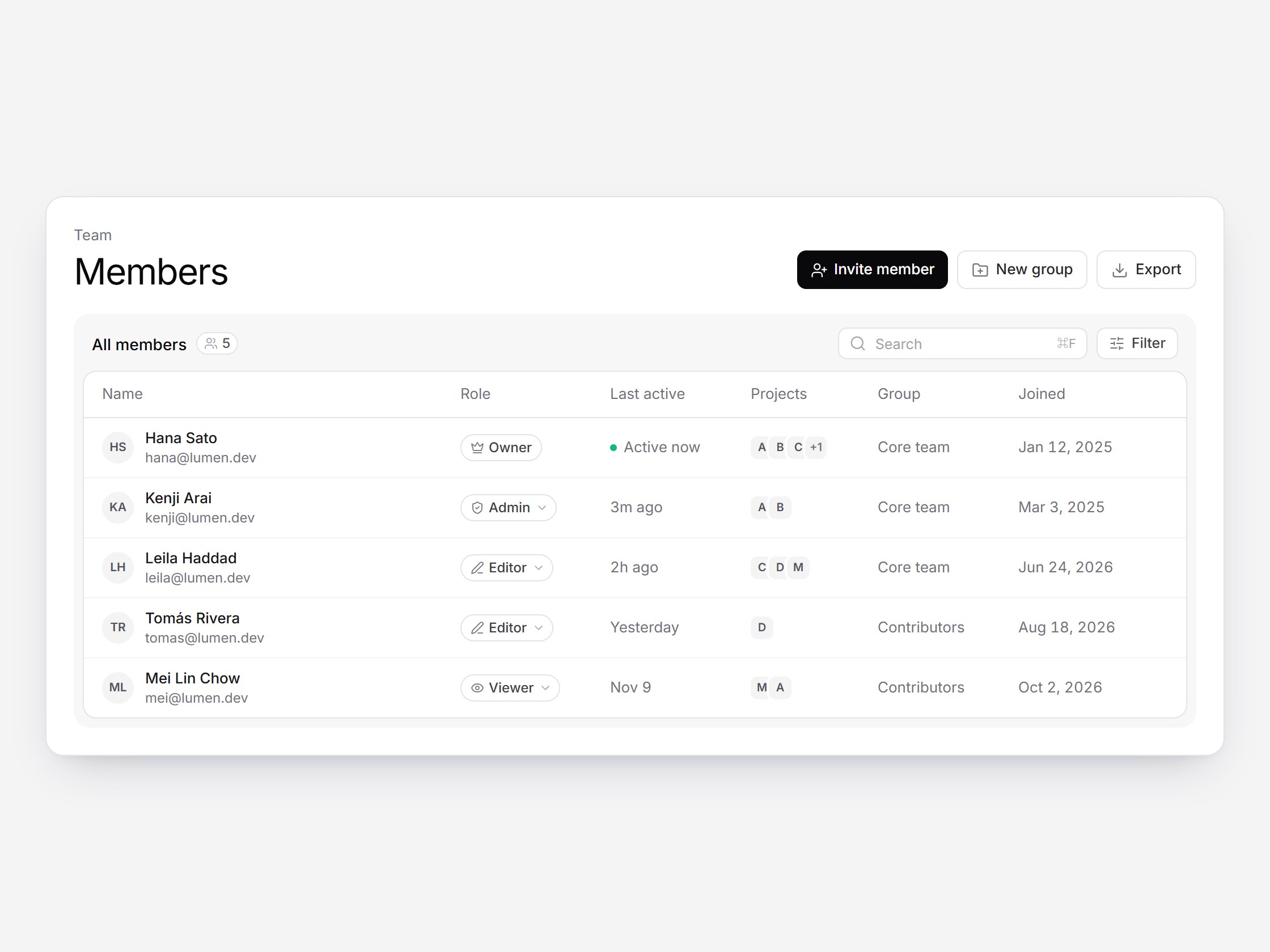
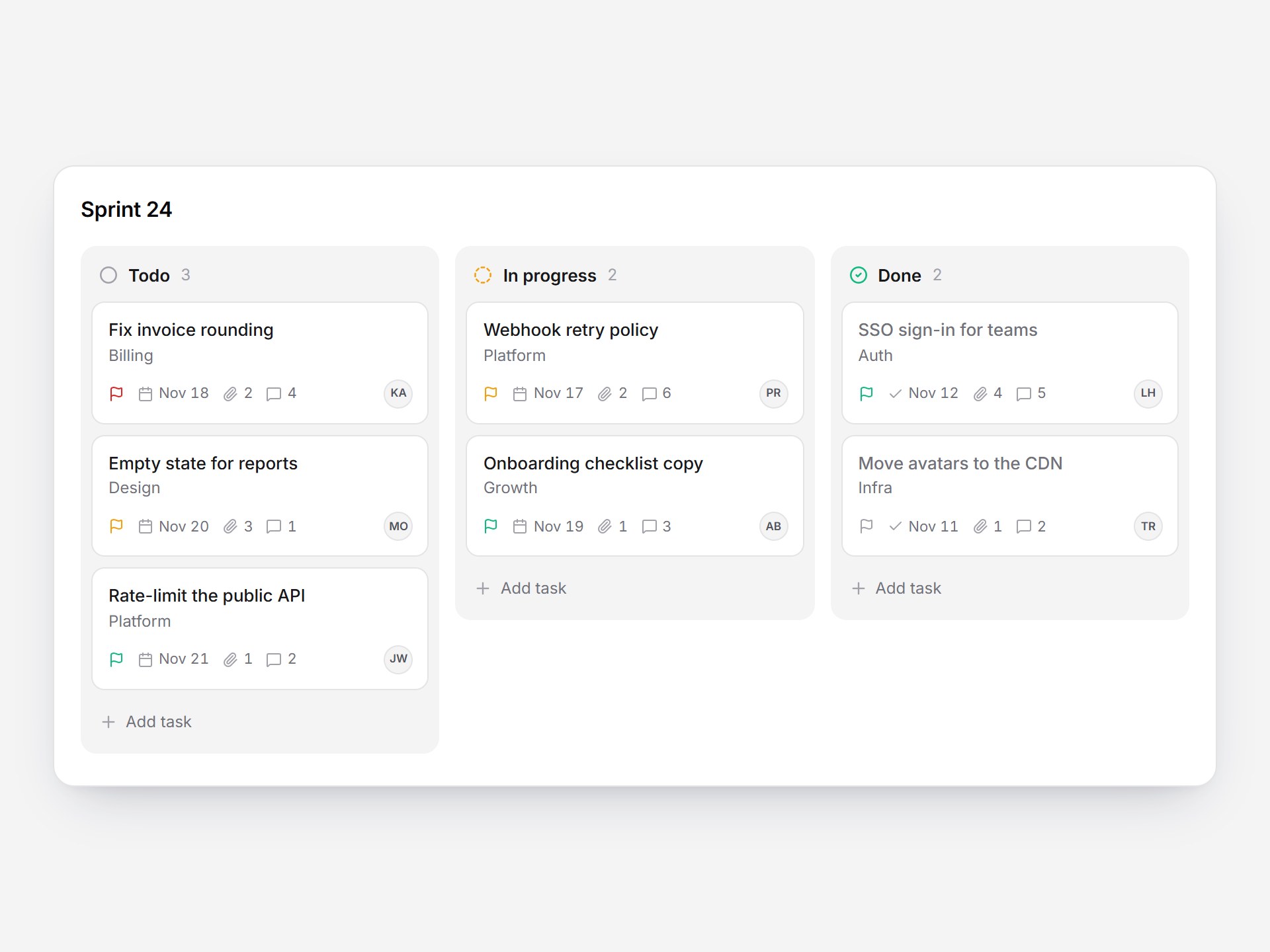
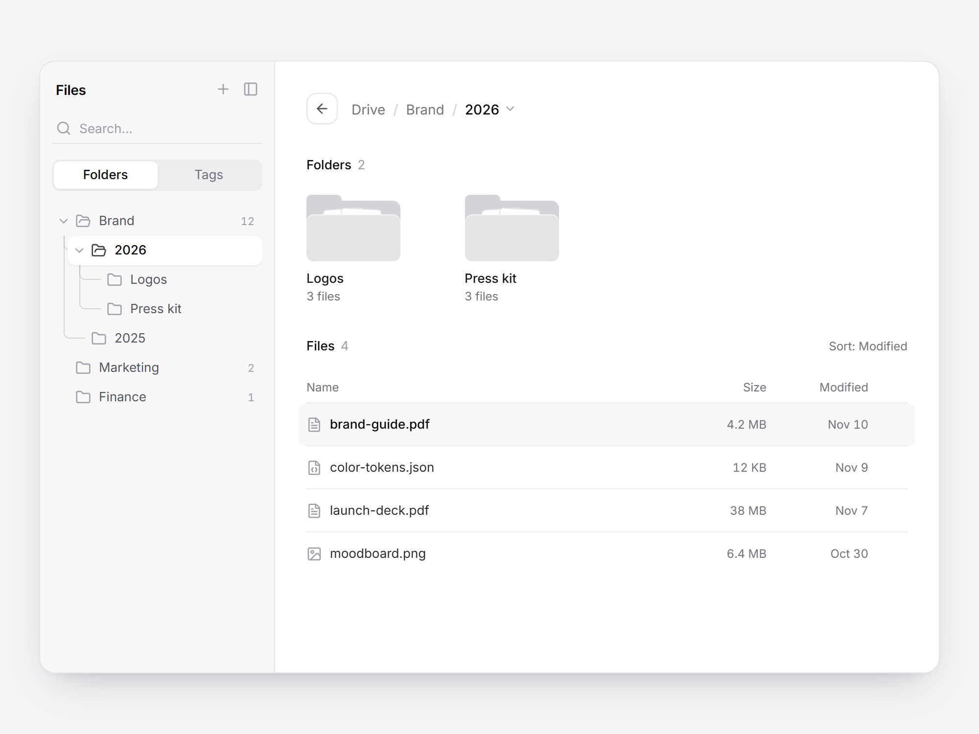
A white panel with a compact issue list and a detail drawer. Rows show a status dot, the key, the title, and the assignee. Click a row and a drawer slides in from the right inside the panel while the list dims. It holds a status select, the assignee, labels, a description, and four subtasks with a progress bar: checking one grows the bar and rolls the “2/4” count. Moving to another issue crossfades the content without closing the drawer, and Esc closes it and returns focus to the row. Swap the issues, then drop it into a tracker or a support tool.
Issue Detail Drawer
A white panel with a compact issue list and a detail drawer. Rows show a status dot, the key, the title, and the assignee. Click a row and a drawer slides in from the right inside the panel while the list dims. It holds a status select, the assignee, labels, a description, and four subtasks with a progress bar: checking one grows the bar and rolls the “2/4” count. Moving to another issue crossfades the content without closing the drawer, and Esc closes it and returns focus to the row. Swap the issues, then drop it into a tracker or a support tool.
Verified Technical Spec
- Animation
- CSS / Tailwind
- Reduced motion
- Verified
- Keyboard focus
- Verified
- Compatibility
- Tailwind CSS v3.4 + v4 · React 19 / Next.js 15 App Router + Vite / Remix compatible
Included
- Copy source into Cursor or Claude for agent install
- Responsive on phone, tablet, and desktop
- Finished React · TypeScript · Tailwind CSS · Lucide UI
Dependencies
- React 19.0.0
- Typescript 5.7.2
- Tailwindcss 3.4.16
- Lucide-react 1.23.0
Tech Stack
- React
- TypeScript
- Tailwind CSS
- Lucide
Version 1.0.0