What is this?
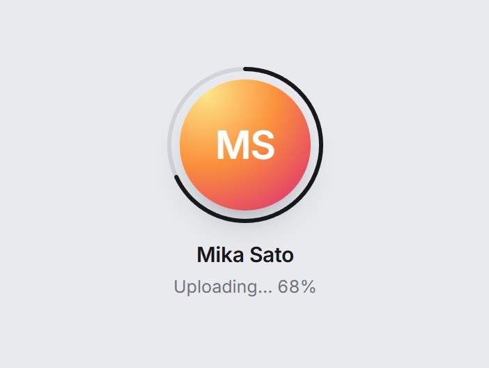
A round avatar with an optional progress ring. Hover or focus shows a camera and “Change photo”, and clicking opens the file picker and previews the picked image. The ring eases to the progress value and turns green with a check badge at 100%. Nothing is uploaded: onSelect hands you the file. Swap the photo, name, and labels, then drop it into a profile or onboarding step.
Full TSX source. No account needed.
avatar-upload-ring.tsx
"use client"; import * as React from "react";import { Camera, Check } from "lucide-react";import { cn } from "@/lib/utils"; export type AvatarUploadRingProps = Omit< React.ComponentPropsWithoutRef<"div">, "onSelect"> & { /** Current photo. Without it, initials from `name` sit on a soft gradient. */ src?: string; name?: string; /** 0–100. Leave unset to hide the ring. */ progress?: number; /** Called with the picked file. Nothing is uploaded; wire your own upload. */ onSelect?: (file: File) => void; /** Hover / focus caption over the photo and the button's accessible name. */ label?: string; /** Line under the name while progress is below 100. `{progress}` is replaced. */ uploadingLabel?: string; /** Line under the name once progress reaches 100. */ doneLabel?: string; /** Line under the name when no progress is shown. */ hint?: string; accept?: string;}; const EASE = "cubic-bezier(0.22, 1, 0.36, 1)";const SIZE = 112;const STROKE = 3;const RADIUS = SIZE / 2 - STROKE / 2;const CIRCUMFERENCE = 2 * Math.PI * RADIUS; function initials(name: string) { return name .split(/\s+/) .filter(Boolean) .slice(0, 2) .map((word) => word.charAt(0).toUpperCase()) .join("");} export const AvatarUploadRing = React.forwardRef< HTMLDivElement, AvatarUploadRingProps>( ( { src, name = "Mika Sato", progress, onSelect, label = "Change photo", uploadingLabel = "Uploading… {progress}%", doneLabel = "Photo updated", hint = "PNG or JPG, up to 2 MB", accept = "image/*", className, ...props }, ref, ) => { const inputRef = React.useRef<HTMLInputElement>(null); const [localSrc, setLocalSrc] = React.useState<string | null>(null); // Start the ring at 0 so a large jump eases in. Small steps and any drop snap, // so a new upload can run 0 → 100 without easing backwards. const drawnRef = React.useRef(0); const [drawn, setDrawn] = React.useState(0); const clamped = progress === undefined ? undefined : Math.max(0, Math.min(100, Math.round(progress))); const done = clamped === 100; React.useLayoutEffect(() => { if (clamped === undefined) return; const from = drawnRef.current; const reduce = window.matchMedia("(prefers-reduced-motion: reduce)").matches; if (reduce || clamped <= from || clamped - from < 16) { drawnRef.current = clamped; setDrawn(clamped); return; } const start = performance.now(); let frame = 0; const tick = (now: number) => { const t = Math.min(1, (now - start) / 640); const eased = 1 - (1 - t) ** 3; const next = t === 1 ? clamped : from + (clamped - from) * eased; drawnRef.current = next; setDrawn(next); if (t < 1) frame = requestAnimationFrame(tick); }; frame = requestAnimationFrame(tick); return () => cancelAnimationFrame(frame); }, [clamped]); React.useEffect( () => () => { if (localSrc) URL.revokeObjectURL(localSrc); }, [localSrc], ); const photo = localSrc ?? src; const pick = (event: React.ChangeEvent<HTMLInputElement>) => { const file = event.target.files?.[0]; event.target.value = ""; if (!file) return; if (file.type.startsWith("image/")) setLocalSrc(URL.createObjectURL(file)); onSelect?.(file); }; const caption = clamped === undefined ? hint : done ? doneLabel : uploadingLabel.replace("{progress}", String(clamped)); return ( <div ref={ref} data-tsuna-id="avatar-upload-ring" data-done={done ? "" : undefined} className={cn("inline-flex flex-col items-center gap-3", className)} {...props} > <div className="relative" style={{ width: SIZE, height: SIZE }}> {clamped !== undefined ? ( <svg aria-hidden className="absolute inset-0 -rotate-90" width={SIZE} height={SIZE} viewBox={`0 0 ${SIZE} ${SIZE}`} > <circle cx={SIZE / 2} cy={SIZE / 2} r={RADIUS} fill="none" stroke="rgba(15,23,42,0.1)" strokeWidth={STROKE} /> <circle cx={SIZE / 2} cy={SIZE / 2} r={RADIUS} fill="none" strokeWidth={STROKE} strokeLinecap="round" strokeDasharray={CIRCUMFERENCE} strokeDashoffset={CIRCUMFERENCE * (1 - drawn / 100)} className={cn( "motion-reduce:!transition-none", done ? "stroke-emerald-500" : "stroke-zinc-900", )} style={{ transition: `stroke 400ms ${EASE}`, }} /> </svg> ) : null} <button type="button" aria-label={label} onClick={() => inputRef.current?.click()} className={cn( "group absolute inset-[9px] cursor-pointer overflow-hidden rounded-full border-0 p-0", "shadow-[0_14px_30px_-16px_rgba(15,23,42,0.55)]", "focus-visible:outline-none focus-visible:ring-2 focus-visible:ring-black/40 focus-visible:ring-offset-[3px] focus-visible:ring-offset-[#e8eaed]", )} style={{ background: photo ? undefined : "radial-gradient(120% 120% at 20% 10%, #fde68a 0%, #fb923c 45%, #db2777 100%)", }} > {photo ? ( // eslint-disable-next-line @next/next/no-img-element <img src={photo} alt="" className="h-full w-full object-cover" /> ) : ( <span aria-hidden className="grid h-full w-full place-items-center text-[28px] font-semibold tracking-[-0.02em] text-white" > {initials(name) || "?"} </span> )} <span aria-hidden className={cn( "absolute inset-0 flex flex-col items-center justify-center gap-1 bg-zinc-950/55 text-white opacity-0", "transition-opacity duration-300 group-hover:opacity-100 group-focus-visible:opacity-100 motion-reduce:transition-none", )} > <Camera className="size-5 translate-y-1 transition-transform duration-300 group-hover:translate-y-0 motion-reduce:transition-none" strokeWidth={2} /> <span className="text-[11px] font-semibold tracking-[0.01em]"> {label} </span> </span> </button> <span aria-hidden className={cn( "absolute right-1 bottom-1 grid size-7 place-items-center rounded-full bg-emerald-500 text-white ring-[3px] ring-white", "motion-reduce:!transition-none", )} style={{ opacity: done ? 1 : 0, transform: done ? "scale(1)" : "scale(0.4)", transition: `opacity 260ms ${EASE}, transform 460ms ${EASE}`, }} > <Check className="size-3.5" strokeWidth={3} /> </span> <input ref={inputRef} type="file" accept={accept} tabIndex={-1} aria-hidden onChange={pick} className="hidden" /> </div> <div className="flex flex-col items-center gap-0.5 text-center"> <span className="text-[15px] font-semibold tracking-[-0.01em] text-zinc-900"> {name} </span> <span aria-live="polite" className={cn( "text-[12.5px] tabular-nums transition-colors duration-300 motion-reduce:transition-none", done ? "text-emerald-600" : "text-zinc-500", )} > {caption} </span> </div> </div> ); },); AvatarUploadRing.displayName = "AvatarUploadRing";


Avatar Upload Ring
A round avatar with an optional progress ring. Hover or focus shows a camera and “Change photo”, and clicking opens the file picker and previews the picked image. The ring eases to the progress value and turns green with a check badge at 100%. Nothing is uploaded: onSelect hands you the file. Swap the photo, name, and labels, then drop it into a profile or onboarding step.
Verified Technical Spec
- Animation
- CSS / Tailwind
- Reduced motion
- Verified
- Keyboard focus
- Verified
- Compatibility
- Tailwind CSS v3.4 + v4 · React 19 / Next.js 15 App Router + Vite / Remix compatible
Included
- Copy source into Cursor or Claude for agent install
- Finished React · TypeScript · Tailwind CSS · Lucide UI
Dependencies
- React 19.0.0
- Typescript 5.7.2
- Tailwindcss 3.4.16
- Lucide-react 1.23.0
Tech Stack
- React
- TypeScript
- Tailwind CSS
- Lucide
Version 1.0.0