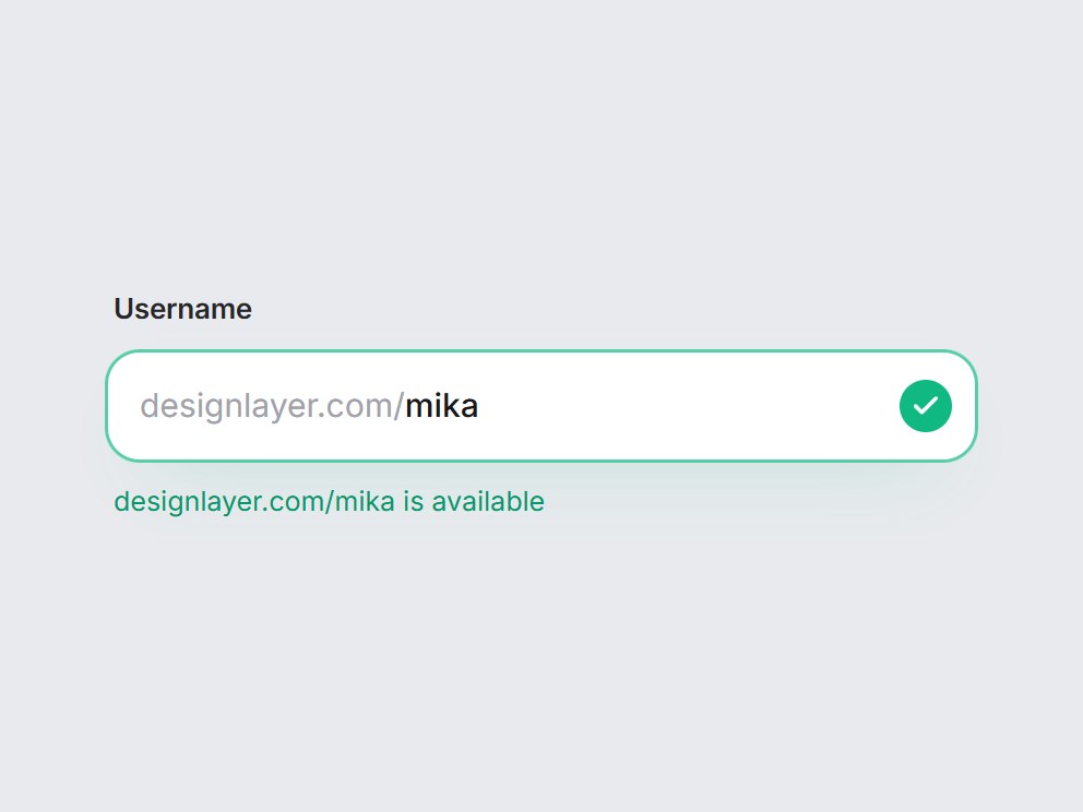
What is this?
A username field with a fixed prefix such as designlayer.com/ or @. After a short pause it shows a spinner, then a green check and “is available” or a red cross and “is already taken”, and the field outline follows the color. Pass status from your own lookup, or leave it unset for a local demo. Swap the prefix and copy, then drop it into sign-up or a profile URL setting.
Full TSX source. No account needed.
handle-availability-field.tsx
"use client"; import * as React from "react";import { Check, LoaderCircle, X } from "lucide-react";import { cn } from "@/lib/utils"; export type HandleStatus = "idle" | "checking" | "available" | "taken"; export type HandleAvailabilityLabels = { idle: string; checking: string; available: string; taken: string;}; export type HandleAvailabilityFieldProps = Omit< React.ComponentPropsWithoutRef<"div">, "onChange" | "defaultValue"> & { value?: string; defaultValue?: string; onValueChange?: (value: string) => void; /** Fixed text before the handle, e.g. "@" or "designlayer.com/". */ prefix?: string; /** * Drive the status from your own lookup. Leave unset for a local demo that * checks after a short pause and marks `takenHandles` as taken. */ status?: HandleStatus; /** Used only by the local demo (when `status` is unset). */ takenHandles?: readonly string[]; label?: string; /** Line under the field per status. `{handle}` is replaced. */ labels?: Partial<HandleAvailabilityLabels>;}; const EASE = "cubic-bezier(0.22, 1, 0.36, 1)"; const DEFAULT_LABELS: HandleAvailabilityLabels = { idle: "Letters, numbers, dots, and dashes.", checking: "Checking {handle}…", available: "{handle} is available", taken: "{handle} is already taken",}; const HANDLE_DEFAULT_TAKEN = ["admin", "design", "team", "support"] as const; function sanitize(text: string) { return text .toLowerCase() .replace(/[^a-z0-9._-]/g, "") .slice(0, 30);} export const HandleAvailabilityField = React.forwardRef< HTMLDivElement, HandleAvailabilityFieldProps>( ( { value, defaultValue = "", onValueChange, prefix = "designlayer.com/", status, takenHandles = HANDLE_DEFAULT_TAKEN, label = "Username", labels, className, ...props }, ref, ) => { const id = React.useId(); const [uncontrolled, setUncontrolled] = React.useState(() => sanitize(defaultValue), ); const handle = value ?? uncontrolled; const [simulated, setSimulated] = React.useState<HandleStatus>("idle"); const shown = status ?? simulated; const copy = { ...DEFAULT_LABELS, ...labels }; // Local demo lookup: pause after typing, "check", then resolve. React.useEffect(() => { if (status !== undefined) return; if (!handle) { setSimulated("idle"); return; } let resolveTimer = 0; const startTimer = window.setTimeout(() => { setSimulated("checking"); resolveTimer = window.setTimeout(() => { const taken = takenHandles.some( (item) => item.toLowerCase() === handle, ); setSimulated(taken ? "taken" : "available"); }, 900); }, 450); return () => { window.clearTimeout(startTimer); window.clearTimeout(resolveTimer); }; }, [handle, status, takenHandles]); const onChange = (event: React.ChangeEvent<HTMLInputElement>) => { const next = sanitize(event.target.value); if (value === undefined) setUncontrolled(next); onValueChange?.(next); }; const message = copy[shown].replace( "{handle}", handle ? `${prefix}${handle}` : "", ); const tone = shown === "available" ? "shadow-[0_16px_34px_-22px_rgba(16,185,129,0.5),inset_0_0_0_1.5px_rgba(16,185,129,0.7)]" : shown === "taken" ? "shadow-[0_16px_34px_-22px_rgba(225,29,72,0.45),inset_0_0_0_1.5px_rgba(225,29,72,0.65)]" : "shadow-[0_14px_32px_-20px_rgba(15,23,42,0.4),inset_0_0_0_1px_rgba(15,23,42,0.09)] focus-within:shadow-[0_16px_34px_-20px_rgba(15,23,42,0.45),inset_0_0_0_1.5px_rgba(24,24,27,0.7)]"; const icon = (key: HandleStatus): React.CSSProperties => ({ opacity: shown === key ? 1 : 0, transform: shown === key ? "scale(1) rotate(0deg)" : "scale(0.4) rotate(-40deg)", transition: `opacity 240ms ${EASE}, transform 420ms ${EASE}`, }); return ( <div ref={ref} data-tsuna-id="handle-availability-field" data-status={shown} className={cn("flex w-[400px] max-w-full flex-col gap-2", className)} {...props} > <label htmlFor={`${id}-input`} className="px-1 text-[13px] font-semibold tracking-[-0.01em] text-zinc-800" > {label} </label> <div className={cn( "flex h-[52px] items-center rounded-[16px] bg-white pr-3 pl-4 transition-shadow duration-300 motion-reduce:transition-none", tone, )} > <span aria-hidden className="shrink-0 text-[15px] text-zinc-400 select-none" > {prefix} </span> <input id={`${id}-input`} type="text" value={handle} onChange={onChange} onKeyDown={(event) => { // Escape clears the handle and resets the status. if (event.key !== "Escape" || !handle) return; event.preventDefault(); if (value === undefined) setUncontrolled(""); onValueChange?.(""); }} spellCheck={false} autoCapitalize="none" autoComplete="username" aria-describedby={`${id}-status`} aria-invalid={shown === "taken" || undefined} className="h-full min-w-0 flex-1 border-0 bg-transparent text-[15px] font-medium text-zinc-900 outline-none" /> <span aria-hidden className="grid size-6 shrink-0 place-items-center"> <LoaderCircle className="col-start-1 row-start-1 size-[17px] animate-spin text-zinc-400 motion-reduce:animate-none motion-reduce:!transition-none" strokeWidth={2.2} style={{ opacity: shown === "checking" ? 1 : 0, transition: `opacity 200ms ${EASE}`, }} /> <span className="col-start-1 row-start-1 grid size-6 place-items-center rounded-full bg-emerald-500 text-white motion-reduce:!transition-none" style={icon("available")} > <Check className="size-3.5" strokeWidth={3} /> </span> <span className="col-start-1 row-start-1 grid size-6 place-items-center rounded-full bg-rose-500 text-white motion-reduce:!transition-none" style={icon("taken")} > <X className="size-3.5" strokeWidth={3} /> </span> </span> </div> <span id={`${id}-status`} aria-live="polite" className={cn( "min-h-5 truncate px-1 text-[12.5px] leading-5 transition-colors duration-300 motion-reduce:transition-none", shown === "available" ? "text-emerald-600" : shown === "taken" ? "text-rose-600" : "text-zinc-500", )} > {message} </span> </div> ); },); HandleAvailabilityField.displayName = "HandleAvailabilityField";
Handle Availability Field
A username field with a fixed prefix such as designlayer.com/ or @. After a short pause it shows a spinner, then a green check and “is available” or a red cross and “is already taken”, and the field outline follows the color. Pass status from your own lookup, or leave it unset for a local demo. Swap the prefix and copy, then drop it into sign-up or a profile URL setting.
Verified Technical Spec
- Animation
- CSS / Tailwind
- Reduced motion
- Verified
- Keyboard focus
- Verified
- Compatibility
- Tailwind CSS v3.4 + v4 · React 19 / Next.js 15 App Router + Vite / Remix compatible
Included
- Copy source into Cursor or Claude for agent install
- Finished React · TypeScript · Tailwind CSS · Lucide UI
Dependencies
- React 19.0.0
- Typescript 5.7.2
- Tailwindcss 3.4.16
- Lucide-react 1.23.0
Tech Stack
- React
- TypeScript
- Tailwind CSS
- Lucide
Version 1.0.0