File Drop Card
What is this?
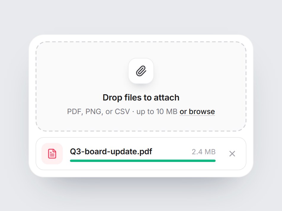
A compact “Drop files to attach” tile: a paperclip, a short hint, and an “or browse” link inside a dashed well. Dragging a file over it tints the well and sets the dashes marching; dropping or picking a file slides a chip in underneath with the name, size, a thin bar that fills, and a remove button. Nothing is uploaded: onFile hands you the file. Swap the copy, then drop it into a message composer, a support form, or an empty state.


File Drop Card
A compact “Drop files to attach” tile: a paperclip, a short hint, and an “or browse” link inside a dashed well. Dragging a file over it tints the well and sets the dashes marching; dropping or picking a file slides a chip in underneath with the name, size, a thin bar that fills, and a remove button. Nothing is uploaded: onFile hands you the file. Swap the copy, then drop it into a message composer, a support form, or an empty state.
Verified Technical Spec
- Animation
- CSS / Tailwind
- Reduced motion
- Verified
- Keyboard focus
- Verified
- Compatibility
- Tailwind CSS v3.4 + v4 · React 19 / Next.js 15 App Router + Vite / Remix compatible
Included
- Copy source into Cursor or Claude for agent install
- Finished React · TypeScript · Tailwind CSS · Lucide UI
Dependencies
- React 19.0.0
- Typescript 5.7.2
- Tailwindcss 3.4.16
- Lucide-react 1.23.0
Tech Stack
- React
- TypeScript
- Tailwind CSS
- Lucide
Version 1.0.0