Support Ticket Card
What is this?
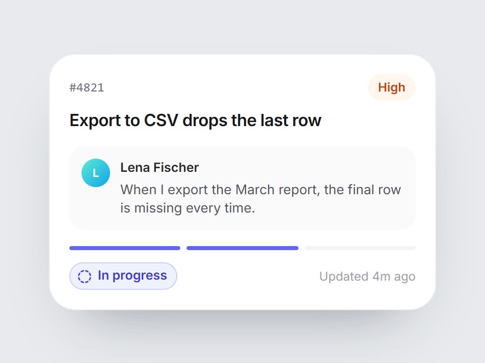
A white helpdesk tile: the ticket number, a priority pill, the subject, and the customer’s latest message as a quote. Below it, a three-part bar and a status pill step from Waiting to In progress to Resolved, changing color from amber to indigo to green. It holds on In progress under reduced motion. Swap the ticket, priority, message, and status labels, then drop it into a support, CRM, or customer-success feature block.

Support Ticket Card
A white helpdesk tile: the ticket number, a priority pill, the subject, and the customer’s latest message as a quote. Below it, a three-part bar and a status pill step from Waiting to In progress to Resolved, changing color from amber to indigo to green. It holds on In progress under reduced motion. Swap the ticket, priority, message, and status labels, then drop it into a support, CRM, or customer-success feature block.
Verified Technical Spec
- Animation
- CSS / Tailwind
- Reduced motion
- Verified
- Keyboard focus
- Not detected in source
- Compatibility
- Tailwind CSS v3.4 + v4 · React 19 / Next.js 15 App Router + Vite / Remix compatible
Included
- Copy source into Cursor or Claude for agent install
- Finished React · TypeScript · Tailwind CSS · Lucide UI
Dependencies
- React 19.0.0
- Typescript 5.7.2
- Tailwindcss 3.4.16
- Lucide-react 1.23.0
Tech Stack
- React
- TypeScript
- Tailwind CSS
- Lucide
Version 1.0.0