Feature Flag Card
What is this?
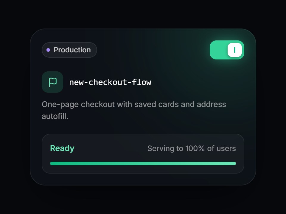
A dark feature-flag tile: an environment pill, the flag key in mono, a short description, and a square-cornered switch. Turning it on slides the knob, lights the switch and a soft green glow, fills the rollout bar, and swaps “Off” for “Ready · Serving to 100% of users”. Space and Enter toggle it too. Swap the flag, environment, and copy, then drop it into a developer platform or release-management feature grid.

Feature Flag Card
A dark feature-flag tile: an environment pill, the flag key in mono, a short description, and a square-cornered switch. Turning it on slides the knob, lights the switch and a soft green glow, fills the rollout bar, and swaps “Off” for “Ready · Serving to 100% of users”. Space and Enter toggle it too. Swap the flag, environment, and copy, then drop it into a developer platform or release-management feature grid.
Verified Technical Spec
- Animation
- CSS / Tailwind
- Reduced motion
- Verified
- Keyboard focus
- Verified
- Compatibility
- Tailwind CSS v3.4 + v4 · React 19 / Next.js 15 App Router + Vite / Remix compatible
Included
- Copy source into Cursor or Claude for agent install
- Finished React · TypeScript · Tailwind CSS · Lucide UI
Dependencies
- React 19.0.0
- Typescript 5.7.2
- Tailwindcss 3.4.16
- Lucide-react 1.23.0
Tech Stack
- React
- TypeScript
- Tailwind CSS
- Lucide
Version 1.0.0