コンポーネント一覧へ戻る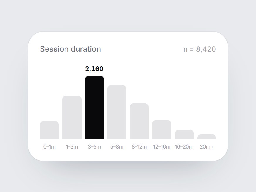
これは何か
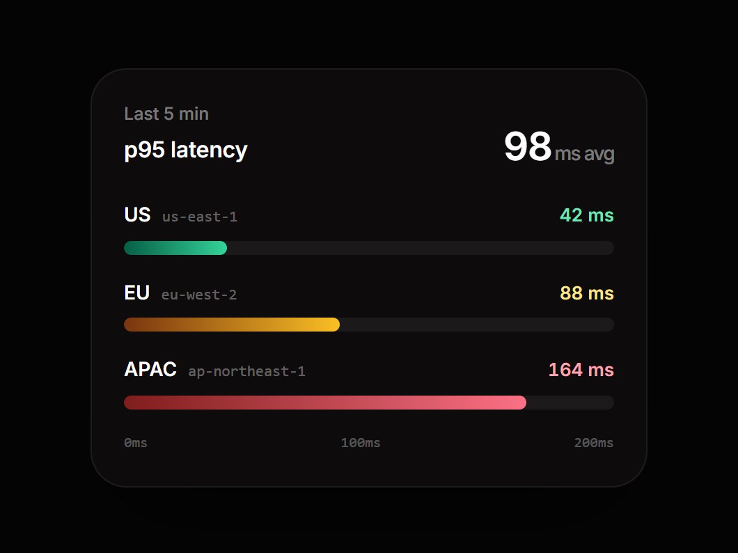
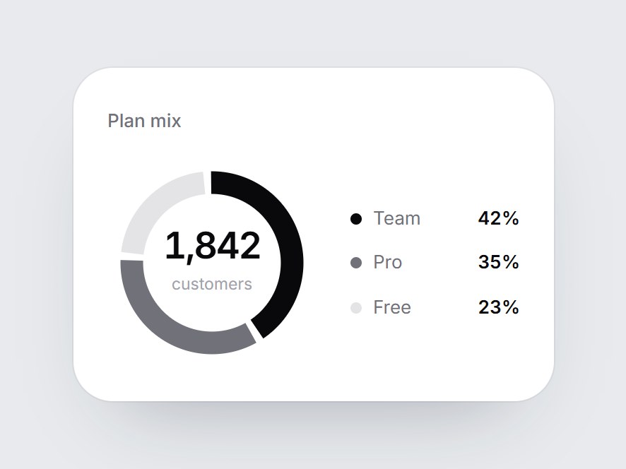
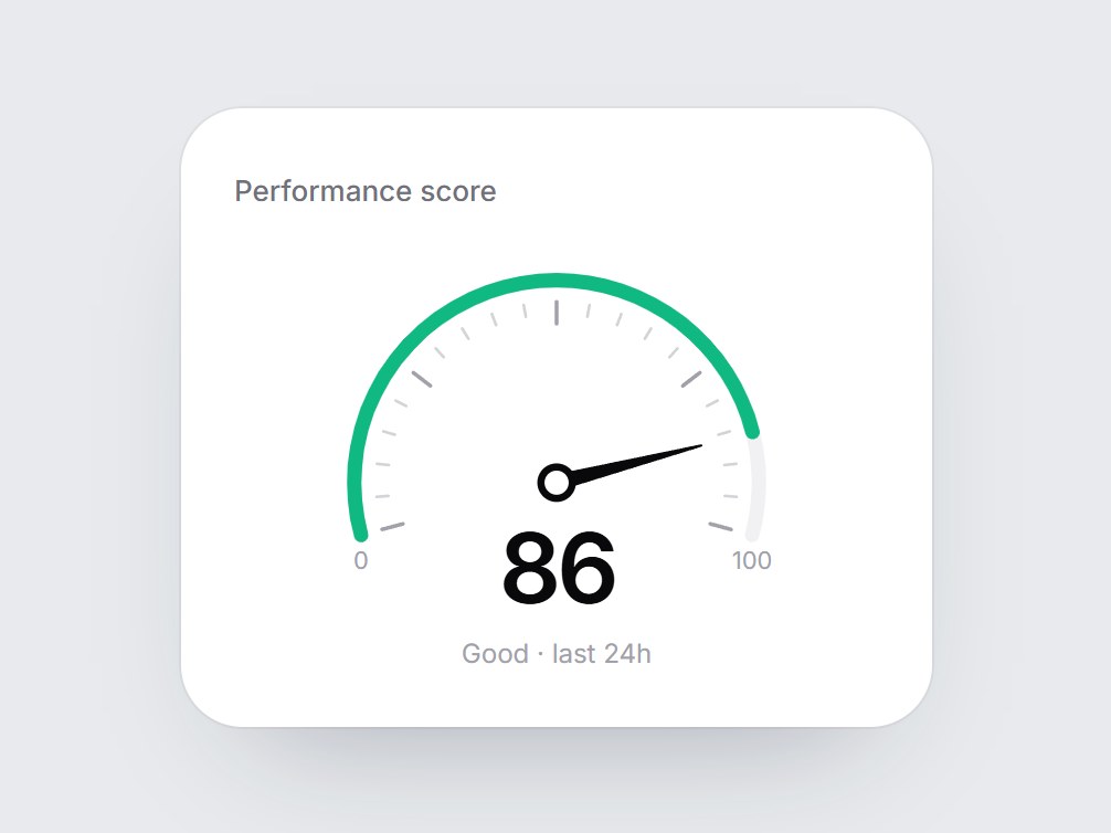
ラベル・サンプル数と、範囲ラベル付きの8本の柱で分布を見せる白いカードです。画面に入ると柱が左から順に下から伸び、いちばん高い柱だけが黒くなって件数が出ます。ラベル・キャプション・区間を差し替えて、利用状況レポートやパフォーマンスの内訳、分析機能の紹介にそのまま置けます。
TSX の全文です。アカウントは不要です。
value-histogram-card.tsx
"use client"; import * as React from "react";import { cn } from "@/lib/utils"; export type ValueHistogramBin = { /** Range under the column, e.g. "3–5m". */ label: string; value: number;}; export const VALUE_HISTOGRAM_DEFAULT_BINS: readonly ValueHistogramBin[] = [ { label: "0–1m", value: 620 }, { label: "1–3m", value: 1480 }, { label: "3–5m", value: 2160 }, { label: "5–8m", value: 1840 }, { label: "8–12m", value: 1220 }, { label: "12–16m", value: 640 }, { label: "16–20m", value: 310 }, { label: "20m+", value: 150 },]; export type ValueHistogramCardProps = React.ComponentPropsWithoutRef<"div"> & { label?: string; /** Sample size on the right of the header, e.g. "n = 8,420". */ caption?: string; /** Lowest range first. The tallest bin is drawn dark and carries its count. */ bins?: readonly ValueHistogramBin[];}; const EASE = "cubic-bezier(0.22, 1, 0.36, 1)";const BAR_MS = 750;const STAGGER_MS = 70; export const ValueHistogramCard = React.forwardRef<HTMLDivElement, ValueHistogramCardProps>( ( { label = "Session duration", caption = "n = 8,420", bins = VALUE_HISTOGRAM_DEFAULT_BINS, className, ...props }, ref, ) => { const localRef = React.useRef<HTMLDivElement>(null); React.useImperativeHandle(ref, () => localRef.current as HTMLDivElement); const [drawn, setDrawn] = React.useState(false); const top = Math.max(1, ...bins.map((bin) => bin.value)); const peakIndex = bins.findIndex((bin) => bin.value === top); const peak = bins[peakIndex]; React.useEffect(() => { const node = localRef.current; if (!node || typeof IntersectionObserver === "undefined") { setDrawn(true); return; } const observer = new IntersectionObserver( ([entry]) => { if (entry?.isIntersecting) { setDrawn(true); observer.disconnect(); } }, { threshold: 0.35 }, ); observer.observe(node); return () => observer.disconnect(); }, []); return ( <div ref={localRef} data-tsuna-id="value-histogram-card" className={cn( "w-[340px] max-w-full rounded-[26px] bg-white p-5 text-zinc-950", "shadow-[0_30px_60px_-34px_rgba(15,23,42,0.35),0_0_0_1px_rgba(15,23,42,0.05)]", className, )} {...props} > <div className="flex items-baseline justify-between gap-3"> <span className="text-[13px] font-medium text-zinc-500">{label}</span> {caption ? <span className="text-[12px] text-zinc-400 tabular-nums">{caption}</span> : null} </div> <div role="img" aria-label={`${label} distribution, ${bins.length} bins${ peak ? `, most common ${peak.label}` : "" }`} className="mt-3 flex h-[132px] items-end gap-[6px] border-b border-zinc-200 pt-6" > {bins.map((bin, index) => { const height = Math.max(2, (bin.value / top) * 100); const delay = index * STAGGER_MS; const isPeak = index === peakIndex; return ( <div key={bin.label} className="relative flex h-full min-w-0 flex-1 items-end"> {isPeak ? ( <span className="absolute left-1/2 -translate-x-1/2 text-[11px] leading-none font-semibold whitespace-nowrap tabular-nums motion-reduce:!transition-none" style={{ bottom: `calc(${height}% + 6px)`, opacity: drawn ? 1 : 0, transition: `opacity 400ms ${EASE} ${delay + BAR_MS - 200}ms`, }} > {bin.value.toLocaleString("en-US")} </span> ) : null} <div className="w-full origin-bottom rounded-t-[6px] motion-reduce:!transition-none" style={{ height: `${height}%`, backgroundColor: isPeak ? "#09090b" : "#e4e4e7", transform: `scaleY(${drawn ? 1 : 0})`, transition: `transform ${BAR_MS}ms ${EASE} ${delay}ms`, }} /> </div> ); })} </div> <div aria-hidden className="mt-2 flex gap-[6px]"> {bins.map((bin) => ( <span key={bin.label} className="min-w-0 flex-1 text-center text-[9px] leading-none tracking-[-0.03em] whitespace-nowrap text-zinc-400" > {bin.label} </span> ))} </div> </div> ); },); ValueHistogramCard.displayName = "ValueHistogramCard";
コンポーネント
値ヒストグラムカード
ラベル・サンプル数と、範囲ラベル付きの8本の柱で分布を見せる白いカードです。画面に入ると柱が左から順に下から伸び、いちばん高い柱だけが黒くなって件数が出ます。ラベル・キャプション・区間を差し替えて、利用状況レポートやパフォーマンスの内訳、分析機能の紹介にそのまま置けます。
Verified Technical Spec
- アニメーション
- CSS / Tailwind
- Reduced motion
- 確認済み
- キーボードフォーカス
- ソース上では未検出
- 対応環境
- Tailwind CSS v3.4 + v4 · React 19 / Next.js 15 App Router + Vite / Remix 対応
含まれるもの
- ソースを Cursor / Claude に渡してエージェントに組み込める
- React · TypeScript · Tailwind CSS の完成 UI
依存パッケージ
- React 19.0.0
- Typescript 5.7.2
- Tailwindcss 3.4.16
技術スタック
- React
- TypeScript
- Tailwind CSS
バージョン 1.0.0