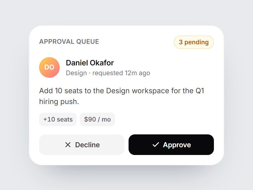
What is this?
A white approval tile: a queue count, the requester with their team, a one-line summary, small detail chips, and Decline / Approve buttons. Approving swaps the buttons for a green “Approved” bar with a check that pops in, plus an Undo; declining shows a quiet gray “Declined”. The pending count drops by one. Swap the people, copy, and chips, then drop it into an admin, finance, or workflow feature block.
Full TSX source. No account needed.
approval-queue-card.tsx
"use client"; import * as React from "react";import { Check, RotateCcw, X } from "lucide-react";import { cn } from "@/lib/utils"; export type ApprovalStatus = "pending" | "approved" | "declined"; export type ApprovalQueueCardProps = React.ComponentPropsWithoutRef<"div"> & { title?: string; requester?: string; /** Role or team under the requester's name. */ requesterDetail?: string; summary?: string; /** Small chips under the summary, e.g. ["+10 seats", "$90 / mo"]. */ meta?: readonly string[]; /** How many requests wait in the queue (this one included). */ pendingCount?: number; /** Controlled status. Leave unset to let the buttons change it locally. */ status?: ApprovalStatus; onApprove?: () => void; onDecline?: () => void; /** Called by Undo; local state also returns to pending. */ onReset?: () => void; approveLabel?: string; declineLabel?: string; approvedLabel?: string; declinedLabel?: string; undoLabel?: string; /** "{count} pending". */ pendingLabel?: string;}; const EASE = "cubic-bezier(0.22, 1, 0.36, 1)"; const CSS = `@keyframes approval-queue-card-pop { 0% { transform: scale(0.4); opacity: 0; } 60% { transform: scale(1.12); opacity: 1; } 100% { transform: scale(1); } }.approval-queue-card-pop { animation: approval-queue-card-pop 520ms ${EASE} both; }@media (prefers-reduced-motion: reduce) { .approval-queue-card-pop { animation: none; }}`; function initials(name: string) { return name .split(/\s+/) .filter(Boolean) .slice(0, 2) .map((word) => word.charAt(0).toUpperCase()) .join("");} export const ApprovalQueueCard = React.forwardRef< HTMLDivElement, ApprovalQueueCardProps>( ( { title = "Approval queue", requester = "Daniel Okafor", requesterDetail = "Design · requested 12m ago", summary = "Add 10 seats to the Design workspace for the Q1 hiring push.", meta = ["+10 seats", "$90 / mo"], pendingCount = 3, status, onApprove, onDecline, onReset, approveLabel = "Approve", declineLabel = "Decline", approvedLabel = "Approved", declinedLabel = "Declined", undoLabel = "Undo", pendingLabel = "{count} pending", className, ...props }, ref, ) => { const [local, setLocal] = React.useState<ApprovalStatus>("pending"); const shown = status ?? local; const resolved = shown !== "pending"; const remaining = Math.max(0, pendingCount - (resolved ? 1 : 0)); const set = (next: ApprovalStatus) => { if (status === undefined) setLocal(next); if (next === "approved") onApprove?.(); else if (next === "declined") onDecline?.(); else onReset?.(); }; const buttonBase = cn( "inline-flex h-10 flex-1 cursor-pointer items-center justify-center gap-1.5 rounded-[12px] border-0 text-[13.5px] font-semibold tracking-[-0.01em]", "transition-[background-color,transform] duration-200 active:scale-[0.98] motion-reduce:transition-none motion-reduce:active:scale-100", "focus-visible:outline-none focus-visible:ring-2 focus-visible:ring-black/30 focus-visible:ring-offset-2", ); return ( <div ref={ref} data-tsuna-id="approval-queue-card" data-status={shown} className={cn( "w-[380px] max-w-full rounded-[26px] bg-white p-5 text-zinc-900", "shadow-[0_30px_60px_-34px_rgba(15,23,42,0.45),inset_0_0_0_1px_rgba(15,23,42,0.06)]", className, )} {...props} > <style>{CSS}</style> <div className="flex items-center justify-between"> <span className="text-[12.5px] font-semibold tracking-[0.02em] text-zinc-500 uppercase"> {title} </span> <span className="rounded-full bg-amber-50 px-2.5 py-1 text-[12px] font-semibold text-amber-700 tabular-nums shadow-[inset_0_0_0_1px_rgba(245,158,11,0.25)]"> {pendingLabel.replace("{count}", String(remaining))} </span> </div> <div className="mt-4 flex items-center gap-3"> <span aria-hidden className="grid size-10 shrink-0 place-items-center rounded-full bg-gradient-to-br from-amber-300 to-rose-400 text-[13px] font-semibold text-white" > {initials(requester)} </span> <span className="flex min-w-0 flex-col"> <span className="truncate text-[14.5px] font-semibold tracking-[-0.01em]"> {requester} </span> <span className="truncate text-[12.5px] text-zinc-500"> {requesterDetail} </span> </span> </div> <p className="m-0 mt-3.5 text-[14px] leading-[1.5] text-zinc-700"> {summary} </p> {meta.length > 0 ? ( <div className="mt-3 flex flex-wrap gap-1.5"> {meta.map((item) => ( <span key={item} className="rounded-[8px] bg-zinc-100 px-2 py-1 text-[12px] font-medium text-zinc-600 tabular-nums" > {item} </span> ))} </div> ) : null} <div className="relative mt-4 grid"> {/* Pending: the two actions */} <div className="col-start-1 row-start-1 flex gap-2 motion-reduce:!transition-none" style={{ opacity: resolved ? 0 : 1, transform: resolved ? "translateY(-6px)" : "none", visibility: resolved ? "hidden" : "visible", transition: `opacity 260ms ${EASE}, transform 380ms ${EASE}, visibility 0s linear ${resolved ? "380ms" : "0s"}`, }} > <button type="button" onClick={() => set("declined")} className={cn( buttonBase, "bg-zinc-100 text-zinc-700 hover:bg-zinc-200", )} > <X aria-hidden className="size-4" strokeWidth={2.4} /> {declineLabel} </button> <button type="button" onClick={() => set("approved")} className={cn( buttonBase, "bg-zinc-950 text-white hover:bg-zinc-800", )} > <Check aria-hidden className="size-4" strokeWidth={2.6} /> {approveLabel} </button> </div> {/* Resolved: the outcome with Undo */} <div aria-live="polite" className={cn( "col-start-1 row-start-1 flex h-10 items-center justify-between rounded-[12px] pr-1.5 pl-2 motion-reduce:!transition-none", shown === "declined" ? "bg-zinc-100 text-zinc-600" : "bg-emerald-50 text-emerald-700", )} style={{ opacity: resolved ? 1 : 0, transform: resolved ? "none" : "translateY(6px)", visibility: resolved ? "visible" : "hidden", transition: `opacity 300ms ${EASE} 80ms, transform 420ms ${EASE} 80ms, visibility 0s linear ${resolved ? "0s" : "420ms"}`, }} > {resolved ? ( <> <span className="inline-flex items-center gap-2 text-[13.5px] font-semibold"> <span aria-hidden className={cn( "approval-queue-card-pop grid size-6 place-items-center rounded-full text-white", shown === "declined" ? "bg-zinc-400" : "bg-emerald-500", )} > {shown === "declined" ? ( <X className="size-3.5" strokeWidth={3} /> ) : ( <Check className="size-3.5" strokeWidth={3} /> )} </span> {shown === "declined" ? declinedLabel : approvedLabel} </span> <button type="button" onClick={() => set("pending")} className={cn( "inline-flex h-7 cursor-pointer items-center gap-1 rounded-[8px] border-0 bg-transparent px-2 text-[12.5px] font-semibold text-current", "transition-colors duration-200 hover:bg-black/5 motion-reduce:transition-none", "focus-visible:outline-none focus-visible:ring-2 focus-visible:ring-black/30", )} > <RotateCcw aria-hidden className="size-3.5" strokeWidth={2.4} /> {undoLabel} </button> </> ) : null} </div> </div> </div> ); },); ApprovalQueueCard.displayName = "ApprovalQueueCard";
Approval Queue Card
A white approval tile: a queue count, the requester with their team, a one-line summary, small detail chips, and Decline / Approve buttons. Approving swaps the buttons for a green “Approved” bar with a check that pops in, plus an Undo; declining shows a quiet gray “Declined”. The pending count drops by one. Swap the people, copy, and chips, then drop it into an admin, finance, or workflow feature block.
Verified Technical Spec
- Animation
- CSS / Tailwind
- Reduced motion
- Verified
- Keyboard focus
- Verified
- Compatibility
- Tailwind CSS v3.4 + v4 · React 19 / Next.js 15 App Router + Vite / Remix compatible
Included
- Copy source into Cursor or Claude for agent install
- Finished React · TypeScript · Tailwind CSS · Lucide UI
Dependencies
- React 19.0.0
- Typescript 5.7.2
- Tailwindcss 3.4.16
- Lucide-react 1.23.0
Tech Stack
- React
- TypeScript
- Tailwind CSS
- Lucide
Version 1.0.0