コンポーネント一覧へ戻る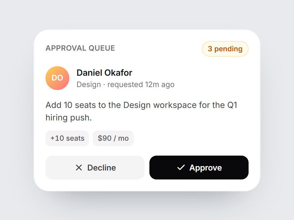
これは何か
承認待ちを見せる白いタイルです。待ちの件数・依頼者とチーム・1行の要約・小さなチップ・Decline と Approve のボタンが並びます。承認するとボタンが緑の Approved の帯に替わり、チェックが弾んで現れて Undo も出ます。却下するとグレーの Declined になります。待ちの件数も1つ減ります。人・文言・チップを差し替えて、管理画面や経費、ワークフローの機能紹介にそのまま置けます。
TSX の全文です。アカウントは不要です。
approval-queue-card.tsx
"use client"; import * as React from "react";import { Check, RotateCcw, X } from "lucide-react";import { cn } from "@/lib/utils"; export type ApprovalStatus = "pending" | "approved" | "declined"; export type ApprovalQueueCardProps = React.ComponentPropsWithoutRef<"div"> & { title?: string; requester?: string; /** Role or team under the requester's name. */ requesterDetail?: string; summary?: string; /** Small chips under the summary, e.g. ["+10 seats", "$90 / mo"]. */ meta?: readonly string[]; /** How many requests wait in the queue (this one included). */ pendingCount?: number; /** Controlled status. Leave unset to let the buttons change it locally. */ status?: ApprovalStatus; onApprove?: () => void; onDecline?: () => void; /** Called by Undo; local state also returns to pending. */ onReset?: () => void; approveLabel?: string; declineLabel?: string; approvedLabel?: string; declinedLabel?: string; undoLabel?: string; /** "{count} pending". */ pendingLabel?: string;}; const EASE = "cubic-bezier(0.22, 1, 0.36, 1)"; const CSS = `@keyframes approval-queue-card-pop { 0% { transform: scale(0.4); opacity: 0; } 60% { transform: scale(1.12); opacity: 1; } 100% { transform: scale(1); } }.approval-queue-card-pop { animation: approval-queue-card-pop 520ms ${EASE} both; }@media (prefers-reduced-motion: reduce) { .approval-queue-card-pop { animation: none; }}`; function initials(name: string) { return name .split(/\s+/) .filter(Boolean) .slice(0, 2) .map((word) => word.charAt(0).toUpperCase()) .join("");} export const ApprovalQueueCard = React.forwardRef< HTMLDivElement, ApprovalQueueCardProps>( ( { title = "Approval queue", requester = "Daniel Okafor", requesterDetail = "Design · requested 12m ago", summary = "Add 10 seats to the Design workspace for the Q1 hiring push.", meta = ["+10 seats", "$90 / mo"], pendingCount = 3, status, onApprove, onDecline, onReset, approveLabel = "Approve", declineLabel = "Decline", approvedLabel = "Approved", declinedLabel = "Declined", undoLabel = "Undo", pendingLabel = "{count} pending", className, ...props }, ref, ) => { const [local, setLocal] = React.useState<ApprovalStatus>("pending"); const shown = status ?? local; const resolved = shown !== "pending"; const remaining = Math.max(0, pendingCount - (resolved ? 1 : 0)); const set = (next: ApprovalStatus) => { if (status === undefined) setLocal(next); if (next === "approved") onApprove?.(); else if (next === "declined") onDecline?.(); else onReset?.(); }; const buttonBase = cn( "inline-flex h-10 flex-1 cursor-pointer items-center justify-center gap-1.5 rounded-[12px] border-0 text-[13.5px] font-semibold tracking-[-0.01em]", "transition-[background-color,transform] duration-200 active:scale-[0.98] motion-reduce:transition-none motion-reduce:active:scale-100", "focus-visible:outline-none focus-visible:ring-2 focus-visible:ring-black/30 focus-visible:ring-offset-2", ); return ( <div ref={ref} data-tsuna-id="approval-queue-card" data-status={shown} className={cn( "w-[380px] max-w-full rounded-[26px] bg-white p-5 text-zinc-900", "shadow-[0_30px_60px_-34px_rgba(15,23,42,0.45),inset_0_0_0_1px_rgba(15,23,42,0.06)]", className, )} {...props} > <style>{CSS}</style> <div className="flex items-center justify-between"> <span className="text-[12.5px] font-semibold tracking-[0.02em] text-zinc-500 uppercase"> {title} </span> <span className="rounded-full bg-amber-50 px-2.5 py-1 text-[12px] font-semibold text-amber-700 tabular-nums shadow-[inset_0_0_0_1px_rgba(245,158,11,0.25)]"> {pendingLabel.replace("{count}", String(remaining))} </span> </div> <div className="mt-4 flex items-center gap-3"> <span aria-hidden className="grid size-10 shrink-0 place-items-center rounded-full bg-gradient-to-br from-amber-300 to-rose-400 text-[13px] font-semibold text-white" > {initials(requester)} </span> <span className="flex min-w-0 flex-col"> <span className="truncate text-[14.5px] font-semibold tracking-[-0.01em]"> {requester} </span> <span className="truncate text-[12.5px] text-zinc-500"> {requesterDetail} </span> </span> </div> <p className="m-0 mt-3.5 text-[14px] leading-[1.5] text-zinc-700"> {summary} </p> {meta.length > 0 ? ( <div className="mt-3 flex flex-wrap gap-1.5"> {meta.map((item) => ( <span key={item} className="rounded-[8px] bg-zinc-100 px-2 py-1 text-[12px] font-medium text-zinc-600 tabular-nums" > {item} </span> ))} </div> ) : null} <div className="relative mt-4 grid"> {/* Pending: the two actions */} <div className="col-start-1 row-start-1 flex gap-2 motion-reduce:!transition-none" style={{ opacity: resolved ? 0 : 1, transform: resolved ? "translateY(-6px)" : "none", visibility: resolved ? "hidden" : "visible", transition: `opacity 260ms ${EASE}, transform 380ms ${EASE}, visibility 0s linear ${resolved ? "380ms" : "0s"}`, }} > <button type="button" onClick={() => set("declined")} className={cn( buttonBase, "bg-zinc-100 text-zinc-700 hover:bg-zinc-200", )} > <X aria-hidden className="size-4" strokeWidth={2.4} /> {declineLabel} </button> <button type="button" onClick={() => set("approved")} className={cn( buttonBase, "bg-zinc-950 text-white hover:bg-zinc-800", )} > <Check aria-hidden className="size-4" strokeWidth={2.6} /> {approveLabel} </button> </div> {/* Resolved: the outcome with Undo */} <div aria-live="polite" className={cn( "col-start-1 row-start-1 flex h-10 items-center justify-between rounded-[12px] pr-1.5 pl-2 motion-reduce:!transition-none", shown === "declined" ? "bg-zinc-100 text-zinc-600" : "bg-emerald-50 text-emerald-700", )} style={{ opacity: resolved ? 1 : 0, transform: resolved ? "none" : "translateY(6px)", visibility: resolved ? "visible" : "hidden", transition: `opacity 300ms ${EASE} 80ms, transform 420ms ${EASE} 80ms, visibility 0s linear ${resolved ? "0s" : "420ms"}`, }} > {resolved ? ( <> <span className="inline-flex items-center gap-2 text-[13.5px] font-semibold"> <span aria-hidden className={cn( "approval-queue-card-pop grid size-6 place-items-center rounded-full text-white", shown === "declined" ? "bg-zinc-400" : "bg-emerald-500", )} > {shown === "declined" ? ( <X className="size-3.5" strokeWidth={3} /> ) : ( <Check className="size-3.5" strokeWidth={3} /> )} </span> {shown === "declined" ? declinedLabel : approvedLabel} </span> <button type="button" onClick={() => set("pending")} className={cn( "inline-flex h-7 cursor-pointer items-center gap-1 rounded-[8px] border-0 bg-transparent px-2 text-[12.5px] font-semibold text-current", "transition-colors duration-200 hover:bg-black/5 motion-reduce:transition-none", "focus-visible:outline-none focus-visible:ring-2 focus-visible:ring-black/30", )} > <RotateCcw aria-hidden className="size-3.5" strokeWidth={2.4} /> {undoLabel} </button> </> ) : null} </div> </div> </div> ); },); ApprovalQueueCard.displayName = "ApprovalQueueCard";
コンポーネント
承認キューカード
承認待ちを見せる白いタイルです。待ちの件数・依頼者とチーム・1行の要約・小さなチップ・Decline と Approve のボタンが並びます。承認するとボタンが緑の Approved の帯に替わり、チェックが弾んで現れて Undo も出ます。却下するとグレーの Declined になります。待ちの件数も1つ減ります。人・文言・チップを差し替えて、管理画面や経費、ワークフローの機能紹介にそのまま置けます。
Verified Technical Spec
- アニメーション
- CSS / Tailwind
- Reduced motion
- 確認済み
- キーボードフォーカス
- 確認済み
- 対応環境
- Tailwind CSS v3.4 + v4 · React 19 / Next.js 15 App Router + Vite / Remix 対応
含まれるもの
- ソースを Cursor / Claude に渡してエージェントに組み込める
- React · TypeScript · Tailwind CSS · Lucide の完成 UI
依存パッケージ
- React 19.0.0
- Typescript 5.7.2
- Tailwindcss 3.4.16
- Lucide-react 1.23.0
技術スタック
- React
- TypeScript
- Tailwind CSS
- Lucide
バージョン 1.0.0