What is this?
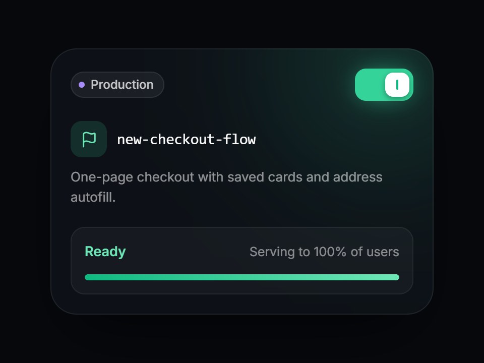
A dark feature-flag tile: an environment pill, the flag key in mono, a short description, and a square-cornered switch. Turning it on slides the knob, lights the switch and a soft green glow, fills the rollout bar, and swaps “Off” for “Ready · Serving to 100% of users”. Space and Enter toggle it too. Swap the flag, environment, and copy, then drop it into a developer platform or release-management feature grid.
Full TSX source. No account needed.
feature-flag-card.tsx
"use client"; import * as React from "react";import { Flag } from "lucide-react";import { cn } from "@/lib/utils"; export type FeatureFlagCardProps = Omit< React.ComponentPropsWithoutRef<"div">, "onChange"> & { /** Flag key, shown in mono. */ name?: string; environment?: string; description?: string; enabled?: boolean; defaultEnabled?: boolean; onEnabledChange?: (enabled: boolean) => void; readyLabel?: string; offLabel?: string; /** Line under the status while on. */ readyDetail?: string; /** Line under the status while off. */ offDetail?: string; /** Accessible name for the switch. */ switchLabel?: string;}; const EASE = "cubic-bezier(0.22, 1, 0.36, 1)"; const CSS = `@keyframes feature-flag-card-glow { 0%, 100% { opacity: 0.55; } 50% { opacity: 1; } }.feature-flag-card-glow { animation: feature-flag-card-glow 2.4s ease-in-out infinite; }@media (prefers-reduced-motion: reduce) { .feature-flag-card-glow { animation: none; opacity: 0.8; }}`; export const FeatureFlagCard = React.forwardRef< HTMLDivElement, FeatureFlagCardProps>( ( { name = "new-checkout-flow", environment = "Production", description = "One-page checkout with saved cards and address autofill.", enabled, defaultEnabled = true, onEnabledChange, readyLabel = "Ready", offLabel = "Off", readyDetail = "Serving to 100% of users", offDetail = "Everyone sees the current flow", switchLabel = "Enable flag", className, ...props }, ref, ) => { const id = React.useId(); const [uncontrolled, setUncontrolled] = React.useState(defaultEnabled); const on = enabled ?? uncontrolled; const toggle = () => { const next = !on; if (enabled === undefined) setUncontrolled(next); onEnabledChange?.(next); }; return ( <div ref={ref} data-tsuna-id="feature-flag-card" data-enabled={on ? "" : undefined} className={cn( "relative w-[380px] max-w-full overflow-hidden rounded-[26px] bg-[#0d1117] p-5 text-white", "shadow-[0_30px_60px_-30px_rgba(0,0,0,0.85),inset_0_0_0_1px_rgba(255,255,255,0.08)]", className, )} {...props} > <style>{CSS}</style> <div aria-hidden className={cn( "pointer-events-none absolute -top-24 -right-16 size-56 rounded-full blur-3xl motion-reduce:!transition-none", on && "feature-flag-card-glow", )} style={{ background: on ? "rgba(52,211,153,0.28)" : "rgba(148,163,184,0.12)", transition: `background-color 600ms ${EASE}`, }} /> <div className="relative flex items-center justify-between gap-3"> <span className="inline-flex items-center gap-1.5 rounded-full bg-white/[0.06] py-1 pr-2.5 pl-2 text-[12px] font-medium text-white/75 shadow-[inset_0_0_0_1px_rgba(255,255,255,0.08)]"> <span aria-hidden className="size-1.5 rounded-full bg-violet-400" /> {environment} </span> <button type="button" role="switch" aria-checked={on} aria-label={switchLabel} aria-describedby={`${id}-status`} onClick={toggle} className={cn( "relative h-8 w-[58px] shrink-0 cursor-pointer rounded-[11px] border-0 p-0", "transition-[background-color,box-shadow] duration-500 motion-reduce:transition-none", "focus-visible:outline-none focus-visible:ring-2 focus-visible:ring-white/60 focus-visible:ring-offset-2 focus-visible:ring-offset-[#0d1117]", on ? "bg-emerald-400 shadow-[0_0_24px_-4px_rgba(52,211,153,0.7)]" : "bg-white/[0.12] shadow-[inset_0_0_0_1px_rgba(255,255,255,0.1)]", )} style={{ transitionTimingFunction: EASE }} > <span aria-hidden className={cn( "absolute top-1 left-1 grid h-6 w-6 place-items-center rounded-[8px] shadow-[0_2px_6px_rgba(0,0,0,0.35)] motion-reduce:!transition-none", on ? "bg-white" : "bg-white/80", )} style={{ transform: on ? "translateX(26px)" : "none", transition: `transform 420ms ${EASE}`, }} > <span className={cn( "h-2.5 w-[2px] rounded-full transition-colors duration-300 motion-reduce:transition-none", on ? "bg-emerald-500" : "bg-zinc-400", )} /> </span> </button> </div> <div className="relative mt-5 flex items-center gap-2.5"> <span aria-hidden className={cn( "grid size-9 shrink-0 place-items-center rounded-[11px] transition-colors duration-500 motion-reduce:transition-none", on ? "bg-emerald-400/15 text-emerald-300" : "bg-white/[0.07] text-white/55", )} > <Flag className="size-[17px]" strokeWidth={2} /> </span> <span className="min-w-0 truncate font-mono text-[15px] font-medium tracking-[-0.01em]"> {name} </span> </div> {description ? ( <p className="relative m-0 mt-2.5 text-[13px] leading-[1.5] text-white/55"> {description} </p> ) : null} <div className="relative mt-5 rounded-[14px] bg-white/[0.04] p-3.5 shadow-[inset_0_0_0_1px_rgba(255,255,255,0.06)]"> <div id={`${id}-status`} aria-live="polite" className="grid"> {[true, false].map((state) => { const visible = state === on; return ( <span key={String(state)} aria-hidden={!visible} className="col-start-1 row-start-1 flex items-baseline justify-between gap-3 motion-reduce:!transition-none" style={{ opacity: visible ? 1 : 0, transform: visible ? "none" : `translateY(${state ? "-6px" : "6px"})`, transition: `opacity 280ms ${EASE}, transform 420ms ${EASE}`, }} > <span className={cn( "text-[13.5px] font-semibold", state ? "text-emerald-300" : "text-white/70", )} > {state ? readyLabel : offLabel} </span> <span className="truncate text-[12.5px] text-white/50"> {state ? readyDetail : offDetail} </span> </span> ); })} </div> <div aria-hidden className="mt-3 h-1.5 overflow-hidden rounded-full bg-white/[0.08]" > <div className="h-full origin-left rounded-full bg-gradient-to-r from-emerald-500 to-emerald-300 motion-reduce:!transition-none" style={{ transform: `scaleX(${on ? 1 : 0})`, transition: `transform 760ms ${EASE}`, }} /> </div> </div> </div> ); },); FeatureFlagCard.displayName = "FeatureFlagCard";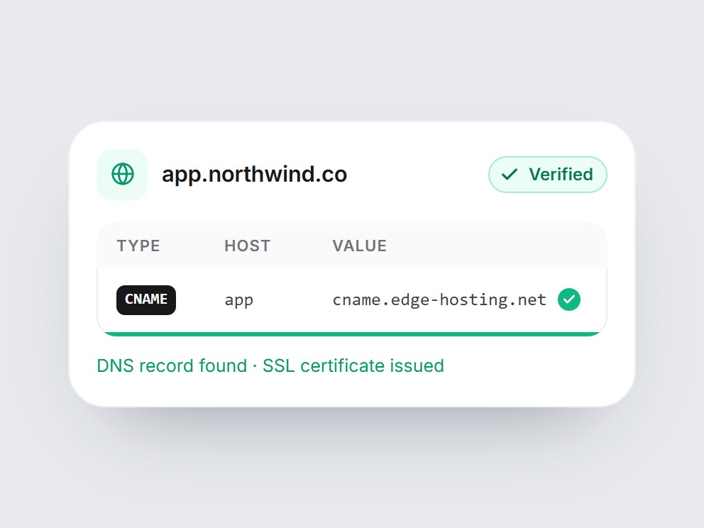
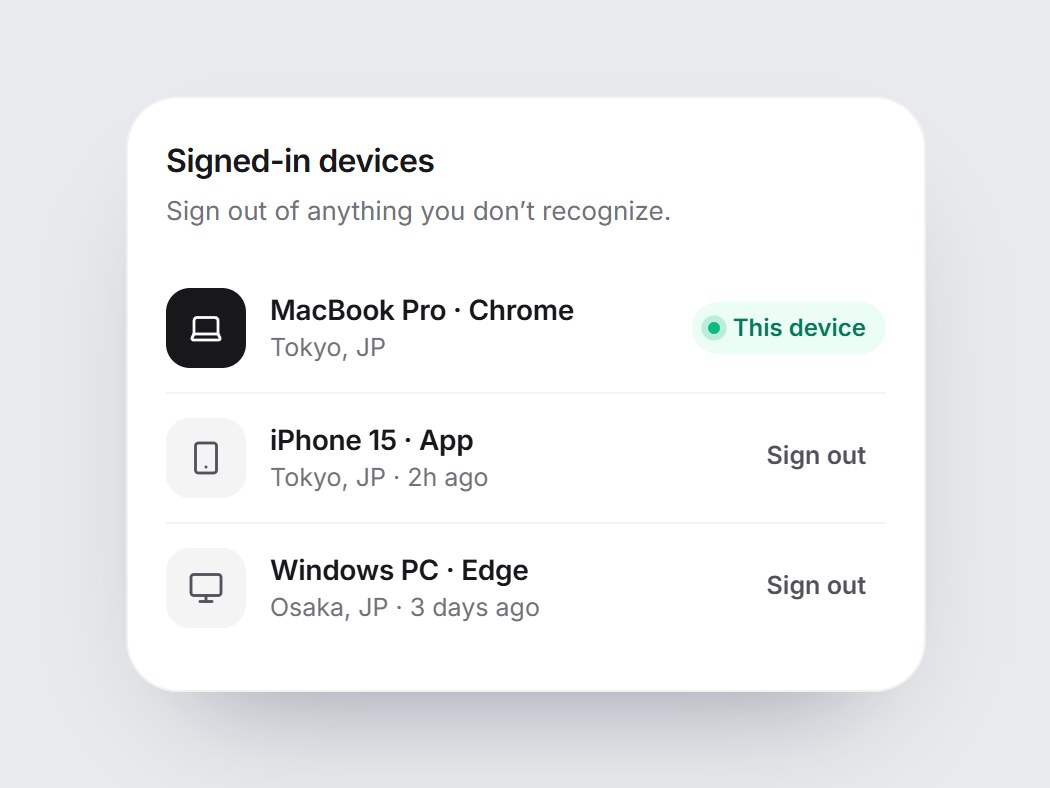
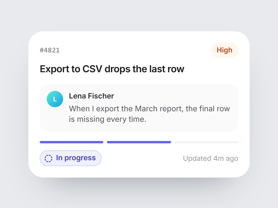
Feature Flag Card
A dark feature-flag tile: an environment pill, the flag key in mono, a short description, and a square-cornered switch. Turning it on slides the knob, lights the switch and a soft green glow, fills the rollout bar, and swaps “Off” for “Ready · Serving to 100% of users”. Space and Enter toggle it too. Swap the flag, environment, and copy, then drop it into a developer platform or release-management feature grid.
Verified Technical Spec
- Animation
- CSS / Tailwind
- Reduced motion
- Verified
- Keyboard focus
- Verified
- Compatibility
- Tailwind CSS v3.4 + v4 · React 19 / Next.js 15 App Router + Vite / Remix compatible
Included
- Copy source into Cursor or Claude for agent install
- Finished React · TypeScript · Tailwind CSS · Lucide UI
Dependencies
- React 19.0.0
- Typescript 5.7.2
- Tailwindcss 3.4.16
- Lucide-react 1.23.0
Tech Stack
- React
- TypeScript
- Tailwind CSS
- Lucide
Version 1.0.0