Back to components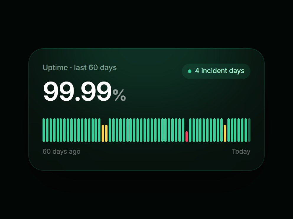
What is this?
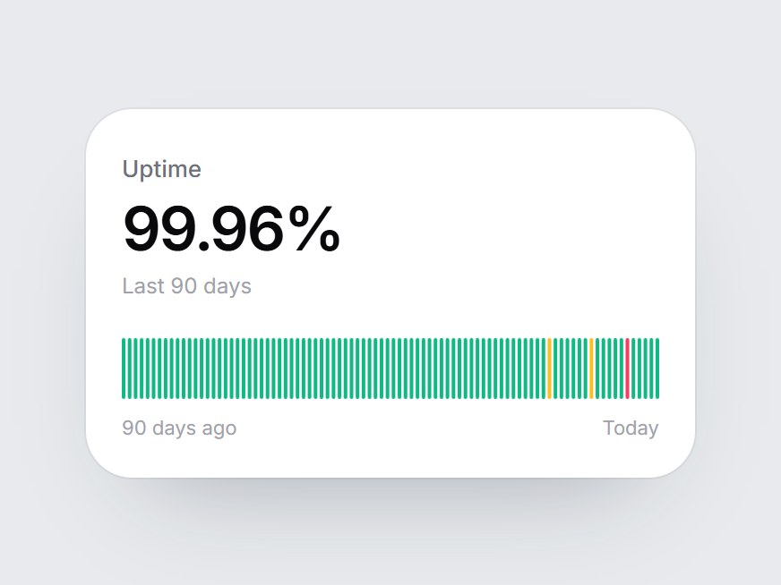
A dark status card with a large uptime figure (99.99% by default) above a row of daily ticks. The ticks rise in from left to right when the card scrolls into view, amber and red mark rough days, and today's tick pulses. Swap the figure, label, and tick list, then drop it into a status page teaser or an infrastructure feature grid.
Full TSX source. No account needed.
uptime-signal-card.tsx
"use client"; import * as React from "react";import { cn } from "@/lib/utils"; export type UptimeTick = "up" | "degraded" | "down"; function buildDefaultTicks(): UptimeTick[] { const ticks: UptimeTick[] = Array.from({ length: 60 }, () => "up"); ticks[17] = "degraded"; ticks[18] = "degraded"; ticks[41] = "down"; ticks[52] = "degraded"; return ticks;} export const UPTIME_SIGNAL_DEFAULT_TICKS: readonly UptimeTick[] = buildDefaultTicks(); export type UptimeSignalCardProps = React.ComponentPropsWithoutRef<"div"> & { /** Headline figure, e.g. "99.99%" or 99.99. */ percent?: string | number; label?: string; /** Oldest first; the last tick is today. */ ticks?: readonly UptimeTick[]; /** Caption under the left end of the ticks. */ startLabel?: string; /** Caption under the right end of the ticks. */ endLabel?: string; /** Pill text when some days are not "up", after the count. */ incidentsLabel?: string; /** Words used in each tick's tooltip. */ statusLabels?: Partial<Record<UptimeTick, string>>;}; const TONE: Record<UptimeTick, string> = { up: "bg-emerald-400", degraded: "bg-amber-300", down: "bg-rose-500",}; const DEFAULT_STATUS_LABELS: Record<UptimeTick, string> = { up: "Operational", degraded: "Degraded", down: "Outage",}; const CSS = `@keyframes uptime-signal-card-rise { from { transform: scaleY(0.12); opacity: 0; } to { transform: scaleY(1); opacity: 1; } }@keyframes uptime-signal-card-beat { 0%, 100% { opacity: 1; } 50% { opacity: 0.35; } }.uptime-signal-card-tick { transform-origin: 50% 100%; opacity: 0; }[data-painted] .uptime-signal-card-tick { animation: uptime-signal-card-rise 520ms cubic-bezier(0.22, 1, 0.36, 1) both; }[data-painted] .uptime-signal-card-latest { animation: uptime-signal-card-rise 520ms cubic-bezier(0.22, 1, 0.36, 1) both, uptime-signal-card-beat 1.8s ease-in-out infinite; }@media (prefers-reduced-motion: reduce) { .uptime-signal-card-tick, [data-painted] .uptime-signal-card-tick, [data-painted] .uptime-signal-card-latest { animation: none; opacity: 1; transform: none; }}`; export const UptimeSignalCard = React.forwardRef<HTMLDivElement, UptimeSignalCardProps>( ( { percent = "99.99%", label = "Uptime · last 60 days", ticks = UPTIME_SIGNAL_DEFAULT_TICKS, startLabel = "60 days ago", endLabel = "Today", incidentsLabel = "incident days", statusLabels, className, ...props }, ref, ) => { const list = ticks.length > 0 ? ticks : UPTIME_SIGNAL_DEFAULT_TICKS; const words = { ...DEFAULT_STATUS_LABELS, ...statusLabels }; const localRef = React.useRef<HTMLDivElement>(null); React.useImperativeHandle(ref, () => localRef.current as HTMLDivElement); const [painted, setPainted] = React.useState(false); React.useEffect(() => { const node = localRef.current; if (!node || typeof IntersectionObserver === "undefined") { setPainted(true); return; } const observer = new IntersectionObserver( ([entry]) => { if (entry?.isIntersecting) { setPainted(true); observer.disconnect(); } }, { threshold: 0.35 }, ); observer.observe(node); return () => observer.disconnect(); }, []); const text = typeof percent === "number" ? `${percent}%` : percent; const match = /^([\d.,]+)(.*)$/.exec(text); const incidents = list.filter((t) => t !== "up").length; const stagger = Math.min(18, 900 / list.length); return ( <div ref={localRef} data-tsuna-id="uptime-signal-card" data-painted={painted ? "" : undefined} className={cn( "relative w-[400px] max-w-full overflow-hidden rounded-[26px] bg-[#07100c] p-6 text-white", "shadow-[0_30px_60px_-30px_rgba(0,0,0,0.85),inset_0_0_0_1px_rgba(52,211,153,0.12)]", className, )} {...props} > <style>{CSS}</style> <div aria-hidden className="pointer-events-none absolute -top-24 left-1/2 h-48 w-80 -translate-x-1/2 rounded-full bg-emerald-400/20 blur-3xl" /> <div className="relative flex items-start justify-between gap-4"> <div className="flex flex-col"> <span className="text-[12.5px] font-medium text-emerald-100/55">{label}</span> <span className="mt-2 text-[44px] leading-none font-semibold tabular-nums tracking-[-0.04em]"> {match ? ( <> {match[1]} <span className="text-[26px] text-white/55">{match[2]}</span> </> ) : ( text )} </span> </div> <span className="mt-0.5 inline-flex shrink-0 items-center gap-1.5 rounded-full bg-emerald-400/10 px-2.5 py-1 text-[11.5px] font-medium text-emerald-200"> <span aria-hidden className="size-1.5 rounded-full bg-emerald-400" /> {incidents === 0 ? words.up : `${incidents} ${incidentsLabel}`} </span> </div> <div role="img" aria-label={`${label}: ${text}. ${incidents} of ${list.length} days with incidents.`} className="relative mt-6 flex h-10 items-end gap-[2px]" > {list.map((tick, i) => { const latest = i === list.length - 1; return ( <span key={i} title={`${list.length - 1 - i === 0 ? endLabel : `${list.length - 1 - i}d ago`} · ${words[tick]}`} className={cn( "min-w-0 flex-1 rounded-[2px]", TONE[tick], tick === "up" ? "h-full" : tick === "degraded" ? "h-[72%]" : "h-[46%]", "uptime-signal-card-tick", latest && "uptime-signal-card-latest", )} style={{ animationDelay: latest ? `${i * stagger}ms, ${i * stagger + 700}ms` : `${i * stagger}ms`, }} /> ); })} </div> <div className="relative mt-2 flex justify-between text-[11px] text-white/35"> <span>{startLabel}</span> <span>{endLabel}</span> </div> </div> ); },); UptimeSignalCard.displayName = "UptimeSignalCard";
Component
Uptime Signal Card
A dark status card with a large uptime figure (99.99% by default) above a row of daily ticks. The ticks rise in from left to right when the card scrolls into view, amber and red mark rough days, and today's tick pulses. Swap the figure, label, and tick list, then drop it into a status page teaser or an infrastructure feature grid.
Verified Technical Spec
- Animation
- CSS / Tailwind
- Reduced motion
- Verified
- Keyboard focus
- Not detected in source
- Compatibility
- Tailwind CSS v3.4 + v4 · React 19 / Next.js 15 App Router + Vite / Remix compatible
Included
- Copy source into Cursor or Claude for agent install
- Finished React · TypeScript · Tailwind CSS UI
Dependencies
- React 19.0.0
- Typescript 5.7.2
- Tailwindcss 3.4.16
Tech Stack
- React
- TypeScript
- Tailwind CSS
Version 1.0.0