Back to components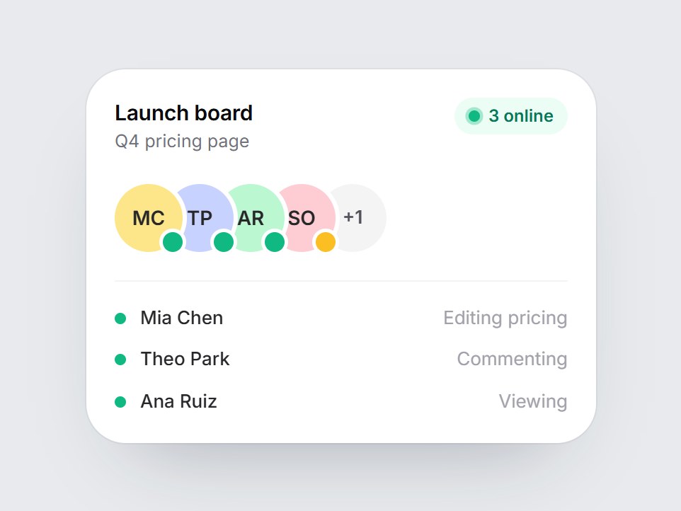
What is this?
A white presence tile for a shared doc or board: a title, overlapping teammate avatars with status dots, a “3 online” pill with a live ping, and who is doing what. Avatars rise in one by one when the card comes into view. Swap the people, photos, statuses, and labels, then drop it into a collaboration or multiplayer feature grid.
Full TSX source. No account needed.
presence-stack-card.tsx
"use client"; import * as React from "react";import { cn } from "@/lib/utils"; export type PresenceStatus = "online" | "away" | "offline"; export type PresencePerson = { id: string; name: string; /** Optional avatar image. Initials are used when it is missing. */ src?: string; status?: PresenceStatus; /** Short activity line, e.g. "Editing hero". */ activity?: string;}; export const PRESENCE_STACK_DEFAULT_PEOPLE: readonly PresencePerson[] = [ { id: "mia", name: "Mia Chen", status: "online", activity: "Editing pricing" }, { id: "theo", name: "Theo Park", status: "online", activity: "Commenting" }, { id: "ana", name: "Ana Ruiz", status: "online", activity: "Viewing" }, { id: "sam", name: "Sam Okafor", status: "away", activity: "Idle 6m" }, { id: "lea", name: "Léa Martin", status: "offline" },]; export type PresenceStackCardProps = React.ComponentPropsWithoutRef<"div"> & { people?: readonly PresencePerson[]; /** Text after the count, e.g. "online" → "3 online". */ onlineLabel?: string; title?: string; subtitle?: string; /** Avatars shown before the "+N" chip. */ maxAvatars?: number;}; const EASE = "cubic-bezier(0.22, 1, 0.36, 1)";const SWATCHES = ["#fde68a", "#c7d2fe", "#bbf7d0", "#fecdd3", "#bae6fd", "#e9d5ff"]; const STATUS_DOT: Record<PresenceStatus, string> = { online: "bg-emerald-500", away: "bg-amber-400", offline: "bg-zinc-300",}; const CSS = `@keyframes presence-stack-card-ping { 0% { transform: scale(1); opacity: 0.55; } 100% { transform: scale(2.4); opacity: 0; } }.presence-stack-card-ping { animation: presence-stack-card-ping 1.8s cubic-bezier(0.22, 1, 0.36, 1) infinite; }@media (prefers-reduced-motion: reduce) { .presence-stack-card-ping { animation: none; display: none; } }`; function initials(name: string) { return name .split(/\s+/) .filter(Boolean) .slice(0, 2) .map((part) => part.charAt(0).toUpperCase()) .join("");} export const PresenceStackCard = React.forwardRef<HTMLDivElement, PresenceStackCardProps>( ( { people = PRESENCE_STACK_DEFAULT_PEOPLE, onlineLabel = "online", title = "Launch board", subtitle = "Q4 pricing page", maxAvatars = 4, className, ...props }, ref, ) => { const list = people.length > 0 ? people : PRESENCE_STACK_DEFAULT_PEOPLE; const localRef = React.useRef<HTMLDivElement>(null); React.useImperativeHandle(ref, () => localRef.current as HTMLDivElement); const [shown, setShown] = React.useState(false); React.useEffect(() => { const node = localRef.current; if (!node || typeof IntersectionObserver === "undefined") { setShown(true); return; } const observer = new IntersectionObserver( ([entry]) => { if (entry?.isIntersecting) { setShown(true); observer.disconnect(); } }, { threshold: 0.3 }, ); observer.observe(node); return () => observer.disconnect(); }, []); const sorted = [...list].sort((a, b) => { const rank = (p: PresencePerson) => (p.status === "online" ? 0 : p.status === "away" ? 1 : 2); return rank(a) - rank(b); }); const online = list.filter((p) => (p.status ?? "online") === "online").length; const avatars = sorted.slice(0, Math.max(1, maxAvatars)); const extra = sorted.length - avatars.length; const active = sorted.filter((p) => (p.status ?? "online") !== "offline").slice(0, 3); const enter = (i: number): React.CSSProperties => ({ opacity: shown ? 1 : 0, transform: shown ? "translateY(0) scale(1)" : "translateY(10px) scale(0.92)", transition: `opacity 420ms ${EASE} ${i * 70}ms, transform 520ms ${EASE} ${i * 70}ms`, }); return ( <div ref={localRef} data-tsuna-id="presence-stack-card" className={cn( "w-[360px] max-w-full rounded-[28px] bg-white p-5 text-zinc-950", "shadow-[0_30px_60px_-34px_rgba(15,23,42,0.35),0_0_0_1px_rgba(15,23,42,0.05)]", className, )} {...props} > <style>{CSS}</style> <div className="flex items-start justify-between gap-3"> <span className="flex min-w-0 flex-col"> <span className="truncate text-[15px] font-semibold tracking-[-0.01em]">{title}</span> <span className="truncate text-[12.5px] text-zinc-500">{subtitle}</span> </span> <span className="inline-flex shrink-0 items-center gap-1.5 rounded-full bg-emerald-50 px-2.5 py-1 text-[12px] font-semibold text-emerald-700"> <span className="relative grid size-2 place-items-center"> <span aria-hidden className="presence-stack-card-ping absolute inset-0 rounded-full bg-emerald-500" /> <span aria-hidden className="relative size-2 rounded-full bg-emerald-500" /> </span> {online} {onlineLabel} </span> </div> <ul aria-label={`${online} ${onlineLabel}`} className="m-0 mt-5 flex list-none items-center p-0"> {avatars.map((person, i) => { const status = person.status ?? "online"; return ( <li key={person.id} className={cn("relative motion-reduce:!transition-none", i > 0 && "-ml-3")} style={{ ...enter(i), zIndex: avatars.length - i }} > <span title={person.name} className={cn( "grid size-12 place-items-center overflow-hidden rounded-full text-[14px] font-semibold text-zinc-800 ring-[3px] ring-white", "transition-transform duration-300 hover:-translate-y-1 motion-reduce:transition-none motion-reduce:hover:translate-y-0", status === "offline" && "grayscale", )} style={{ backgroundColor: SWATCHES[i % SWATCHES.length] }} > {person.src ? ( // eslint-disable-next-line @next/next/no-img-element <img src={person.src} alt="" className="h-full w-full object-cover" /> ) : ( initials(person.name) )} </span> <span aria-hidden className={cn( "absolute right-0 bottom-0 size-3.5 rounded-full ring-[2.5px] ring-white", STATUS_DOT[status], )} /> <span className="sr-only">{`${person.name}, ${status}`}</span> </li> ); })} {extra > 0 ? ( <li className="relative -ml-3 grid size-12 place-items-center rounded-full bg-zinc-100 text-[13px] font-semibold text-zinc-600 ring-[3px] ring-white motion-reduce:!transition-none" style={enter(avatars.length)} > +{extra} </li> ) : null} </ul> <ul className="m-0 mt-5 flex list-none flex-col gap-2.5 border-t border-zinc-100 p-0 pt-4"> {active.map((person, i) => { const status = person.status ?? "online"; return ( <li key={person.id} className="flex items-center gap-2.5 text-[13px] motion-reduce:!transition-none" style={enter(i + avatars.length + 1)} > <span aria-hidden className={cn("size-2 shrink-0 rounded-full", STATUS_DOT[status])} /> <span className="min-w-0 flex-1 truncate font-medium text-zinc-800">{person.name}</span> {person.activity ? ( <span className="shrink-0 truncate text-zinc-400">{person.activity}</span> ) : null} </li> ); })} </ul> </div> ); },); PresenceStackCard.displayName = "PresenceStackCard";
Component
Presence Stack Card
A white presence tile for a shared doc or board: a title, overlapping teammate avatars with status dots, a “3 online” pill with a live ping, and who is doing what. Avatars rise in one by one when the card comes into view. Swap the people, photos, statuses, and labels, then drop it into a collaboration or multiplayer feature grid.
Verified Technical Spec
- Animation
- CSS / Tailwind
- Reduced motion
- Verified
- Keyboard focus
- Not detected in source
- Compatibility
- Tailwind CSS v3.4 + v4 · React 19 / Next.js 15 App Router + Vite / Remix compatible
Included
- Copy source into Cursor or Claude for agent install
- Finished React · TypeScript · Tailwind CSS UI
Dependencies
- React 19.0.0
- Typescript 5.7.2
- Tailwindcss 3.4.16
Tech Stack
- React
- TypeScript
- Tailwind CSS
Version 1.0.0