What is this?
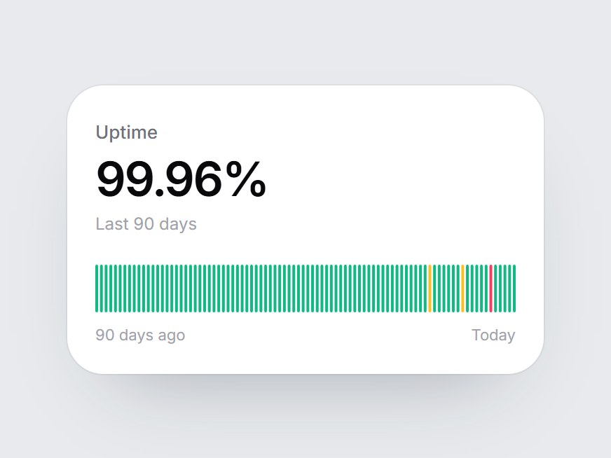
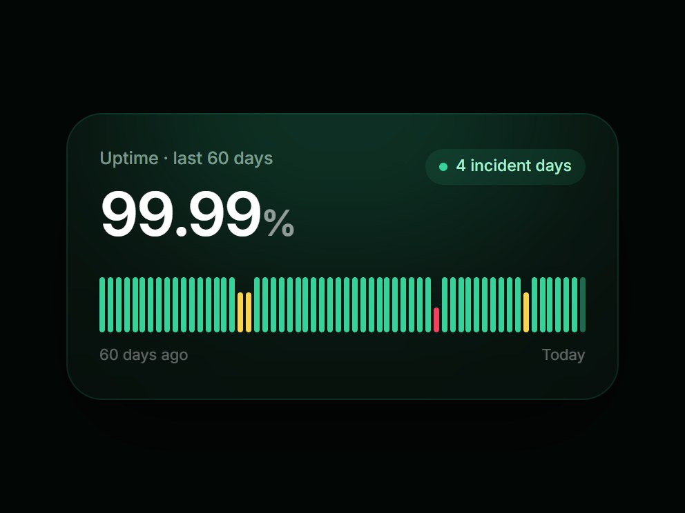
A white reliability tile: a label, a big uptime figure, and a slim strip of ninety daily ticks. When the card comes into view, the ticks rise from the left one after another. Healthy days are green, degraded days amber, and outages rose. Swap the label, figure, and days, then drop it into a status page, an SLA summary, or a reliability feature block.
Full TSX source. No account needed.
uptime-day-strip.tsx
"use client"; import * as React from "react";import { cn } from "@/lib/utils"; export type UptimeDayStatus = "up" | "degraded" | "down"; /** * 90 days, oldest first. Almost every day is "up"; two degraded days (72 and 79) * and one outage (85) sit near the end so the strip reads at a glance. */export const UPTIME_DAY_STRIP_DEFAULT_DAYS: readonly UptimeDayStatus[] = Array.from( { length: 90 }, (_, index): UptimeDayStatus => { if (index === 84) return "down"; if (index === 71 || index === 78) return "degraded"; return "up"; },); export type UptimeDayStripProps = React.ComponentPropsWithoutRef<"div"> & { label?: string; /** Pre-formatted figure, e.g. "99.96%". */ value?: React.ReactNode; /** Line under the figure. */ caption?: string; /** Oldest first. One tick per day. */ days?: readonly UptimeDayStatus[]; /** Left end of the strip. Defaults to "{n} days ago". */ startLabel?: string; endLabel?: string;}; const EASE = "cubic-bezier(0.22, 1, 0.36, 1)";const TICK_MS = 400;const STAGGER_MS = 12;const PITCH = 4;const TICK_W = 2.4;const STRIP_H = 34;const TONE: Record<UptimeDayStatus, string> = { up: "#10b981", degraded: "#fbbf24", down: "#f43f5e",}; export const UptimeDayStrip = React.forwardRef<HTMLDivElement, UptimeDayStripProps>( ( { label = "Uptime", value = "99.96%", caption = "Last 90 days", days = UPTIME_DAY_STRIP_DEFAULT_DAYS, startLabel, endLabel = "Today", className, ...props }, ref, ) => { const localRef = React.useRef<HTMLDivElement>(null); React.useImperativeHandle(ref, () => localRef.current as HTMLDivElement); const [painted, setPainted] = React.useState(false); const degraded = days.filter((day) => day === "degraded").length; const down = days.filter((day) => day === "down").length; React.useEffect(() => { const node = localRef.current; if (!node || typeof IntersectionObserver === "undefined") { setPainted(true); return; } const observer = new IntersectionObserver( ([entry]) => { if (entry?.isIntersecting) { setPainted(true); observer.disconnect(); } }, { threshold: 0.35 }, ); observer.observe(node); return () => observer.disconnect(); }, []); return ( <div ref={localRef} data-tsuna-id="uptime-day-strip" className={cn( "w-[340px] max-w-full rounded-[26px] bg-white p-5 text-zinc-950", "shadow-[0_30px_60px_-34px_rgba(15,23,42,0.35),0_0_0_1px_rgba(15,23,42,0.05)]", className, )} {...props} > <span className="text-[13px] font-medium text-zinc-500">{label}</span> <div className="mt-1.5 text-[34px] leading-none font-semibold tabular-nums tracking-[-0.04em]"> {value} </div> {caption ? <span className="mt-1.5 block text-[12px] text-zinc-400">{caption}</span> : null} <svg role="img" aria-label={`${label}, ${days.length} days: ${degraded} degraded, ${down} down`} viewBox={`0 0 ${days.length * PITCH - (PITCH - TICK_W)} ${STRIP_H}`} preserveAspectRatio="none" className="mt-5 block h-[34px] w-full" > {days.map((day, index) => ( <rect key={index} x={index * PITCH} y={0} width={TICK_W} height={STRIP_H} rx={1.2} fill={TONE[day]} className="motion-reduce:!transition-none" style={{ transformBox: "fill-box", transformOrigin: "50% 100%", transform: `scaleY(${painted ? 1 : 0})`, transition: `transform ${TICK_MS}ms ${EASE} ${index * STAGGER_MS}ms`, }} /> ))} </svg> <div className="mt-2 flex items-center justify-between text-[11px] text-zinc-400"> <span>{startLabel ?? `${days.length} days ago`}</span> <span>{endLabel}</span> </div> </div> ); },); UptimeDayStrip.displayName = "UptimeDayStrip";
Uptime Day Strip
A white reliability tile: a label, a big uptime figure, and a slim strip of ninety daily ticks. When the card comes into view, the ticks rise from the left one after another. Healthy days are green, degraded days amber, and outages rose. Swap the label, figure, and days, then drop it into a status page, an SLA summary, or a reliability feature block.
Verified Technical Spec
- Animation
- CSS / Tailwind
- Reduced motion
- Verified
- Keyboard focus
- Not detected in source
- Compatibility
- Tailwind CSS v3.4 + v4 · React 19 / Next.js 15 App Router + Vite / Remix compatible
Included
- Copy source into Cursor or Claude for agent install
- Finished React · TypeScript · Tailwind CSS UI
Dependencies
- React 19.0.0
- Typescript 5.7.2
- Tailwindcss 3.4.16
Tech Stack
- React
- TypeScript
- Tailwind CSS
Version 1.0.0