Onboarding Checklist Card
What is this?
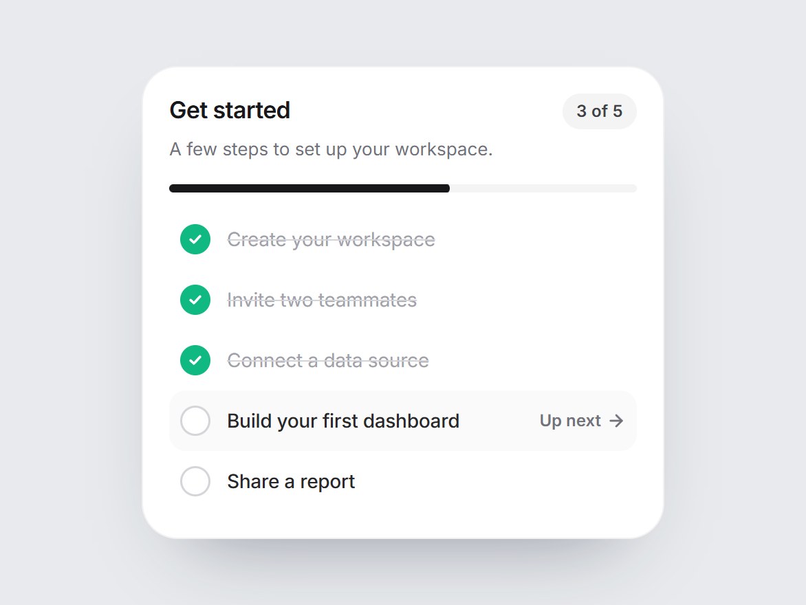
A white “Get started” tile with a progress fraction such as 3 of 5, a thin progress bar, and a short checklist. The open steps tick off one by one: the circle fills green, a check draws itself, and the label fades with a strike-through while “Up next” moves down. It pauses off screen and holds still under reduced motion. Swap the title and steps, then drop it into an empty dashboard or a product tour section.
Onboarding Checklist Card
A white “Get started” tile with a progress fraction such as 3 of 5, a thin progress bar, and a short checklist. The open steps tick off one by one: the circle fills green, a check draws itself, and the label fades with a strike-through while “Up next” moves down. It pauses off screen and holds still under reduced motion. Swap the title and steps, then drop it into an empty dashboard or a product tour section.
Verified Technical Spec
- Animation
- CSS / Tailwind
- Reduced motion
- Verified
- Keyboard focus
- Not detected in source
- Compatibility
- Tailwind CSS v3.4 + v4 · React 19 / Next.js 15 App Router + Vite / Remix compatible
Included
- Copy source into Cursor or Claude for agent install
- Finished React · TypeScript · Tailwind CSS · Lucide UI
Dependencies
- React 19.0.0
- Typescript 5.7.2
- Tailwindcss 3.4.16
- Lucide-react 1.23.0
Tech Stack
- React
- TypeScript
- Tailwind CSS
- Lucide
Version 1.0.0