Value Histogram Card
What is this?
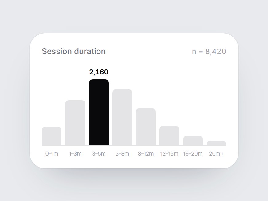
A white distribution card: a label, a sample size, and eight columns with a range under each. When the card comes into view, the columns grow from the baseline one after another, left to right, and the tallest bin turns dark and shows its count. Swap the label, caption, and bins, then drop it into a usage report, a performance breakdown, or an analytics feature grid.
Value Histogram Card
A white distribution card: a label, a sample size, and eight columns with a range under each. When the card comes into view, the columns grow from the baseline one after another, left to right, and the tallest bin turns dark and shows its count. Swap the label, caption, and bins, then drop it into a usage report, a performance breakdown, or an analytics feature grid.
Verified Technical Spec
- Animation
- CSS / Tailwind
- Reduced motion
- Verified
- Keyboard focus
- Not detected in source
- Compatibility
- Tailwind CSS v3.4 + v4 · React 19 / Next.js 15 App Router + Vite / Remix compatible
Included
- Copy source into Cursor or Claude for agent install
- Finished React · TypeScript · Tailwind CSS UI
Dependencies
- React 19.0.0
- Typescript 5.7.2
- Tailwindcss 3.4.16
Tech Stack
- React
- TypeScript
- Tailwind CSS
Version 1.0.0