Budget Burn Card
What is this?
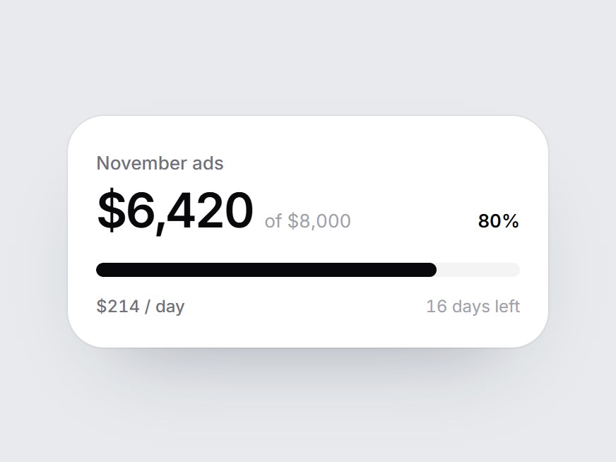
A white spend-versus-budget tile: a label, the amount spent, the budget, a linear bar, and a row for burn rate and days left. When the card comes into view, the bar fills to the share used, the amount counts up, and the two captions fade in. Swap the label, value, budget, and captions, then drop it into an ads dashboard, a cost report, or a billing feature block.
Budget Burn Card
A white spend-versus-budget tile: a label, the amount spent, the budget, a linear bar, and a row for burn rate and days left. When the card comes into view, the bar fills to the share used, the amount counts up, and the two captions fade in. Swap the label, value, budget, and captions, then drop it into an ads dashboard, a cost report, or a billing feature block.
Verified Technical Spec
- Animation
- CSS / Tailwind
- Reduced motion
- Verified
- Keyboard focus
- Not detected in source
- Compatibility
- Tailwind CSS v3.4 + v4 · React 19 / Next.js 15 App Router + Vite / Remix compatible
Included
- Copy source into Cursor or Claude for agent install
- Finished React · TypeScript · Tailwind CSS UI
Dependencies
- React 19.0.0
- Typescript 5.7.2
- Tailwindcss 3.4.16
Tech Stack
- React
- TypeScript
- Tailwind CSS
Version 1.0.0