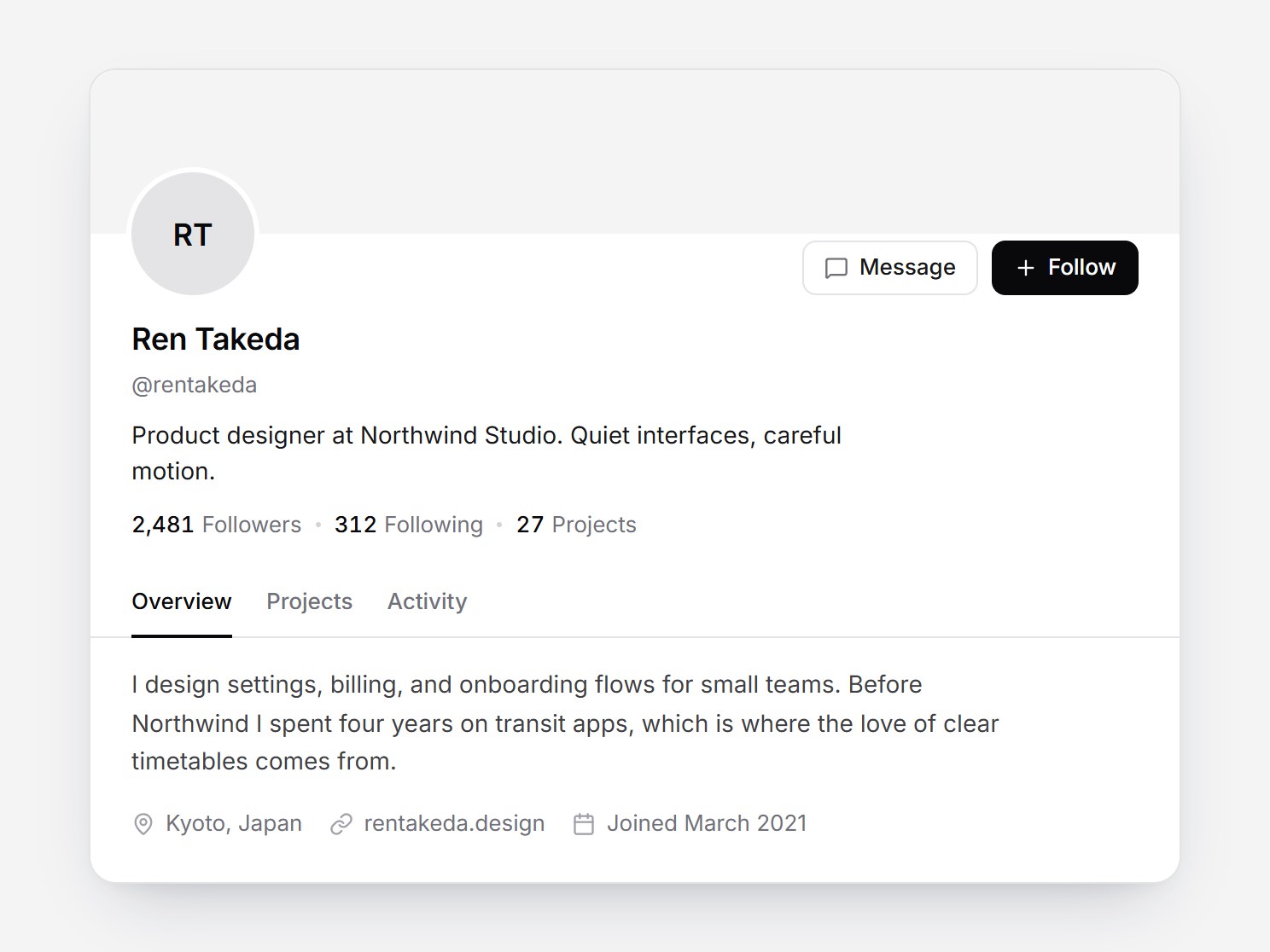
What is this?
A white profile header: a flat muted cover with an overlapping avatar, the name, handle, and a short bio, stats for Followers 2,481, Following 312, and Projects 27, and Message and Follow buttons. Follow turns into “Following” and the follower count rolls up by one; clicking again rolls it back. Under Overview, Projects, and Activity, the tab underline slides, the panel crossfades, and the card height follows. Swap the name, numbers, and tab content, then drop it into a community, a portfolio, or a team directory.
Full TSX source. No account needed.
profile-header-section.tsx
"use client"; import * as React from "react";import { Calendar, Check, CreditCard, FileText, ImagePlus, Layers, Link, MapPin, MessageSquare, Plus, TramFront, UserPlus, type LucideIcon,} from "lucide-react";import { AnimatePresence, animate, motion, useReducedMotion } from "motion/react";import { cn } from "@/lib/utils"; export type ProfileHeaderStat = { id: string; label: string; value: number;}; export type ProfileHeaderProject = { id: string; title: string; meta: string;}; export type ProfileHeaderActivity = { id: string; text: string; time: string;}; export type ProfileHeaderTab = "overview" | "projects" | "activity"; export type ProfileHeaderLabels = { follow?: string; following?: string; /** Shown in place of `following` while that button is hovered. */ unfollow?: string; message?: string; overview?: string; projects?: string; activity?: string; about?: string;}; export type ProfileHeaderSectionProps = Omit< React.ComponentPropsWithoutRef<"div">, "onDrag" | "onDragStart" | "onDragEnd" | "onAnimationStart"> & { name?: string; handle?: string; bio?: string; /** Longer text in the Overview tab. */ about?: string; location?: string; website?: string; joined?: string; /** Optional cover image. A flat muted fill shows when unset. */ coverSrc?: string; /** Optional avatar image. Initials show when unset. */ avatarSrc?: string; /** The stat with id "followers" follows the Follow button. */ stats?: readonly ProfileHeaderStat[]; projects?: readonly ProfileHeaderProject[]; activity?: readonly ProfileHeaderActivity[]; following?: boolean; defaultFollowing?: boolean; onFollowingChange?: (following: boolean) => void; onMessage?: () => void; tab?: ProfileHeaderTab; defaultTab?: ProfileHeaderTab; onTabChange?: (tab: ProfileHeaderTab) => void; labels?: ProfileHeaderLabels;}; const EASE = "cubic-bezier(0.22, 1, 0.36, 1)";const EASE_CURVE = [0.22, 1, 0.36, 1] as const;const FOCUS = "outline-none focus-visible:outline-none focus-visible:ring-2 focus-visible:ring-zinc-900/35 focus-visible:ring-offset-2"; const CSS = `@keyframes profile-header-section-in-up { from { opacity: 0; transform: translateY(100%); } to { opacity: 1; transform: none; } }@keyframes profile-header-section-in-down { from { opacity: 0; transform: translateY(-100%); } to { opacity: 1; transform: none; } }@keyframes profile-header-section-out-up { from { opacity: 1; transform: none; } to { opacity: 0; transform: translateY(-100%); } }@keyframes profile-header-section-out-down { from { opacity: 1; transform: none; } to { opacity: 0; transform: translateY(100%); } }.profile-header-section-in-up { animation: profile-header-section-in-up 200ms ${EASE} both; }.profile-header-section-in-down { animation: profile-header-section-in-down 200ms ${EASE} both; }.profile-header-section-out-up { animation: profile-header-section-out-up 200ms ${EASE} both; }.profile-header-section-out-down { animation: profile-header-section-out-down 200ms ${EASE} both; }@media (prefers-reduced-motion: reduce) { .profile-header-section-in-up, .profile-header-section-in-down { animation: none; } .profile-header-section-out-up, .profile-header-section-out-down { animation: none; opacity: 0; }}`; const DEFAULT_STATS: readonly ProfileHeaderStat[] = [ { id: "followers", label: "Followers", value: 2481 }, { id: "following", label: "Following", value: 312 }, { id: "projects", label: "Projects", value: 27 },]; const DEFAULT_PROJECTS: readonly ProfileHeaderProject[] = [ { id: "pr1", title: "Harbor checkout", meta: "Case study · 2026" }, { id: "pr2", title: "Lumen design system", meta: "Open source · 2025" }, { id: "pr3", title: "Kite Transit app", meta: "Mobile · 2025" },]; const DEFAULT_ACTIVITY: readonly ProfileHeaderActivity[] = [ { id: "a1", text: "Published “Designing calm settings pages”", time: "2d" }, { id: "a2", text: "Added 4 screens to Harbor checkout", time: "5d" }, { id: "a3", text: "Started following Mina Okada", time: "1w" },]; const DEFAULT_LABELS: Required<ProfileHeaderLabels> = { follow: "Follow", following: "Following", unfollow: "Unfollow", message: "Message", overview: "Overview", projects: "Projects", activity: "Activity", about: "About",}; const TABS: readonly ProfileHeaderTab[] = ["overview", "projects", "activity"];const PROJECT_ICONS: readonly LucideIcon[] = [CreditCard, Layers, TramFront]; function initials(name: string) { return name .split(/\s+/) .slice(0, 2) .map((part) => part.charAt(0).toUpperCase()) .join("");} const LABEL_SLIDE = { duration: 0.15, ease: EASE_CURVE }; /** Lucide check, drawn with pathLength so the stroke can start empty. */function DrawnCheck({ reduced }: { reduced: boolean }) { const ref = React.useRef<SVGSVGElement>(null); React.useLayoutEffect(() => { const path = ref.current?.querySelector("path"); if (!path || reduced) return; const controls = animate(path, { pathLength: [0, 1] }, { duration: 0.2, delay: 0.04, ease: "easeOut" }); return () => controls.stop(); }, [reduced]); return <Check ref={ref} aria-hidden className="size-3.5" />;} function activityIcon(text: string): LucideIcon { const value = text.toLowerCase(); if (value.includes("follow")) return UserPlus; if (value.includes("added")) return ImagePlus; return FileText;} /** The whole figure slides out and the new one slides in, up when it grows. */function RollNumber({ value }: { value: number }) { const [pair, setPair] = React.useState({ prev: value, current: value }); if (pair.current !== value) setPair({ prev: pair.current, current: value }); const changed = pair.prev !== pair.current; const dir = pair.current < pair.prev ? "down" : "up"; const format = (n: number) => n.toLocaleString("en-US"); return ( <span className="relative inline-grid overflow-hidden tabular-nums"> {changed ? ( <span key={`out-${pair.prev}-${pair.current}`} aria-hidden className={cn("absolute inset-0", `profile-header-section-out-${dir}`)} > {format(pair.prev)} </span> ) : null} <span key={pair.current} className={changed ? `profile-header-section-in-${dir}` : undefined}> {format(pair.current)} </span> </span> );} export const ProfileHeaderSection = React.forwardRef<HTMLDivElement, ProfileHeaderSectionProps>( ( { name = "Ren Takeda", handle = "@rentakeda", bio = "Product designer at Northwind Studio. Quiet interfaces, careful motion.", about = "I design settings, billing, and onboarding flows for small teams. Before Northwind I spent four years on transit apps, which is where the love of clear timetables comes from.", location = "Kyoto, Japan", website = "rentakeda.design", joined = "Joined March 2021", coverSrc, avatarSrc, stats = DEFAULT_STATS, projects = DEFAULT_PROJECTS, activity = DEFAULT_ACTIVITY, following, defaultFollowing = false, onFollowingChange, onMessage, tab, defaultTab = "overview", onTabChange, labels, className, ...props }, ref, ) => { const text = { ...DEFAULT_LABELS, ...labels }; const reduced = useReducedMotion() === true; const uid = React.useId(); const [ownFollowing, setOwnFollowing] = React.useState(defaultFollowing); const isFollowing = following ?? ownFollowing; const [hoveringFollow, setHoveringFollow] = React.useState(false); const [liveLabel, setLiveLabel] = React.useState(""); const followRef = React.useRef<HTMLButtonElement>(null); const followWidth = React.useRef<number | null>(null); const followScale = React.useRef<{ stop: () => void } | null>(null); const [ownTab, setOwnTab] = React.useState<ProfileHeaderTab>(defaultTab); const active = tab ?? ownTab; const tabButtons = React.useRef<Partial<Record<ProfileHeaderTab, HTMLButtonElement | null>>>({}); const fade = reduced ? { duration: 0 } : { duration: 0.15, ease: EASE_CURVE }; const layoutTransition = reduced ? { duration: 0 } : { layout: { duration: 0.15, ease: EASE_CURVE } }; React.useLayoutEffect(() => { const el = followRef.current; if (!el) return; const next = el.offsetWidth; const prev = followWidth.current; followWidth.current = next; if (prev == null || prev === next || reduced) return; // Layout projection holds its scale until the exiting label unmounts, so the width flip runs here. el.style.transformOrigin = "right center"; followScale.current?.stop(); followScale.current = animate(el, { scaleX: [prev / next, 1] }, { duration: 0.15, ease: [0.22, 1, 0.36, 1] }); }, [isFollowing, reduced, text.follow, text.following, text.unfollow]); React.useEffect(() => { if (!isFollowing) return; const id = window.setTimeout(() => { if (followRef.current?.matches(":hover")) setHoveringFollow(true); }, reduced ? 0 : 220); return () => window.clearTimeout(id); }, [isFollowing, reduced]); const toggleFollow = () => { const next = !isFollowing; if (following === undefined) setOwnFollowing(next); if (!next) setHoveringFollow(false); setLiveLabel(next ? text.following : text.follow); onFollowingChange?.(next); }; const selectTab = (next: ProfileHeaderTab, focus = false) => { if (tab === undefined) setOwnTab(next); onTabChange?.(next); if (focus) tabButtons.current[next]?.focus(); }; const onTabKeyDown = (event: React.KeyboardEvent) => { const index = TABS.indexOf(active); let next: number | null = null; if (event.key === "ArrowRight") next = (index + 1) % TABS.length; if (event.key === "ArrowLeft") next = (index - 1 + TABS.length) % TABS.length; if (event.key === "Home") next = 0; if (event.key === "End") next = TABS.length - 1; if (next === null) return; event.preventDefault(); selectTab(TABS[next] ?? "overview", true); }; const tabLabel: Record<ProfileHeaderTab, string> = { overview: text.overview, projects: text.projects, activity: text.activity, }; const renderPanel = (which: ProfileHeaderTab) => { if (which === "projects") { return ( <ul className="m-0 grid list-none grid-cols-3 gap-3 p-0"> {projects.map((project, index) => { const Icon = PROJECT_ICONS[index % PROJECT_ICONS.length] ?? CreditCard; return ( <li key={project.id} className="overflow-hidden rounded-[10px] border border-zinc-200 bg-white transition-transform duration-150 ease-out hover:-translate-y-0.5 motion-reduce:transition-none motion-reduce:hover:translate-y-0" > <div aria-hidden className="grid aspect-[4/3] place-items-center bg-zinc-100 text-zinc-400"> <Icon className="size-5" /> </div> <div className="p-2.5"> <p className="m-0 truncate text-[13px] font-medium text-zinc-900">{project.title}</p> <p className="m-0 truncate text-[12px] text-zinc-500">{project.meta}</p> </div> </li> ); })} </ul> ); } if (which === "activity") { return ( <ul className="m-0 list-none p-0"> {activity.map((entry) => { const Icon = activityIcon(entry.text); return ( <li key={entry.id} className="flex h-10 items-center gap-2"> <Icon aria-hidden className="size-3.5 shrink-0 text-zinc-400" /> <span className="min-w-0 flex-1 truncate text-[13px] text-zinc-800">{entry.text}</span> <span className="shrink-0 text-[12px] text-zinc-400 tabular-nums">{entry.time}</span> </li> ); })} </ul> ); } return ( <div> <p className="m-0 max-w-[520px] text-[14px] leading-[1.6] text-zinc-700">{about}</p> <ul className="m-0 mt-4 flex list-none flex-wrap gap-x-4 gap-y-2 p-0 text-[13px] text-zinc-500"> {location ? ( <li className="inline-flex items-center gap-1.5"> <MapPin aria-hidden className="size-3.5 text-zinc-400" /> {location} </li> ) : null} {website ? ( <li className="inline-flex items-center gap-1.5"> <Link aria-hidden className="size-3.5 text-zinc-400" /> {website} </li> ) : null} {joined ? ( <li className="inline-flex items-center gap-1.5"> <Calendar aria-hidden className="size-3.5 text-zinc-400" /> {joined} </li> ) : null} </ul> </div> ); }; return ( <motion.div ref={ref} layout={reduced ? false : true} transition={layoutTransition} data-tsuna-id="profile-header-section" data-following={isFollowing ? "" : undefined} className={cn( "w-[640px] max-w-full overflow-clip rounded-2xl border border-zinc-200 bg-white text-zinc-900", "shadow-[0_18px_40px_-18px_rgba(15,23,42,0.28),0_4px_12px_-8px_rgba(15,23,42,0.14)]", className, )} {...props} > <style>{CSS}</style> <div aria-hidden className="h-24 rounded-t-2xl bg-zinc-100 bg-cover bg-center" style={coverSrc ? { backgroundImage: `url(${JSON.stringify(coverSrc)})` } : undefined} /> <div className="px-6"> <div className="flex items-end justify-between gap-3"> <span role="img" aria-label={name} className="-mt-9 grid size-[72px] shrink-0 place-items-center rounded-full bg-zinc-200 bg-cover bg-center text-[18px] font-semibold text-zinc-950 ring-[3px] ring-white" style={avatarSrc ? { backgroundImage: `url(${JSON.stringify(avatarSrc)})` } : undefined} > {avatarSrc ? null : initials(name)} </span> <div className="flex items-center gap-2"> <button type="button" onClick={onMessage} className={cn( "inline-flex h-8 cursor-pointer items-center gap-1.5 rounded-lg border border-zinc-200 bg-white px-3 text-[13px] font-medium whitespace-nowrap text-zinc-900", "transition-colors duration-150 hover:bg-zinc-50 motion-reduce:transition-none", FOCUS, )} > <MessageSquare aria-hidden className="size-3.5 text-zinc-500" /> {text.message} </button> <span className="sr-only" aria-live="polite"> {liveLabel} </span> <motion.button ref={followRef} type="button" aria-pressed={isFollowing} onClick={toggleFollow} onMouseEnter={() => { if (isFollowing) setHoveringFollow(true); }} onMouseLeave={() => setHoveringFollow(false)} onPointerDown={(event) => { if (event.pointerType !== "mouse" && event.pointerType !== "touch") return; event.currentTarget.dataset.pointer = ""; }} onBlur={(event) => { delete event.currentTarget.dataset.pointer; }} onKeyDown={(event) => { delete event.currentTarget.dataset.pointer; }} whileTap={ reduced ? undefined : { scale: 0.96, transition: { type: "spring", stiffness: 500, damping: 30 } } } className={cn( "inline-flex h-8 origin-right cursor-pointer items-center gap-1.5 rounded-lg border px-3 text-[13px] font-medium whitespace-nowrap", "outline-none transition-[background-color,border-color,color] duration-150 ease-out motion-reduce:transition-none", "focus:outline-none focus-visible:ring-2 focus-visible:ring-zinc-900/35 focus-visible:ring-offset-2", "data-[pointer]:focus-visible:ring-0 data-[pointer]:focus-visible:ring-offset-0", isFollowing ? "border-zinc-200 bg-white text-zinc-900 hover:bg-zinc-50" : "border-zinc-950 bg-zinc-950 text-white hover:border-zinc-800 hover:bg-zinc-800", )} > <span className="relative grid size-3.5 shrink-0 grid-cols-1 grid-rows-1 place-items-center"> <AnimatePresence initial={false}> {isFollowing ? ( <motion.span key="check" className="col-start-1 row-start-1 grid" initial={reduced ? false : { opacity: 0 }} animate={{ opacity: 1 }} exit={{ opacity: 0 }} transition={{ duration: reduced ? 0 : 0.15 }} > <DrawnCheck reduced={reduced} /> </motion.span> ) : ( <motion.span key="plus" className="col-start-1 row-start-1 grid" initial={reduced ? false : { opacity: 0, rotate: -90 }} animate={{ opacity: 1, rotate: 0 }} exit={reduced ? { opacity: 0 } : { opacity: 0, rotate: 90 }} transition={{ duration: reduced ? 0 : 0.15, ease: EASE_CURVE }} > <Plus aria-hidden className="size-3.5" /> </motion.span> )} </AnimatePresence> </span> <span className="relative grid"> <span aria-hidden className="invisible col-start-1 row-start-1 whitespace-nowrap"> {isFollowing ? (hoveringFollow ? text.unfollow : text.following) : text.follow} </span> {isFollowing ? ( <> <span aria-hidden className="invisible col-start-1 row-start-1 whitespace-nowrap"> {text.following} </span> <span aria-hidden className="invisible col-start-1 row-start-1 whitespace-nowrap"> {text.unfollow} </span> </> ) : null} <span className="absolute inset-0 overflow-hidden"> <AnimatePresence mode="popLayout" initial={false}> <motion.span key={isFollowing ? "following" : "follow"} className="absolute inset-x-0 top-0 whitespace-nowrap" initial={reduced ? false : { opacity: 0, y: 6 }} animate={{ opacity: 1, y: 0 }} exit={reduced ? { opacity: 0 } : { opacity: 0, y: -6 }} transition={reduced ? { duration: 0 } : LABEL_SLIDE} > {isFollowing ? ( <span className="grid"> <AnimatePresence initial={false}> <motion.span key={hoveringFollow ? "unfollow" : "following"} className="col-start-1 row-start-1" initial={reduced ? false : { opacity: 0 }} animate={{ opacity: 1 }} exit={{ opacity: 0 }} transition={{ duration: reduced ? 0 : 0.12 }} > {hoveringFollow ? text.unfollow : text.following} </motion.span> </AnimatePresence> </span> ) : ( text.follow )} </motion.span> </AnimatePresence> </span> </span> </motion.button> </div> </div> <h2 className="m-0 mt-3 text-[18px] font-semibold tracking-[-0.01em] text-zinc-950">{name}</h2> <p className="m-0 mt-1 text-[13px] text-zinc-500">{handle}</p> <p className="m-0 mt-2 max-w-[440px] text-[14px] leading-[1.5] text-zinc-900">{bio}</p> <dl className="m-0 mt-3 flex flex-wrap items-center gap-2"> {stats.map((stat, index) => ( <React.Fragment key={stat.id}> {index > 0 ? <span aria-hidden className="size-[3px] shrink-0 rounded-full bg-zinc-300" /> : null} <div className="flex items-baseline gap-1 whitespace-nowrap text-[13px]"> <dd className="m-0 font-medium text-zinc-950"> <RollNumber value={stat.value + (stat.id === "followers" && isFollowing ? 1 : 0)} /> </dd> <dt className="font-normal text-zinc-500">{stat.label}</dt> </div> </React.Fragment> ))} </dl> </div> <div className="mt-4"> <div role="tablist" aria-label={name} onKeyDown={onTabKeyDown} className="flex h-10 gap-5 px-6" > {TABS.map((key) => { const selected = key === active; return ( <button key={key} ref={(node) => { tabButtons.current[key] = node; }} type="button" role="tab" id={`${uid}-tab-${key}`} aria-selected={selected} aria-controls={`${uid}-panel`} tabIndex={selected ? 0 : -1} onClick={() => selectTab(key)} className={cn( "relative h-10 cursor-pointer border-0 bg-transparent px-0 text-[13px] font-medium shadow-none", "transition-colors duration-150 motion-reduce:transition-none", selected ? "text-zinc-950" : "text-zinc-500 hover:text-zinc-800", FOCUS, )} > {tabLabel[key]} {selected ? ( <motion.span layoutId={`${uid}-underline`} aria-hidden className="absolute inset-x-0 -bottom-px z-10 h-0.5 bg-zinc-950" transition={reduced ? { duration: 0 } : { type: "spring", stiffness: 520, damping: 42 }} /> ) : null} </button> ); })} </div> <div aria-hidden className="h-px bg-zinc-200" /> </div> <div role="tabpanel" id={`${uid}-panel`} aria-labelledby={`${uid}-tab-${active}`} className="px-6 pt-4 pb-6"> <AnimatePresence mode="popLayout" initial={false}> <motion.div key={active} initial={reduced ? false : { opacity: 0, y: 4 }} animate={{ opacity: 1, y: 0 }} exit={reduced ? { opacity: 0 } : { opacity: 0, y: 4 }} transition={fade} > {renderPanel(active)} </motion.div> </AnimatePresence> </div> </motion.div> ); },); ProfileHeaderSection.displayName = "ProfileHeaderSection";
Profile Header Section
A white profile header: a flat muted cover with an overlapping avatar, the name, handle, and a short bio, stats for Followers 2,481, Following 312, and Projects 27, and Message and Follow buttons. Follow turns into “Following” and the follower count rolls up by one; clicking again rolls it back. Under Overview, Projects, and Activity, the tab underline slides, the panel crossfades, and the card height follows. Swap the name, numbers, and tab content, then drop it into a community, a portfolio, or a team directory.
Verified Technical Spec
- Animation
- Framer Motion
- Reduced motion
- Verified
- Keyboard focus
- Verified
- Compatibility
- Tailwind CSS v3.4 + v4 · React 19 / Next.js 15 App Router + Vite / Remix compatible
Included
- Copy source into Cursor or Claude for agent install
- Finished React · TypeScript · Tailwind CSS · Motion · Lucide UI
Dependencies
- React 19.0.0
- Typescript 5.7.2
- Tailwindcss 3.4.16
- Lucide-react 1.23.0
- Motion 12.42.2
Tech Stack
- React
- TypeScript
- Tailwind CSS
- Motion
- Lucide
Version 1.0.0